15 Interesting Web Graphics That Show Excellent Design
With a trillion websites competing for netizens’ attention, having excellent web graphics has now become more crucial than ever before.
Recent statistics reflect the significance of graphic design in website traffic. According to data, more than 9 out of 10 people will leave a website if they find its graphic design poorly made.
Furthermore, this outbound web traffic could translate to a massive loss in revenue and brand popularity, especially for brands that rely on their online presence for revenue.
Here are some examples of websites that show excellent design. Plus, take a look at how each platform was customized to the project brand industry and also how they satisfy the audience’s demographics and psychographics.
1. Zero
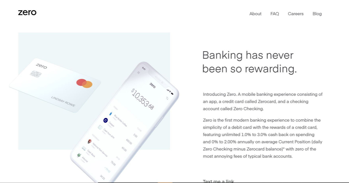
Zero offers a mobile banking experience consisting of an app, a credit card called Zero card, and a checking account called Zero Checking. The website features a minimalist style, mostly white.
Zero has a simple and catchy tagline, “simplicity of a debit card, cashback of a credit card.” And the platform banks on uncomplicated design to express how straightforward their business is.
2. Boosted
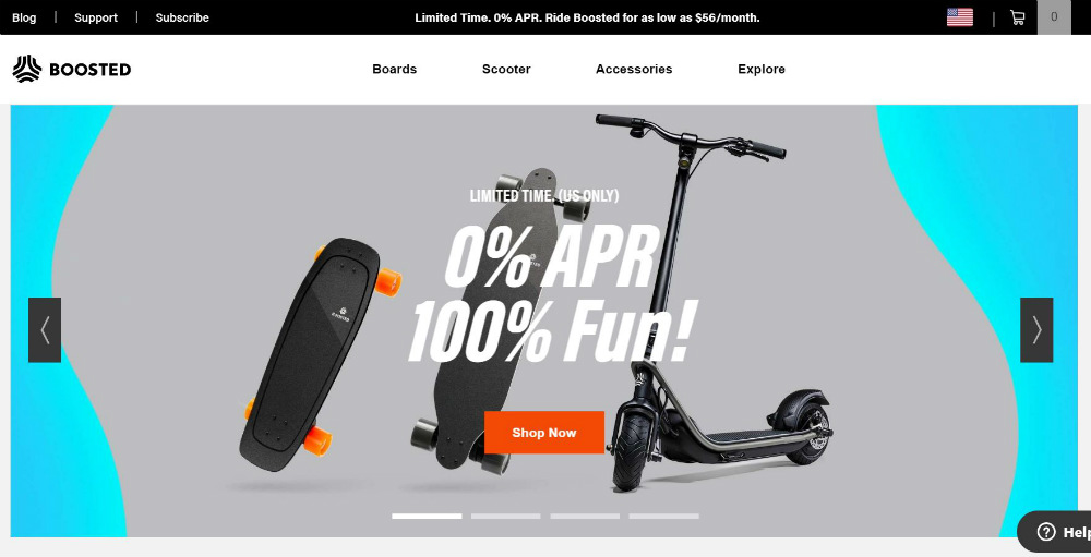
Boosted, a startup that offers scooters, electric longboards, and electric skateboards as an affordable form of transportation.
The company is a brainchild of grad students looking for a better way to get around campus. And its website offers a clean canvas of black and white. This simple palette emphasizes the home page’s automatic video cards that reflect the brand’s mission to reinvent transportation.
3. Zillow
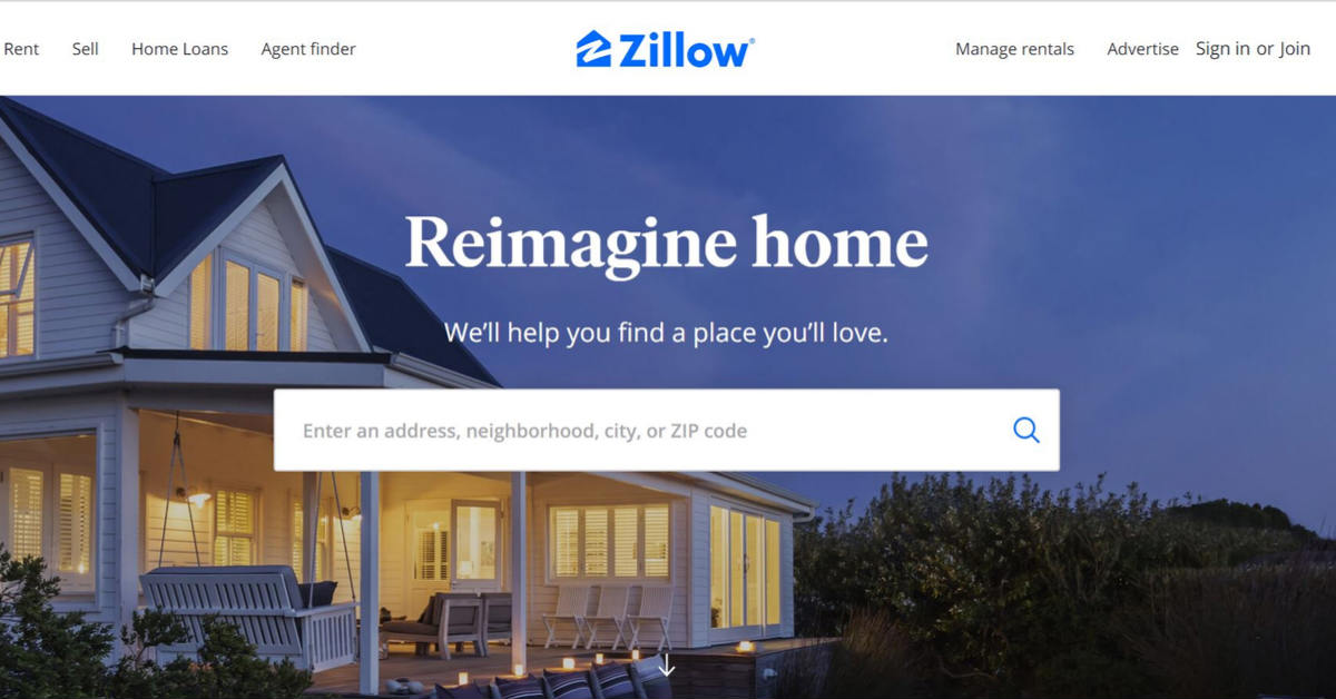
The real estate and rental marketplace website offers an individual feel that makes it unique among its industry competitors.
Zillow promises to empower consumers with data, inspiration, and knowledge to equip them to invest wisely in real estate. However, instead of a formal, all-business website that enumerates how they assist investors, they went the other way and opted to appeal to visitors’ emotions. Their logo and website look exudes relaxation, peace, and serenity – the best feelings anyone can associate with home.
4. ESPN
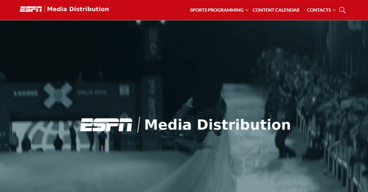
ESPN is known for showing action-packed sports events. Fittingly, its website offers a brand of plainness that allows visitors to focus on the video card on its home page. Below the fold are image cards that feature its website categories: boxing, films, FINA, IAAF, NCAA, Poker, Special Olympics, and XGames.
The American sports channel seems to be confident with its standing as a well-established brand, as evidenced by the prominent display of its logo.
5. Design Clever
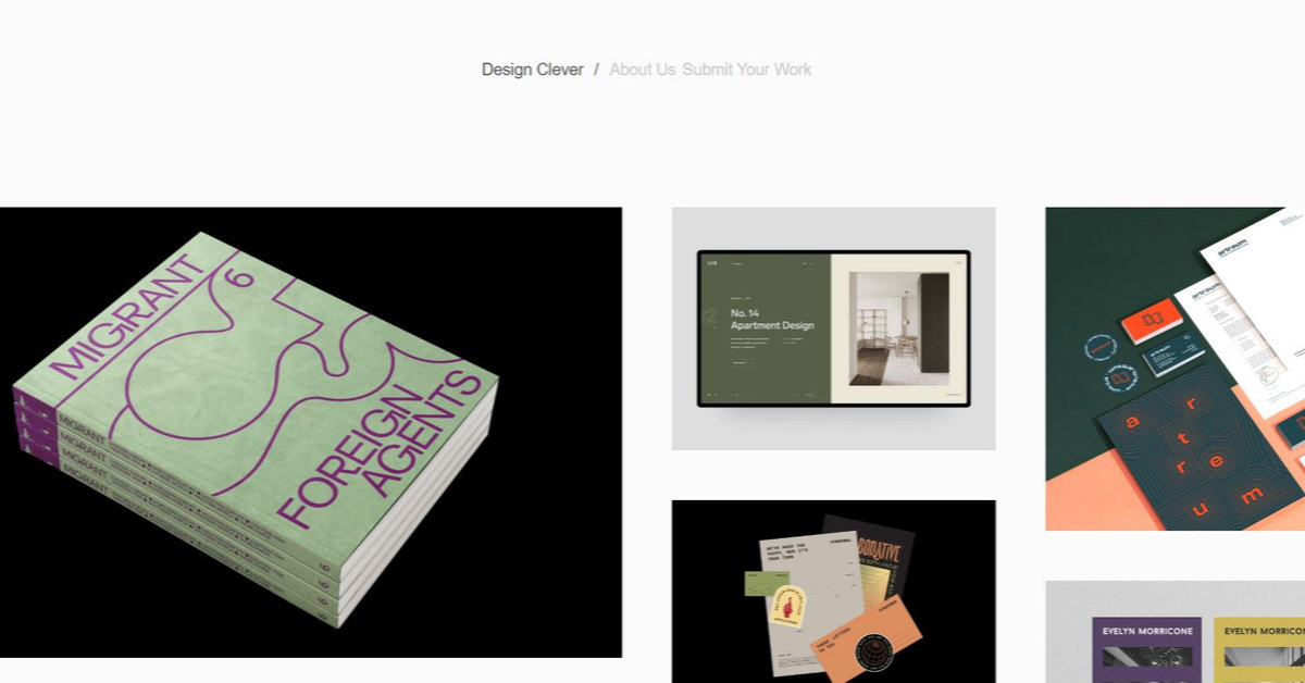
Design Clever is all about celebrating design, and their web graphics reflect this.
Described as a project of “two aspiring Graphic Designers with a passion for everything Design related,” a visitor gets the vibe that design is king on the website. Even the website name takes a backseat to the tiles of graphics displayed on the home page.
6. Mikiya Kobayashi
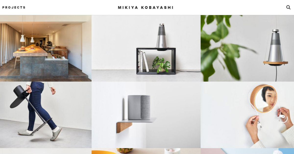
Mikiya Kobayashi is a Japanese furniture designer, and his website is unsurprisingly impressive as his glorious works of art. The website canvas is minimalist and straightforward, with unadorned block sans serif font.
The website features a collage of clickable images, each featuring a design element. Moreover, the thumbnails were strategically placed alongside one another. They guide the eyes to appreciate each image without overwhelming the senses.
7. Nowness
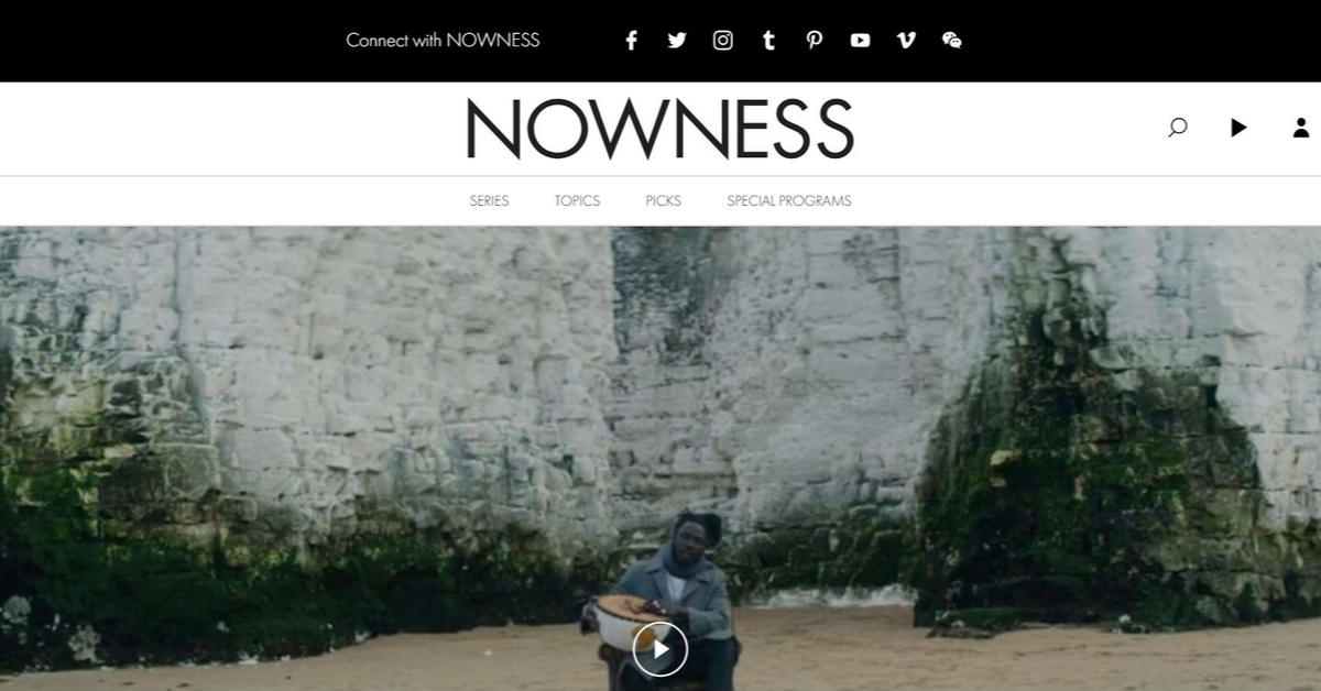
The website of this digital video channel is sleek, uncomplicated, and easy to navigate. Secondly, the website prides itself as a “movement for creative excellence in storytelling celebrating the extraordinary of every day.” Lastly, it shows the company’s commitment to inspire netizens in terms of design, fashion, art, beauty, music, food, and travel.
8. Overflow
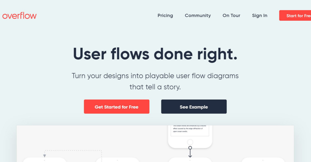
Overflow is a platform that turns designs into playable user flow diagrams that tell a story. As a result, It proves that you can come up with minimalist web graphics without having to stick to black and white. In addition, the website features a color palette of bluish-gray, red, and black – the same colors found on its logo.
9. Minimums
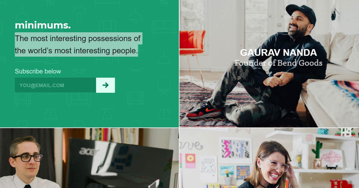
The idea behind Minimums is very new-age. In a nutshell, it features “the most interesting possessions of the world’s most interesting people.” Each article centers around a person and what makes them game-changers. Plus, an enumeration of their most interesting possessions, each item with an interesting story. The graphic design allows for easy reading and the photography highlights each possession being described.
10. Amanda Martocchio Architecture
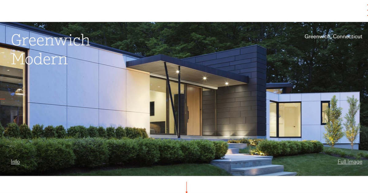
Anyone browsing the internet for contemporary architectural services would hire Amanda Martocchio Architecture the moment they lay eyes on the firm’s website. The homepage features a photo of a serene building facade, with clean lines and perfectly lit walls. The site is mostly white, peppered with red-orange accents the same shade as its clever logo.
11. Made by Folk
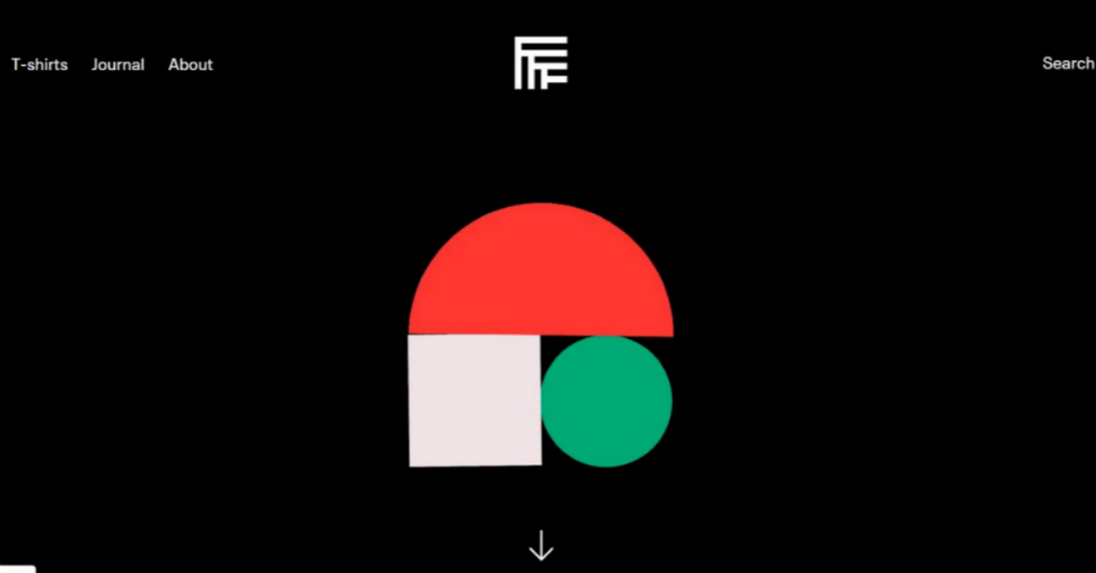
Made by Folk is a curated design marketplace that promises to deliver materials that inspire people. The website offers typographic, photographic, illustrative, graphic, and screenprints. Furthermore, it features a black and gray color palette, accented with geometric shapes in red, sky blue, seafoam, and off-white.
12. Design Week
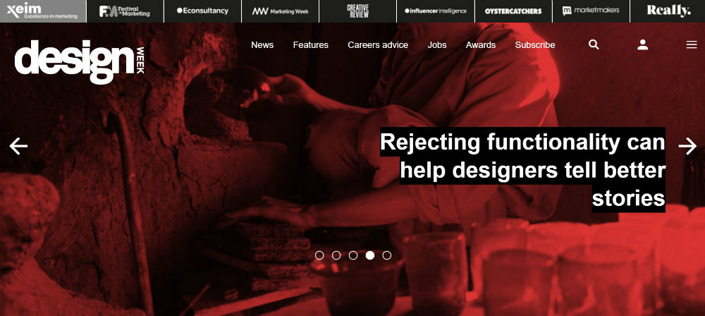
Design Week takes pride in being the UK’s leading online design magazine. It offers a fresh look that manages to look young and trendy without sacrificing its air of professionalism and expertise.
The home page features flipping cards featuring their latest articles. The images all come in a crimson filter that goes very well with the white logo and black and dark gray design accents.
13. Creative Review
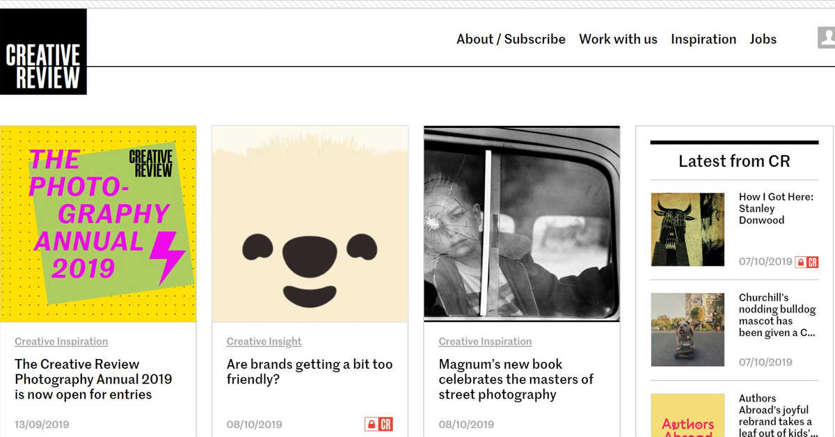
The website for this bi-monthly print magazine and digital publication is straightforward and easy to navigate, thanks to its classic layout style and clear sections. Moreover, the magazine is known for focusing on commercial creativity, including covering design, advertising, photography, branding, digital products, and film since 1980. Above all, the website conclusively shows how much the publication has evolved and kept up with the times.
14. G2G Branding and Web Design

Amid graphic design platforms all trying to look minimalist, G2G Branding embraces and celebrates its quirky aesthetics. With a muted pink and gray color palette, the homepage features an eccentric illustration. However, its serif font may not be typical for design platform websites, but it makes G2G unique and original.
15. Shillington

Shillington Design Blog, run by Shillington Education, offers graphic design courses. Its web graphics express simplicity and dynamism, with neat rows and symmetric layout. Likewise, the website’s colorful thumbnails, headlines, and leads spark interest. Plus, they make the whole website look like a vast treasure chest of knowledge and tips about design education.


