Game-Changing Graphic Inspiration Examples For Your Next Campaign
Several weeks from now, we will be saying goodbye to 2019. Fret not; you still have time to come up with the strategy that may change the course of your next campaign. Our minds are an abyss of infinite possibilities, which is an advantage for us. However, that abyss can become cluttered and overloaded with too much information. Don’t worry, we’re here to help. Here are some game-changing graphic inspiration and ideas for your next campaign.
3D Typography
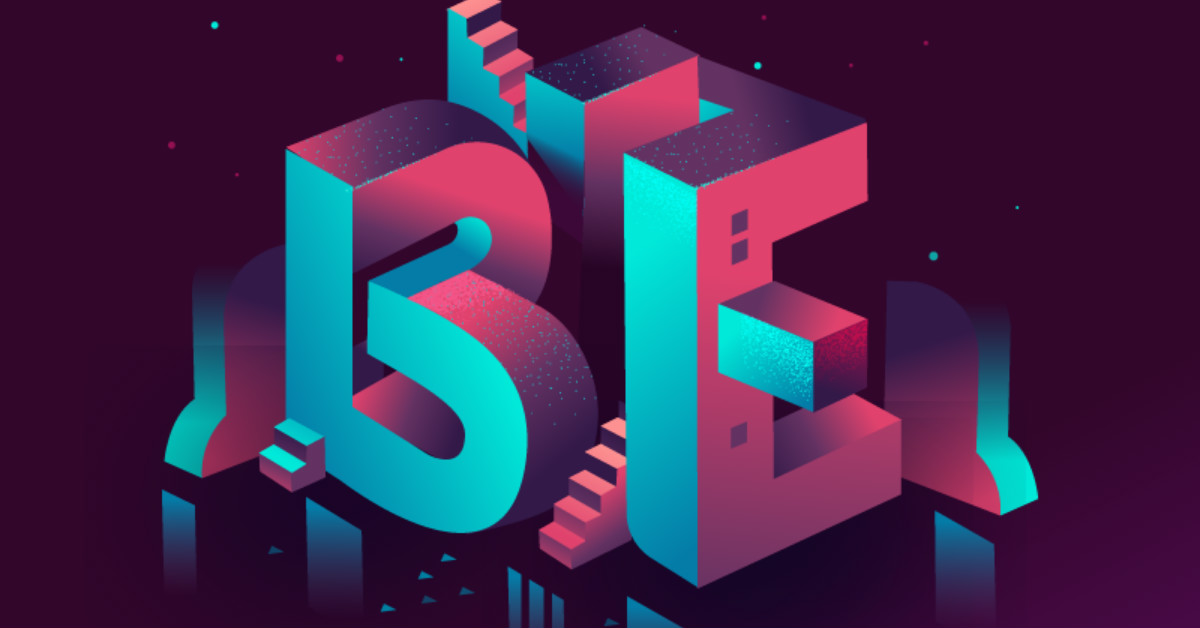
Using three-dimensional typography gives a realistic feel to the design. This type of font style has lots of texture and shadows, giving more dimensions compared to an ordinary typeface. This type of typography is sharp and crisp and is usually presented with a blurred background. There’s a sense of depth between the foreground and the background, emphasizing the embossed typeface.
Apart from the use of shadows and texture, 3D typography is also characterized by tilting. It can create a more playful and quirky mood if a curvy typeface is used.
Open Composition
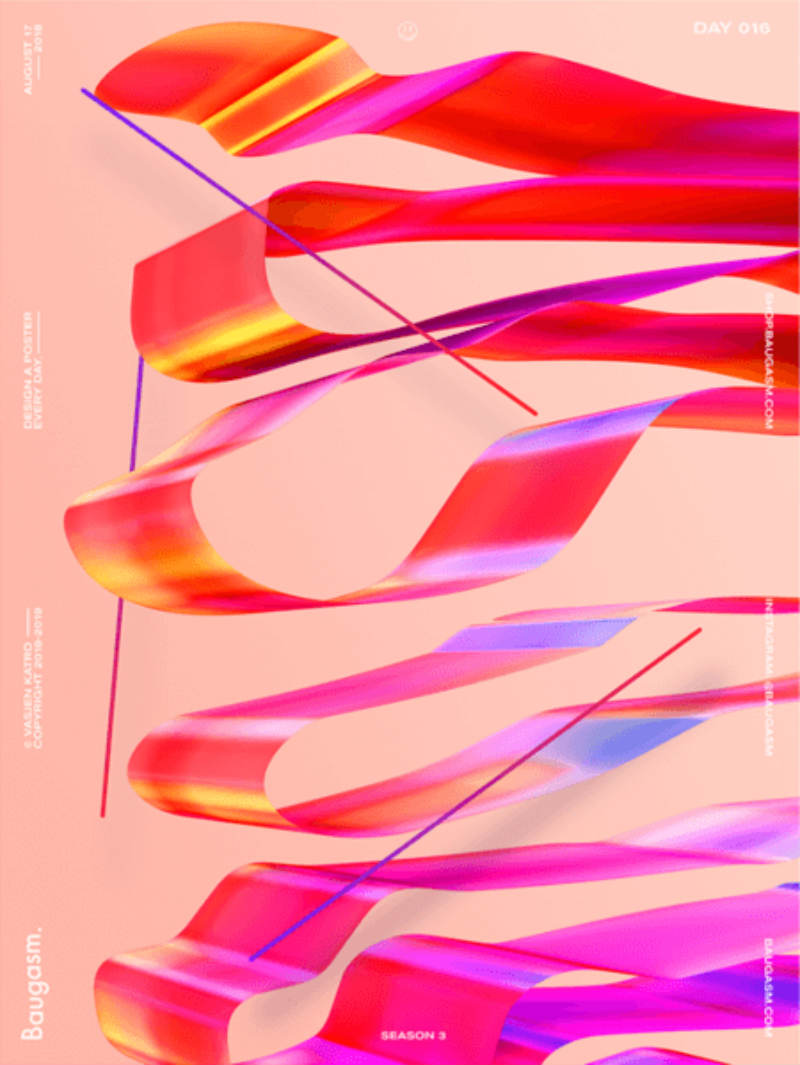
One of the most trending graphic styles in 2019 is open composition. Typically, elements are framed in a particular container and open composition breaks that rule. This type of visual style has lots of overlapping elements to it. Also, it defies the boundary. This type of aesthetic might not be appropriate for those who wanted to achieve the minimalistic and classy design. In a way, the open composition can be perfect for repeating patterns.
Vivid Colors

If your campaigns are so used to classic and muted colors, stepping out of the comfort zone and trying out vivid colors might change the course of the game — for good. Vivid colors are striking and it gives more life to the design.
It’s easier for this type of color to get the attention of the customers. Companies like Spotify and Apple have been applying vivid colors to their campaigns. It is also wise to take note that you need to use vivid colors that are contrasting with one another.
Neon Colors
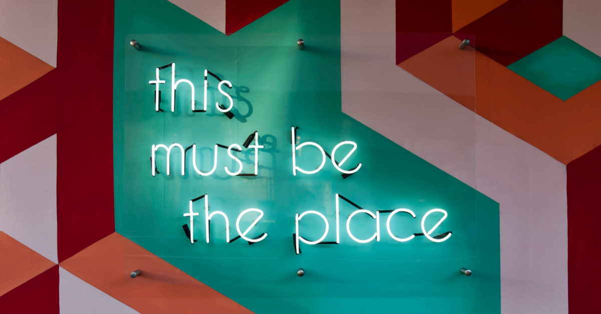
Technically, neon colors are vivid since they’re bright. The difference between vivid and neon is that the latter is more intense and they appear to be glowing. Neon has this mysterious vibe into it. No wonder why it’s quite popular in movies and television shows like Nerve, Riverdale, and Stranger Things. Lastly, neon also has a retro vibe into it.
Stacked Art
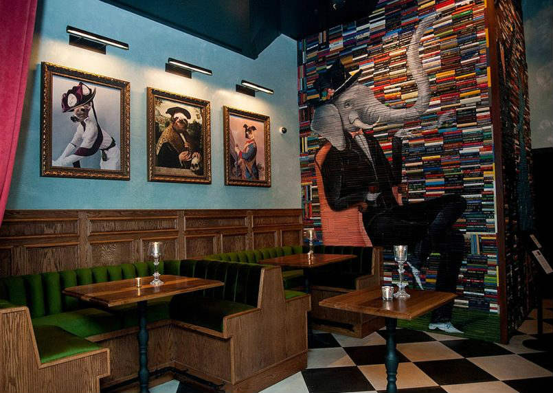
Another creative strategy that you can apply to your next campaign is with the use of art stacking. This style splits the design into a different canvas. Alone, the image won’t make sense but if they’re stacked to the other parts, you’ll get the entire aesthetic. It’s a good strategy to emphasize the importance of looking at the bigger picture, literally.
Here’s a perfect example of stacked art. The artist behind this beautiful art is Mike Stilky. He uses book covers as multiple canvases to connect little pieces of art. This can be game-changing to your campaigns. Apart from books, the wine company Sechzisch-Vierzisch also applied this kind of strategy to its alcohol packaging design.
Isometric Design
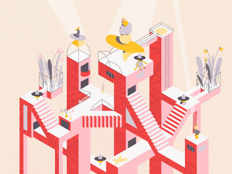
Another visual design that has the capability of changing the course of your campaign is isometry. Isometric designs are three-dimensional designs. It can be a little bit complicated compared to the flat designs but for sure it’s more aesthetically pleasing. This visual aesthetic shows you a better perspective of the product you are trying to sell.
Illustrative Rechanneling
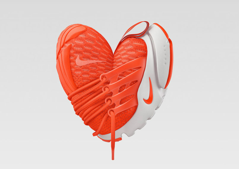
Some may think that rechanneling or transforming a certain product into something else is an insane act. But for some, it may spark creative thinking. Perhaps it’s a different way of sending a message to the audience.
For instance, you can look at these illustrations by Chris Labrooy. He had somehow transformed Nike shoes into different objects like stars, hearts, lips, and more. These are clearly three dimensional and have realism in it. It’s a surreal art for the modern-day.
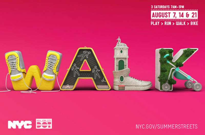
Take a look at this ad by the NYC government. Chris Labrooy has the same approach. But the designer combines 3D typography and different elements to create this very unique design.
Fluid and Drips
The liquid effect, or to artists, the drip effects give a little whip of creative freedom with typography. One may be able to assign different thicknesses into a flat typeface, giving a little more accent to it. In a way, drips can provide another dimension to boring typography.
This visual effect sticks out because of its texture and splatters. If your brand looks for something clean and classy, this graphic inspiration might be a good idea. However, the liquid effect can be the best pair up with vivid colors and 3D typography.
Anti-Gravity Effect
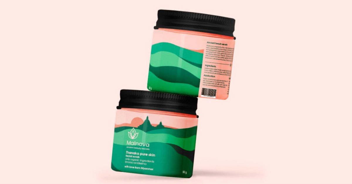
Another visual strategy that you can use is anti-gravity. It’s freezing a specific moment before something is about to fall. Or to put it positively, make the elements of your designs float. There is a sort of action and motion going on the design. This movement can add up layers and life to a flat aesthetic.
The anti-gravity visual design is usually paired up with open composition involving the overlapping of elements and more tilting.
Metallic Design
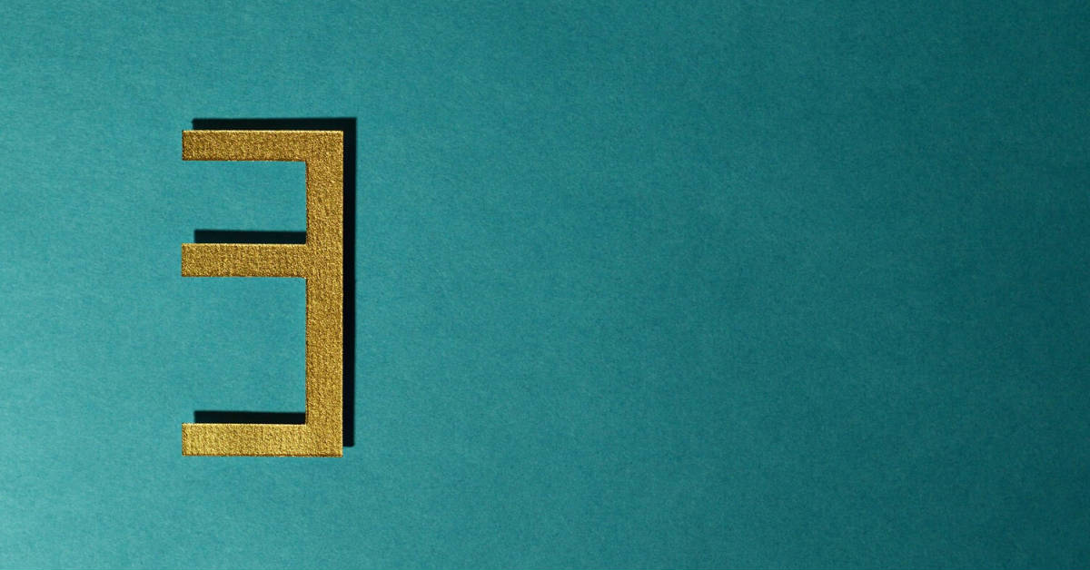
Adding a metallic aesthetic to a graphics design can add more depth and sophistication to it. Pair metals with any iridescent color like gold. This metallic aesthetic can show off the classic and sophisticated vibe especially when light hits through it.
Metallic designs are good for luxury product campaigns like cars and wines. It’s best to pair the metallic elements with a contrasting background.
Doodles & Illustrations
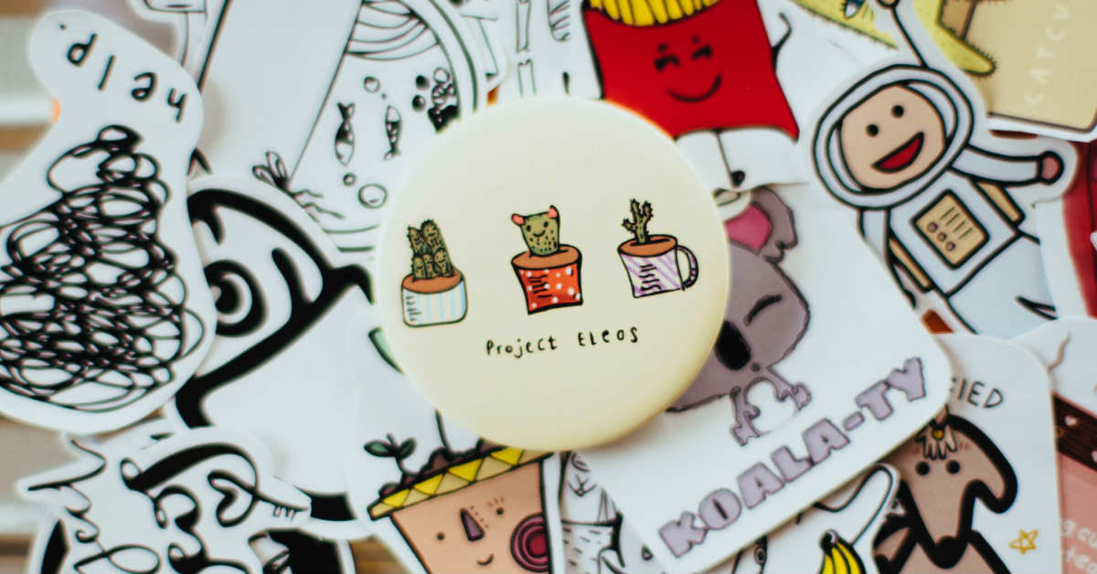
Another graphic inspiration you can apply to your next marketing campaign is doodles and illustrations. Doodles never go out of style. It’s a freestyle type of visual aesthetics and it’s up to you if you make the overall aesthetic playful or quirky. These are usually famous in designer graphic tees.
Wrap Up
These are just among the graphic inspiration examples you use or apply to your next marketing campaign. Remember, you can combine two or three design strategies and achieve the mood you wish to achieve. If not, you can also start with a couple or three design aesthetics and then find out what works. Certain design strategies might be effective for a particular product but won’t yield the same results to the other services your business is offering. The first step of having a successful marketing campaign is getting the best graphic design that will catch the attention of the customer. If you need any help with your marketing materials, ping us at Design Doctor.


