These Are The Top Alcohol Packaging Designs Of 2020
Francis Scott Key Fitzgerald once said, “First you take a drink, then the drink takes a drink, then the drink takes you.” I couldn’t agree more. Alcohol is a part of every gathering with friends, colleagues, and families. Heck, it’s a good companion when you want to spend time by yourself. Sure the content is what we came for but it’s the packaging that will catch our attention. Let’s take a look at the top alcohol packaging design examples of 2020.
Smeaton Bristol Dry Gin
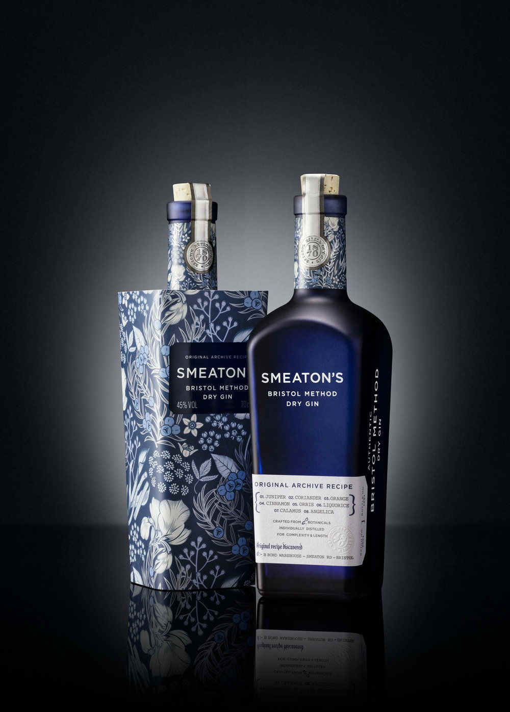
At a glance, you can already see how sophisticated and classy is the design of Smeaton Bristol Dry Gin. The blue frosted glass bottle encapsulates the premium packaging of this alcoholic drink. Denomination designed this product and they took a minimalist approach on the label of the dry gin. The name of the gin is screen printed on the bottle with its ingredients wrapped around it. The typography is so classy as well, bringing a more refined feel on the overall vibe of the packaging design.
The Legacy by Taylor Wines
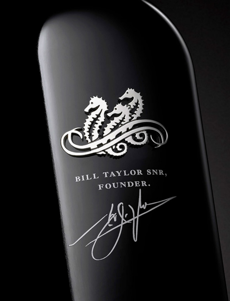
There’s nothing classier as black and I believe that Taylor Wines was able to nail it with their take on delivering a commemorative product. Taylor Wines has worked with jewelers and master craftsmen to come up with a sophisticated packaging. The metallic logo of the brand is well polished. The bottle is adorned with a metallic capsule that contains NFC technology to ensure product authenticity. The overall design is simple but it’s bold.
Wild Turkey Cornerstone Rye
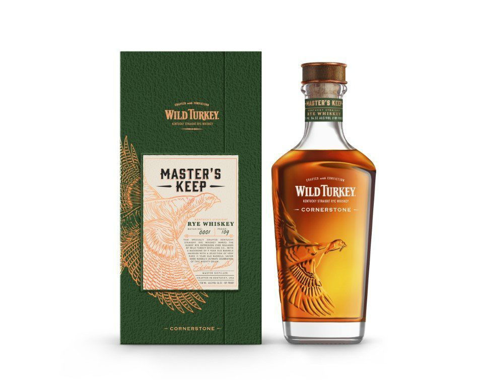
I think the engraved turkey on the left side of the bottle is beautiful. The design of the bottle itself is vintage with striking seams. The label of the alcohol design package is so well placed at the top center of the bottle. There is a sense of balance in the black space. The typography used is clean that goes along very well with the shape of the bottle.
Old Forester Birthday Bourbon 2019
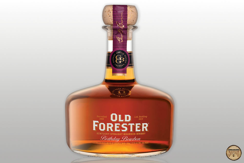
The stout bottle of Old Forester Bourbon certainly caught my eye. The strokes at the front of the bottle balance out the roundness when you look at it in its entirety. The addition of a longer bottleneck is perfect to achieve that vintage alcoholic bottle. Topping the bourbon with a wooden cork wrapped with adhesive decorated with purple, yellow, and black hues was a well-thought style.
Wasatch Brewery
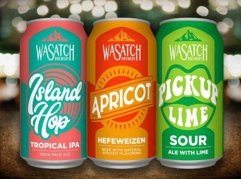
The newly revamped design of Wasatch Brewery is playful to the eyes. The cans are encapsulated in pastel hues with curvy typography to go with its overall quirky appearance. I think it’s very unique for beer cans to have this kind of alcohol packaging design. The curvy style of typography used in the product stood out against the balanced complimentary color background.
Beck’s Beer
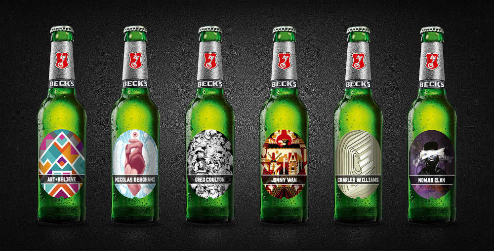
I love the illustration on the Beck’s beer bottles. The photo shows the work of artists that Beck is collaborating with. The digital drawing surely added life into the overall appearance of the green bottle. I love how they use a metallic adhesive to the neck of the bottle. It added an accent to the simplicity of the green bottle (not to mention it goes along with the silver cap).
It’s good to know that they are now using digital printing on the bottle and minimize waste on paper. Apart from that sustainable move, it’s also better since the design will stay longer on the bottle.
Sechzisch-Vierzisch
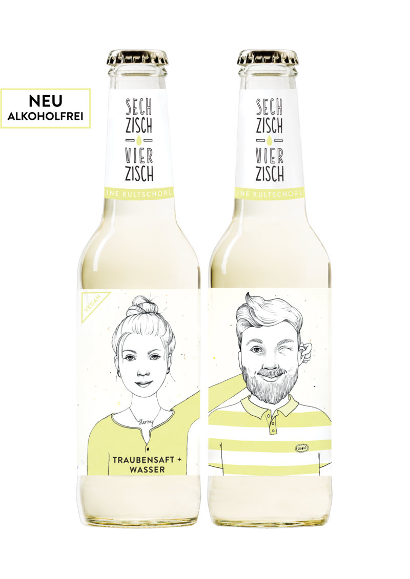
Have you seen a beer with a drawing on it? Well, you’ve probably have not noticed Sechzisch-Vierzisch’s alcohol packaging design. The Dutch company is using a simple bottle but they made sure to add life in it by putting up drawings. The bottle has an illustration of a man and a woman in separate designs. If you only see one bottle design, it won’t make any sense. If you pair it up with the right design on different bottles, it’s unique. It is somehow connected to it.
Also, the neck is embellished with a minimalist design containing the brand logo and topped with a golden cap.
Sorbo Tequila
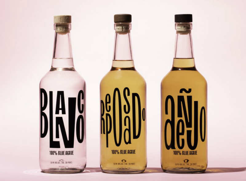
The packaging of Sorbo Tequila is probably one of the simplest yet unique designs I’ve noticed. It super minimal and it doesn’t involve a lot of colors and typographic designs. The center of the bottle is filled out with the label that is digitally imprinted. The brand label is also added with some text about its alcohol level and volume. Unlike other bottle designs, its neck is bare and is topped with a simple rounded cork.
District Made Vodka

The bottle design of District Made Vodka is not something colorful. It’s black and white but the bottle is embossed with the brand logo. The design is composed of two dominant colors and is centered with a diamond icon containing an illustration of a tree.
The upper part of the design is more dominant than the lower part making a semi-asymmetrical illustration. The overall packaging is manly. What makes it on my list? It’s the shape of the bottle and it’s improved by being topped with the design concept I mentioned.
Curio Blueberry Gin
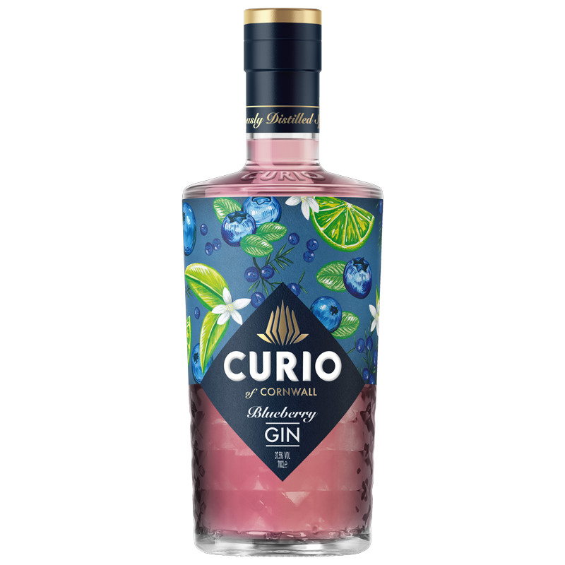
Curio’s design is something unique from the others on the list. The design of the label almost takes the entire façade of the bottle. I love the shape of the bottle and the prism-like matte finish of it. It’s sophisticated and the bottle cap is something classy.
Fling Craft Cocktails
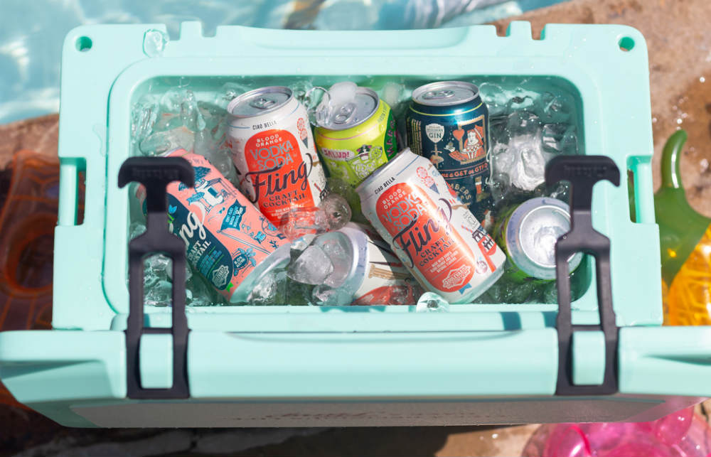
Fling’s design is quite similar to Wasatch. The difference is that Fling’s has more elements to it. Apart from that, it’s more vibrant and saturated. It is indeed more playful but it’s not something super scattered. There are tons of overlapping with the arrangement of the elements. They are also using complementary colors and very creative illustrations.
Wrap Up
The above list is just some of the top alcohol packaging design examples of 2020. The world of design is constantly evolving and who knows what will be trendy soon. So, how are you going to present your products well? Please remember though that the shape of the bottle matters. The label design is like the icing on top of the cake.


