Top 10 Billboard Designs of 2019
With technology advancing at breakneck speeds, it’s a wonder that non-digital forms of advertising are still alive and kicking. One good example is billboards. And by the looks of it, it’s going nowhere and would still turn heads and grab our attention for years to come. Billboard design is quite a creative challenge because of so many factors. It has to be readable from a distance and grab the attention of passersby (mostly driving at high speeds). Plus, it has to send the message across within a few seconds, among others. But that doesn’t mean that it isn’t doable.
Here are the top 10 billboards for 2019 that have done a great job of fulfilling their purpose: make a lasting impression long after the reader has moved past it.
1. Bic Razor
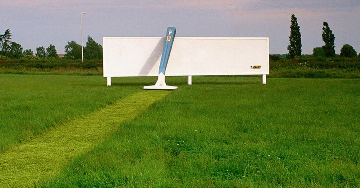
Located in Japan, this Bic Razor billboard design features a giant razor leaving a shaved trail on a field of grass. The billboard itself is almost blank except for the small logo of Bic in the lower right corner. It brilliantly shows how effective their product but on a larger scale.
It didn’t matter that the logo is small and is located in an indistinct part of the billboard. Bic is known worldwide for its razors so it’s undeniably recognizable even from a distance.
2. BBC World
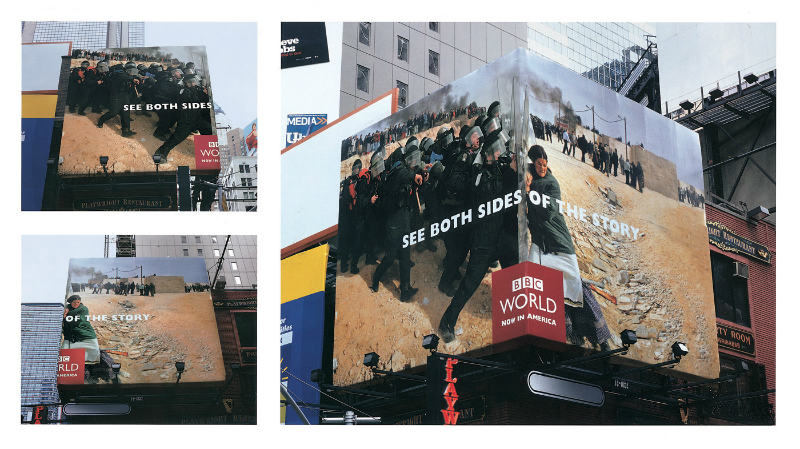
On one side of this BBC World billboard design, you’ll see a woman pushing against the wall. On the other side are anti-riot policemen pushing against the same wall. This is the company’s way of showing that there are two sides to a story and their objectivity in their news reporting.
A billboard doesn’t have to be flat as what we normally see. This one is filled with creativity that it used a box shape to further enhance the message they’re sending across.
3. Cadbury
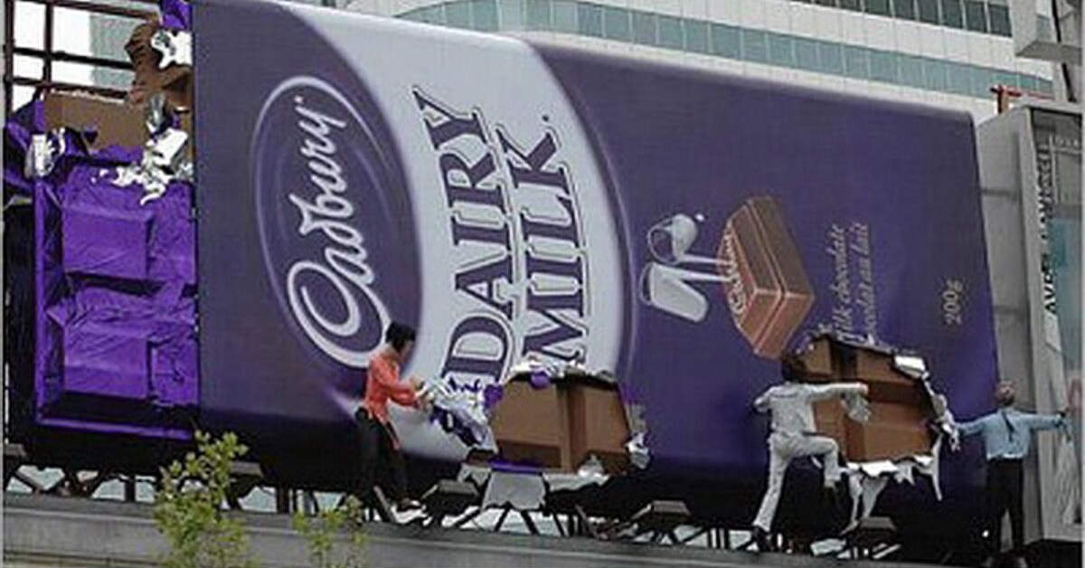
When you see this billboard from Cadbury, you’ll surely stop dead in your tracks. A giant chocolate bar being ripped open by people? Then you’ll notice that they are just mannequins and it’s really not made from chocolate, how sad.
When images aren’t enough to do the job, you need to create something that will. The idea of eating from a larger than life chocolate bar is too tempting. All you can do is get one, ASAP.
4. Papakura District Council
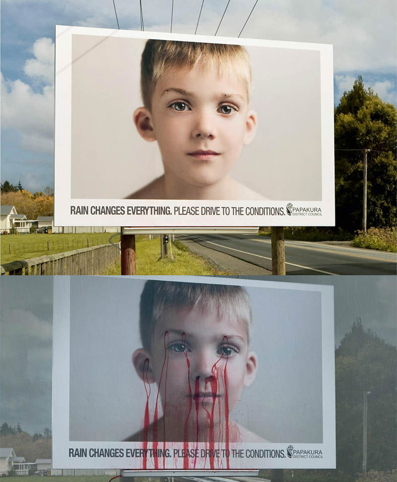
A road safety reminder from Papakura district in New Zealand, this billboard says “Rain changes everything. Please drive to the conditions.” When the weather is clear and sunny, the picture of the boy is pure innocence and good health. When rain hits the billboard, red paint oozes from the back on different spots right smack on the face of the kid.
This may be disturbing to some people, but the message is so powerful, you’d really drive carefully according to the road conditions.
5. Heineken
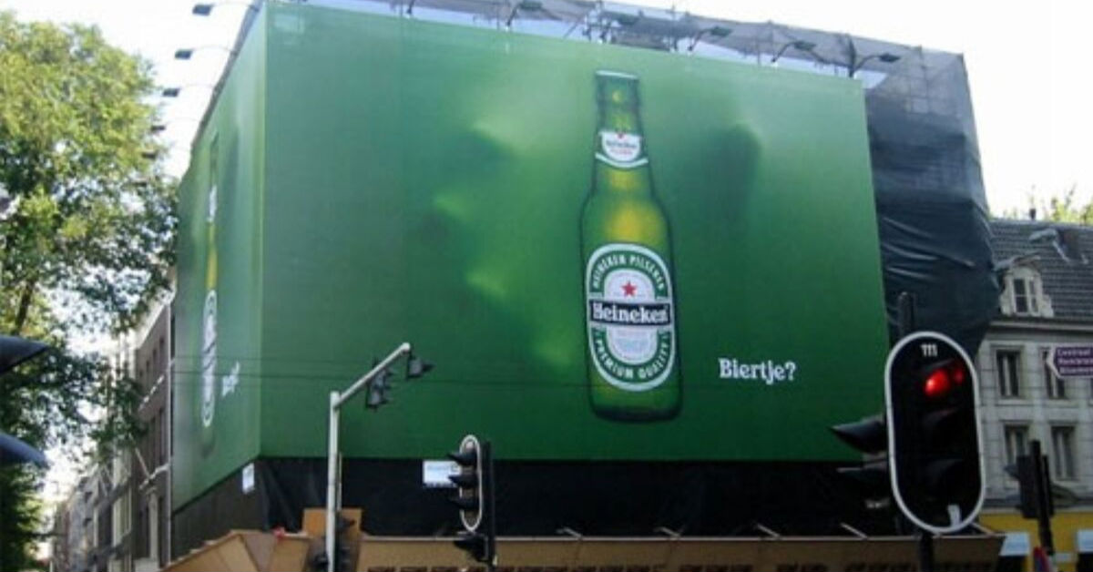
This billboard design from Heineken is so simple with only an image of a bottle on it. What makes this billboard extra special is the 3D effect of a hand about to grab the bottle. This billboard will make you look twice and probably grab a bottle yourself.
The use of high-quality images is essential in billboards and although that in itself will sell the product, an added touch of creativity can go a long way.
6. McDonald’s
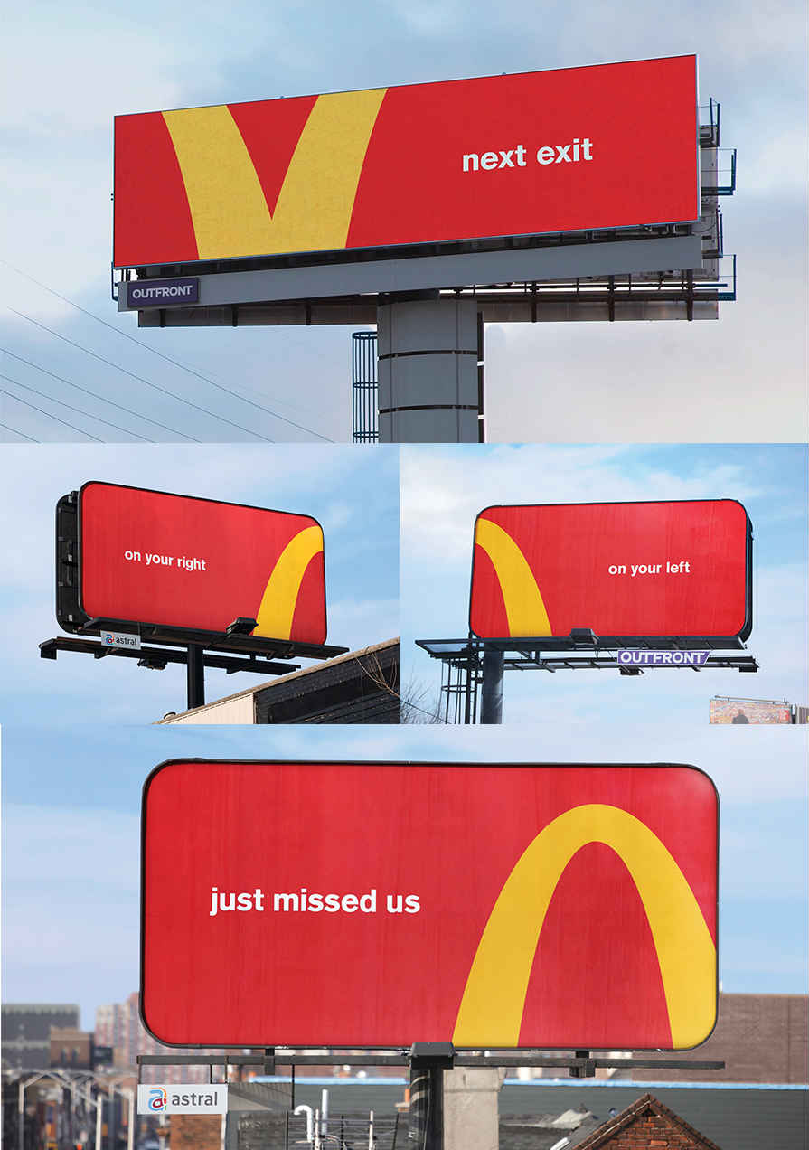
With stores scattered all over the globe, it’s no surprise that McDonald’s logo is one of the most popular. Their Follow the Arches campaign used their logo as directional arrows pointing to a store nearby. The logos were cropped to show left, right, near an exit, and that you missed them and have to turn back.
Not everyone can chop off their logo and get away with it, and this clever and amusing billboard is proof that McDonald’s is king of their industry.
7. Alaska Airlines
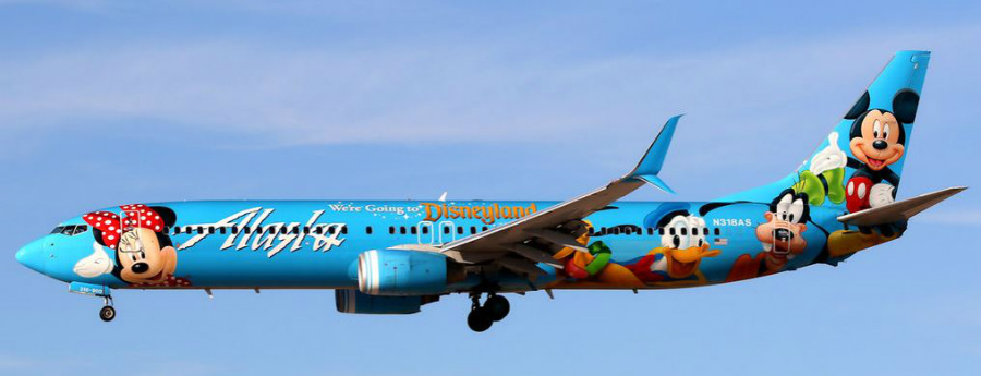
Alaska Airlines has taken the billboard design to a whole new level. They wrapped their airplanes with pictures of Mickey, Minnie, Donald, and other Disney characters. The perfect way to show everyone that they can take you to Disneyland, no problem.
Thinking out of the box can make the billboard stand out from the crowd. As mentioned earlier, a billboard doesn’t have to conform to the norm of rectangular spaces plastered on walls. It can also take to the skies, especially if going up there is your business.
8. Google
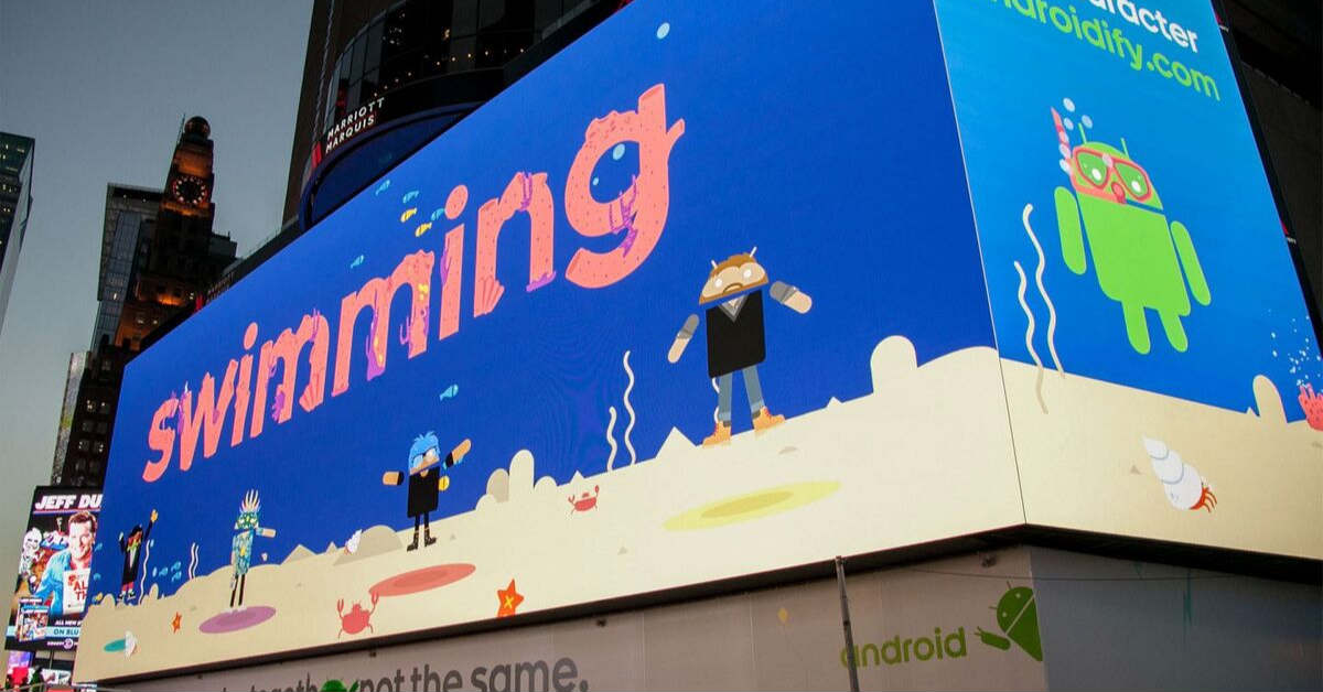
A billboard design doesn’t have to be static, it can also be dynamic with a digital version like this one from Google. To celebrate Android, Google released this billboard that featured custom-made characters that they asked the general public to create for them. It was an interactive billboard as there were games that were played by those who viewed them.
Google is a company that’s in the frontier of technology and its clever use of it is not totally unexpected. Combined with a ton of creativity, this is one billboard that’s not just eye-catching, you have to stop and immerse yourself in it.
9. 3M
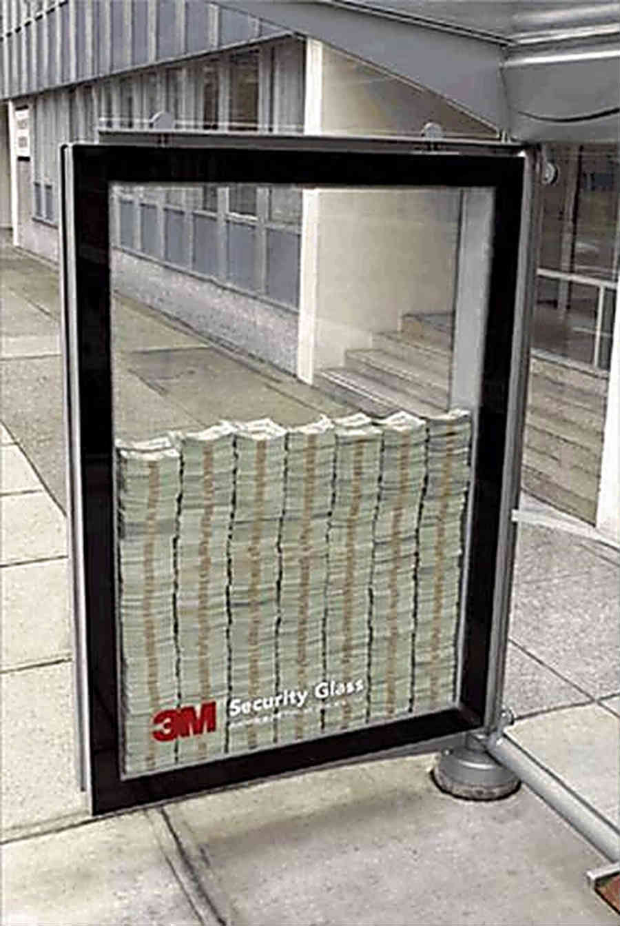
3M has taken advantage of this billboard design to prove how reliable and dependable they are. It’s a glass enclosure with stacks upon stacks of paper money in it. At the bottom is their logo unobtrusively located so what you mostly see is what’s on the inside.
It’s almost saying if you can break it, you can have it. That’s how sure they are of their security glasses. The concept is so simple yet it radiates with the confidence you’d be willing to trust them with your most treasured possessions.
10. Siemens Mixer
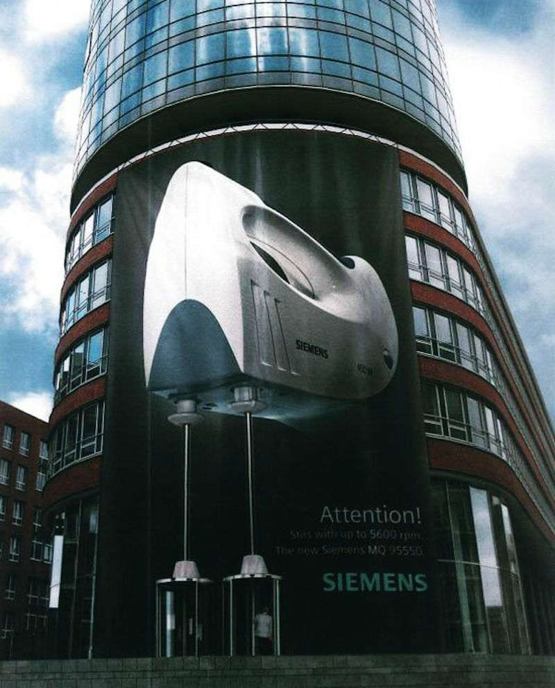
This billboard from Siemens features a giant mixer posted on a tall building. The beaters are shown in the place of the building’s revolving doors, which looks like they’re moving as people come in and out. Very ingenious even if this type of billboard can only be placed on strategic locations such as this.
The size alone, which is imposing and impossible to overlook, makes a huge impact. This is what exactly this billboard design does, especially since the brand isn’t commonly known for household electronic items such as a mixer.


