Repurposing Old Logos to New Logos 101
Naturally, designers strive to create timeless new logos for the brands they work for. However, there will always come a time that you need to change it. It depends on the trend, the market’s behavior, and if the brand is taking a different direction.
But creating a brand new logo isn’t always the answer. You don’t have to start from scratch once again. In fact, we recommend repurposing an old one, if there is any. It’s not because it’s easier. In fact, in some cases repurposing an old logo is more challenging. However, using an established logo design is beneficial if you have a pool of brand supporters.
When you use your old logo as your foundation for the new one, the brand recall is already there, and you don’t have to reintroduce the brand as opposed to when you create a new design. People will easily recognize it, while some would be intrigued that your company may have something unique to offer. Put merely, redesigning is targeted for both your loyal and potential customers. In addition, repurposing your logo means that you are keeping up with the times while still embracing the brand’s history. It shows how versatile and relevant your brand is.
7 Companies That Successfully Repurposed Old Logos
Even big and well-known brands have repurposed their old logos, and we have a list of those who were able to execute the change successfully.
1. Juicy Fruit


This is a comparison of Juicy Fruit‘s logo from 1946 and 2015. The old one has a more rigid design, which they now made more playful. Yet, they retained the iconic yellow color so it wouldn’t deviate too much from the design that most people are accustomed to.
2. Goodyear

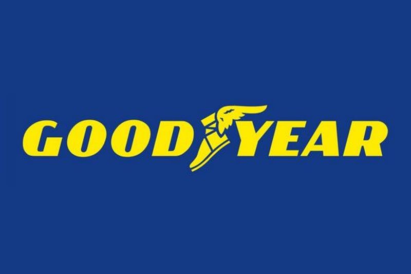
The old logo was from 1901, and the new design was created in the 1970s. The previous logo was made even before the existence of the computer. But as technology progresses, we also have to change our marketing tools and materials, including the logo. But notice how similar these two designs are. Only minor changes were made on the Wingfoot, color, and font.
3. Volkswagen
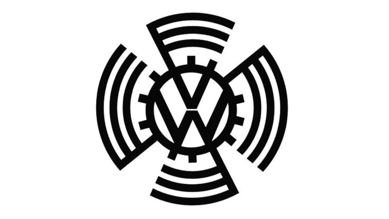

Volkswagen started with a flat design back in 1939 and changed it into something with depth. And just recently, it went back to having a flat design once again. But if you will take a closer look, they retained the foundation of the logo where they place the letter V on top of the letter W. The new design is simpler and easier to scale which most companies are doing right now. Apart from being the trend, scaling the design is a breeze.
4. BMW


BMW’s logo has changed over time, but they have always incorporated one of their most iconic elements – the quadrant. That worked to their advantage and replacing it could create a backlash. Can you imagine a BMW without it?
This is important when you are repurposing a logo. At times, a designer is tempted to create drastic changes. But one should weigh the defining elements of the brand. You should never omit it from the design.
5. Nike


Nike’s swoosh never left the company, and it will be hard for people to recognize the sports brand if they change it. What they did in the past though was to alter the font to make the logo more modern.
6. Target
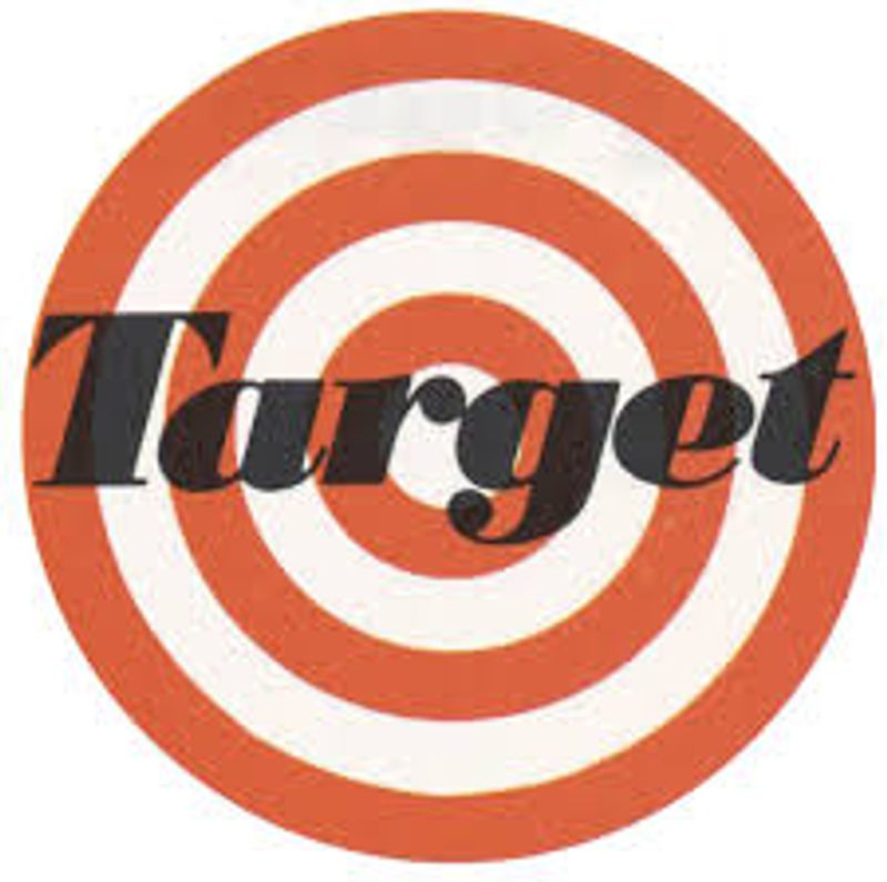

In the 1960s, Target’s logo consisted of three red narrow rings. But to have a simpler and cleaner look, they decided to take a straightforward design by removing one of the lines and making it bolder. This is more ideal, most notably for marketing purposes where you need to place and print logos on several posts or merchandise. Again, simpler designs are easier to scale.
7. Google
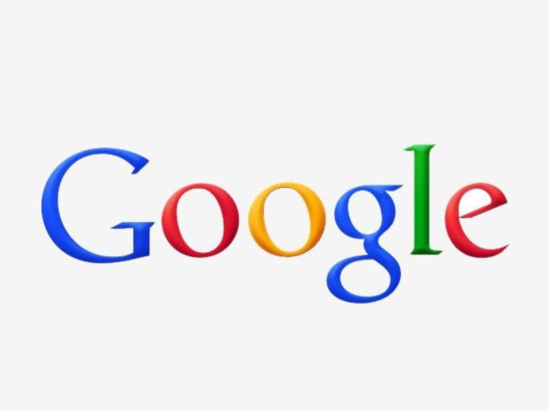
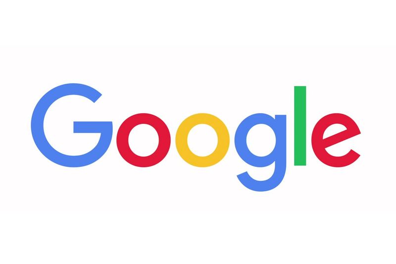
Google has always been the forerunner in terms of logo designs. They always try to make their designs clear and concise every single time. For such an established brand, you might think they don’t need to redesign every so often. However, repurposing their old logo to a more relevant one means that the company is up for change. And that’s a good message to their market.
How to Repurpose Old Logos to New Logos
From the examples above, here are the steps to consider when repurposing old logos to new logos.
1. Consider Your Logo’s Prominent Elements
When creating new logos based on previous designs, always consider the most critical elements of your brand. These elements are what people usually associate with your company. It could be the color, typeface, or icons. Take, for example, BMW. Even if they changed the typography of their logo, they retained their iconic quadrant. The same principle applies to Nike and the swoosh. You can say the same for McDonald’s and their golden arches.
You must involve your current market when you plan to redesign your logo. This is so you can understand which elements from your logo they are highly attached to. Once you have the data, the designer will know how to play with the new logo while retaining what’s important for the public.
2. Strive for Simplicity
If you will notice, new logos today opt for simpler designs. Take a look at Apple’s first logo. The old one is obviously filled with details.
While such logos show the creativity of the designer, it could also cause problems. For example, imagine if you are going to use the logo for smaller items like pens or a thumb drive. Do you think a logo that has intricate details can be printed nicely?
Even with the best printers available, this could be a challenge. What we recommend is to simplify your logo while using the brand’s iconic elements. Make it scalable enough to look good both on huge materials such as billboards and smaller items like a cap. Don’t forget about the texts if your logo has it. It should be readable at all times.
3. Look Out for Trends
As we’ve mentioned, changing your logo sends a message that you strive to keep up with the times. Having said that, you need to watch out for design trends and incorporate them onto the new logos. As of the moment, companies are using flat designs, and this could go on for the next couple of years.
Take note that this also depends on your brand. For example, you have a vintage and classic logo that matches your product like Louis Vuitton. Changing it to a more modern design might look like it is deviating from what the brand stands for. Hence, there should always be a high level of understanding if changing your logo is necessary.
Conclusion
Repurposing old logos to new logos can be a complex task. It’s not just about changing or tweaking design elements. It’s about understanding the brand and its message while incorporating the trends. That is why a team of professional graphic designers is needed when creating new logos. It takes creativity and technical knowledge to come up with a repurposed logo design that will impact the market.
