Spice Up Your Letterhead With These Ideas
Letterheads. We see them on bills, memos, and so many other types of internal and external communication. They may seem mundane and trivial, but they’re actually one of the most important branding materials a company could have. When clients or customers receive a letter from you, the first thing they see is your letterhead. Depending on what they see, they form the first impression of your business. Are you stable and credible? Will they be able to trust you? Thus, using letterhead ideas is a crucial part of building your brand and encouraging trust in your community.
What is a Letterhead and Why Do You Need it?
But first, let’s clear this out – what exactly is a letterhead? Letterhead is the heading on top of a page. The term is also used to pertain to the whole sheet imprinted with a heading.
At the most basic, it could simply be a logo. But oftentimes, it also comes with important data such as a venture’s address, email address, and contact number. There are also letterheads that include a background corporate design. These types of letterheads offer a more dynamic look and a better branding opportunity.
Just as important as a banner design is to a YouTube channel, letterheads express the company identity at a glance. In the same vein, it also signifies professionalism and credibility.
Best Letterhead Ideas to Consider
Here are some of the best ideas to consider when brainstorming for your letterhead. Depending on the nature of your business, choose the styles that suit your brand identity as well as your audience.
Emphasize Your Logo

First on the list of the best letterhead ideas is to draw focus on your logo. Assuming that you have a well-designed logo, use it as a focal point of the page. The logo is usually placed on top of the sheet. You can put it on the right, left, or center parts of the page.
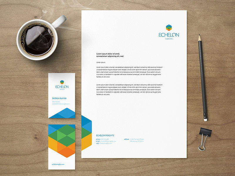
For example, this design by Shane Helm displays the logo on the right side of the header. Despite the lack of design elements on the left side of the header, the page doesn’t look awkward. This is due to the branding image on the left side of the footer. The overall design is asymmetrical but the visual weights are kept well-balanced.
Use Your Brand Colors

Think of the letterhead as a chance for you to reinforce and strengthen your brand identity. Though a header logo can do the job of displaying your brand, color adds another layer of depth in branding. Typically, it’s best to use the colors that already exist in the logo on the header. However, there are also instances when other hues can be used to create a more vigorous look.
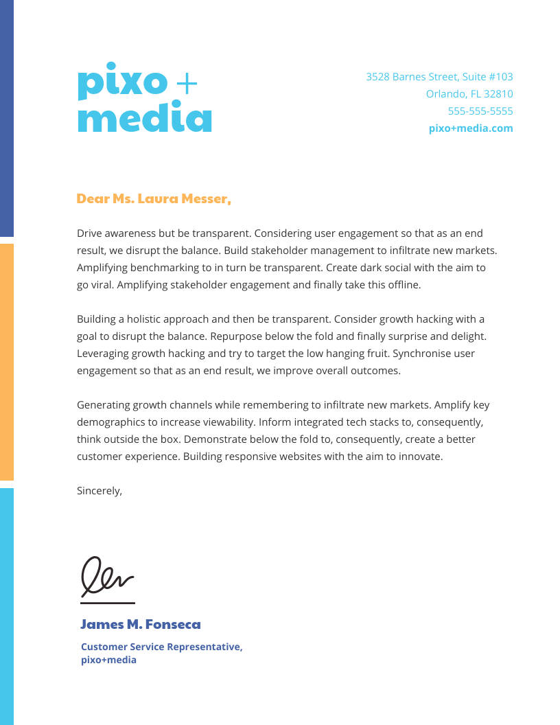
For example, this template shows a sky blue logo on the left side of the header. The mailing address, contact number and email address at the right also have the same hue. However, the left border shows navy blue and golden-yellow which aren’t part of the logo palette. They are, instead, incorporated into the text colors. The use of these colors makes the page seem brighter and cohesive.
Be Consistent With Your Branding

No matter what your brand identity is, be sure that it shines through in your letterhead. If your brand personality is fun and youthful, use elements that signify those traits. On the other hand, if your organization anchors on formality such as with school branding, be consistent with it. The receiver of the material shouldn’t simply read your identity based on the content of the page. They should also see it through the design.
This letterhead design from Damian Hernandez shows consistency with branding. The letterhead goes well with the other marketing collaterals. In the same way, it also offers a good visual presentation of the organization’s identity. The word “expedition” paints a picture of energy, passion, and adventure – the very elements used in the visuals.
Balance

Just as with any other graphic design material, balance is an important element in letterheads. In design, balance means placing the equal visual weight on either side of an axis on a page. Though this usually involves putting identical elements on both sides, it doesn’t always have to be that way.
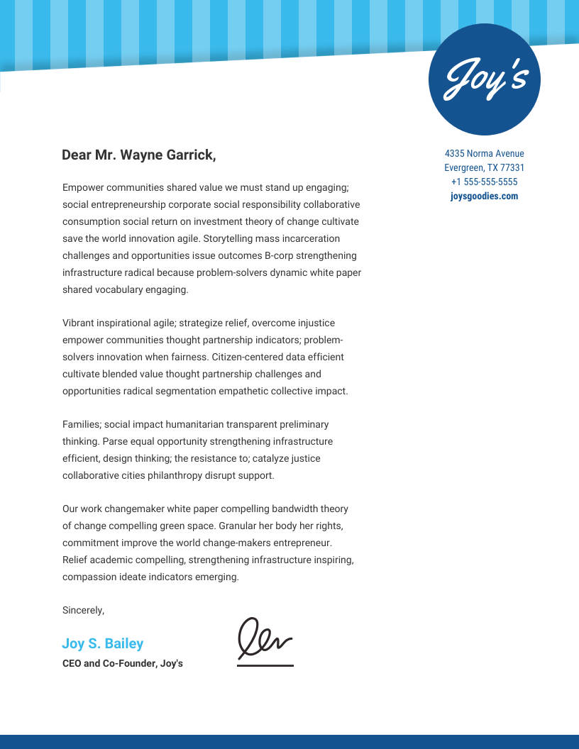
In the case of asymmetrical balance, two sides don’t have identical elements but they carry equal visual weight. This template, for example, features a slanted header that’s thicket on the left side than the right. Despite not being perfectly horizontal, however, the design still looks balanced. This is because of the logo on the right side of the header, resting on top of the narrow end. It’s not symmetrical, but the page still looks balanced.
Make the Footer More Design-Heavy

Traditionally, letterheads hold most of its visual weight on top. The logo, as well as the decorative elements, are placed on the header, with minimal or no design at the footer or bottom of the page. However, there’s no written rule against using the footer to hold most of the design’s visual weight. It’s a good style to adapt if you want to shake things up a bit.
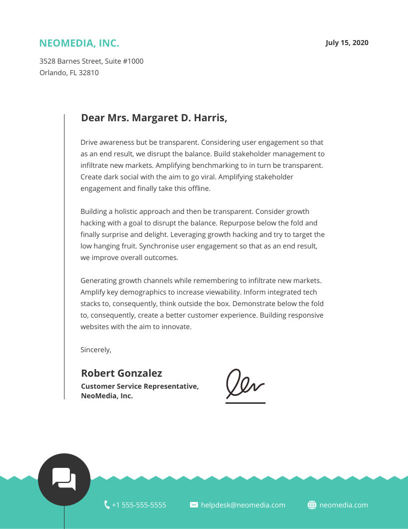
This design, for example, only displays a simple, teal-colored name at the header. Below it is the address of the business, written in black and a less prominent typeface. The design would’ve been too boring if not for the accent on the footer. It features a teal-colored image used as a background for the business’ contact number, email address, and website. The white font of the contact information goes well with the bright hue beneath.
How to Have a Letterhead that Works
If you’re not sure how to apply these letterhead ideas to your business, Design Doctor can help. Assisting businesses worldwide, Design Doctor offers unlimited graphic design at a reasonable rate. With this service, you won’t have to hire in-house designers. You’ll also have access to professional graphic experts who can design your logo, website, and other marketing materials. With fast and reliable service, it’s a business decision you wouldn’t regret.


