10 Advertising Materials that Show Excellent Graphic Design
Graphic design is one of the most crucial elements in print and digital advertising. Through it, advertisers can make the most out of visual storytelling and complement a compelling copy.
So, what makes for excellent advertising graphic design? And what are the things to keep in mind when crafting one? Read on to find out.
What Makes an Advertising Graphic Design Excellent?
An advertisement aims to attract attention and spark interest among a product or service’s target market. The ad needs to be aesthetically pleasing to achieve these goals.
Fundamental design elements, including line, color, shape, texture, and typography, should all work together to create a visual that would make people look twice.
Aside from being aesthetically pleasing, the visual elements should also work to advance brand identity and not distract viewers from it.
That said, everything, from the images up to the hues and tones, should all be parallel to the brand. Also, the logo must not look out of place in the ad, and the business’ unique personality should be able to shine through.
10 Best Advertising Graphic Design Examples
Here are some examples of advertisements that display clever graphic design aesthetics that doesn’t distract from the material’s made message.
1. Pedigree
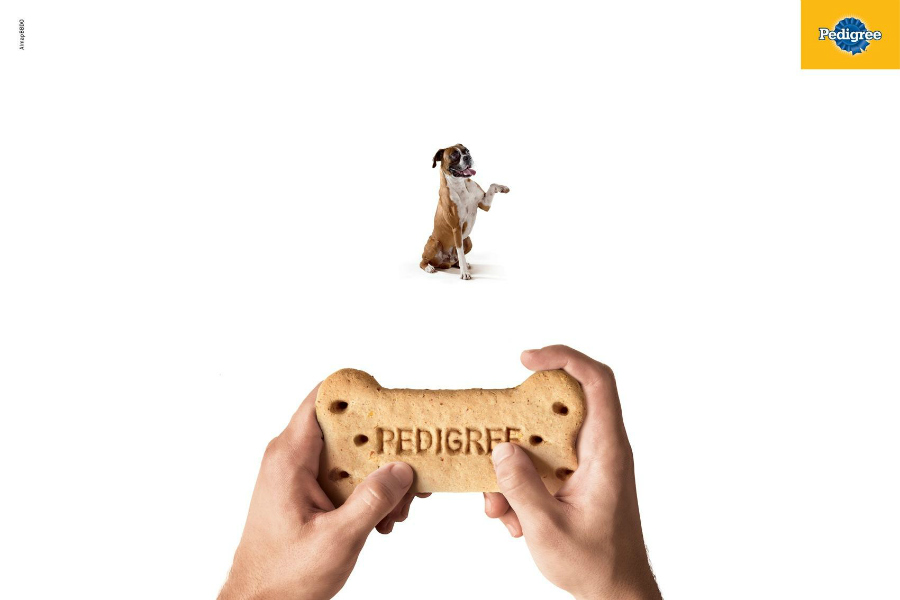
Training a dog is very challenging. Most pet owners probably wished they had a magic controller they could use to have their furry friends follow their every command.
This idea is the concept behind this ad from the pet food brand.
The ad featured a dog being controlled by its owner through a controller shaped like a dog treat. The material’s play on shapes and its integration of owner experience makes this advertisement attention-grabbing and memorable.
2. Sea Shepherd Conservation Society

The non-profit, marine conservation organization got people’s attention with this compelling advertisement urging everyone to stop using single-use plastic.
Moreover, the ad showed a tortoise choking with its head inside a plastic bag. In plain all-caps font was its primary copy: “The plastic you use once tortures the oceans forever.”
Although some might argue that the ad is too brutal, it certainly got the message across.
3. McDelivery
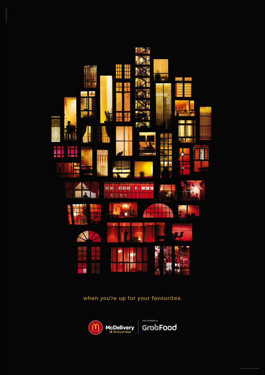
This ad for McDelivery features a collage appeal that maximizes colors and images that collectively illustrates one of their iconic products.
The image shows several residential and commercial windows with red and yellow hues. All the windows were placed together in a pattern that resembles a box of fries.
The use of imagery in this ad subtly tells the audience that wherever you are, whatever you’re doing, the fast-food chain’s delivery service is for everyone.
4. Lipton
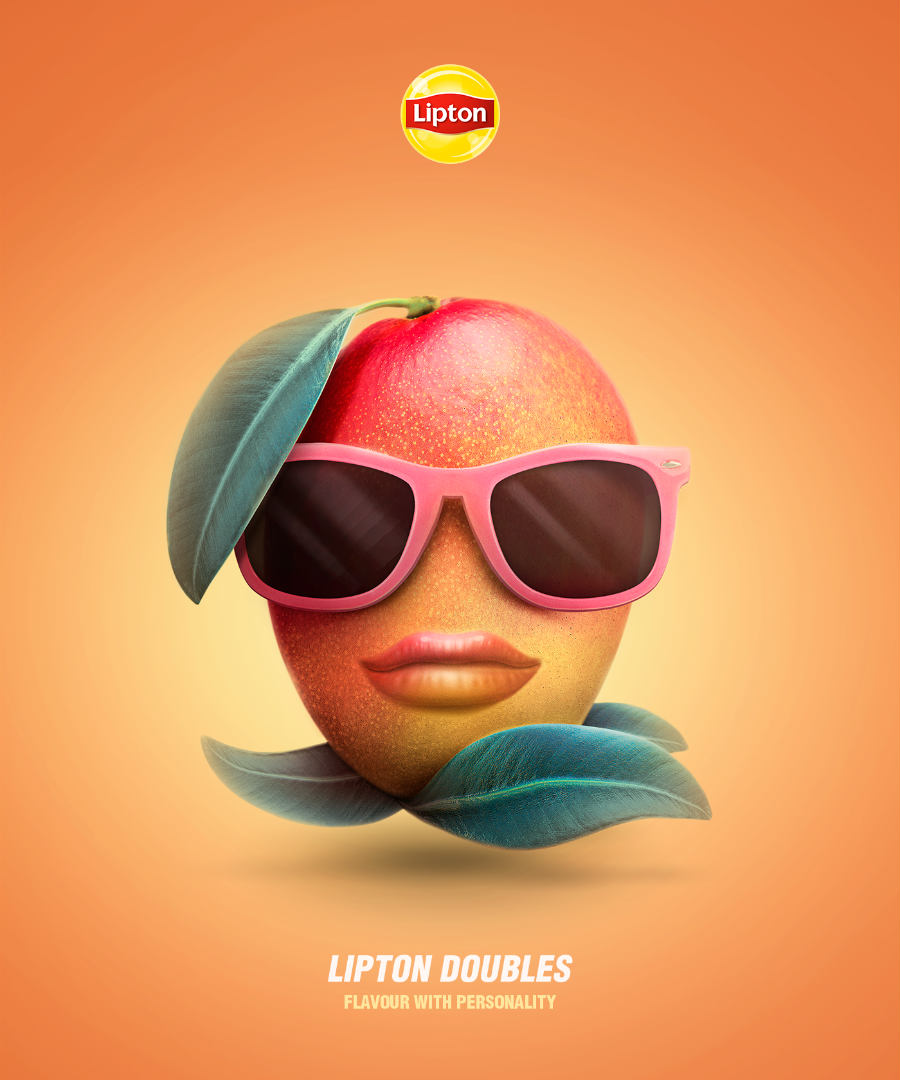
This ad for the British tea brand paints its products as anything but bland.
The campaign made Lipton’s ice tea flavors come to life, with each variant displaying a unique personality. Their ads included a sleek and chic mango, a cool and sound-tripping passion fruit, and a geeky and friendly raspberry.
Because their Lipton Double line featured variants with a combination of two flavors, they presented the match just as people would announce their relationship on social media. But instead of “in a relationship with,” they cleverly used “in a bottle with.”
5. Greenpeace
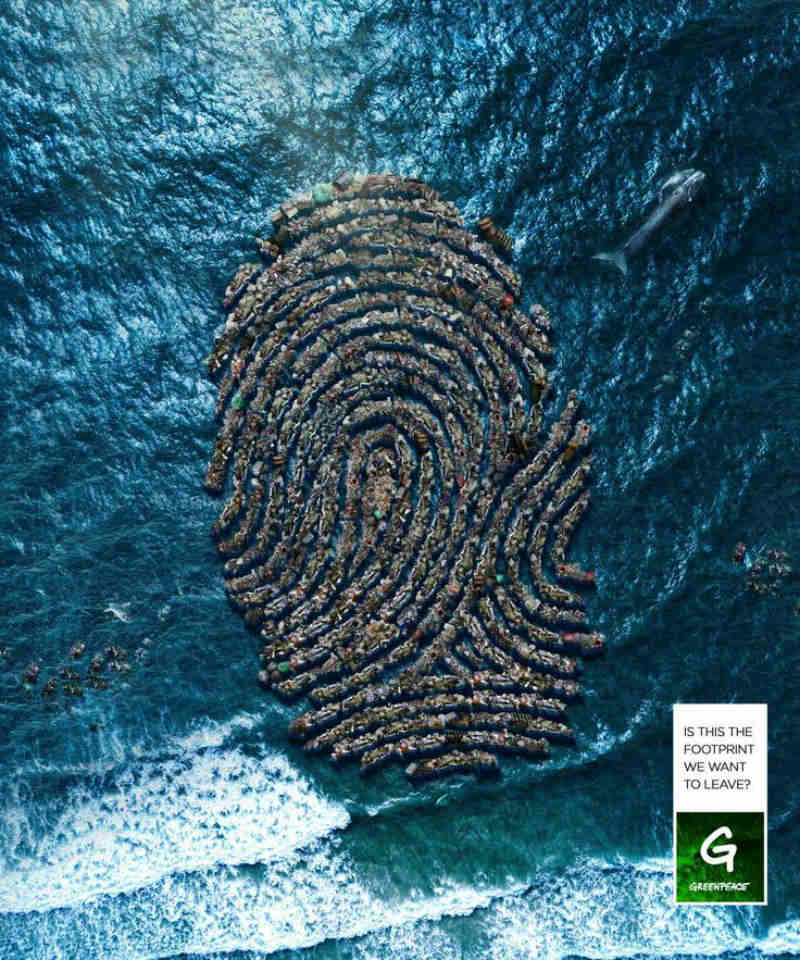
This ad from the non-governmental environmental organization paints a picture of people’s footprints on nature.
The image shows lines of garbage forming a pattern of a fingerprint, floating on a blue ocean.
Though the message of the visuals is clear enough, the copy that says, “Is this the footprint we want to leave?” further reiterates it.
6. Durex
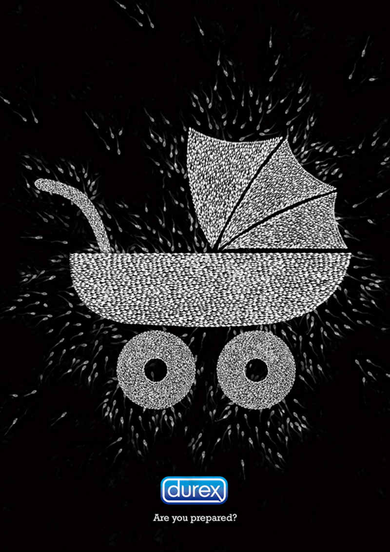
This ad for the British condom brand appeals to its target audience’s fear to catch their attention.
The visuals show sperm cells forming a baby carriage pattern. The accompanying copy is simple but hits the nail on the head: “Are you prepared?”
The black background of the ad emphasizes the light-colored illustration, and the short but concise copy gets the message across as clearly as it needs to be.
7. Ecovia
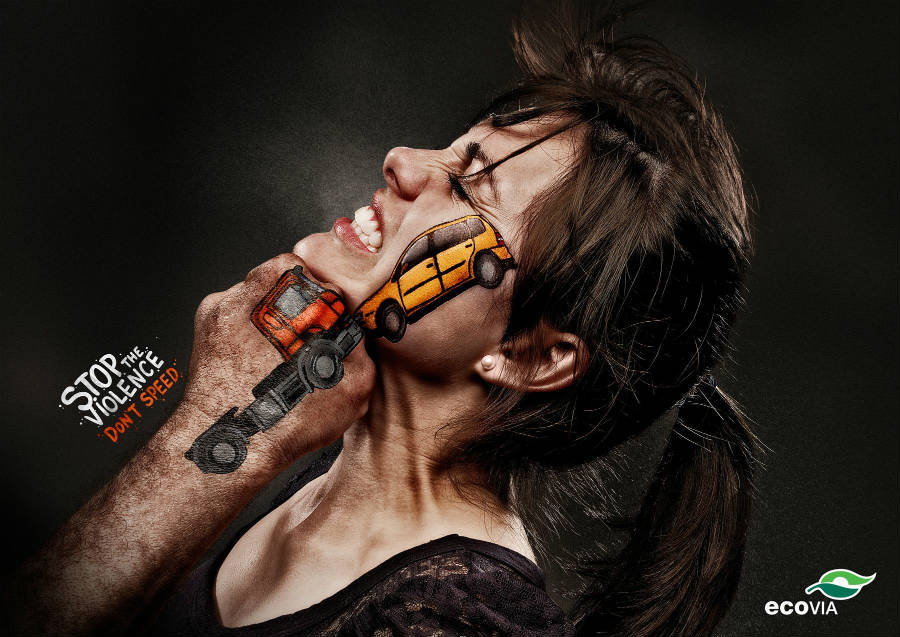
At first glance, you would think that this image is for a public service announcement about violence against women.
However, this ad was released by a bus rapid transport system. The ad wittingly associated reckless driving with violence. And that being a dangerous driver is almost the same as deliberately trying to hurt other people. The font style and color used for the copy, “stop the violence, don’t speed,” aptly suits the overall style aesthetics of the visuals.
8. KitKat
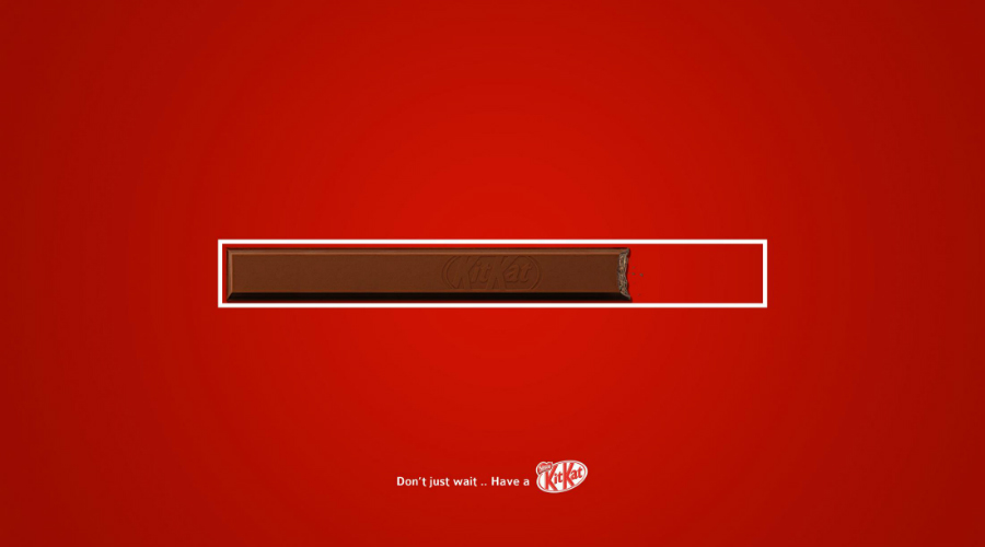
This ad for the chocolate brand shows how a simple product image if used creatively in a current context, can make for a unique and groundbreaking visual marketing tool.
The ad features a bar of the chocolate-covered wafer with a bite, placed inside a rectangle resembling a download bar.
The copy says, “Don’t just wait… Have a KitKat.” This statement makes the ad message crystal clear for those who might be confused as to what the image is trying to convey.
Most people could relate to the frustrating feeling of waiting for a download to complete. And with chocolate consumption associated with taking a break, the resulting ad is genius.
9. Colgate
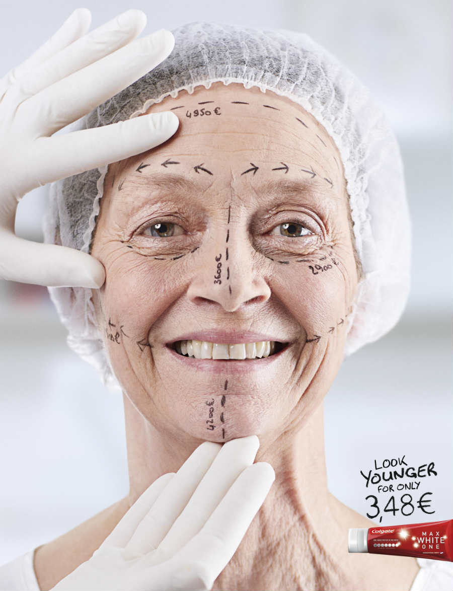
In their ad campaign, the oral hygiene products brand wanted to highlight how a set of pearly whites can make a person look a lot younger.
The image showed a mature woman with surgical skin markers on her face, each part labeled with a hefty price presumably for plastic surgery.
In a font that looks like marker writing, the copy says, “Look younger for only €3.48.”
The poster is mostly white, placing more emphasis on the flesh color of the face and the Red packaging of the toothpaste tube.
10. Coca-Cola
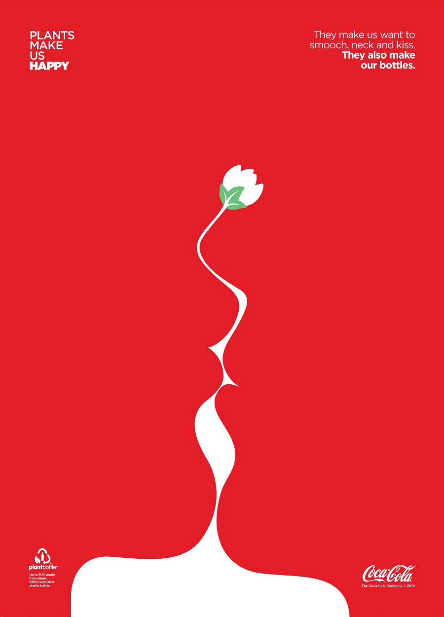
This advertising graphic design used for the popular carbonated beverage shows a creative use of negative space.
This print ad highlighted Coca-Cola’s bottles which are 30% made from plants and 100% recyclable.
The ad, mostly red, featured a white image of a plant stem with a flower on top. The image was cleverly designed, the red parts look like two lips about to kiss.
The ad’s copy aptly suited the visuals: “They make us want to smooch, neck, and kiss. They also make our bottles.”


