These Are The Best Email Design Inspiration You’ll Ever See
Social media may have the biggest piece of the pie when it comes to communication nowadays. But in business, this may not be as true. Did you know that email marketing has an undue advantage? When communicating for business purposes, 86% of professionals use email as their main channel of contact. For that reason alone, now is the time to ramp up your email marketing strategies. To start you right, here are the best email design inspiration examples you’ll find on the internet today.
Tiffany & Co.
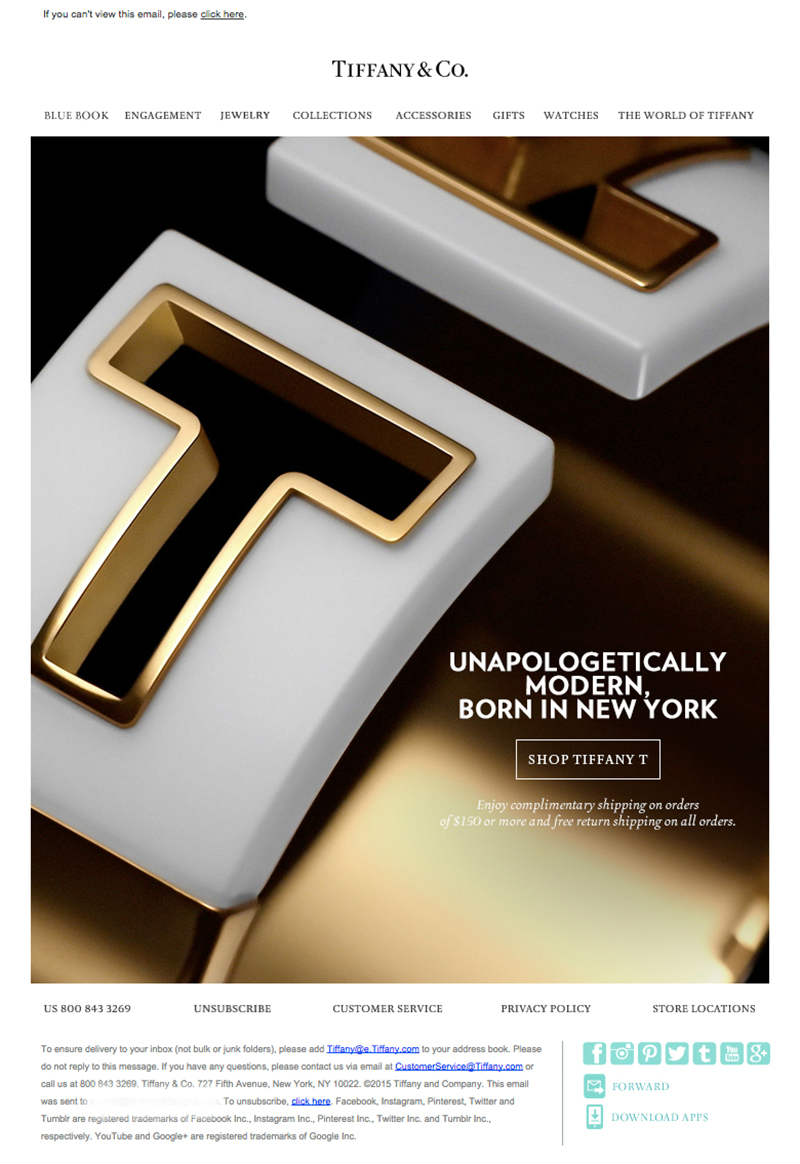
A maven in the industry, Tiffany & Co. has the most beautiful diamond and sterling silver jewelry around. And their artistry and elegance don’t stop there, even the email they send out is a stunning as their brand. If you’re going for class and charm, this is the email design inspiration for you.
Starbucks
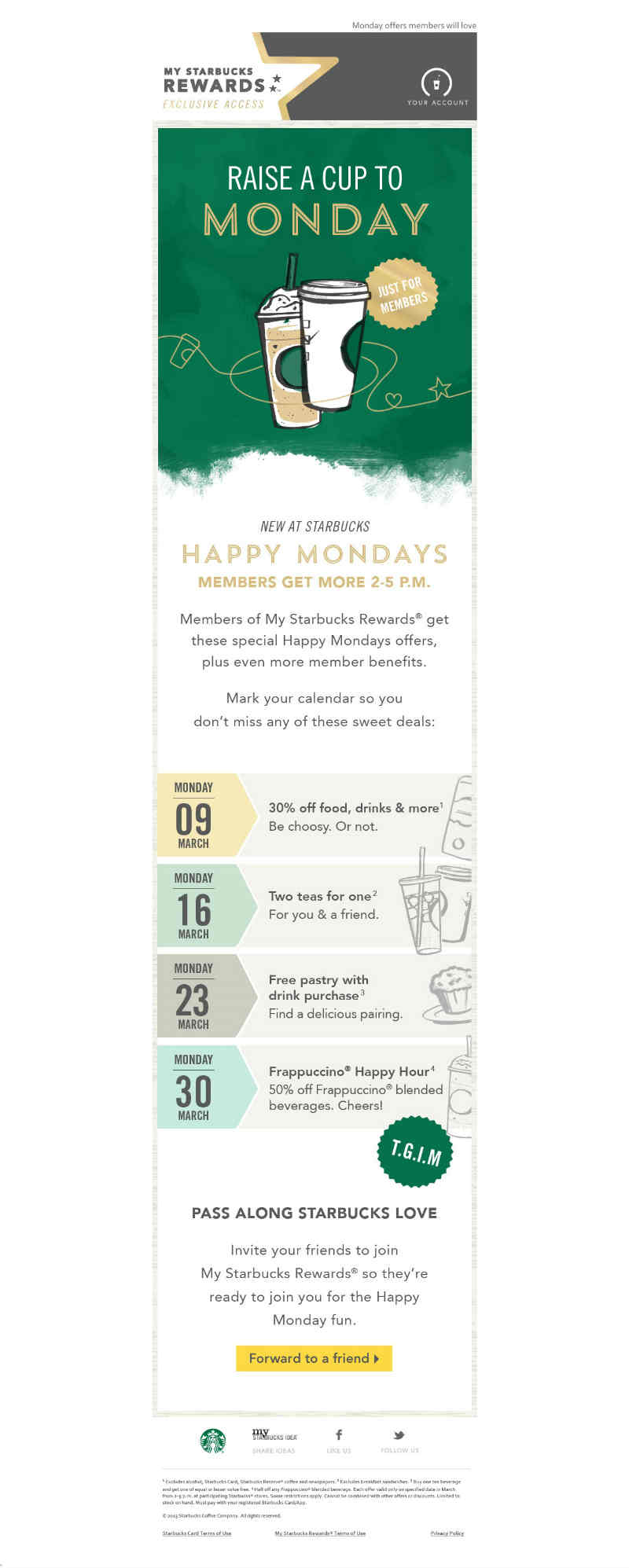
One of the most popular coffee companies the world over, Starbucks has an impressive email marketing strategy. They send out emails about their latest news, promos, and updates and they are hard to ignore. They use large product images, varying fonts, and perfect layout that pop out and grab attention easily.
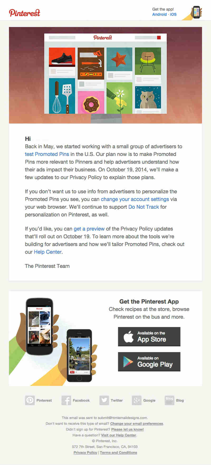
This Pinterest email is composed of a group of different images, the email body, and their whereabouts on social media. The fonts used on the email body is straightforward and simple for easy readability. The images are colorful yet do not take your view away from the email’s original intent.
Converse
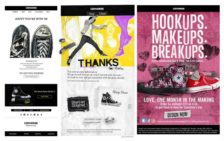
These Converse emails are full of colors, swank, and attitude. The colors are eye-catching, the layout is superbly done, and the words are natural; an overall vibrant email design inspiration.
J. Crew

Everybody knows what J. Crew is. And sometimes, you don’t need words to send out your message. Their email shows a picture of an ice cream cone and not much else. They want you to scroll down and magically, you follow suit, why? Just like the company, everybody likes ice cream.
HomeAway
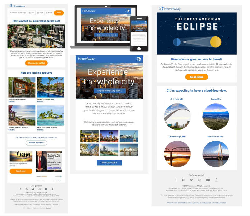
A vacation home rental website, HomeAway sends out emails with suggestions for houses on different vacation spots across the country. When you subscribe to their email list, you’ll be offered convenience. That’s because the emails already contain homes that you can rent along with the price and other details.
Apple
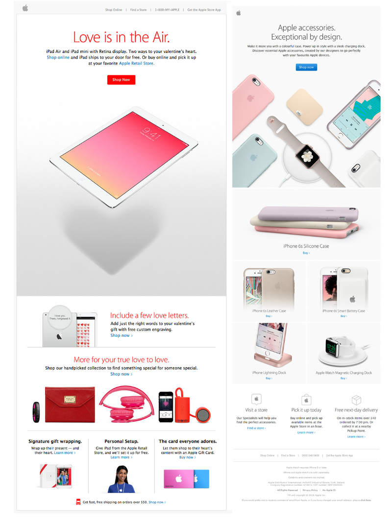
Colors are a great way to catch the eye but that isn’t always the case. In this email design inspiration from Apple, the emphasis is on the products. The background is a pale color that highlights them so well, making them stand out. The layout is perfect with the right amount of white space all over.
Blue Apron
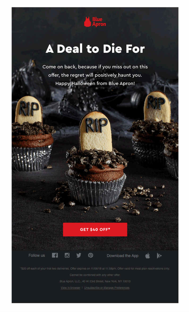
Use scare tactics when designing emails, or in the case of Blue Apron, a bit of humor. They’re offering a Halloween promo and the email is scary, funny, and downright cute. It includes everything you need to know. Plus, one glimpse of the picture will make you want to read the whole thing.
Dropbox
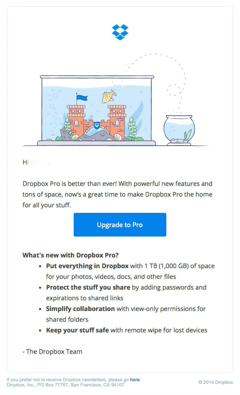
The use of gifs, animation, or cartoons is one great way to get people to read your emails. This Dropbox email includes a cartoony illustration of a fish coming out of the water to jump to a bigger abode. This aligns with what the message is about, to offer more storage space to their premium account users.
DogVacay
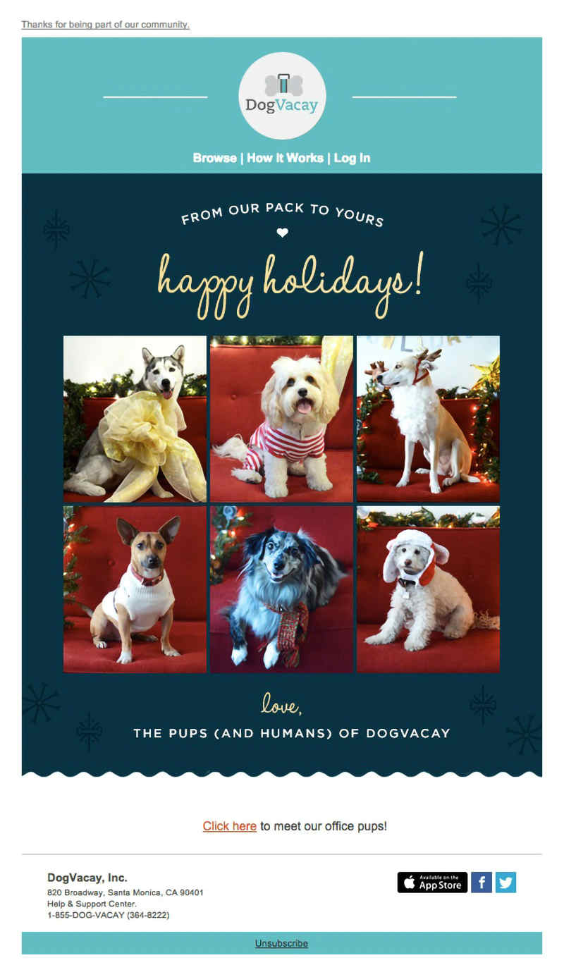
One of the reasons people don’t like opening emails is because they don’t like being sold to. This email from DogVacay, a boarding home for dogs, is a good example of this. They merely sent a holiday greeting with no product or service promotion at all. It makes the email more sincere, something recipients will surely appreciate.
Butcher Box
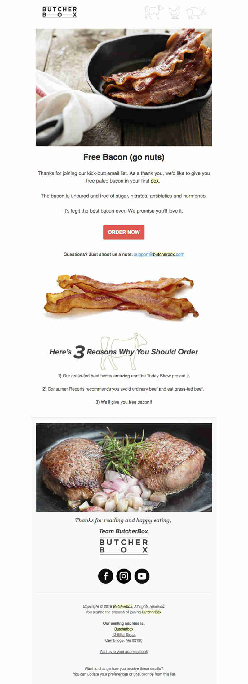
With the text Free Bacon (go nuts), you’d be crazy not to scroll down and read the whole email from butcher Box. This meat delivery service knows how to touch base with its customers by including pics of the most delicious-looking meat dishes there is.
The New York Times

Want your brand to stand out? Take a cue from the New York Times and see how they made themselves stand out in this email. The newspaper industry is a serious business and the email uses cartoons and a light color to brighten the mood. Also, the 50% discount is hard to refuse.
Bose
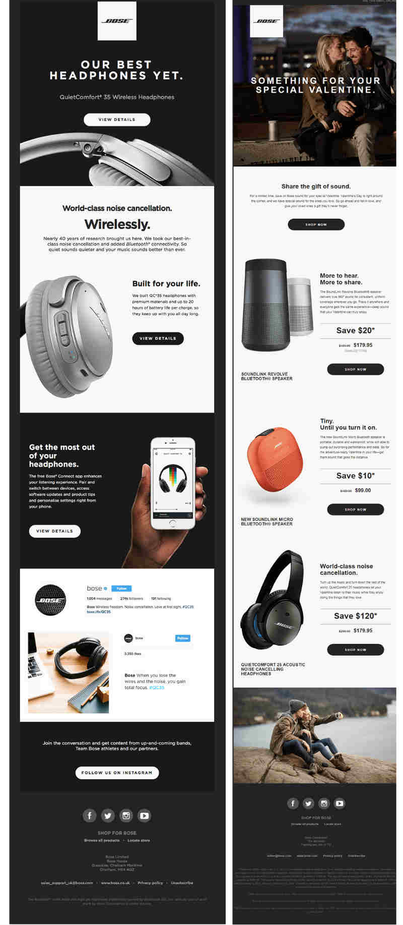
This email from Bose is very informative with an array of their products included and ways to enjoy them. The design is clean and the layout is smooth and flowing. It’s a good read that has the right call-to-action buttons once the viewer decides to get their products.
See’s Candies
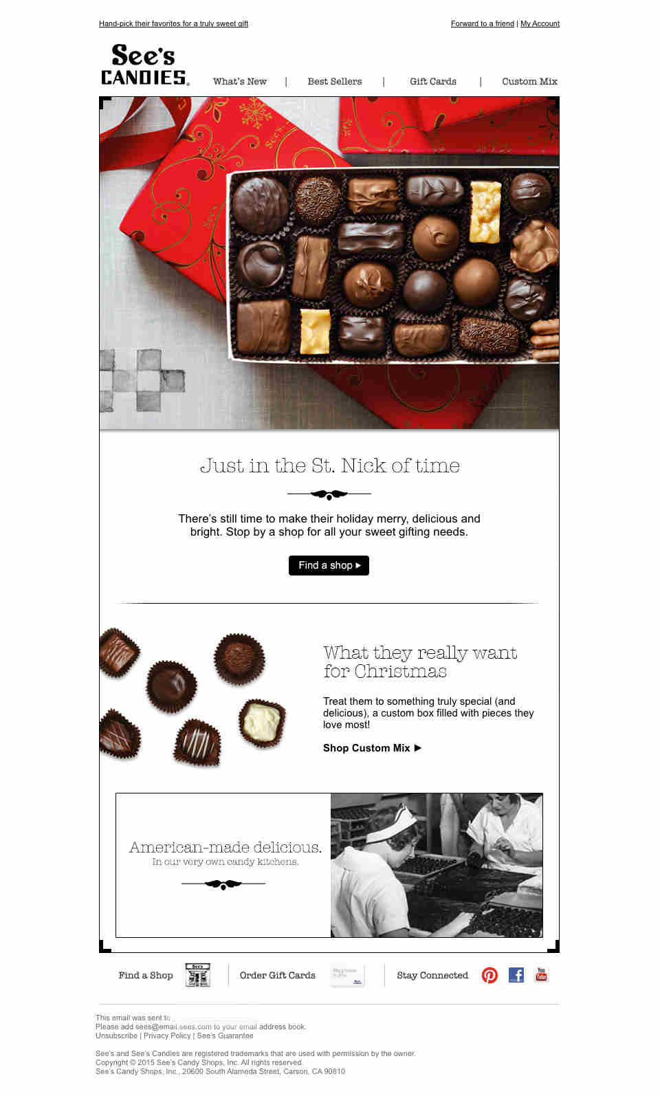
This See’s Candies email has a mouth-watering picture of a box of their candies and that’s enough reason to look at the email. But their gift suggestions would make you want to read it, too. The email seems plain and simple yet nice to look at. It uses easy to read and uncomplicated fonts that match everything in the email.
Nest Thermostat
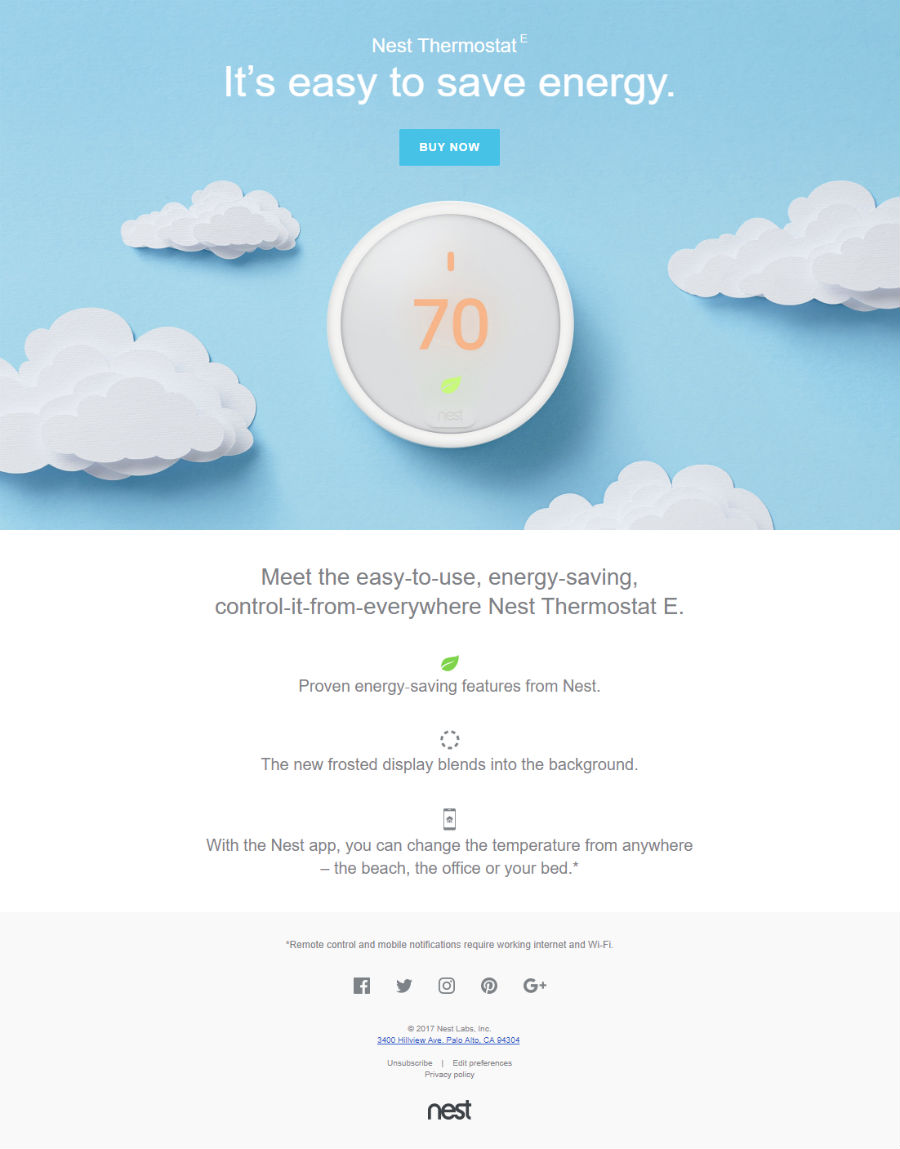
When you look at Nest Thermostat’s website and this email they sent out, you’ll easily recognize that it’s the same company. The word nest is common but their design is well connected and put-together you’ll recognize them instantly. Since they create products for the home, building authority is a must in their marketing strategies. And this shows well in their emails.
How Design Doctor Can Help You
This list of the best email design inspirations is created with a lot of careful and thoughtful planning. It’s more than just writing the best email body, compelling graphic design plays a big role as well. In this world that everyone is vying for your attention, your brand needs to stand out from the crowd.
Design Doctor is an unlimited graphic design service that lets you have all the design you need for just as little as $329 a month. We can help you create the most suitable email designs for your brand. Our team of professional graphic designers is trained to handle all your design needs.


