
10 Most Noteworthy Professional Logo Design Failures
A business logo should represent your brand in the best light possible. Although quality products and services matter more than logos, your business logo emanates a particular impression or emotion. Some consumers might see your logo as utterly offensive or poorly-designed. In turn, this will create a lasting impression and can influence your audience’s buying decision. And that’s why businesses must invest in professional logo design to instill brand recall.
And that’s what these 10 companies and organizations didn’t do. Learn from these professional logo design failures and make sure you make yours unique and memorable.
1. London 2012 Olympic Games
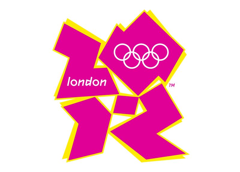
One of the most controversial professional logo design failures is the London 2012 Olympic Games logo. The logo, with jagged edges and modern appeal, is said to represent London’s popular landmarks. Unfortunately, the effort was futile, and over 48,000 British citizens signed a petition to ditch it.
The logo costs €400,000, and Wolff Olins, the creative agency behind the logo, thinks it’s a success. The agency claims it’s a modern and urban take, unlike all the other mundane ones. In the end, the logo remains, and the London Olympic Committee even built a brand around it.
2. HASC Center
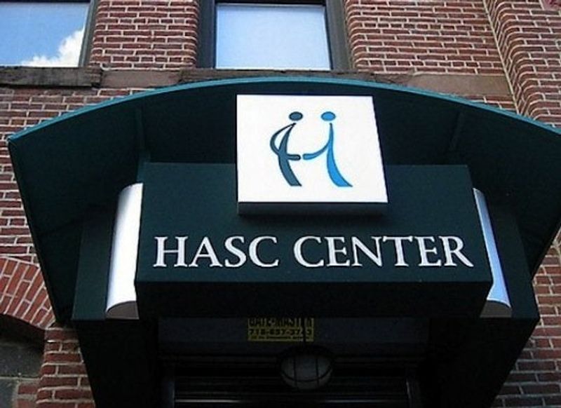
HASC Center believes that every person deserves a better and quality life, despite any circumstances. That said, the organization aims to help people with special needs to sustain a life of comfort and fulfillment. Unfortunately, their logo says otherwise.
Although the organization has a noble cause, the logo represents none of its mission. The goal was to portray a person helping someone with special needs while forming a letter “H.” But the designers didn’t think this through. It seemed like the other person is touching someone’s private part.
3. Arlington Pediatric Center
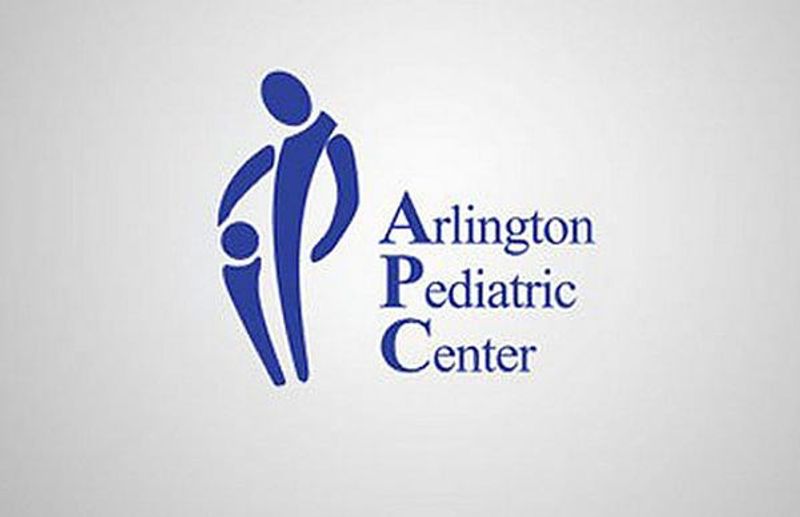
Children are amazing, and as amazing as they are, they must be taken care of. Arlington Pediatric Center promises optimum service and love for children. Unfortunately, Arlington Pediatric Center didn’t consult professional logo design experts before showing this to the public.
Although you get the concept behind the logo where an adult nurtures a child, it gives off the wrong idea. Pedophilia, to be exact. That’s why it’s always better to have a second or third expert opinion before printing your business logo on billboards.
4. Kids Exchange
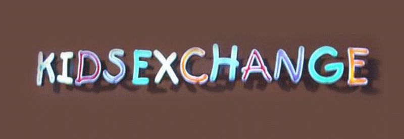
Lettermark logos, those that are text-based, do a bang-up job representing your brand in the best light. But using typography on your business logo is sometimes tricky. You’ll have to consider the font style, kerning, and other spacing logo design elements. And this is where Kids Exchange failed.
A simple spacing mishap can result in a significant backlash. Kids Exchange’s logo is nowhere near professional and memorable. The two words are incredibly close together, bringing the “S” near the word “Exchange.” Now, the word “SEX” sticks out like a sore thumb. This is not a very good implication of your brand if you’re catering to a younger demographic.
5. Megaflicks
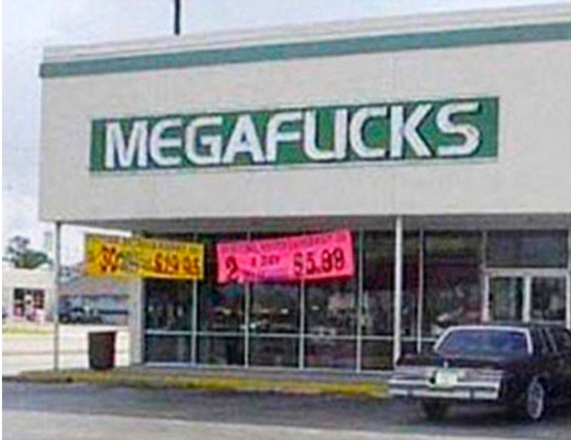
This is another typography fluke that can appall audiences. When designing a logo, kerning is exceptionally crucial, so your font will look good on any business channel or marketing material. And this is where the company Megaflicks failed.
By not leaving a space between the “L” and “I,” this logo can give a wrong first impression. Although it’s sort of funny, not a lot of their customers will find this amusing. And “MEGAFUCKS” definitely is the last word you want to name your movie rental business.
6. A-Style
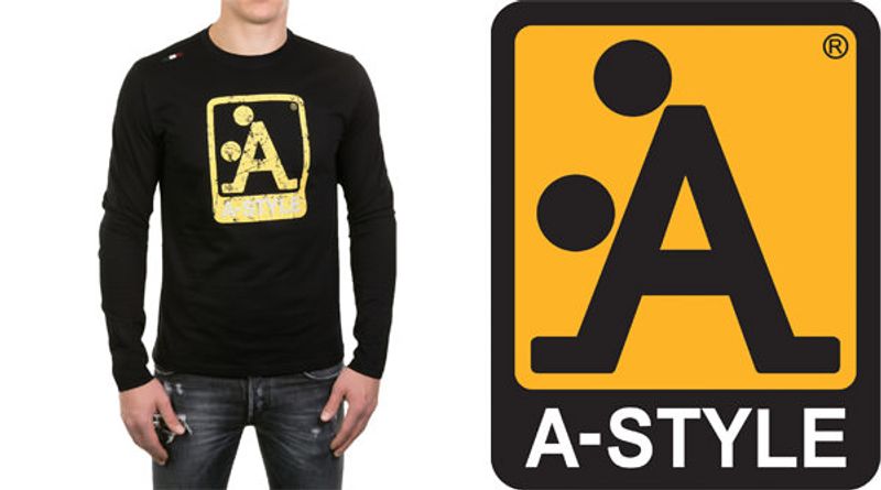
A-Style is a hip clothing brand that takes pride in its unique “streetwear” style. As unusual as it is, the logo also emanates a somewhat uniquely disgusting message. While some young, hip customers might find this amusing, it just doesn’t convey your branding the right way.
A-Style’s logo seemingly looks like a guy is taking a woman from behind. When printed on a shirt, the logo’s yellow color makes it pop even more, especially amidst a dark background. Unfortunately, it’s not a professional logo design that instigates brand recognition.
7. Catholic Church’s Archdiocesan Youth Commission
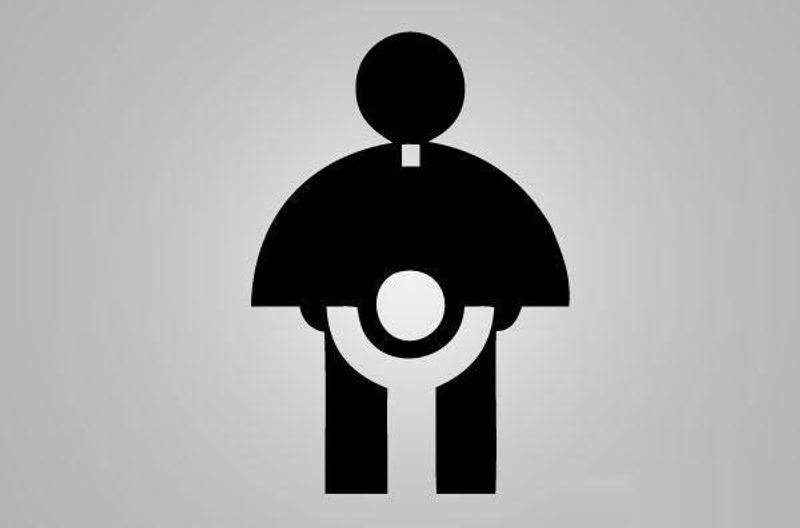
Another one of those cringeworthy logos, Catholic Church’s Archdiocesan Youth Commission, misplayed the graphics on this. The shape of a priest on a cassock pretty much symbolizes the organization entirely. However, it’s the white space that doesn’t look right.
This logo depicts the idea of pedophilia, pointing out a controversial issue in the Catholic Church — sexual abuse. A mere lack of know-how on using negative space could be the death of your brand. Negative space is a crucial design element, and only experts know how to integrate it to create design cohesion. That said, it’s essential to seek the expertise of graphic designers for a professional logo design.
8. Fully Erect
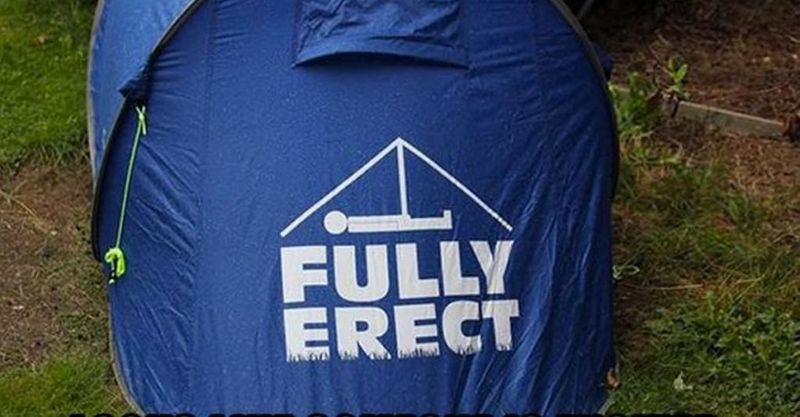
Fully Erect is a tent company advocating life outdoors and in nature. Their products promise a reliable shelter, regardless of where you are in the wilderness. Despite the weather conditions, their tents stay fully erect to offer clients comfortable slumber.
Although this might be an honest mistake, one should never miss a subtle disaster like this. It does give you the impression that not only the tent is “erect” when you’re out camping.
9. Computer Doctors
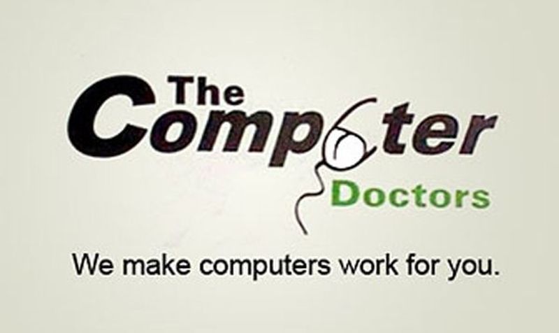
Despite the excellent typography, only one design pops out from the entire layout, and it’s the mouse. Well, it doesn’t look like a mouse at first glance. You’d have to look closer to realize the wire is attached in front. Still, the wire could resemble another thing.
Graphics that look like a man’s penis is the last design you want on your logo. And this logo from Computer Doctors undoubtedly needs a redesign.
10. Locum Paper Products
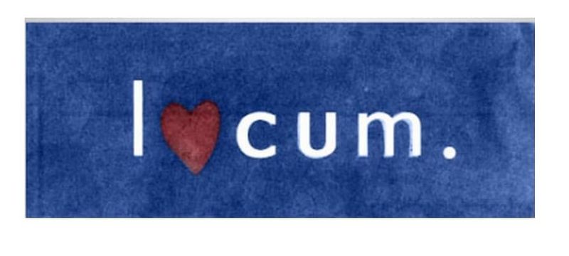
A heart is an excellent way to symbolize your love for something. And for a paper company such as Locum, the brand wants to show how much their love is for this industry by putting it on their logo.
Unfortunately, wrong placement has ruined the whole representation of their brand. It’s really not what you think. The heart symbol substitutes the letter “O” in Locum. But the effort to be a bit creative is futile.


