The Worst Mistakes You’re Making on Your Social Media Graphics
Nowadays, social media is a business bigger than life, and businesses and entrepreneurs know how powerful it has become. With over 3 billion people using different platforms of social media, it’s quite understandable that they use this to market their brands. The reach is enormous, you would be missing out on a lot if you don’t take advantage of it. But even if you go all out on using social media graphics for your marketing strategies, there are some mistakes you still need to be aware of. Here are the worst mistakes you can make and how you can fix them:
No Social Media Marketing Strategy
![]()
Creating social media graphics just so you can have something to post on these platforms is like shooting a gun blindfolded. You can be wasting precious time, money, and effort in a social media campaign that’s not being effective. Investing time on creating an action plan and defining your goals is the key to a successful marketing strategy.
You’ll have a schedule for posting, what it is you’ll be sharing, what the hierarchy of content is, and what your audience wants to see. You’ll also need to set benchmarks, learn about your target audience, and track the results of your strategies.
No Substance

Some entrepreneurs fall into the trap of creating killer social media graphics that they soon forget about the reasons they’re posting in the first place. Pepsi has apologized for this social media campaign they did using voodoo dolls to represent Cristiano Ronaldo. Of course, the fans didn’t like it.
The images are sure heart-stoppers but the flak they got from it was not worth all the hype it got. There is absolutely no truth to the saying, bad publicity is still publicity. Remember that even the best-looking images will be meaningless if there’s no substance in it.
Cluttering
Using too much text or images or using too much of both in one image can be a disaster. Viewers have very short attention spans so you can’t expect them to read or look closely at all that’s in your social media post. The noise on social media is deafening and to cut through all that noise, you need to stand out, not scare away your followers.
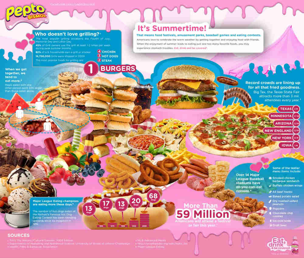
Schedule your posts at regular intervals instead of cramming everything in one single post. Feed your viewers with snackable content that they will be sure to read rather than have it all in one go which they’ll ignore. This example from Pepto-Bismol is an infographic that’s cluttered with too much text and images that it’s very easy to just scroll away from.
Poor Quality Visuals
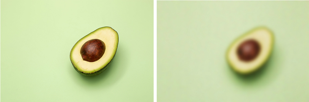
In all your marketing materials, clear imagery is a must and that goes as well for your social media graphics. Having blurry photos on your social media posts is an eyesore especially if you’re in the food industry. Clear pictures of food are the best way to entice people to try you out, even if you’re a wizard with words, the text just won’t do enough.
Not Designing for Your Target
Getting a good grasp on who your target audience is is a breeze these days. There are many tools or software you can use to know who reads your posts or who buys your products. One of the worst mistakes you can make is creating social media graphics that pay no attention to your audience.
No matter how hard you work at your graphic design if it’s not targeting your buyer marketing persona, you’re up for disappointment. Creating graphics for your social media shouldn’t be a one-size-fits-all strategy. Learn who you want to buy from you then design accordingly.
Over-promoting
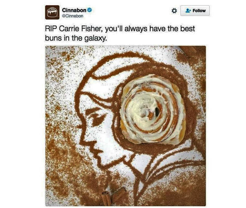
Sure, people love to buy and one of the reasons they’re looking at your post is because they’re interested in something you have to offer. But most of the time, they hate the idea of being sold to. Take this example from Cinnabon wherein they used a Star Wars character only to promote their product.
Yes, the reason you’re on social media indeed is to sell, but you don’t have to do it in an obvious way. You can warm them up then sell them your stuff. You can tell stories to pique their curiosity first then move on to introducing your products. Once they get familiar, start with your pitch.
Thinking Each Social Network Is the Same

Each social media platform has its own audiences. 71% of people who use Instagram are under the age of 35 while the majority of young people flock to YouTube instead of Facebook. Some marketing people create social media graphics that they use on all these platforms instead of creating ones specifically for each.
You need to know who your audiences are to know which platforms to go for. You also need to learn how to strategize for each although bear in mind that you don’t have to be on all of them to be effective. It may seem a lot of work but always remember what Steve Jobs said, “Everything is important- that success is in the details.”
How to Make Better Social Media Graphics
Here are some tips on how to create social media graphics that work:
Be Legible
It’s as simple as that—be legible. Make sure that the text you include is easily readable. Avoid fancy typefaces as much as possible.
Use Contrast
Use light against dark or thin against thick. Contrast is essential in creating graphics that stand out and grabs attention.
Use Colors Sparingly
Avoid anything too flashy or too bright that it may take away the focus on what you’re really selling. Understand what each color represents and take it from there.
Have Visual Hierarchy
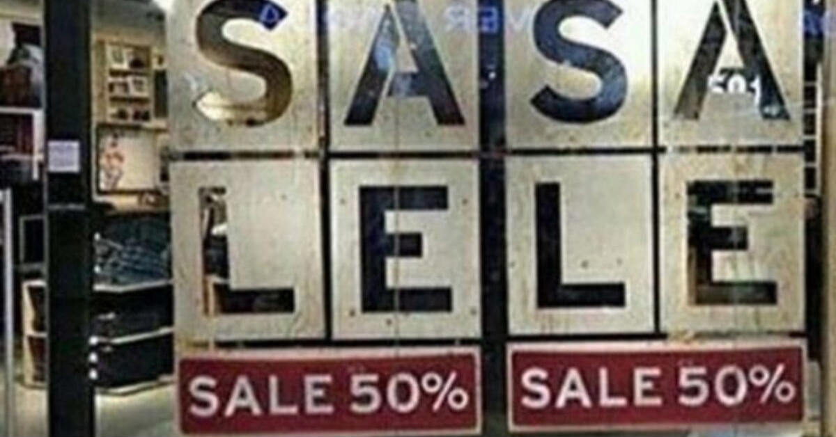
Convey your information in an organized layout. Let your readers see what’s the most important down to the last details of your post. Have an order in your post to get readers to prioritize and digest data more easily. This sale sign has gone viral and is a perfect example of the importance of creating visual hierarchy.


