Why These University Branding Examples Are A Success
A university will need a rebranding at one point in its decades- or century-long success. Whether it’s a minor or a major overhaul, a university rebranding has one primary goal: To make the school’s logos, typography, slogan, and colors more akin to the current culture.
Some universities even go as far as changing their names to keep up with the changing trends. One example is Pennsylvania’s Beaver College.
Though founded in 1853 and renamed to Beaver College in 1872, the university trailed behind its competing collegiate universities. And the only reason was because of its name.
Research found that the name, ‘Beaver College’ repelled 30 percent of prospective students. In 2001, it was then changed to Arcadia University. To date, it was the most significant decision that would spell success for the organization.
University rebranding is more than just revamping the logo or the graphical elements. It goes beyond what graphics are on the university’s website, social media platforms, or marketing mediums.
A school rebranding shouldn’t be taken lightly because it reflects what the university’s branding is. More often than not, if the school’s culture, principles, and vision changes, the graphics also go along with it.
Read on to find out what universities need when it comes to university rebranding and check out five colleges that underwent successful rebranding.
What Goes Into University Rebranding
Hiring a graphic designer for your newly polished university logo isn’t the only factor to consider in your school rebranding. You want to make sure that the message you’re trying to get across is clear and reflects your school’s identity.
Here are three elements that should go into rebranding a university:
History
History is one of the weighing factors that push students to enroll. Of course, when they pick a university, they look at the school’s achievements, community, alumni, leaders, and founders. The more significant the historical accomplishments and progress, the more students are inclined to the university.
Branding
As mentioned, the rebranded message should be clear to the target audience. If there is a total shift of culture, then it’s better to tweak or change the school’s slogan and icons.
For instance, Wharton rebranded their tagline on a single word: Knowledge. Its new slogan, which is, “Knowledge for Action,” can have several varieties like “Knowledge for Innovation,” or “Knowledge for Life.”
Consistency
First of all, university branding is bound to fail with low-quality graphics. That said, a university must ensure that everything is well-thought-out and of high-quality.
Suitable typography must be used. Different school elements must also be incorporated. Additionally, colors should let the new logo shine without overpowering the message and branding it conveys.
Last but not least, to make the rebranding known, a university must be consistent across all their marketing channels.
Now that you know what goes into rebranding a university. Let’s get to know some of the collegiate universities that had successful branding overhaul.
5 Examples of Universities that Underwent Rebranding
1. UCONN
Old:

New:

UCONN, or formerly known as the University of Connecticut, has had a total rebranding almost a decade ago. According to UConn president Susan Herbst, the school will waste away if it continues to lag behind other prominent universities.
The university adopted the shorter name, UCONN, and considered it as a symbol that represents the university’s entirety. Likewise, the symbol, with no graphical elements, emanates a reverence that the previous logo didn’t.
With one word, UConn was able to capture the identity that they are known for: a diverse and forward-thinking identity.
Even the university’s husky had to undergo several changes in 50 years. Now, it’s more vibrant and fresh, which reflects the school’s athletics division.
2. George Washington University
Old:

New:

George Washington University is located in one of the most progressive states in the United States. And this university, also deemed as a research center, is continually innovating ways driven by passion and knowledge to make an impact.
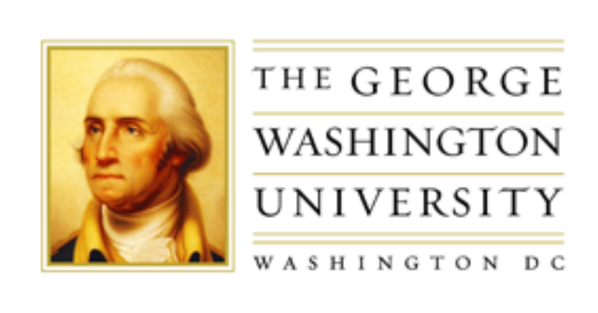
The old logo that had a vintage photo of George Washington didn’t resonate with the school’s as well as the city’s modernization. Steven Knapp, George Washington University’s President, claimed that it didn’t look good on different channels. Hence, the rebranding.
In 2012, they transformed the old image into a digitized George Washington, along with apt typography. The unveiling of the new logo also brought together the entire community through a fun celebration.
3. Towson University
Old:

New:

In an attempt to break the stagnant identity for 20 years, Towson finally came up with a new one last year. In fact, the American Marketing Association Baltimore Chapter touted the rebranding as the “Best Rebrand Campaign of the Year.”
This award was during the “MX” Marketing Excellence Awards. Additionally, the university boasts this momentous achievement that made the entire community proud.
The research started in 2016. Several focus groups, surveys, and over 2,000 stakeholders after, the university went with a bolder symbol that would represent the school aptly.
Inspired by the state flag of Maryland, the new logo is both cohesive and contemporary.
4. The University of Texas
Old:

New:

Considered as one of the prominent universities in the country, The University of Texas had a significant rebranding in 2014. Although not a lot of people are a fan of the ‘burnt orange’ color, it weaves the new logo collectively.
I thought the old logo was a bit overcrowded, especially that it dons only one solid color. Using other distinct colors as an accent would’ve made the other elements apparent.
The new logo revamped the shield and all the components in it. The book, star, and laurel wreath are now bolder. The shield has a thicker outline and brings forth a magnitude of prominence.
Lastly, the typography is more playful than the previous one. However, it’s a fitting representation of the Lone Star State.
5. Oklahoma Christian University
Old:

New:

At first glance, the old Oklahoma Christian University logo reminds me of a highway shield. Similar to a route marker, the border that encapsulates the acronyms denotes stagnation and obsolescence.
As Oklahoma Christian University tries to get with the times, the institution finally had an overhaul this year. And it was a success!
The new logo is fresh, modern, and eye-catching. The whites replaces the greys, and the university bid goodbye to the shield holding back the progressive identity.
Overall, the university rebranding for Oklahoma Christian University undeniably invites more student enrollments.


