Amazing University Rebranding That Increased Enrolment
Just like in any other industry, education providers aren’t exempt from having to maintain a good image. It’s not surprising that university rebranding has become a vital part of the game. Because their target audience is young students, rebranding a university equips the school to stay relevant and keep up with the times.
These university rebranding examples will school you on how to upgrade your identity to increase enrollment rates. It’s also crucial to know the basics of building a college brand or a university brand that appeals to the market. So get ready to take notes as we delve deep into University and College Rebrand 101.
Why Rebranding a University Can Be a Smart Move
Data from the National Center for Education Statistics tells us that there were 4,298 degree-granting post-secondary institutions in the US in 2017. This number only confirms that competition is stiff, and branding efforts are a must.
For many centuries, higher education institutions have relied on grade standards, awards, and pristine stature to attract students. However, current trends have made it crucial for schools to express what sets them apart from all others.
Here are some factors to keep in mind when planning tertiary rebrands.
Best University Brand Guidelines
Brand guidelines are a set of rules on using visual assets. It includes ways on how to use the custom logo design, wordmark, color palette, layout grids, web graphics, and other visual elements. Renowned schools have strict brand guidelines. For example, Stanford has an Identity Toolkit that includes templates, photos, and fonts related to its branding. When brainstorming for a new brand look, take the time to review the best university branding standards to guide you.
Rebranding Graphic Design
Graphic design is of the utmost value in rebranding a school. For instance, you can upgrade your vision, identity, and key values to keep up with the times. However, if the brand overhaul doesn’t reflect in your visual assets such as ad graphic design, then the effort will be all in vain.
Education Branding vs. Corporate Rebranding
If you’ve had experience with corporate rebranding, it’s vital to review how it compares to education branding. Despite both efforts aiming to upgrade brand image, business branding can allow for bigger and bolder changes in identity. Schools, on the other hand, can update its vision and key values, but still, have to fall under the mission of teaching and formal schooling.
University and College Rebranding Examples
Here are some of the best rebrands in the education industry that led to positive results.
Stanford University

This private research university is regarded for ranking as one of the world’s top unis. Aside from its acad feats, it’s also known for its prestige, wealth, and nearness to Silicon Valley. Previously, Stanford’s wordmark featured upper case letters and a thin serif font. It had a formal look through and through.

A few years ago, however, they revamped their wordmark but retained their other symbols, including their seal, the Block “S.” In the new wordmark, only the first letter is written in the upper case. Also, the font is a bit thicker than the previous typeface. The change in style gave Stanford a fresher look without giving up its air of stability.
Cornell University

This Ivy League research uni in Ithaca, New York, still stands proud more than a century after Ezra Cornell and Andrew Dickson White founded it. With an undergrad headcount of 15,043 for Fall 2019, it’s safe to say that the enrolment rate is going strong.

Before, Cornell’s wordmark featured an upper case serif font. Many students didn’t like how it looked; they compared it to JCPenney’s logo. Allegedly, both logos were designed by the same firm. Amid the backlash, Cornell went for a more classic look by using a simplified version of their emblem. Now, their wordmark features a mix of upper and lower case letters in a simple serif font.
Northern Arizona University

Unlike high school rebrand efforts, tertiary rebrands require more in-depth research into what complements brand recall. For instance, NAU decided to change their emblem in 2018 because their athletics logo proved to echo more among students, alumni, and parents. Due to that, they decided to upgrade their logo and adopt a more modern-looking symbol.

Before the idea came to them, the admin knew they had to unite their visual identity. Because they had 20 satellite campuses and three logo changes over the last 20 years, the symbols they used didn’t all match. And so, the new logo and branding not only gave a breath of fresh air to NAU but also offered a unified identity.
University of California

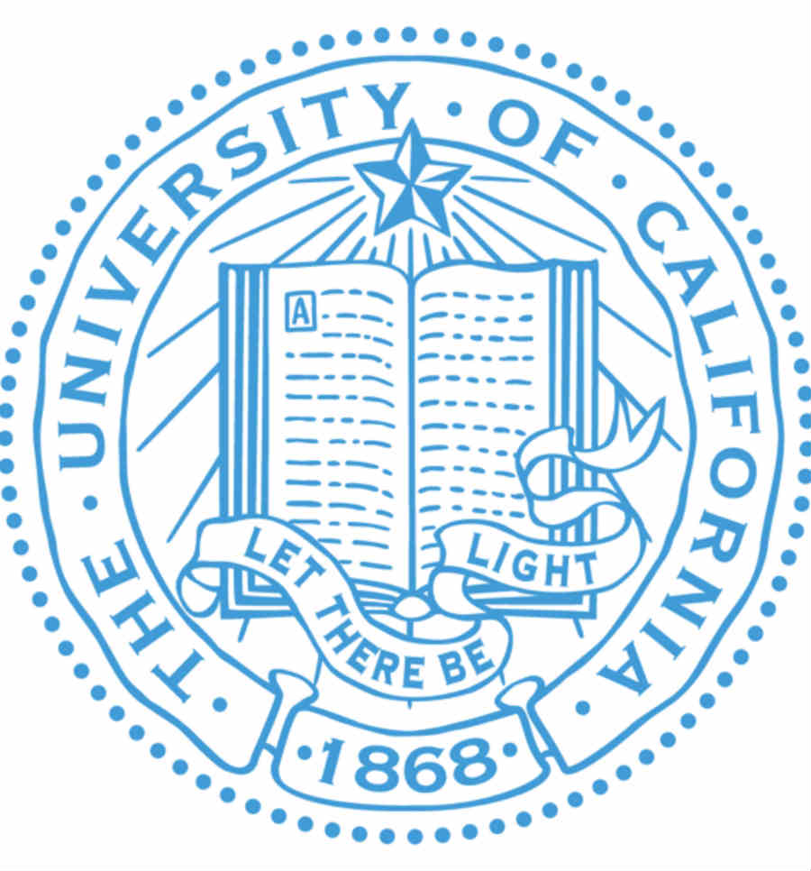
Indeed, there are times when school branding strategies don’t work. For instance, UC tried to refresh its image with a new logo in 2012. However, it received backlash from students, alumni, and faculty. UC’s leadership said the rebrand aimed to reflect a more distinct look. However, many complained that it looked like a generic ad for a healthcare firm or a logo for a washing machine brand. Though the admin said that the logo wasn’t meant to replace their seal, critics just wouldn’t want to see the new symbol anywhere.

Because of the public backlash, UC decided to rebrand – or more aptly – revert to its original look. They canceled the use of the new logo. Instead of it, they adopted a more modern wordmark and used the original seal for other materials.
The George Washington University

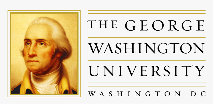
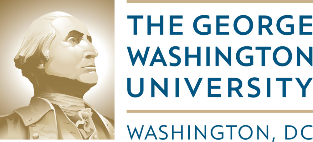
If there’s one thing common between universities and marketing, it’s the need to evolve while staying true to one’s main purpose. Take GW’s previous rebrand, for instance. The old logo featured a colored photo of the first US President and a serif font, both designed with golden line accents. The new logo looks a lot cleaner, thanks to the monotone photo, sans serif font, and reduced lines.

In conclusion, tertiary education branding is indeed a tricky business. Though you’d want to appeal to the young audience, you also need to maintain a reliable image. But with audience research, creativity, and the right resources, you’ll surely come up with a rebrand that makes the grade.


