What’s a Pitch Deck and Why Do You Need One?
When you build a startup from scratch, one essential element needs your constant attention day in and day out: finances. Yes, excellent products and stellar service are paramount to success, but you can’t sustain both if you’re strapped for cash. Helping you get more financing from investors is exactly what a pitch deck does.
According to a study, the lack of financing and investor interest is one of the top 20 reasons why startups fail.
After all, aside from the initial capital needed to set up shop, you still need more investments to launch new products or fund expansion.
What Exactly are Pitch Decks Used for?
So, pitch decks are used to get more financing. But how do you use it, and more importantly, when do you use it?
There are typically two instances when it’s useful to have a pitch deck ready:
- If you’re coordinating with potential investors through email, sending them a pitch deck pdf will allow them to learn more about the business.
- When you meet potential investors face-to-face, using a pitch deck will allow you to give an organized and informed visual presentation.
It’s crucial to understand that the slides aren’t meant to land you an investment right then and there.
Instead, it’s designed to make the viewer excited about the venture, engage in conversation, and, hopefully, decide to invest.
Elements of a Successful Pitch Deck Design
In his book, The Art of Startup Fundraising, investor and serial entrepreneur Alejandro Cremades says it’s best to have two sets of pitch decks:
- The first set could have more text in it; you can share this with potential investors through email.
- The second set should be more visual-centric; you can use this during face-to-face presentations.
You can follow the author’s advice and decide to create two sets of pitch decks. Or, you can also focus on just one versatile piece to be used for both email and presentations.
Whatever you decide on, however, it’s vital to keep its content and design on point.
Content
Paypal co-founder and Silicon Valley legend, Peter Thiel, wrote a pitch deck template for entrepreneurs looking to find more investors. Cremades, on the other hand, also has a template he swears by.
Comparing the Thiel and Cremades’ pitch deck outline templates, both have these parts in common:
- Problem and Solution
- Market
- Product
- Team
- Opportunity (Traction)
- Competition
- Finances (Funding History, Financial Model)
If you have a solid business plan in place, you won’t have to rack your brain to get the elements above.
However, make sure that you shorten the sentences and limit the text. Bombard the viewer with hunks of paragraphs, and you’ll lose them in seconds.
Form and Design
Here are some tips to keep in mind when it comes to design and form:
- Keep the deck limited to 19 slides, more or less. This is the average length of pitch decks.
- Let your brand identity shine through. Use your custom logo design, typography, and other visual assets.
- Use your brand color palette. For instance, using the same palette as in your web graphics will instantly make the brand seem more cohesive and put-together.
- Just as how a YouTube banner design functions for a channel, your pitch deck should reflect your brand at a glance.
Who Creates a Pitch Deck?
If you have knowledge and skills in graphic design basics, then you can probably go ahead and make one. However, it’s still best to get graphic design services. Not only will it make the deck look more professional, but you’ll also unload yourself of a tedious project. In doing so, you can have more time to connect with venture capitalists or prepare for your presentation.
Pitch Deck Examples
Here are some of the best pitch decks examples that show us the right way to do it.
Castle

This is a deck for Castle, a property management app. Usually, new tech can be complex to explain, what with all the features it has to solve an existing problem. This pitch deck, however, is clear, simple, and, best of all, easy to digest.
Added to that, the real estate graphic accent at the bottom gives the slides a light feel without tainting its clean look. View Castle’s whole pitch deck here.
BuzzFeed

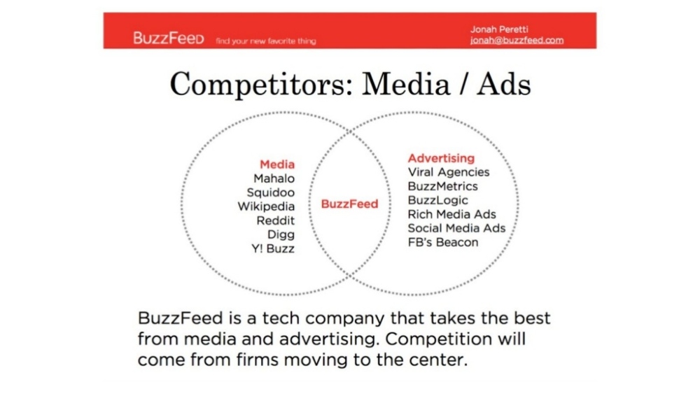
Buzzfeed’s pitch deck makes it very clear where the platform is at present and where it intends to be. In this particular slide, they visually illustrated how unique they are from their competitors in the sense that they’re in the middle of media and advertising. Check out the whole pitch deck here.

The Facebook pitch deck may not be the most sophisticated design-wise. After all, it was designed more than one and a half decades ago, and graphic styles have evolved much since. However, it’s surely worth knowing how Mark Zuckerberg was able to convince Peter Thiel to invest in the project (then called “The Facebook”) back in 2004.
As seen on this slide, the material used a combination of simple graphics and concise texts to make the info very easy to absorb. See the whole pitch deck here.
A Pitch-Perfect Presentation
When pitching your business, you have limited time to get people’s attention. In fact, a study says VCs, on average, will look at a seed pitch deck for 3 minutes and 44 seconds. That’s less than 4 minutes to give them the info they need to decide if your startup is worth the investment.
In the end, businesses aren’t static. No matter how great you’re doing, you need to keep up with market trends, tech, and social paradigm shifts. In short, you need to evolve. And a pitch-perfect presentation can take you one step closer to getting the money you need to step forward.
At the end of the day, it’s not all about finding the best pitch deck template. Nor is it all about the quality of your showmanship during the presentation. It’s about making the most out of visuals to tell the company’s narrative. And in the process, convince the viewer why they’d want to be part of the story.


