10 Inspirational Retail Ecommerce Design Homepages
Once you’ve got your eCommerce website up and running, it doesn’t stop once you’ve picked the theme and uploaded your photos. The logical step is to market your products so your customers can go to the site. Take a moment to look at your website’s eCommerce design. Is it optimized? Is it responsive? Is it well-designed?
An enticing eCommerce design can impact the way visitors would navigate on your website. Plus, it has a crucial role in ensuring your eCommerce sales. So don’t take for granted this very crucial design process.
In this article, I enumerate ten of the best well-designed eCommerce homepages. Check out how you can apply some elements of these eCommerce sites to yours.
1. J.CREW
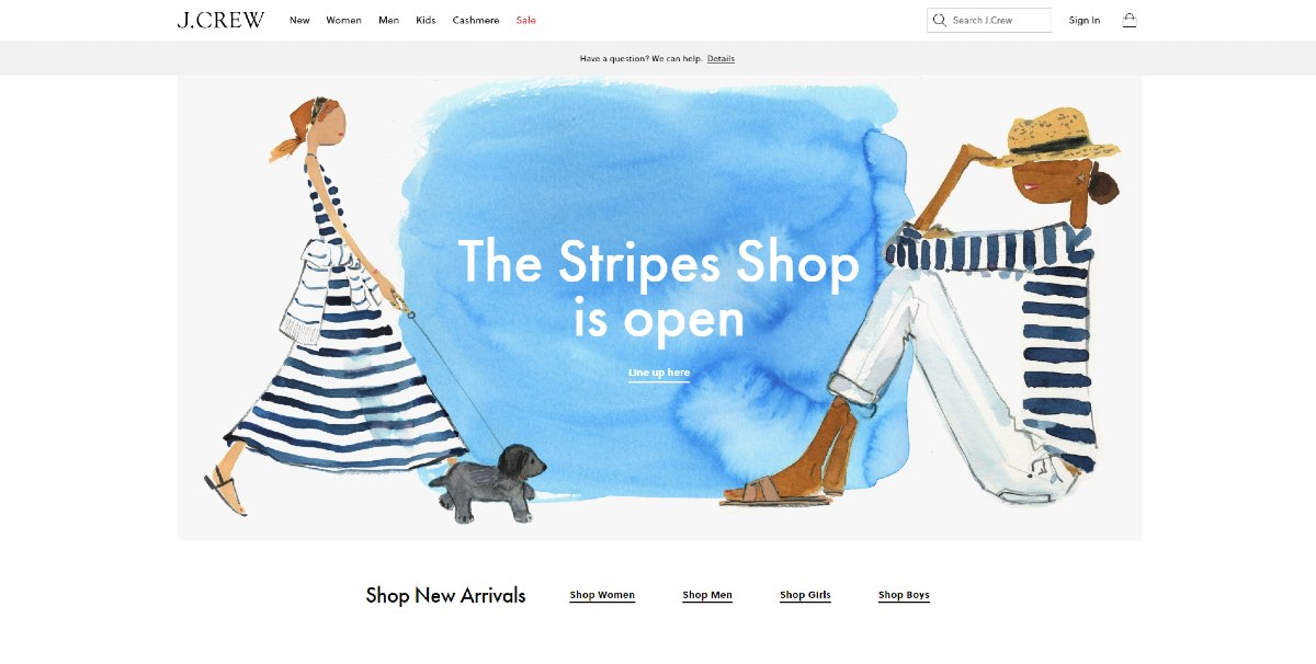
One of the great things about the J.Crew homepage is it doesn’t feature too many products. Sometimes, having too many product features on the homepage can slow things down or overwhelm the visitor. Plus, a visitor won’t scroll a lot on the page, either. This may allow them to browse more on your other pages and decide if they want to buy anything in your online store.
Not many would use a watercolor-type of drawing on their illustration for their banner or landing page. But J.Crew made it work for their latest Stripes marketing campaign.
Probably the best part of the J.Crew homepage is the Sale button in red. This could draw in customers to browse what’s on sale on their website and check out a product or more.
Most eCommerce stores would have a separate contact page for users. However, J.Crew added their contact information at the end of the homepage. It’s to help them get in touch with any member of the J.Crew team at any time.
2. GLOSSIER
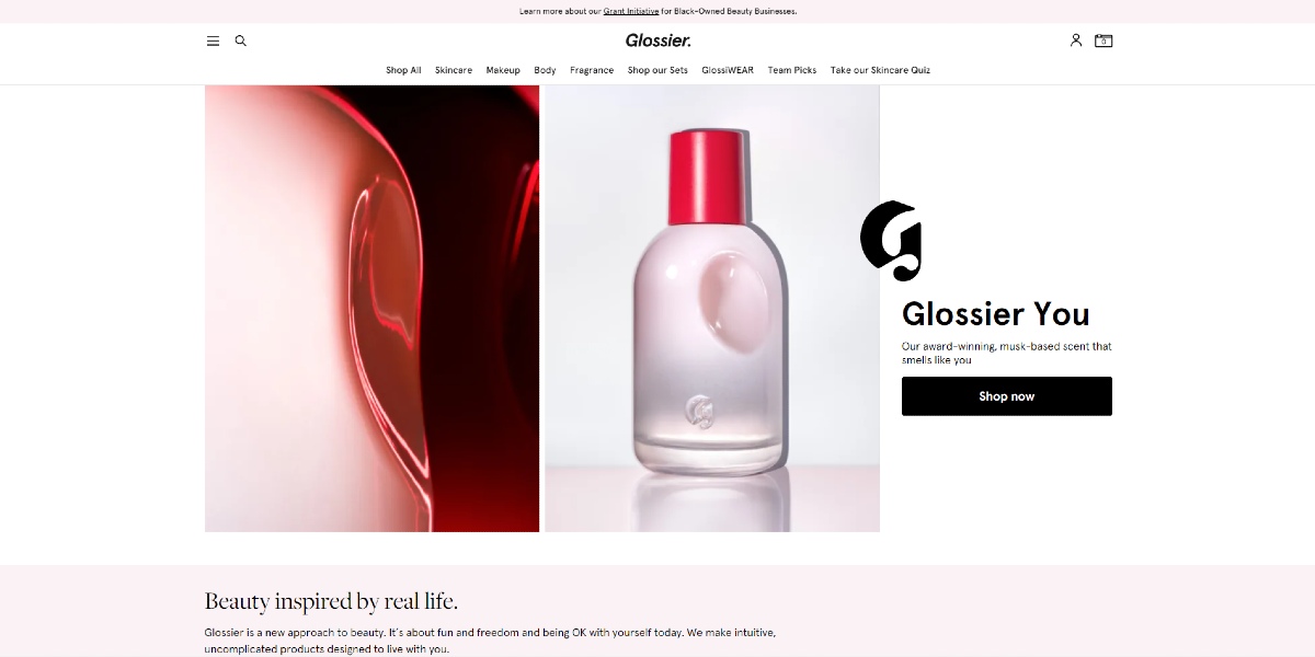
Once you load the Glossier homepage, you might get intrigued over the bottle. This will enable visitors to click on it and learn more about that item. If it doesn’t, you’ll still know their bestsellers and the other products they offer.
It’s good that Glossier added social proof by the end of the homepage. It’s for those scrolling down and haven’t decided to buy any item from them. Part of an excellent eCommerce design is adding social proof. In Glossier’s case, they used a media feature. This way, they can magnify their reach to the media’s readers.
Plus, those who are still in the consideration stage can visit their physical stores to see if Glossier items are worth buying. At least, this way, they can test the product personally.
3. BEST BUY
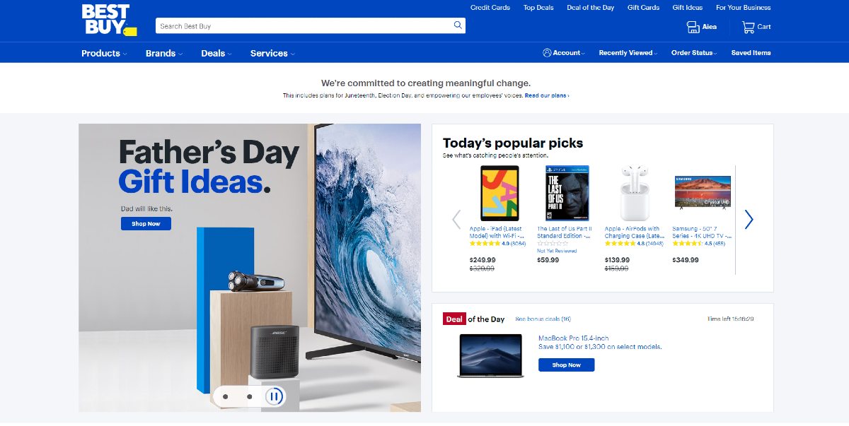
Unlike other big retailers, the Best Buy eCommerce design doesn’t go all out with the products above the fold. They have a timed banner to show you what the latest deals are. Plus, they even added a grid with “Today’s Popular Picks” for shoppers to see what other shoppers bought in the day. Plus, in the bottom grid above the fold, they have a timer to show that the deal would be gone soon.
They used white space well as you navigate on the homepage, putting the focus on the products. Not only that, but they also added reviews on the products. This could sway potential buyers to check out their products.
Their signature blue is consistent on the site. It’s a great contrast to the white background, and it can draw attention to the latest deals and more.
4. MIISTA
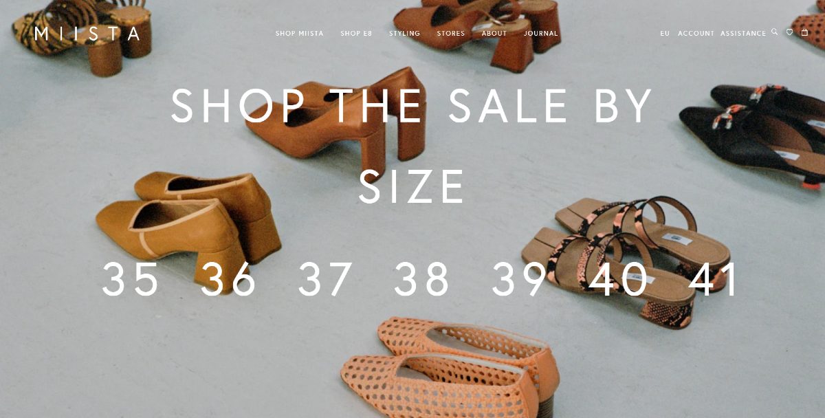
Miista has its twist on the landing page. Instead of the typical “shop now” or “learn more button,” they provided seven different buttons for the sizes available in their store. Any interested shopper could just click on their foot size and get redirected to the page.
When a curious shopper scrolls down, they get an idea of what’s on sale and their hot products. It also helps that their menu bar is a constant on the homepage. It’s so anyone can click on the other pages anytime.
They used asymmetry and layering on their photos, which is a hot graphic design trend for 2020. Even if it’s not an official design trend, most websites will use huge letters to make the copy pop. Miista used it so their visitors can shift their gaze to a particular section.
At the end of the page, a visitor could subscribe to the shoe shop’s email newsletter. This could increase their website visitor traffic and possibly referral rates.
5. GREATS
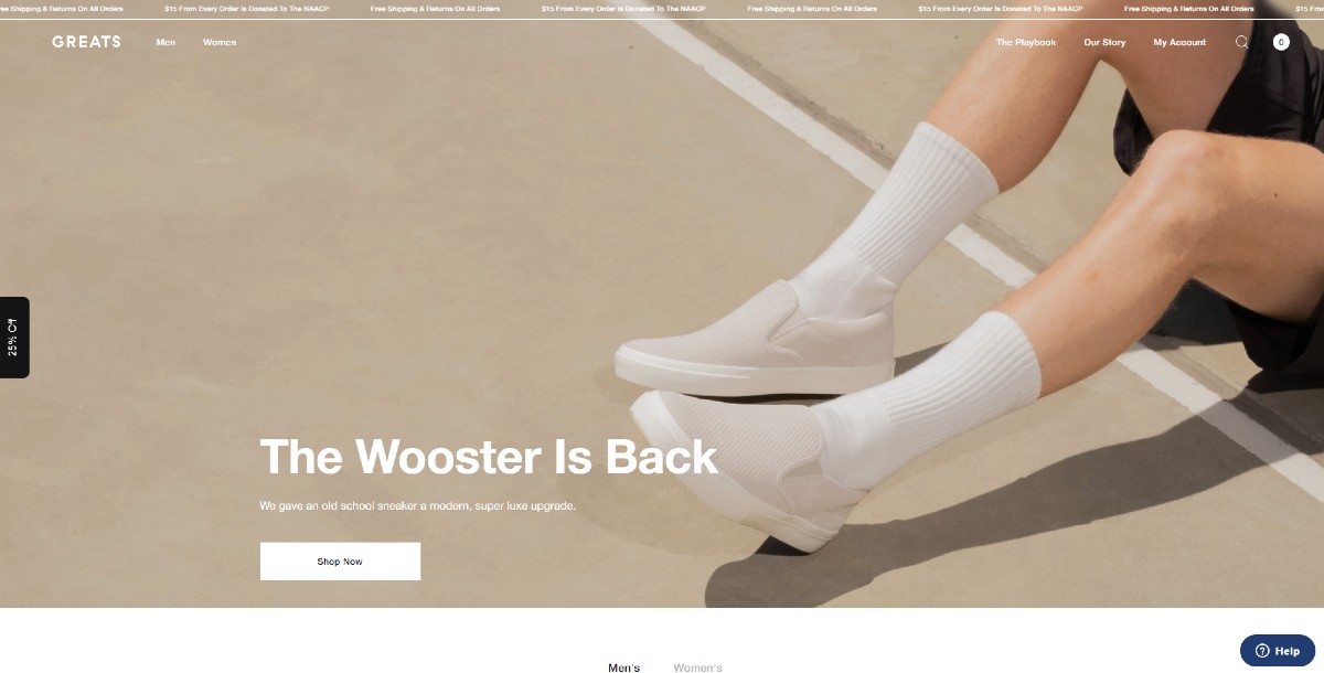
Once you see the eCommerce design on the Greats homepage, you’ll see the visual hierarchy on the copy. It’s also a plus they used a high-quality, compelling photo that features the product.
The color of the menu bar even changes as you scroll down from the landing page. It’s a nice touch, so at least the menu bar is constant as you browse the homepage.
When you also hover their products on sale, you’ll also get a photo of a model wearing their shoes. It’s to see how to pair the shoes with clothes and how it looks overall.
They also used optimized photos on the site so it’ll load faster but maintain its quality.
6. HORCHOW
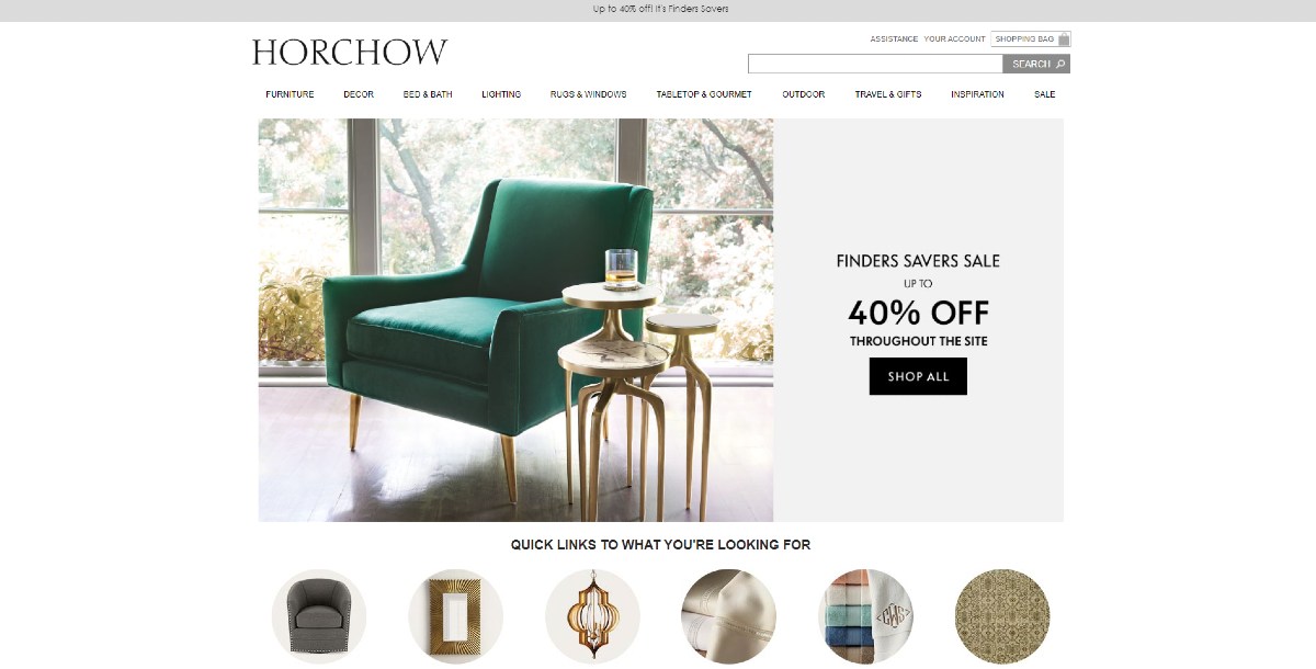
The Horchow website offers a seamless experience for any visitor. It’s nice they provided a variety of shapes like grids, which can contribute to visitor engagement on the site. It’s also a minimalist site by incorporating white space well. This will put the focus on the products and add copy only when necessary.
They followed the neutral or earthy color graphic design trend, and it works well for them. Since their products are related to the home, it accentuates that feeling for potential customers.
Besides that, they don’t just use photos to showcase their products. There’s also a video or gif to entice visitors to click on the products for that category. Plus, the images look optimized, too, that it doesn’t ruin the overall picture’s quality. It’s a bonus for this eCommerce design because it can increase website conversions. Over 90% of consumers would buy products that are shown in high-quality.
7. SISTER & CO
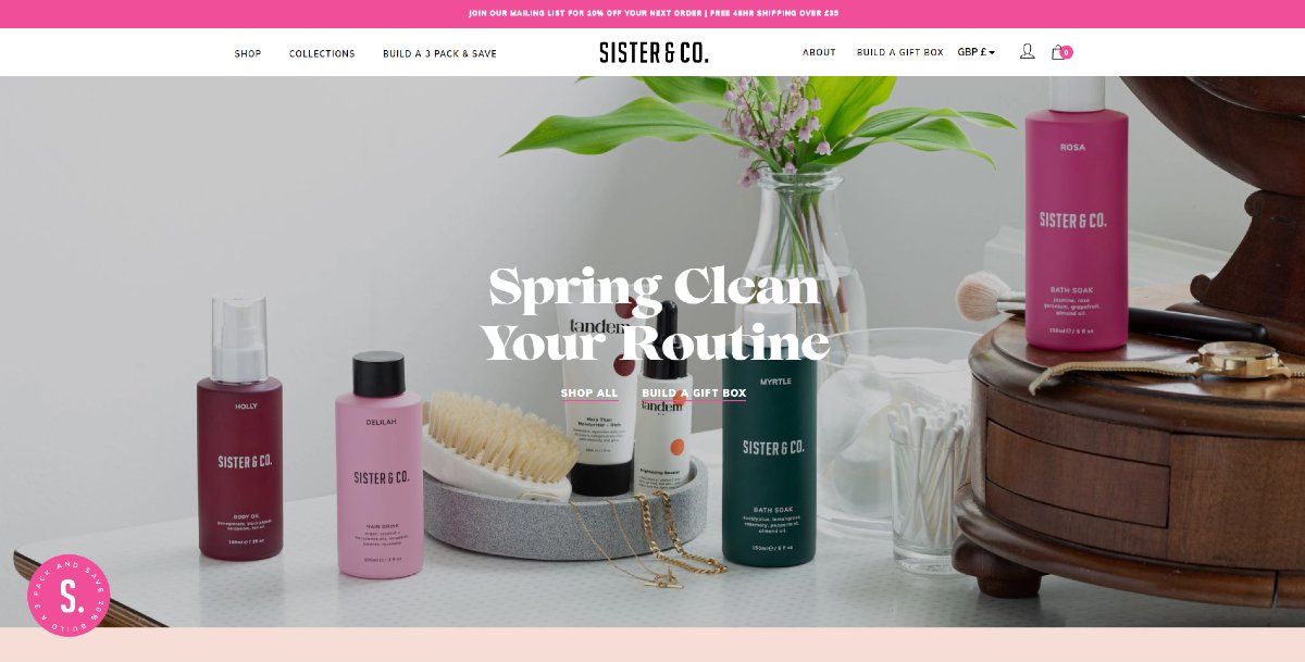
Once you load the Sister & Co website, and immediately the pink draws you in on the banner and the rotating discount pack. While Horchow used a variety of shapes for the grids, they used different colored rectangle grids. Having a pop of color on the site could capture the audience’s attention. They also used a zig-zag formation, so that visitors can follow a particular flow on the site.
Aside from adding an email newsletter sign-up form, they included their posts from Instagram. It’s so visitors can follow their social media accounts and get the latest updates there.
8. CALEPINO
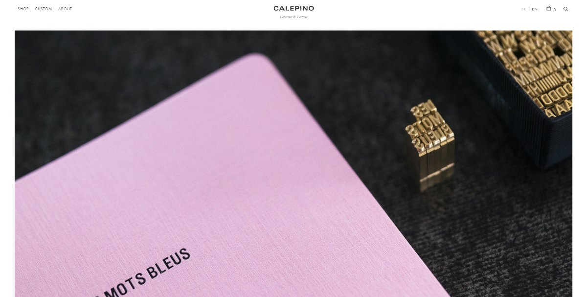
Calepino takes on a minimalist approach to its eCommerce design.
This enables users to view the products instantly. When visitors load the page for the first time, they’re prompted with a pop-up page, which is crucial for an eCommerce marketing strategy.
Maybe the visitors want to learn more about their history so that they can check out their About page. At the end of the page, there’s even a little snippet before a visitor would like to sign up for their newsletter.
9. ARTIFOX
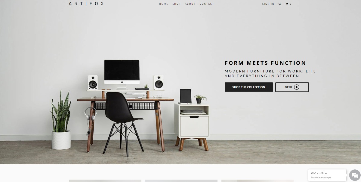
On the Artifox landing page, you have two options. You can discover their collection through the Shop tab, or click on the video to see how to use their products.
It’s also great they made neutral consistency on the site because they are the colors of their products. Even if the colors are muted, it creates a feeling of minimalism and cleanliness.
Those who want to browse on their homepage will have an idea of their product selections. Plus, they added social proof, so potential customers will know where they were recommended in or featured.
There’s also a chat box where potential customers can ask more questions about the company and its products.
10. FELIX GRAY
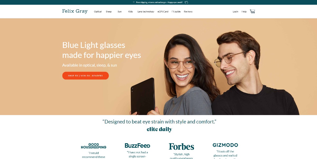
The landing page on Felix Gray makes use of contrast on the background and the call-to-action (CTA) button. It’s a practice most websites observe, to draw in customers to click more on their campaigns or products.
If the user doesn’t choose to click anything above the fold, they’ll see different types of social proof on the homepage. Social proof plays a role in what people buy. According to Podium, 97% of shoppers will buy a product because they saw reviews.
The social proof they included are:
- Earned media
- User testimonials
- Raw quantity
Plus points for them for doing that since social proof has weight over a potential customer’s decision to buy a product. This also creates the feeling of “Fear of Missing Out.” It’s because the product does have its benefits when using it every day. Besides, the cool kids are using their products, so they too would feel like a “cool kid” when wearing it.
Not all eCommerce websites would include a “Why” section on their homepage. But Felix Gray made sure to add that to their eCommerce design so they can inform their visitors on what makes them different from others.
Are you inspired by an eCommerce website design on the list? With Design Doctor, you can request for a website design that suits your brand or company. Since Design Doctor is a subscription-based design service, you can ask for other visual assets too. We’ve got you covered on your social media campaigns, marketing collaterals, and your app! For $599, you can have this and more. Subscribe to a Design Doctor plan here.


