Fresh Black And White Business Cards Any Professional Can Use
Many professionals looking for free calling card vector and templates initially look for designs with bright and lively hues. Though colorful graphics can indeed catch attention, black and white business cards can be just as powerful.
If you’re still thinking twice about using these contrasting tones for your calling card, you’ve come to the right place. We’ll discuss the common styles used for monotone designs. We’ll also touch on how you can make your material catchy without having to use other colors.
The Design Appeal of Black and White
But first, let’s talk about the design appeal of black and white. We’ve learned from the color theory that contrasting or “complimentary” hues look good together. If you look at a color wheel, for example, you can see green and red directly opposite each other. These two hues compliment each other and make the other seem brighter when used together.
If you’re still not convinced about the power of complementary colors, look at all the green and red graphics during the Holiday season. Aside from the Yuletide colors, other complementary colors are orange and blue, and yellow and violet.
In the same vein, black and white can be seen as opposites. Black symbolizes strength and dominance, while white signifies purity and cleanliness. In fashion, the pair is considered to be a classic and timeless palette used for apparel, footwear, and accessories.
In graphic design, however, it takes excellent skills and superb creativity to make a monotonous palette spring to life. Color is one of the elements you can use to brighten up a design. With color out of the equation, you should use the other factors to create a visually-pleasing material.
10 Best Templates of Black and White Business Cards
Here are the 10 of the best black and white business cards we found online. Take note of the design concepts used for each design and see how these styles can inspire your calling card.
Clean Lines

This example from Canva shows us how monotonous clean lines can create a visual impact. The design features a black background and main serif text, with a thick white at the upper half of the card. The designation is written in a light gray, sans serif font, which glows in contrast to the dark background.
The resulting design is quiet but intriguing. Ever notice how truly accomplished people don’t feel like they have to move mountains to impress other people? That’s the vibe that you get from this template. It displays confidence and security sans the grandstanding.
Black and White Photos

If you want a monotone calling card that looks creative, use a black and white photo as the background. It gives the material an instant character without much effort on your part. When using a photo background, however, remember to use a minimalist font. Doing so will prevent your text from clashing with the background.
Minimalist With a Twist

This design features a minimalist layout with clean lines and lots of negative space. Even the typography is simple – unremarkable sans serif font. Despite the straightforwardness of the background, border, and text, the logo changes the dynamic of this card.
Texture

If you want a dynamic design but you can’t quite decide on a photo or image, go with texture. This template features a dark marble pattern as the background. The white rectangle at the center of the card makes for a good canvas for the simple serif and sans serif text.
Bold Typography

This design template makes the most out of typography to give the card a character despite the lack of color. If you want your brand identity to shine through a monotone card, use font styles that best represent you.
It’s important to note, however, that not all bold and loud text types are great for any business. Some types of cursive text, for example, might not work well for a venture that anchors on formality like higher education. Another important thing to remember is to not use too many bold fonts together in one card. Doing so will make the design seem too busy and tiring to look at.
Noteworthy Back

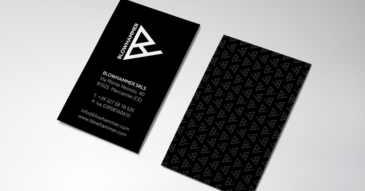
Most people pay attention to the design of the business card facade. After all, it’s the only important part, right? Not quite. Not using the back of the card is not utilizing the available space you have to introduce your brand. This sample shows how the designer used the back of the card to display a pattern made from the main logo.
Portrait Orientation

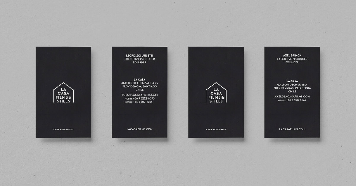
This business card is a great example of a well-balanced design. The logo and contact information are laid out at the center of the card. The portrait orientation of the calling card further emphasizes the symmetry of the design.
Creative Illustration

Akin to how a YouTube banner represents the vibe of the channel, so should a card reflect the traits of a person or business. This design is a great example of how a business card can clearly paint a picture of what a brand is all about. The creative illustration tells the brand’s story at a glance.
Vintage Look

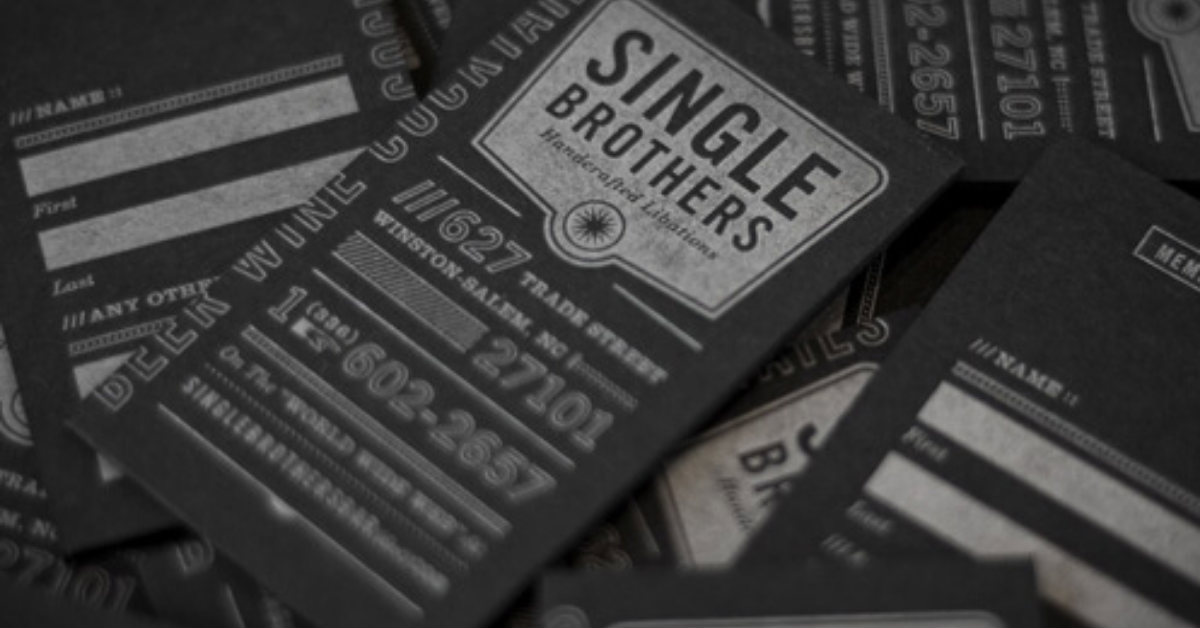
Most people instantly think of modern and sleek designs when creating a monotone calling card. However, going vintage also works well with black and white. This design, for example, shows how rustic-looking shapes and text can be laid out to look classy without seeming outdated.
Asymmetrical Design

Last but not least, on our best black and white business cards is this design from card observer. The template features an asymmetrical design and a lot of negative space. This style gives the material a good dose of mystery. It makes the clients want to lean in and know more about what the business does.
We hope all these designs inspire you as you try to go the monotone route with your calling card. If you want a stunning black and white calling card but have no idea how to design, Design Doctor can help. Providing unlimited graphic design for a flat monthly rate, you can enjoy professional services without going broke. Professional designers would know how to make the most out of black and white to best present your brand to clients.


