25 Great Email Design Inspo that Performs Well
Email newsletters are no longer just about promoting products. It’s to connect with their customers and subscribers. It’s a challenging strategy for many because people can opt-out of an email subscription. That’s why brands should always ensure a good copy and a great email design. For your (first or next) email campaign, you shouldn’t just focus on copy alone because the design is as important for every newsletter for that campaign.
So, for this article, we focus on 25 of the best email designs to get you inspired.
1. Litmus
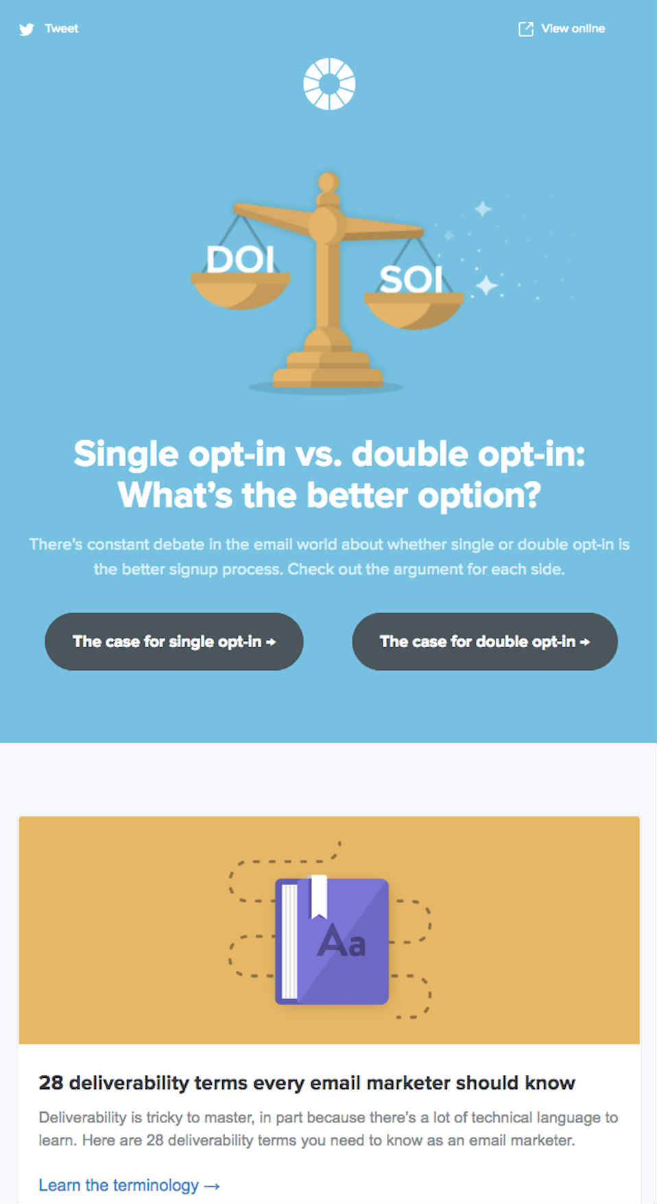
As an email marketing service, Litmus does a particularly great job of designing email newsletters. As you can see in the design, it’s organized and neat. They make use of illustrations for imagery.
It performs well because the main copy for the top grid asks the subscriber, what’s the better option? Then, the user can click any of the options and learn what type of opt-in would be best.
2. Headspace
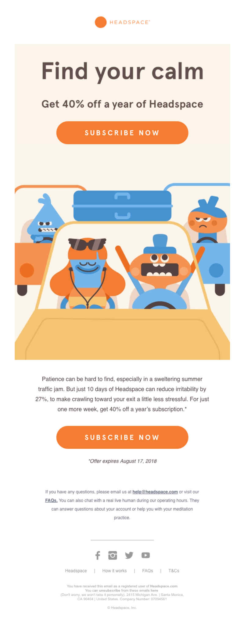
Headspace is a subscription-based meditation app. Their email newsletters tend to have illustrations, which can entice the subscriber. One of its standout email newsletters was its email campaign to get 40% off a subscription.
In the email design, you can see four human-like creature illustrations. It’s their signature style of drawing their characters. It also seems to use a three-color combination that works well too. But it’s their signature orange that stands out in the email newsletter. It’s a good branding technique for people to retain Headspace.
This email would perform well because for those looking for a discount would immediately notice the 40% off above the Subscribe Now Call to Action (CTA) button.
3. National Geographic
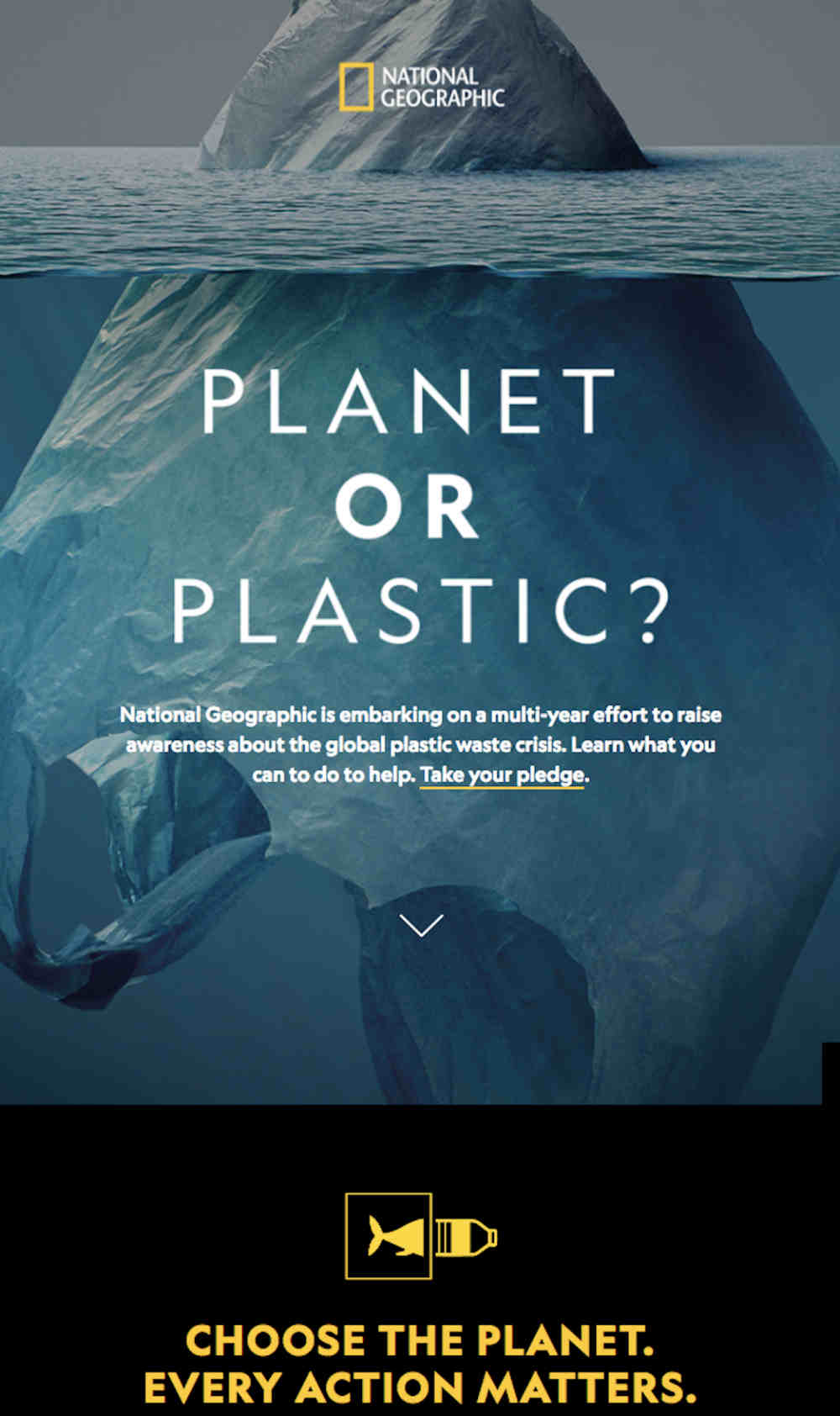
Many praise National Geographic for making an effort in all of their marketing channels and email is no exception.
One of its campaigns is the Planet or Plastic. To show an illusion, it used an iceberg at the top of the ocean, but it’s revealed as a plastic bag as you scroll down. By doing this, they’re evoking an image of pollution in the oceans.
4. Lyft
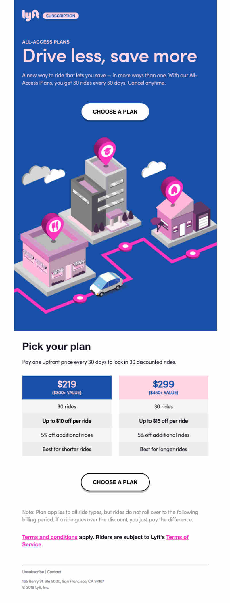
The Lyft newsletter has a great email design because it uses isometric design and a color scheme that blends well with one another. The color scheme is evident also in the second part of the newsletter where they show a comparison of the plans.
It works because of the complementary colors and having two CTA buttons as the subscriber scrolls down.
5. Away
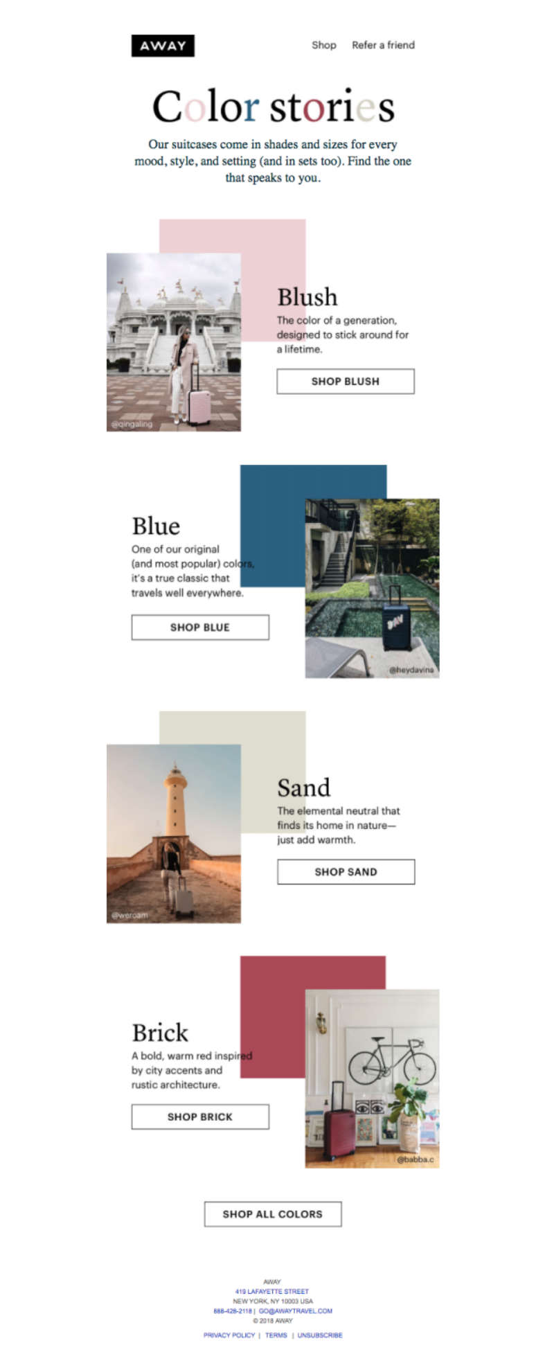
Following the latest graphic design trends, Away uses asymmetrical patterns for their email newsletter and it works well!
As you can see in the email newsletter, it makes use of their popular colors. It’s a way to ingrain the colors in people’s minds. Not only that, but they also made use of user-generated content too, so it forges a connection between customers and the company.
6. Toms
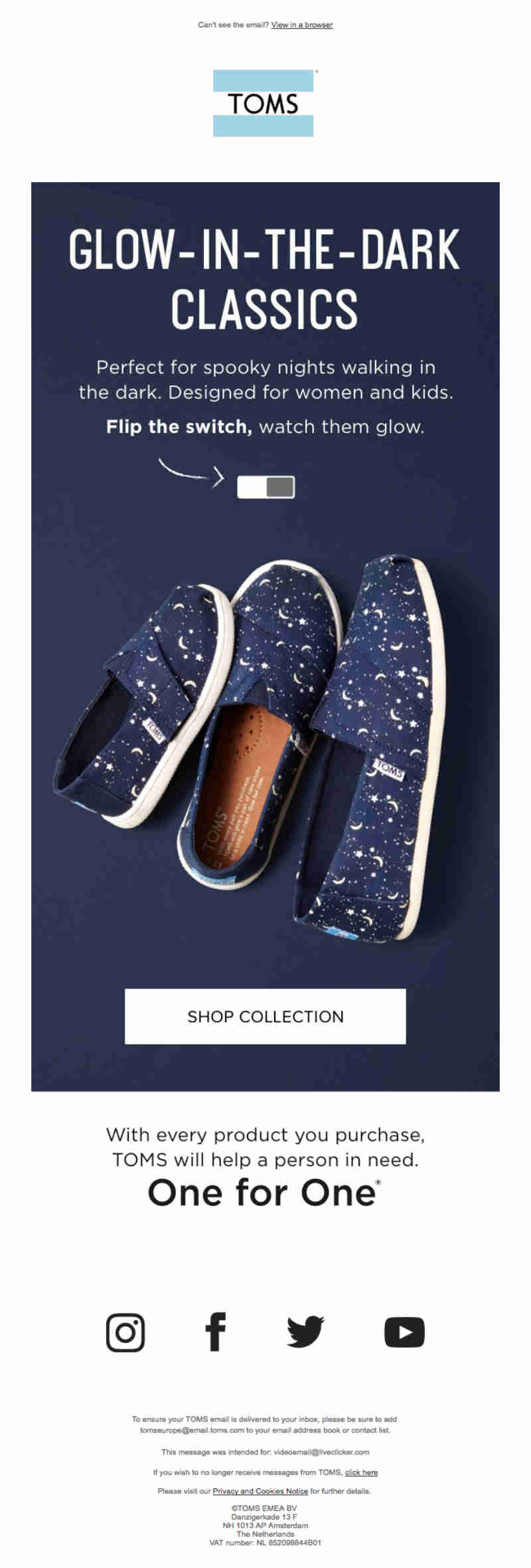
This Toms email newsletter has a great email design. Why? For one, you’re able to interact with the email newsletter. By doing so, you need to put your cursor exactly atop the switch. There, you can hover from left to right to see how it glows.
It works well because it enables the subscriber to interact with the email. Not only that, but the email design is simple too. Since they’re promoting that product, it’s best to keep that shoe in the spotlight.
Check out how it glows in the dark here.
7. reMarkable
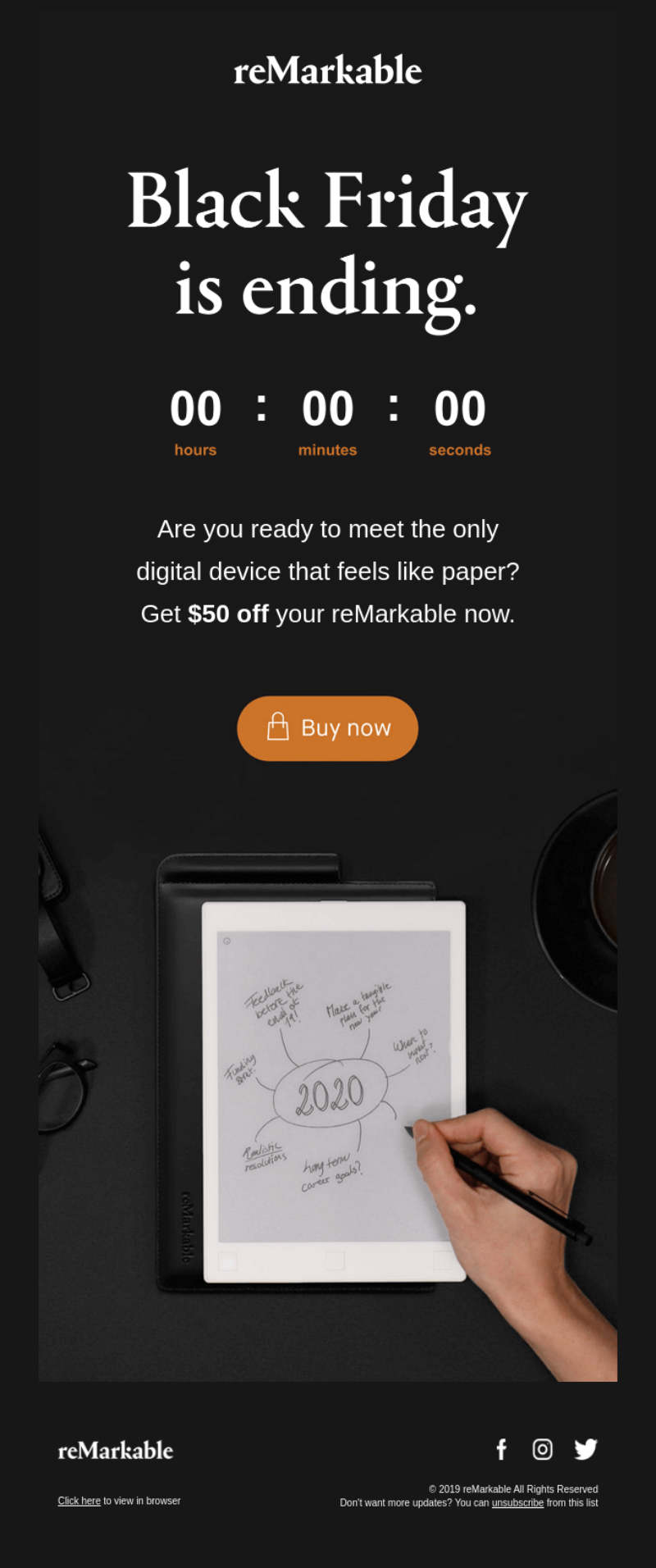
reMarkable utilized a black background for their email. Not many do that. But on Black Friday, companies do it in the spirit of the holiday.
The reMarkable email newsletter looks neat and simple. It has the basic elements like a photo, text, and call to action button. It even showed a countdown timer to present exclusivity.
8. Grammarly
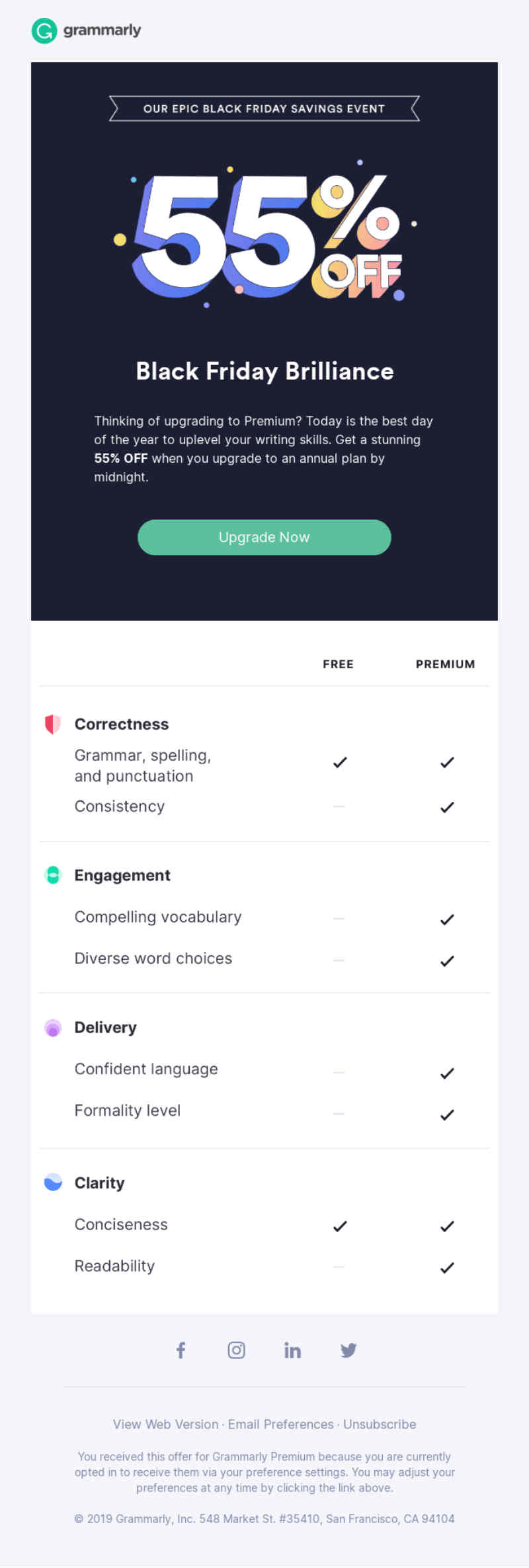
The Grammarly email newsletter is another example of a Black Friday campaign. Grammarly doesn’t use the black background like reMarkable and other brands did. It still is an effective email newsletter because it highlights 55% off their subscription plan.
They also present the features of having a premium plan against a free one, which can be convincing to those who need the Premium add-ons.
9. Aldo
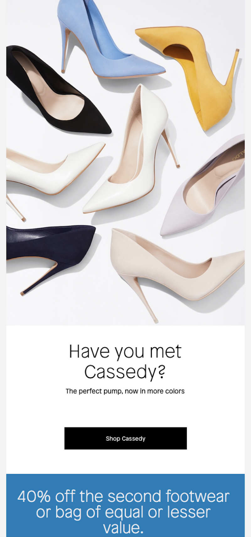
For every shoe lover’s dream, the Aldo newsletter has a great email design. You’ll see the same shoe (Cassedy, as Aldo calls it) but in different colors. It can make a subscriber want to view more colors and designs on the website. Plus, they also provide a 40% discount on the second pair if they buy one.
10. Harry’s
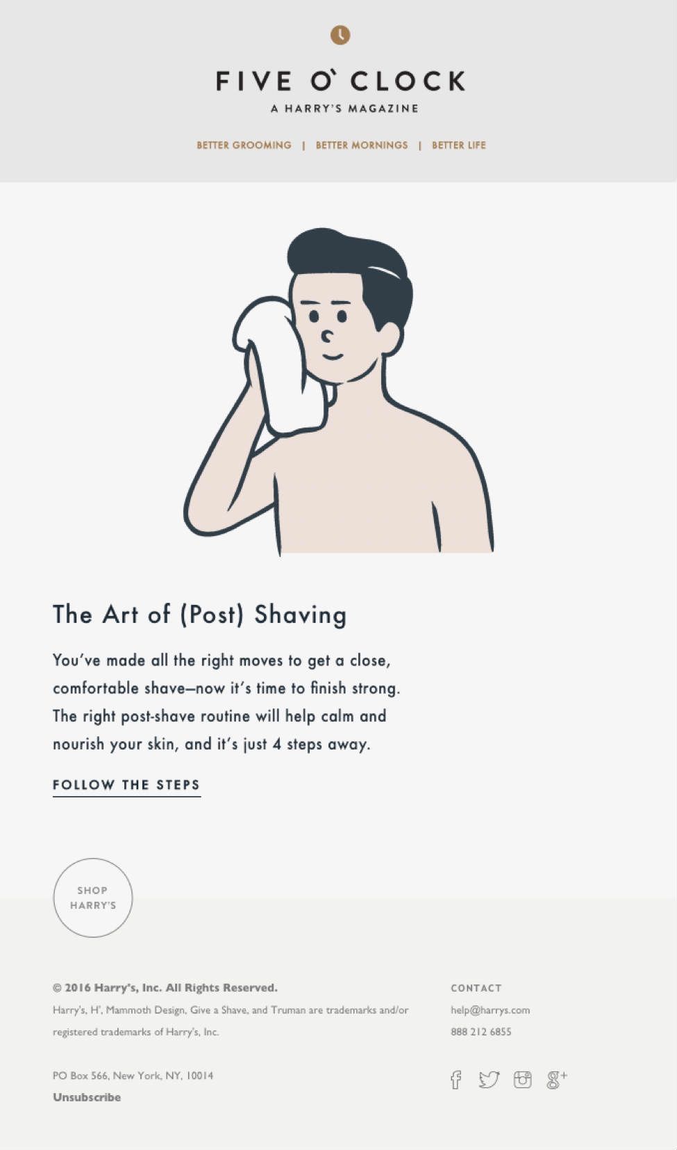
Harry’s sells grooming products for men. Their email newsletter shows one illustration of a guy after shaving. They also write a copy as to why men need to take care of their skin post-shave.
Their email newsletter looks clean and it doesn’t have too many elements, which won’t overwhelm the reader with too many text, colors, or images. It works too because the illustration matches the copy that will help them follow a routine after shaving.
11. Warby Parker

Email newsletters don’t need to be serious all the time. And that’s what Warby Parker did for their clean, minimalist email design. They drew custom drawings on how to use sunglasses indoors. It’s an effective newsletter because while sunglasses aren’t traditionally worn indoors, they wanted to make subscribers laugh and even give them an idea of how they are as a brand.
12. Patagonia

The Patagonia email newsletter is another Black Friday campaign. On that email campaign, you can see a digital design showing hands resembling a plant that presents giving. It matches their copy well. Also, they will match anything a subscriber would donate.
The use of colors for the design seems triadic and it’s well-executed. It works well too because of their promise to match a donation is in an orange circle, which captures a subscriber’s attention.
13. Tommy Hilfiger
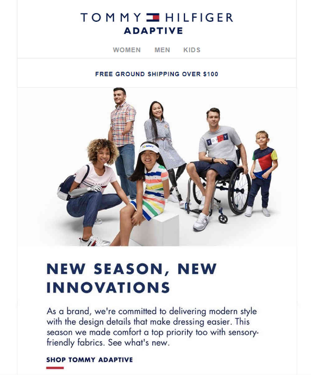
As with many email designs on this list, this one has a minimalist design as well. The splash of color it has is Tommy Hilfiger’s signature blue and red on its text and lines.
It works well because it shows that it wants to connect with its target audience (those with disabilities). Tommy Hilfiger wants to show that it’s in the business of inclusive design. By having this campaign, it solidifies their initiative towards inclusivity.
14. Casper

Casper dubs itself as a “sleep company” since they sell essential items for the bedroom. They make great email newsletters, but their “Snooze Letter” is one that captures the eye.
For one, they use an illustration of a sleeping human at the top of the newsletter. It then follows with the title of their blog, “70+ Sleep Statistics…”. It’s good to use statistics on a newsletter too so facts are supported by concrete data.
It’s a simple, minimalist design that makes you want to click on the Read More button.
15. Blu Dot
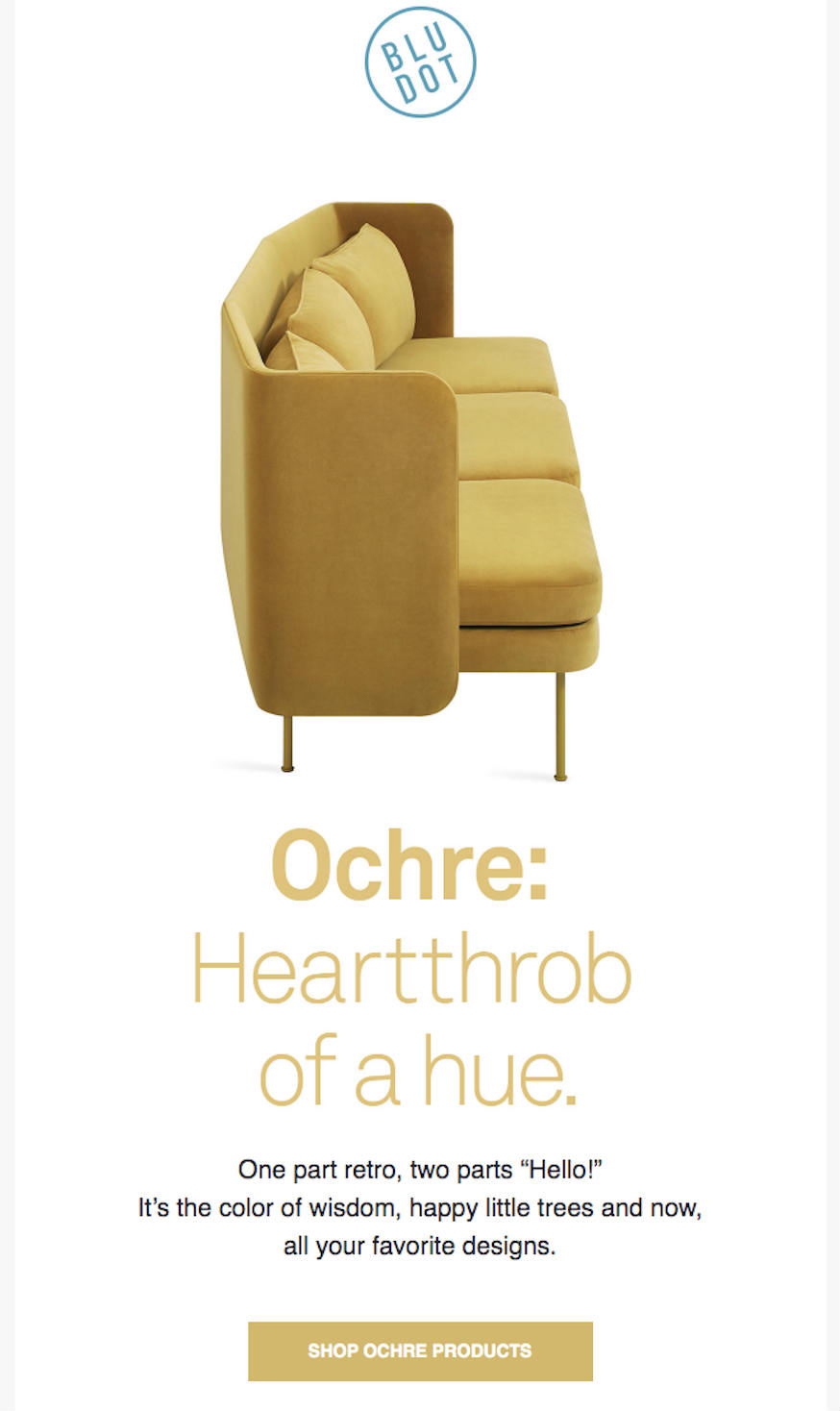
Blu Dot featured Ochre in one of their email newsletters. By doing that, they showed off furniture in that color. So it can guide subscribers on how to design their homes with the color.
Even the call to action is in Ochre so it’s consistent with their color theory campaign.
16. Hers

Seems like the trend for email newsletters are a simple and clean design. Hers is also hopping on that trend. The female-focused company sent a survey to their subscribers and emailed them the results.
It’s an effective email newsletter because they want to make sure their subscribers are heard. It used both graphics and data to spice up the email newsletter.
17. Chobani
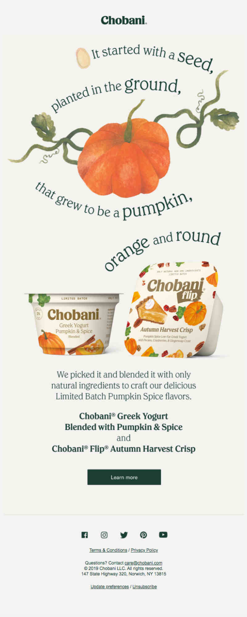
Chobani created a great email design to promote a pumpkin and spice flavored yogurt.
You’ll see a drawing of a pumpkin with the curved text. It’s a way to emphasize the shape of the pumpkin and its yogurt. They used the font that can get them recognized by many. The background looks earthy too which may be associated with Fall and pumpkins.
18. Freshly
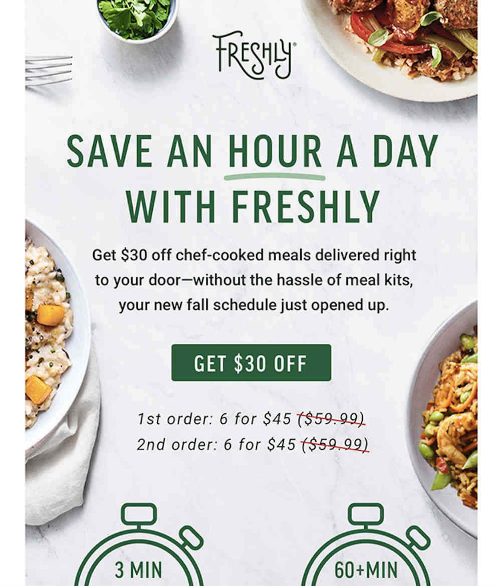
Freshly uses photos and illustrations for their email newsletter. They used photos and illustrations to differentiate why people should subscribe to Freshly.
By making the illustrations darker than the background color on the right side of the newsletter, it highlights how Freshly wants to emphasize the ease of eating healthily through their service. Not only that, it uses different hues of green to stay consistent in their branding.
19. Poppin
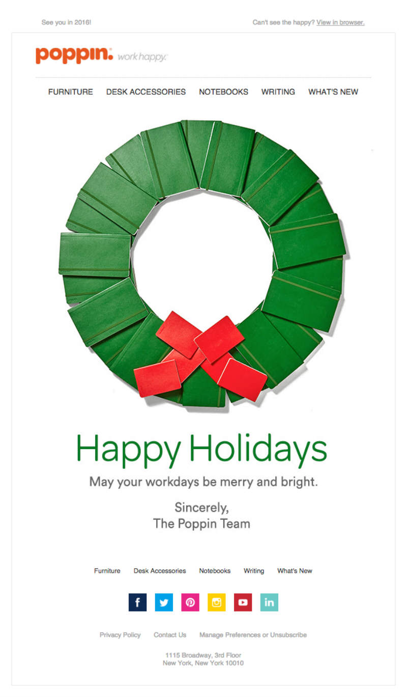
As with many companies, some would greet their customers on the day of celebration (e.g. Easter, Christmas, Thanksgiving). To feature its products in the email newsletter, Poppin took a photo of a notebook wreath. It’s a creative way to promote what they’re selling to their customers.
The wreath is clickable and redirects you to their website.
20. Soylent
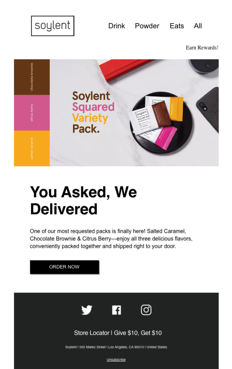
In promoting their Soylent squares, Soylent sent out an email newsletter for its subscribers. The design looks neat. The squares on the left of the photo and font color match the products too. This is to hype up the product for their subscribers.
21. Netflix
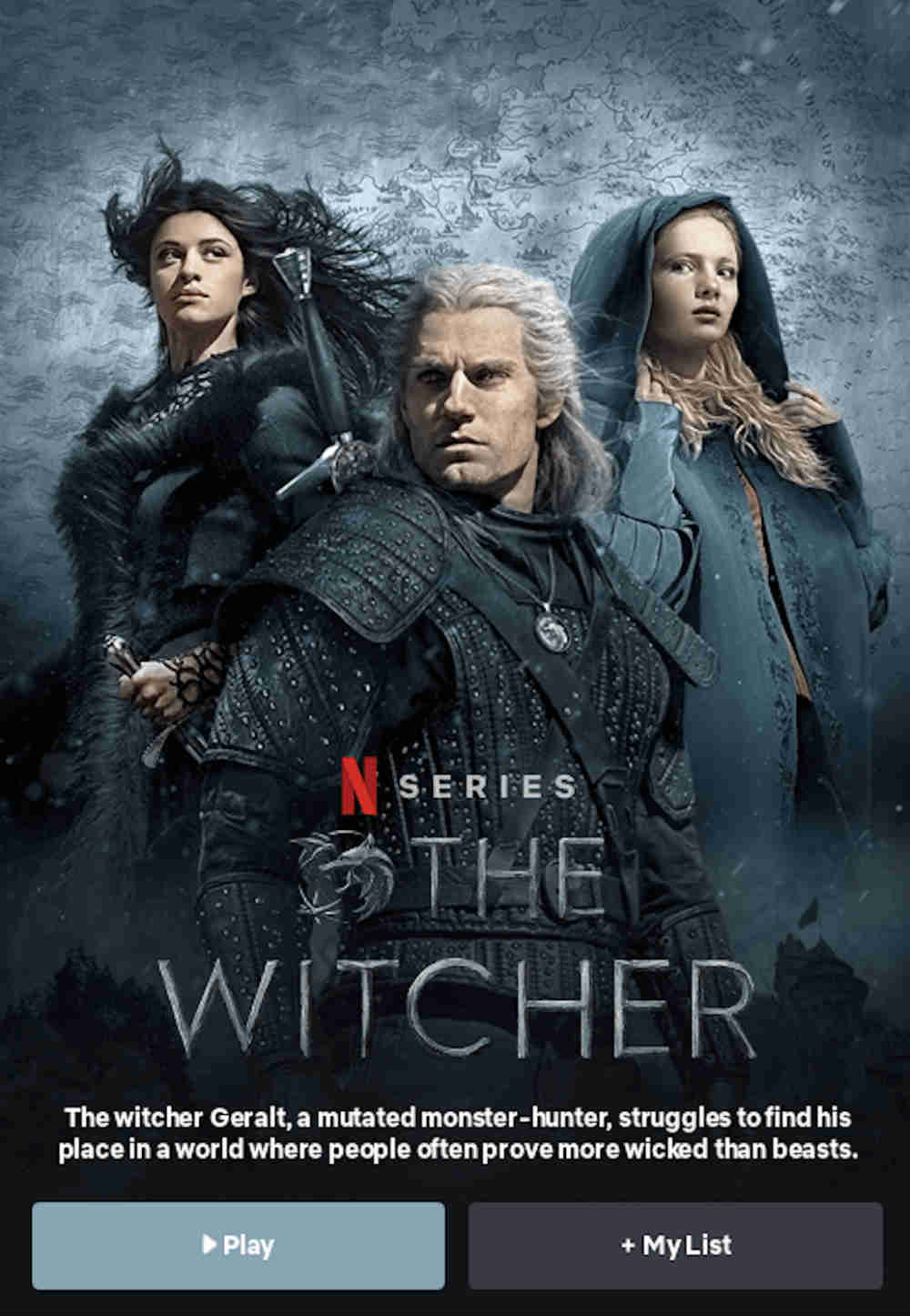
To promote one of its new originals, Netflix sent an email newsletter putting a spotlight on the show, ‘The Witcher’. At the top of the newsletter, you’ll see the three main characters of the show. As you scroll down, you can also click on the characters and learn more about them. It’s great for those who have yet to know about the show and the characters.
It performs well because the design enables a subscriber to click on any button and be redirected to wherever they want to go (if they’re curious about it). It performs well also because of those call-to-action buttons.
22. Vimeo
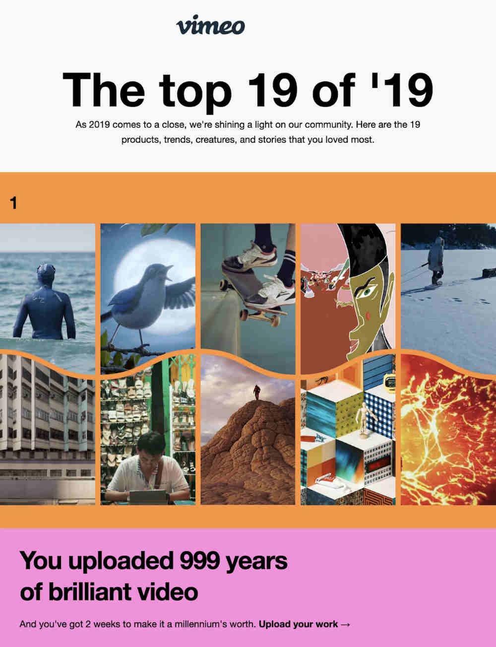
To round-up the 19 best videos in 2019, Vimeo sent a colorful email newsletter to their subscribers. The email works because of:
- Visually striking colors that keep your eyes locked at the newsletter
- Bolded text that will make you skim at the newsletter
- Data and numbers in the newsletter
23. Apple
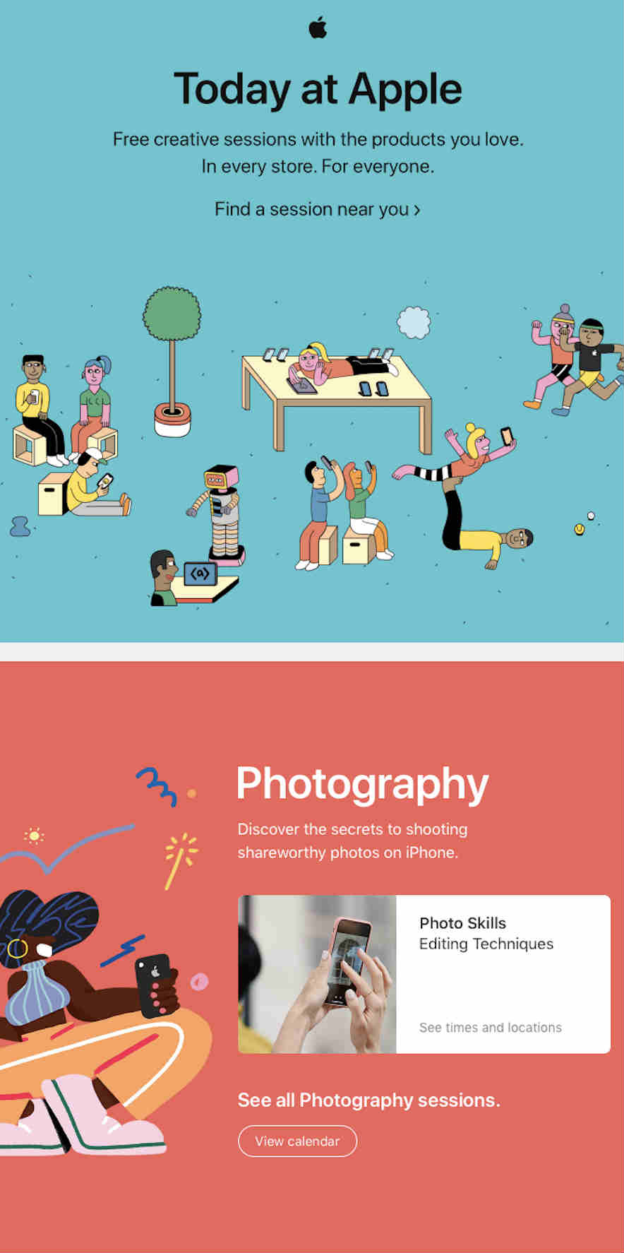
In a similar fashion like Vimeo, Apple also uses vibrant colors to entice the subscriber to read the newsletter. They also make use of illustrated humans in every part of their newsletter section. For every section too, you’ll see a CTA button “View Calendar”, for subscribers to check out an event they can attend.
24. Sony Playstation
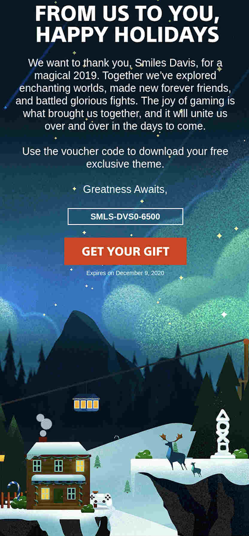
The email newsletter has a themed background that illustrates the season of Christmas. On the upper part of the newsletter, you’ll see the controller buttons lighted up as well. The controller buttons are also part of the theme, as a snow sculpture and decor in the house.
The newsletter allows the subscriber to download a custom theme including a voucher code made for them only. It’s a great email design because unlike others that use solid colors or different ones, Sony made a custom graphic design for the email.
25. Mindnode
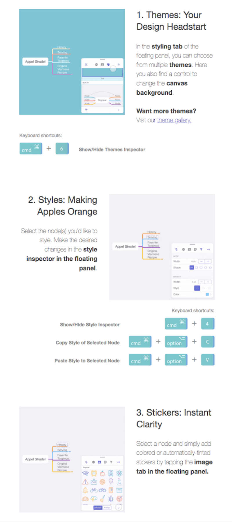
Mindnode is a Mind Map and Brainstorm app to get your ideas flowing visually. As a visual company, it’s only right their email newsletter also has great email design.
They send out three introductory emails to the user showing how to use the app on iOS. The common theme in their introductory tutorials is a graphic design at the top of the newsletter making use of their colors. Also, as you scroll down, you can see screenshots of how to use the app. There are even 3D illustrations of the keyboard shortcuts to guide the user.
Here’s why you should use Design Doctor for your email newsletters. For one, you wouldn’t need to use an email marketing service, which could be costly, IF you’re trying it out first. An email designer will make the designs for you, then you can request a great email design with a quick turnaround.
Design Doctor is an unlimited design graphic service, so you can ask for any visual asset you’ll need for your brand. It saves you time and money to find a freelancer for every project and you can subscribe monthly.


