
11 Infographic Examples that Inform and Entertain
If you look back at the books you had when you were a kid, how many of them had pictures? Chances are, all of them. After all, they were meant to make learning a lot easier for your young mind. Humans are naturally visual learners, and there’s no doubt about it. In fact, a study published in the Journal of Visual Literacy, which analyzed the most liked infographic examples online, says useful infographics encourage cognitive info processing and critical thinking.
Because they visually present dense and complex info, the material helps foster learning, understanding, and recollection.
What Makes a Good Infographic?
Before we dive right into the best models, let’s review what goes into good infographic examples. According to the research above, its power lies in the following factors:
- Delivering the most content in the least amount of space
- Being clear and precise
- Quickly tells a story, or
- Quickly show relationships and structure
In addition to its functional design, however, the visuals must apply graphic design basics. A professional graphic designer would know how to use elements properly to create an asset that’s easy on the eyes.
The Best Infographics Online
1. Food Fraud

This example explains what food fraud is. Instead of using a lengthy definition, the visuals define the term it through bite-size text accompanied by simple graphics. It included info such as the most fraudulent foods as well as consumer survey reports. Though some of the data were presented as text, the clean layout makes the whole subject easy to digest.
2. How to Be Productive
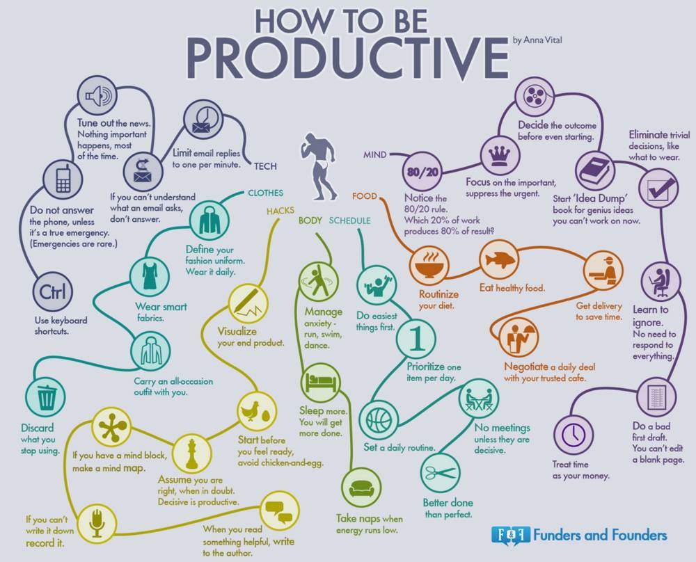
The question “How to be productive?” requires a complicated answer. But this image proves that it can be done with a single visual. The info chain makes it easy to understand. By starting at the center, you’ll choose among the categories and follow the chain of simple graphics and texts. This example shows that you won’t need advanced infographic software if you know the topic by heart.
3. The Personal Finance Landscape

Financial literacy may not be the most gripping topic there is. But this graphic used a simple approach in presenting various aspects of personal finance, and it’s easy to absorb. The compelling info was presented in a cohesive design, thus making it one of the best business infographic examples.
4. Wine vs. Beer

Even the top graphic designers won’t make a visual more complicated than it should be for the sake of artistry. This image, for example, is so straightforward, it’s hard to find a simpler and more cohesive visual than this. That said, this is the type of graphic you’d want to screenshot or save on your phone for emergencies. Like, when you’re in a bar and only have seconds to decide between a pint or a flute.
5. Love & Money
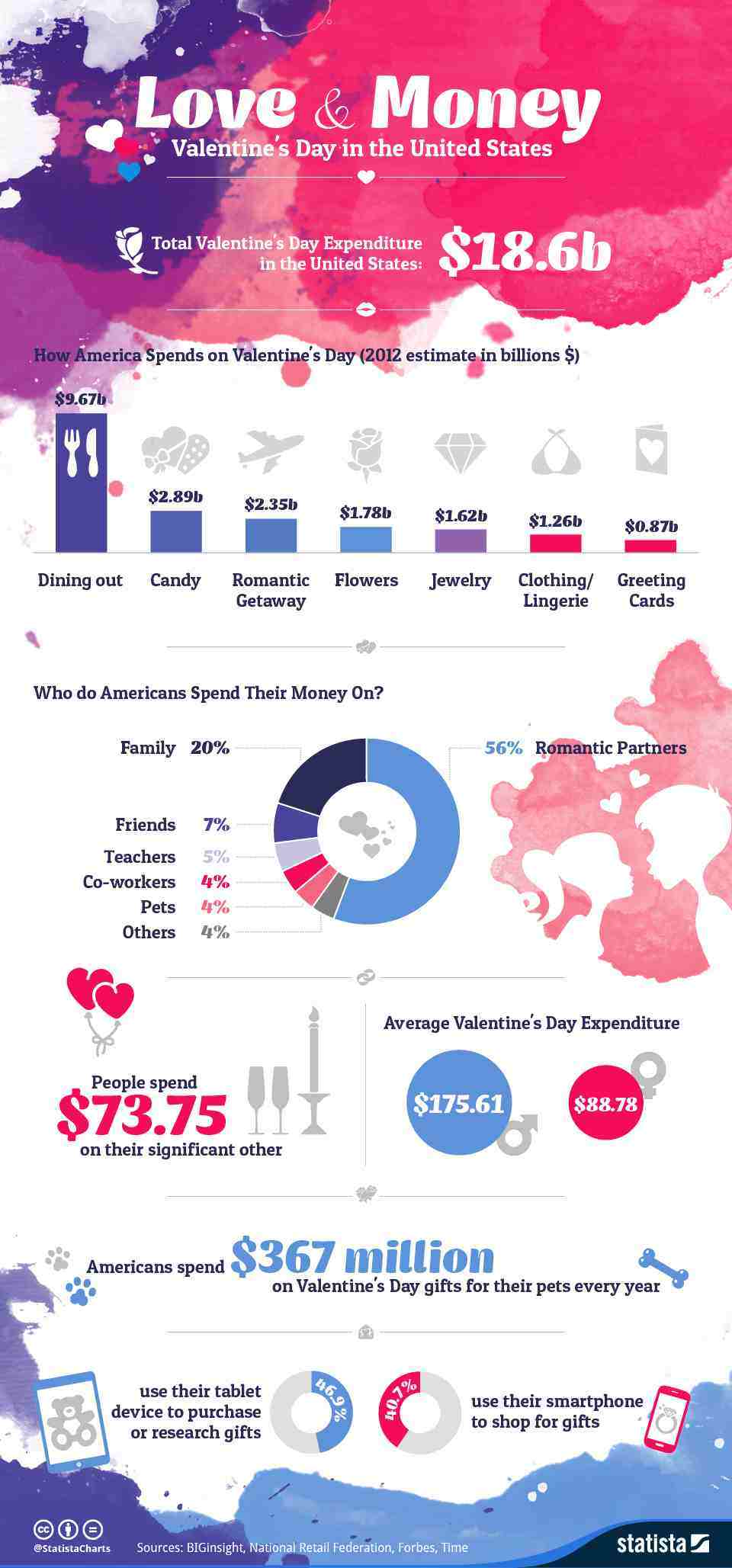
With a name that sounds like a title for a soap opera, this infographic example married data with drama. It was created to present info about Valentine’s Day spending in the US. So, the color palette used included pinks, purple, and blues. The illustrations, on the other hand, are very simple, taking the backseat to allow the watercolor accents to steal the show.
6. Baking Measuring Dos and Don’ts
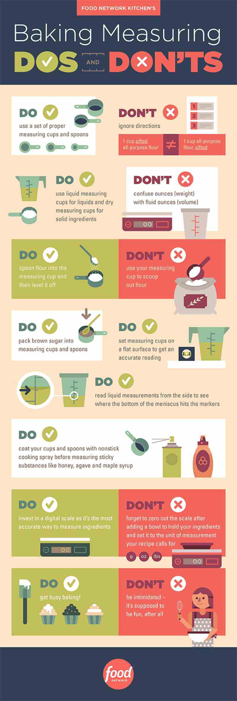
Have you ever tried baking from scratch? If yes, then you know how tricky it is to come up with a successful result every time. This image from the Food Network is more or less a list of guidelines meant to guide home bakers. Obviously, it’s much more interesting than a full text of dos and don’ts. So, you’re most likely to retain the info and remember it the next time you bake a batch of choco chip cookies.
7. Safety Tips for Handling Food
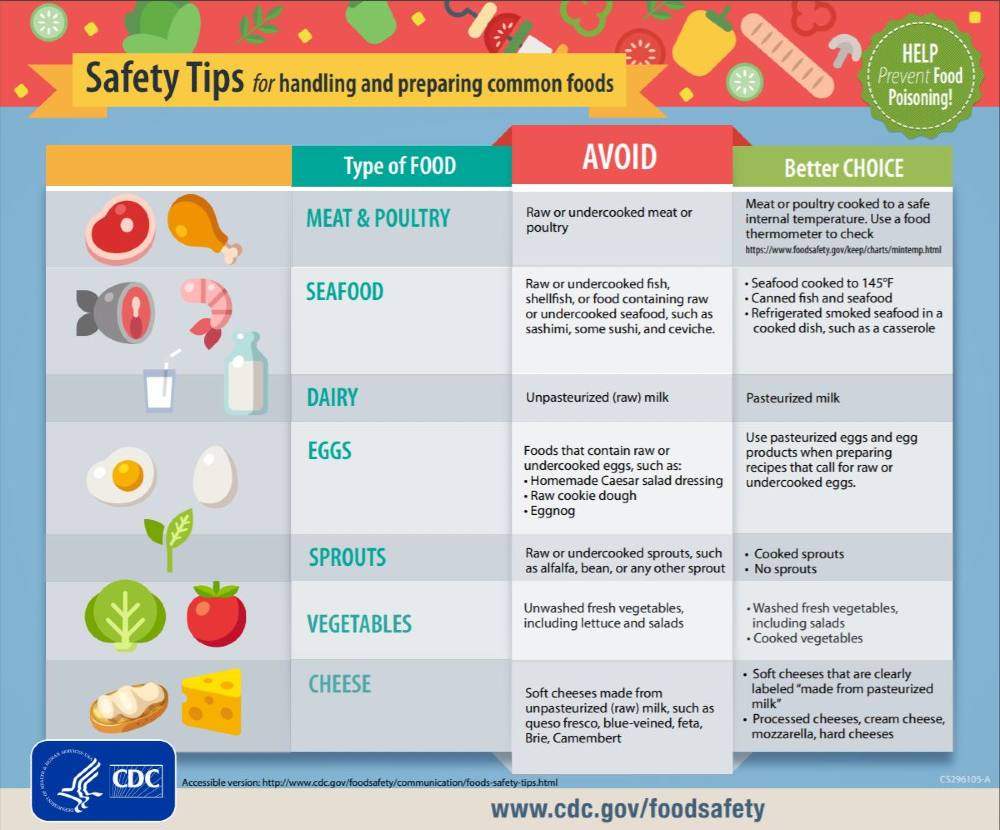
If you’re still learning the ropes of using graphics to inform, this simple infographic template is a good pattern. Created by the CDC, it aims to inform the public about safety tips for handling and preparing common food so as to prevent food poisoning. The visuals feature cute food illustrations and three text columns. The columns are categorized into the type of food as well as the dos and don’ts of handling them.
8. How to Win the Booker Prize
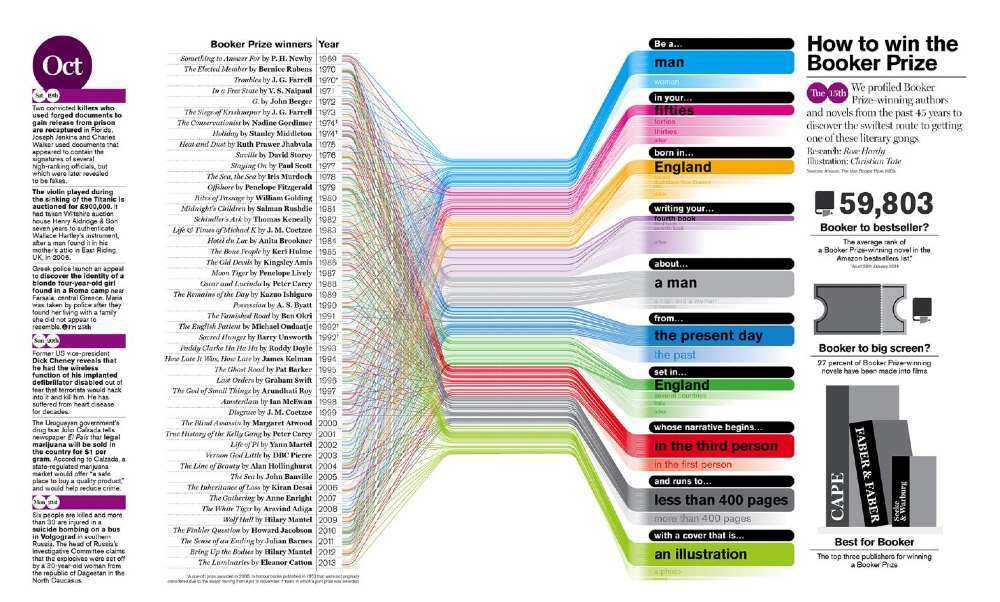
This image may not make the list of the top simple infographic examples. However, it’s so efficient in organizing complex data, so it’s surely worth the limelight! This graphic profiled Man Booker Prize winners from the last 45 years. The analysis used color coding to compile info about past winners’ gender, age, place of birth, as well as descriptions about their winning works.
9. Zero Carbon Buildings
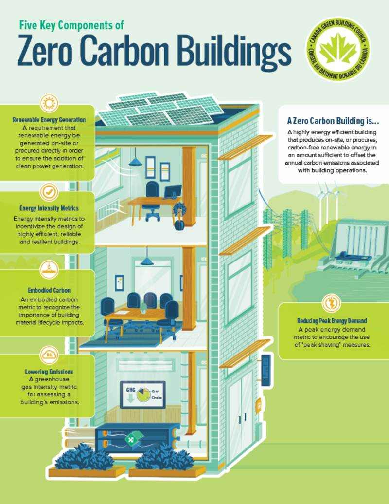
This is one of the best infographic examples for students who are new to graphic design. Instead of using the regular bar or pie charts, the graphic incorporates the topic right into the visuals. It makes the overall graphic more fun to look at without downplaying the provided info.
10. Relationships in America
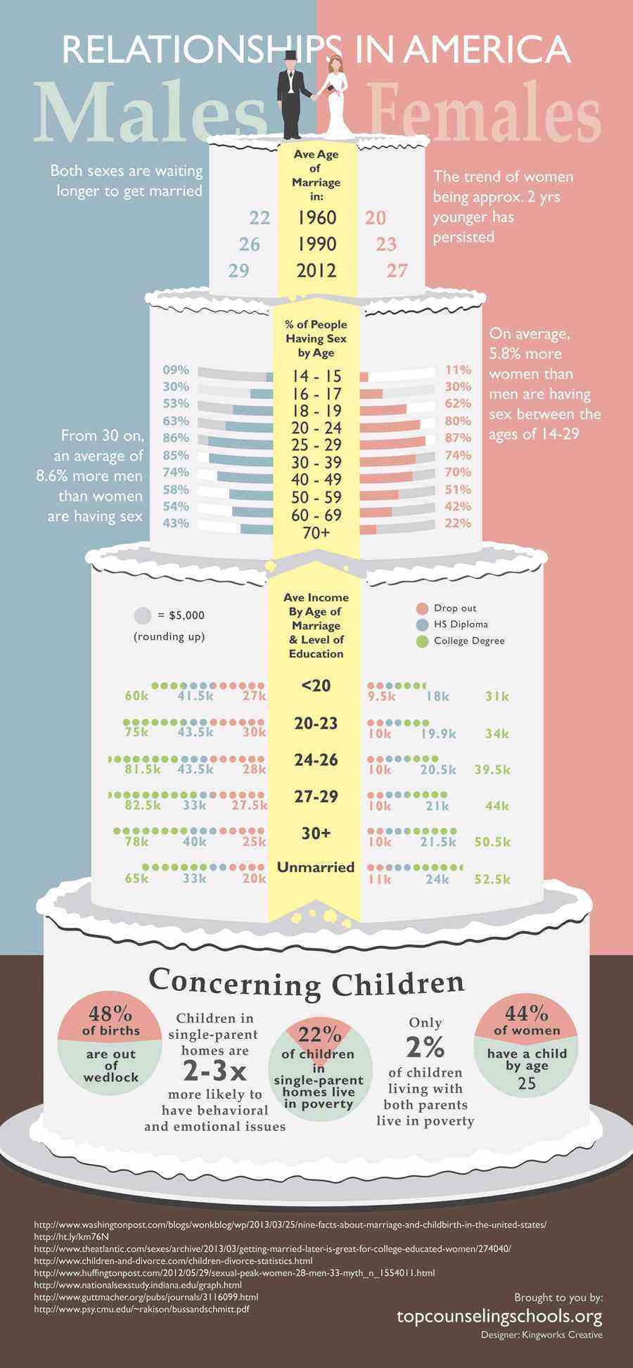
This image is akin to ad design examples. It works to inform the viewer about the overview of the material right from the first glance. Using a wedding cake as the main structure, the tiers show various data related to marriage, sexual behavior, and children.
11. Infographic of Infographics

This example will make you go, “This is so meta!” Created by artist Ivan Cash, this made waves the year it was released and was even tagged as “The Infographic that will End All Infographics.” Also, it was used by a Penn Libraries Guide to show the principles of a good infographic. The visual shows basic stats about the most common design and content used, such as chart style, font, and title length, among many others.
Making the Most Out of Infographics
These infographic examples show us that great material relies equally on two things—first, solid data presented through concise wording. And second, strong visuals that illustrate the data. Keep these in mind whether you’re creating one as part of your web graphics or for a marketing asset. Remember, it’s all about making learning more fun, much like a picture book does for kids.


