Hidden Meanings Behind Restaurant Logo Designs
Think about your favorite restaurant. Can you picture its logo in your mind? Whether it’s an international franchise or a local mom-and-pop shop, you should be able to retain the restaurant logo design if they did it right.
Without a doubt, a custom logo design is one of the most significant assets of a restaurant or any business, for that matter.
In fact, statistics tell us that the market size of logo design service in the US is pegged at 3 billion US dollars.
And to make their logos even more significant, many ventures have included hidden meanings into their symbols.
Here are ten restaurant logo examples with hidden meanings you may not have known about.
McDonald’s
McDonald’s golden arch symbol is one of the most famous restaurant logos known worldwide. It’s a golden M letter typically over a red or white background. At first glance, the logo doesn’t seem to mean anything else, given that it’s the brand’s letter initial.
Hidden Meaning: McDonald’s logo is the golden arches of the letter M on a red background. According to a historical account, design consultant and psychologist Louis Cheskin in the 1960’s reportedly told the company to retain the logo because of its Freudian symbolism of… a pair of nourishing breasts.
Subway
Subway’s logo displays simple graphic design basics. As one of the most famous restaurant logos, the international sandwich shop revamped its logo design a few years ago and came up with this yellow and green wordmark with the same iconic arrows.
Hidden Meaning: According to the brand, the new logo reflects how they use fresh produce to create their products. The arrows on the letters S and Y of the brand name means entrance and exit, thus reflecting that you can have food on the go.
Wendy’s
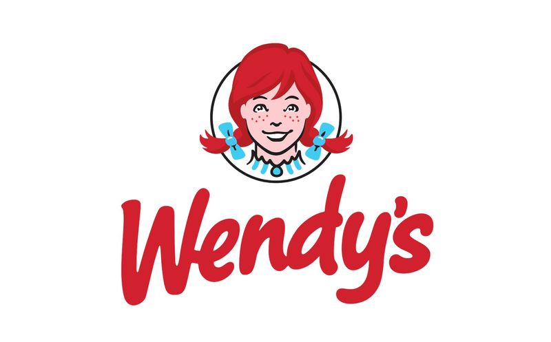
Wendy’s fast-food restaurant logo is easy to understand. After all, it’s just an image of Wendy, right? Wendy is the daughter of the joint’s founder, Dave Thomas, who started the chain in 1969.
Hidden Meaning: If you look closely, Wendy’s collar and center button spell MOM. However, it isn’t clear whether the subliminal message was intended or accidental.
Domino’s
Domino’s restaurant logo design is simple and easily absorbed – a domino block with a white outline and red and blue hues. Despite the literal visual translation of the name, it also bears a meaning not known to many
Hidden Meaning: The block, which shows three dots, symbolize the franchise’s first three locations after they first opened shop in the 1960s.
Panera Bread
If you’re aiming for restaurant logo ideas that incorporate insider information, check out Panera Bread. The logo shows an image of a woman reflecting their tagline, “A loaf of bread in every arm®”.
Hidden Meaning: Other than its connection to the tagline, the woman in the logo is called “Mother Bread.” A mother dough is what bakers use to start fermentation in every batch of bread.
Baskin Robbin
Baskin Robbin’s logo’s blue and pink symbol shows its initials, B and R, enclosed in a circle. However, the image incorporates a fact about the internationally-franchised ice cream shop.
Hidden Meaning: The curves of the B and the straight line of the R, both colored pink, can also be read as 31. Baskin Robbins offers 31 flavors of ice cream.
Cracker Barrel
Cracker Barrel’s logo is quite intricate, with details that spell old Southern country. Aside from being the symbol of the restaurant-cum-gift store chain, the logo bears meanings about the store’s significance.
Hidden Meaning: As seen on the logo, a cracker-barrel pertains to barrels in the early 20th century used to hold soda crackers sold in country stores. Visitors would usually hang out around the barrels and catch up with friends.
Whataburger
Whataburger has gone a long way since Harmon Dobson and Paul Burton opened the first restaurant in Corpus Christi, Texas, back in 1950. The logo consists of orange and white stripes forming a “W” letter.
Hidden Meaning: Dobson’s love for flying reportedly inspired the logo. Being a pilot, he wanted a big and bright logo that he’d be able to spot his stores from the sky when flying an aircraft.
Burger King
Burger King’s blue, golden yellow, and red color palette are distinct. Its round logo bearing its brand name is an iconic symbol of the international burger joint serving customers since 1954.
Hidden Meaning: Though the symbol may seem like a simple round button logo, the golden yellow half-circles on the top and bottom of the wordmark symbolize burger buns. As a result, the text looks like the filling of a fat, juicy burger.
Starbucks
This logo for the coffee shop giant is a common sight for coffee lovers around the world. Many know its green logo of a siren (a two-tailed mermaid) from coffee cups and tumblers donned by fans are regular customers of the Seattle-based franchise. In the same vein, it’s also shown on the packaging design of their merchandise, such as coffee grounds, cookies, and pastries.
Hidden Meaning: According to their website, the siren was inspired by a Norse woodcut from old marine books. It symbolizes the coffee house’s connection to the sea: its hometown, Seattle, is a port city. Also, most of their coffee imports arrive in the city via a sea vessel.
Dos and Don’ts of Creating a Restaurant Logo Design
Here are tips to remember when creating a restaurant logo design for your business.
Do:
- Create a logo that reflects your brand identity
- Incorporate your brand’s color palette and main shapes or symbols
- Consider current logo trends within your industry
Don’t:
- Go overboard with hidden meanings that your logo looks like a hodgepodge
- Settle for a generic restaurant logo vector that looks like a thousand others
- Copy your competitor’s design
Conclusion
Incorporating hidden meanings in a restaurant logo design will surely make your symbol more beautiful and significant.
Having an expert create your business symbol instead of using a logo maker generator will result in a more meaningful logo to represent your brand identity and values. That said, it’s certainly a visual asset worth investing in.
Need a food logo for your business? Check out Design Doctor! Offering unlimited graphic design at a flat monthly cost, they can create all the visuals you need, from web graphics and logos to online and printable menus.
