The Best Typography Ad Examples You’ve Ever Seen
When brainstorming for an ad, many entrepreneurs often think about the best images to use or the best color palette that spark audience interest. Seldom do most people pay attention to typography.
However, designers know just how crucial it is to use only the right typeface style and text size, especially for typography ad materials.
As simple as it may seem, the appearance of text can sometimes make or break an ad.
What is Typography Ad and Why Does It Matter?
Typography is the theory and practice of text style and appearance. It is the art of applying design to text, whether it’s for visual materials, digital materials, or videos.
Typeface style and text size matter so much in the sense that the design itself becomes part of the message.
When it comes to advertisements, the copy is as significant as how it’s written. Its style and size can either lessen or strengthen the message of the ad, and you’ll always want it to be the latter.
Essential Things to Remember About Typography
Most non-designers wouldn’t want to concern themselves with the nitty-gritty of typography properties. Letter spacing, leading, tracing, cap, descender, stem, and stroke, to name a few.
However, it’s essential to know at least the basics, especially if you’re planning to explore the possibility of launching a typography ad.
For one, it’s important to note that certain type classifications are easier on the eyes when it comes to printed materials. Other fonts look better when viewed on computer screens.
According to experts, serif fonts, or font styles with small shapes or projections appearing at the beginning or end of a stroke on a letter, are better to be used in text bodies for print. These materials can include broadsheets, newsletters, flyers, and brochures.
Sans serif or those without serif, on the other hand, are often used for visual materials typically viewed on computer screens. These include website copies, emails, digital advertisements, or social media posts.
Common Mistakes to Avoid
One typography taboo to avoid with advertising materials is using too many different styles of the typeface in one copy. This faux pas can make the visuals too busy, unnecessarily confusing the viewer.
Another mistake some people make is applying a font style that doesn’t go with the theme of the material. Whether the concept is fun, classic, serious, or modern, the ad should use an appropriate font style.
Dated fonts or typefaces attributed to a specific period are also best avoided. As much as possible, stay away from fonts like Comic Sans, Papyrus, Curlz, Creepster, or Jokerman, unless the theme of the ad is retro.
10 Best Typography Ad Examples
Here are ten of the best ad examples that bank on the perfect typeface and text size to catch attention and sustain interest.
Aasra
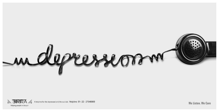
Aasra is a Mumbai-based mental health non-government organization known for operating a 24-hour helpline for individuals who are suicidal and emotionally distressed. For their ad, the coils of the telephone cord spell out the word, “depression.” Though the visuals don’t show the whole phone, the receiver was enough to put the font style in context.
Ikea

This poster is part of an ad campaign for a Swedish-founded company. And it works very well for a venture known for its ready-to-assemble furniture, kitchen appliances, and home accessories. Each ad features a top view of a part of the home. All components color-coordinated and forming letters that spell words associated with home.
Skinny Cow
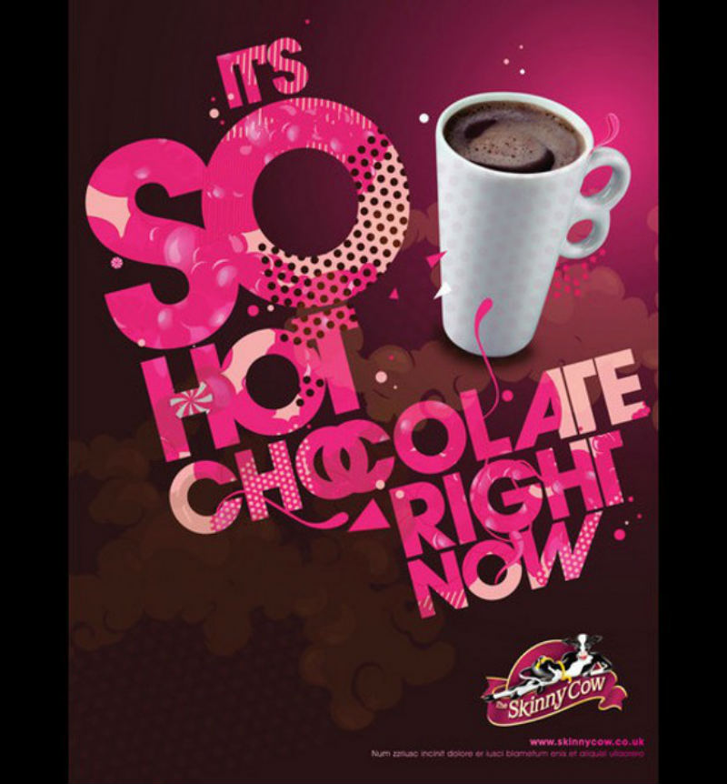
The varying font sizes and texture styles of this ad would’ve looked too busy. Thankfully, the coherent color palette, mostly pink like the logo, and the simple image of a hot chocolate mug all orchestrate to create a cohesive and attention-grabbing ad.
Regaine
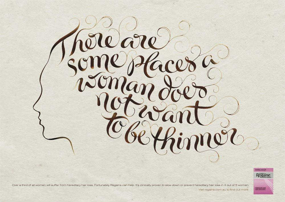
The simple color palette and the plain background of this ad make for a perfect canvas for an elaborate text style. The copy that says, “There are some places a woman does not want to be thinner,” is in a wavy font. It resembles healthy brown curls.
Sun-Rype

This ad from the food and beverage manufacturer makes for a refreshing and fruity visual. The material uses grapefruits to spell out the words of the copy. The idea resulted in a mostly yellow-orange text emphasized by the complementary blue background. A few pieces of grapefruit cut in half give the letters a little squeeze of vibrant pink hue.
Optimum Health

The ad for a fitness venture features a clever placement of the letters F, A, and T. The tagline that says, “When your desire lies somewhere in between,” is written in plain text. It also complements the visuals of the ad.
Dunkin’ Donuts
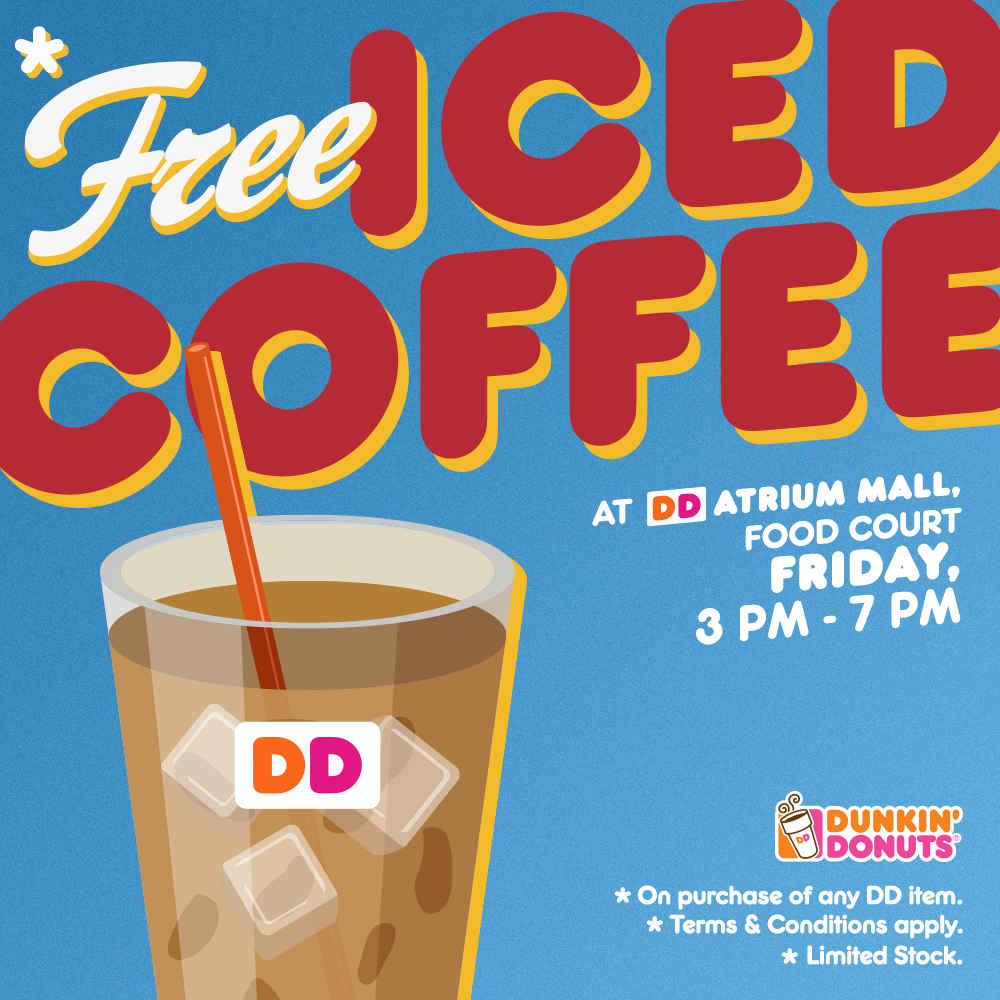
This ad from Dunkin’ Donuts looks retro, fun, and young, all at the same time. The red and yellow text that spells “iced coffee” is somewhat similar to the primary typeface of their name logo. The font of the word, “free,” looks like a script version of the main font. Its white color makes it stand out, immediately grabbing viewers’ attention.
Beetle Exhibition
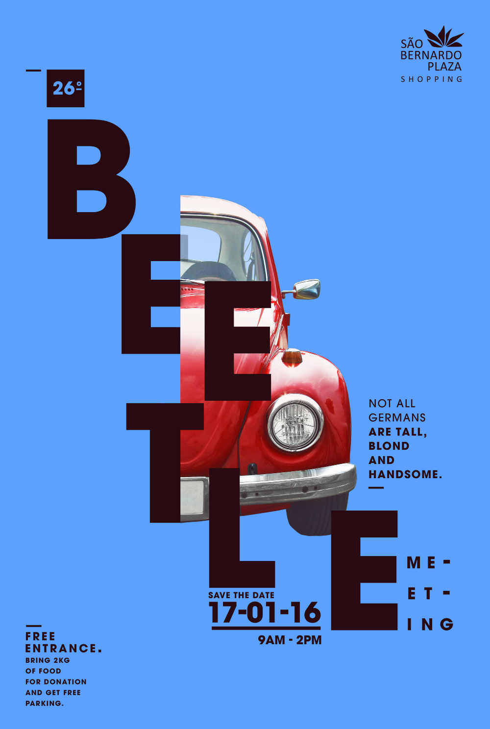
This poster for a Beetle Expedition in a shopping plaza features an eccentric text arrangement. It banks on contemporary appeal to spark the audience’s interest. The dark block texts and the sky blue background makes the ad look impressive. The excellent text style doesn’t take away from the main star of the visual material, which is the car itself (or half of it).
Arla

Shadows, placement, and color make this ad an exciting visual to look at. The primary copy which says, “good on a bagel or fingers,” are on strips of darker blue ombre. The images of a bagel smothered with cream cheese, blueberries, and a tub of cheese spread brings the ad to life. All the elements make for a vibrant ad that would make any viewer crave for a cheesy bagel.
Miller Lite

This typography ad from Miller Lite features classic but quirky font styles. It also incorporates the ad image into the text, with dominoes forming the letters for the word, “Phone.” The hands at the sides of the table reiterate the relatability of the ad for its target market.


