12 Website Layout Ideas That Will Attract New Users
A website is crucial for any business. No matter what industry it belongs, a website is the channel that initially interacts with its customers. Apart from your logo, your website design should communicate with prospects to convert them into paying customers. If your company website is still in the works, gather some website layout ideas to create an excellent one that keeps your prospects on the site longer.
To give you a headstart, here are 12 of the most excellent website layout designs you can take inspiration from. But before we scrutinize each one, learn why these 12 website designs are a cut above the rest.
What Makes These Website Layout Designs Stand Out

A company website is more than just a platform for customers to check your products or services. The site has a significant impact on how your target market sees your brand. For instance, if you have a website that takes too long to load, customers will be out of your homepage even before you know it.
Secondly, it has the power to communicate your branding. One look at your homepage and your audience can assess the kind of quality and company you are.
Lastly, your platform should be up-to-date with website design trends. Here are six trends that should give you an idea of how to design yours.
Right Use of Colors
Using the right colors is vital for brand recognition and relevance. Colors evoke a person’s mood, feeling, and behavior. Check out this color psychology guideline.
White Space
White space or negative space is often used in website design to make for a clean and uncluttered look. It’s also an excellent way to relax the eyes, especially if a lot of information is on your site.
Navigable
One way to attract users is to make your website navigable. Use the three-click rule to let users find what they’re looking for in three clicks. Always design with the users in mind.
Call to Action
A website without a call to action will never be able to lead users down the sales funnel. Always make sure you make your call to action evident on every page of your site. That way, your customers will know what step to take next.
SEO-Friendly
SEO (Search Engine Optimization) is organic advertising that gives your brand vast marketing mileage — if done the proper way. Here’s a guide on how to make your website SEO-friendly.
Mobile-Friendly
Half of the internet’s traffic is all because of mobile browsing. Since people will be browsing on their mobile, ensure that your website is optimized for mobile speed. Check your site regularly using mobile-friendly tools.
12 Website Layout Ideas that Attract Users
1. Apple
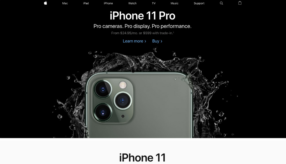
Apple’s website has sophistication and quality written all over it. The brand mainly uses black, white, and grey as their primary colors, apt for the brand’s quality products.
The website design is clean and straightforward and has enough white space that’s pleasing to the eyes. Lastly, the brand has concise product descriptions that hook customers instantly.
2. Grammarly
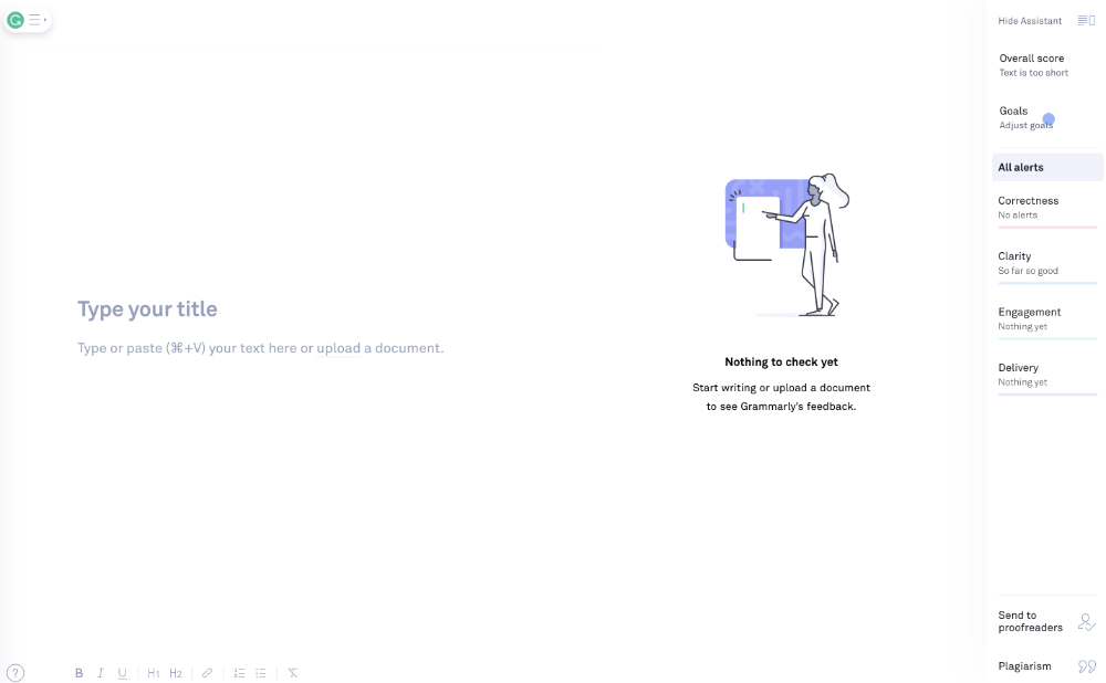
Grammarly’s application has one primary element that attracts even the most computer-illiterate user — simplicity. When you get to the main page, you get four menus on the left and an option to upload a document on the right. Once you start using the editor, it gets even simpler that anyone will be compelled to use it.
3. HubSpot
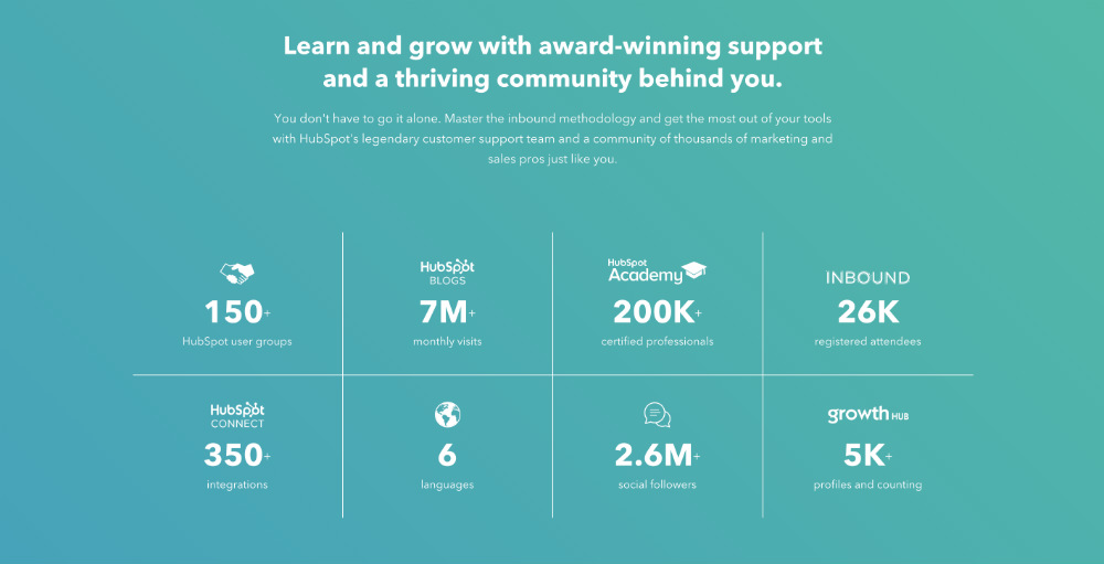
HubSpot has combined vibrant colors to show off their friendly and approachable branding. The layout is also simple, with a couple of menu options. Once you hover your mouse over the options, a set of categories and subcategories emerge. But their brilliant idea of showing concrete data also makes their website appealing to users.
4. MailChimp

Using social proof is also one way to convert leads to subscribers. Aside from its uncluttered website design, MailChimp utilized testimonials from its clients to increase the credibility factor.
5. Forbes
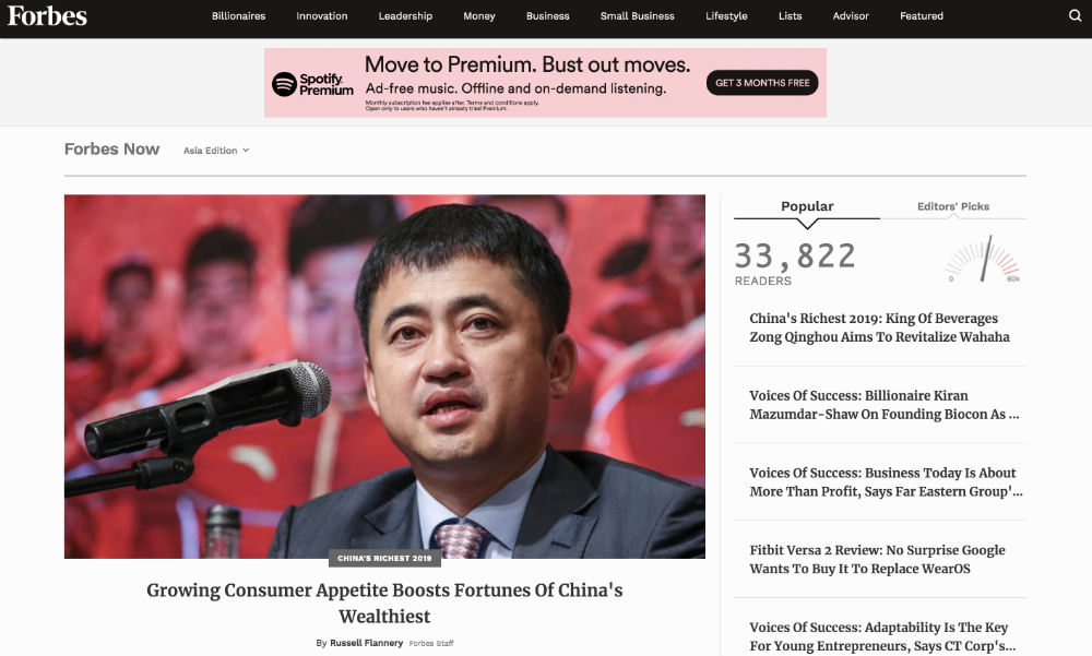
Forbes displays all the trending articles on the right side of the homepage, and they’ve categorized this into two. One is the popular articles with a real-time number of how many readers they have. And the other one is the editor’s picks with a gauge on how hot the topics are. Also, they have all the different categories on the header for their reader’s choosing.
6. Penji
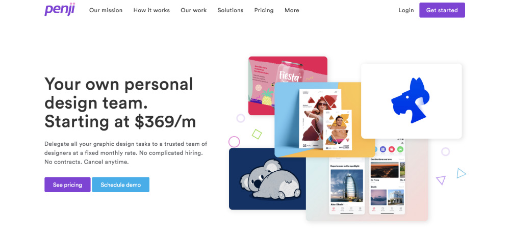
What sticks out from Penji’s website is the call to action. Once you land on its homepage, you can quickly move onto the next steps depending on your preference. Either check the company’s pricing or schedule a demo. Nonetheless, both are effective in increasing conversions.
7. Shopify
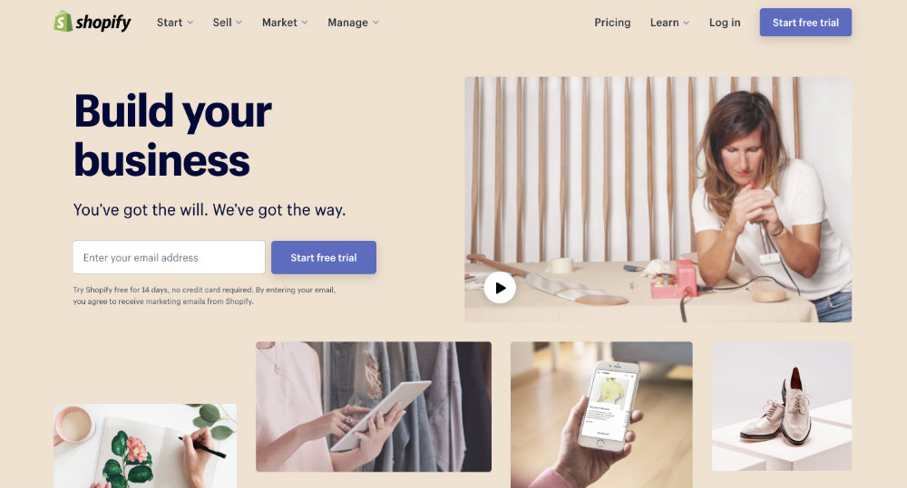
Building an eCommerce store from scratch can be daunting. But with Shopify’s welcoming homepage, it can be as easy as typing your email and trying it out for 14 days. You also get detailed instructions on features, benefits, and steps on how to start your online store.
8. Slack
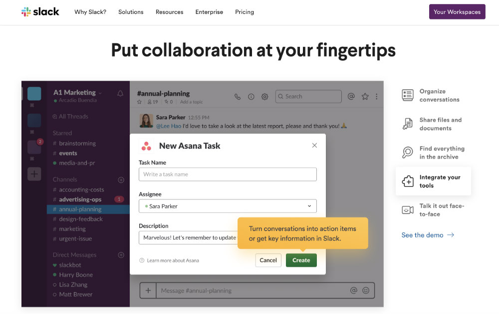
Slack’s website displays their product’s interface in a slideshow format. It changes from one screen to another while providing highlights of the various benefits if businesses subscribe to their service.
9. Fitness Blender
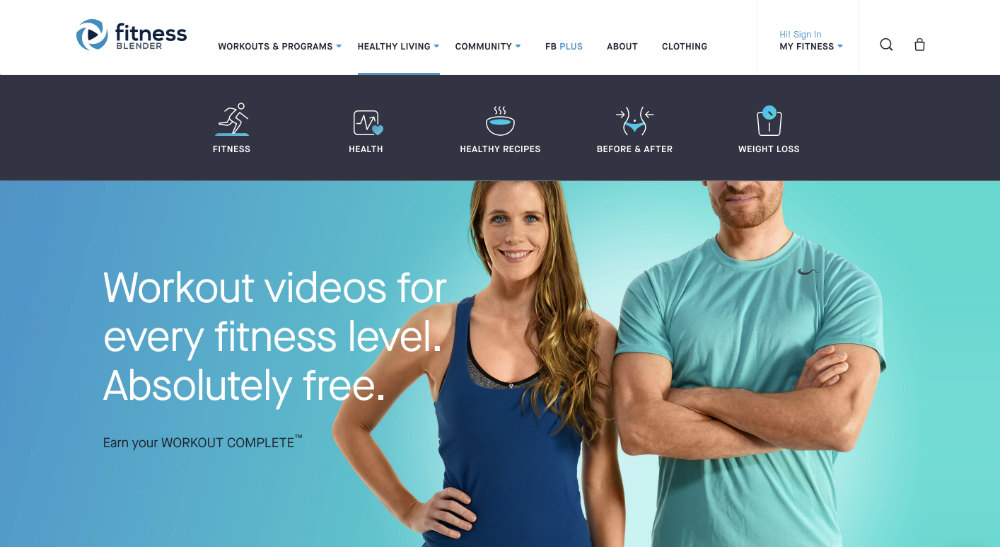
Icons are also another way to capture users’ attention, especially with their declining attention span. And Fitness Blender utilized this in their menu options. Once you hover over them, you get these icons as subcategories. The different hues of green and blue are also akin to the brand’s healthy advocacies.
10. Airbnb
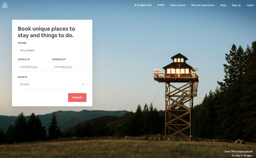
Airbnb is the perfect example of conciseness from all the other website layout ideas on this list. Once you visit their site, you instantly get options to help you find what you’re looking for. This is a user-friendly marketplace that caters to different audiences.
11. Amazon
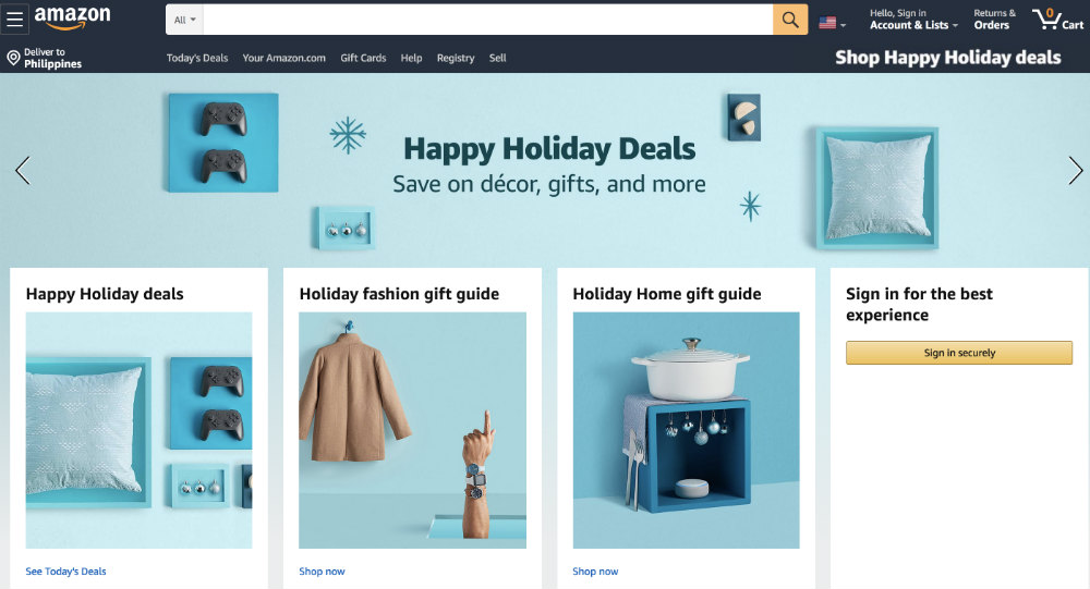
I love how Amazon’s versatile homepage keeps up with recent events, occasions, and whatnot. Currently, it has a fresh, light teal color, perfect for the upcoming holidays. It has a rectangular carousel that features different products and a stationary collage with product images, as well. On top is a search box with a drop-down button on the left side where you can browse by categories.
12. Asana
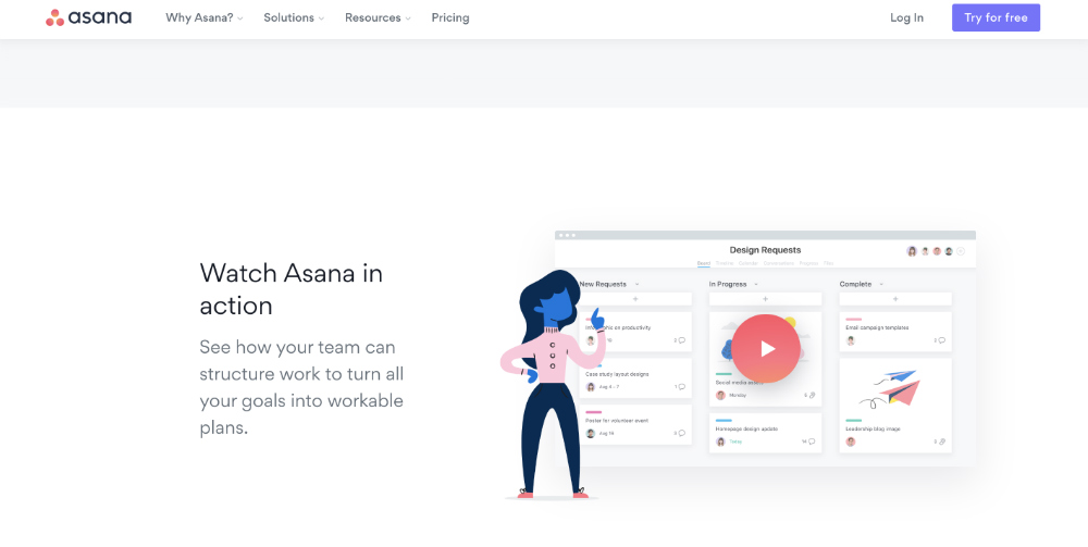
Asana is a task management software that helps remote teams collaborate and organize projects. Their layout is one of the most navigable website layout ideas. It’s simple with an all-white background. However, they’ve managed to make it easy for users to understand their services by including a clip on top. Plus, they followed it up with a step-by-step video guide on how to use the software.
Wrap Up
These website layout ideas and tips should be enough to let you create one that matches your brand. If you feel it’s a colossal undertaking, hire the best graphic designers and web developers in the industry. After all, a website can make or break your conversions, so it’s just right to spend money to earn money.


