Boost Your Conversion Rate with These Landing Page Best Practices
Many businesses online use landing pages as a way to capture leads or promote products or services. It’s an effective way to boost conversions as well. It’s a tried and tested method, and many are following suit. If you want to get the leads you need, you need a good landing page design to boot. So, that’s why we enumerated 15 landing page best practices and examples to inspire you in creating your landing page.
1. Keep It Simple

You wouldn’t want everything cluttered or clustered in one place. Use up the space while respecting the principle of negative space. Make sure there’s room for the prospective customer to view all the images and text without overwhelming them.
If you’re using forms for your landing page, make sure that it’s placed well so that it’s not too close or too far from the primary copy.
Check out this example from Optimizely. It’s not fussy, and there’s no other elements but the copy and the illustration.
2. Remember Negative Space
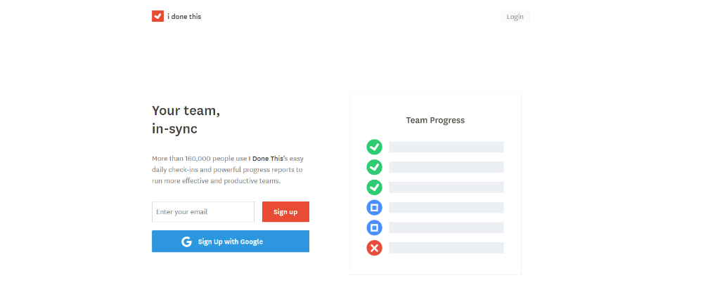
In any graphic design, you should always remember negative space.
Negative space can make the landing page design look clean. Through negative space, you can follow a visual hierarchy as well, which can help you present the elements of a landing page better.
In some cases, simplicity is related to negative space. Many landing page experts advise that simplicity is a plus in landing page conversion rates. You don’t want cluttered landing pages. Get straight to the point, remember the landing page essentials, and make negative space your friend.
Here’s an example from I Done This. You can see how compact its landing page is. As you can see, it’s readable due to the spaces between the elements. That way, the visitor can focus on that area.
3. Follow a Layout
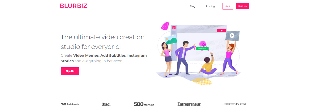
To emphasize the previous point, following a layout can guide you to which elements you should place on the landing page. That way, the visitor can be guided accordingly through the copy, images, links, and the call-to-action (CTA) button. According to Instapage, you can follow either an F or a Z layout.
As you can see from the Blurbiz example, they follow an F layout. Following the guideline provided by Instapage, you’ll read the header first, and then your eyes follow the landing page. From there, you read the copy horizontally until you see the CTA button.
4. Use Color Contrast
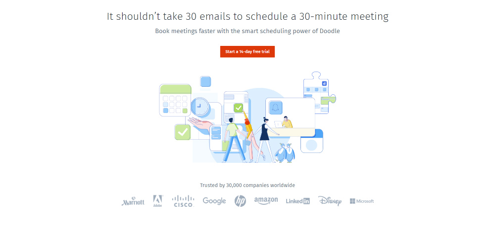
You want a landing page design to stand out once it’s loaded. You don’t want a prospective customer closing their tab on the website. To keep them on the page, you’ll need to play with the colors. To do that, make sure there’s color contrast.
Color contrasting works well if your CTA button has a different color than the prominent colors on the page. Say the page is white, then the CTA should stand out by using a bright color. That way, you draw your visitor’s attention to the CTA button subtly. It’s one of the recommended landing page best practices by many experts.
To capture the attention of audiences, Doodle used a red CTA button for their landing page. That way, it’s prominent, and it’s one of the first things a visitor views.
5. Implement Color Psychology
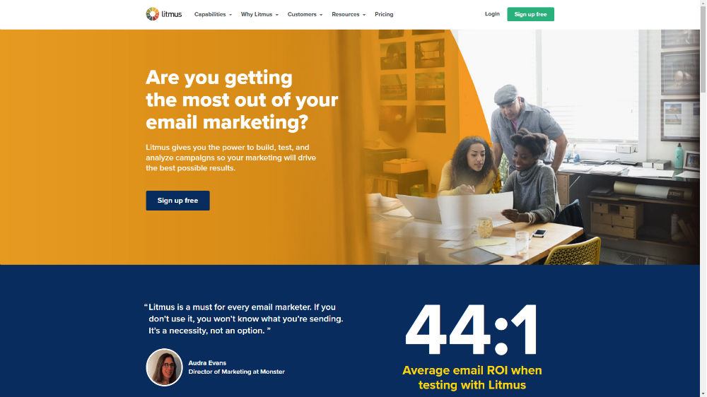
One of the cool things about having a landing page is that you don’t have to adhere to your brand’s color scheme. That way, you can focus more on the messaging of the landing page rather than follow your brand’s colors.
You can use color psychology to entice your visitor to take action. Specific colors can evoke emotions. Like red with passion or green with peace.
Here’s an excellent example from Litmus. As you can see, they use blue for the CTA button. It stands out against the yellow in their header image, which then complements the blue. It seems Litmus wants its visitors and eventual customers to trust them not only through the CTA but the additional information peeking at the bottom as well.
6. Add Hero Images
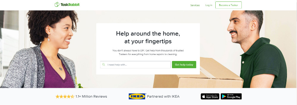
Images also create a significant impact on boosting conversation rates. Hero images are not only just photos of the product or service offered by a company. It’s also a visually appealing photo that can capture the audience’s attention. Make sure that the image is high-quality that way, it’s not off-putting for those who check out your website.
To demonstrate that, check out how TaskRabbit uses a hero image for their landing page. It’s an example where they make their employees the hero of the website.
7. Design illustrations
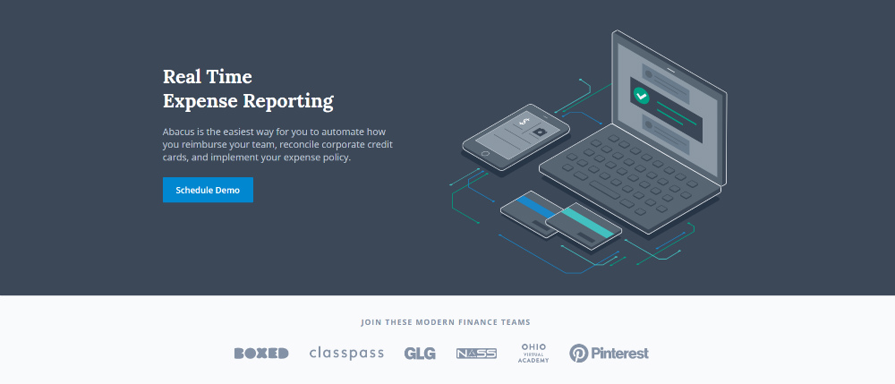
As an alternative to images, you can use illustrations to captivate your target audience. Many experts recommend illustrations as part of landing page best practices too.
Isometric illustrations are an excellent example to make something look 3D. According to Carrie Cousins from Design Shack, it blends flat and depth, which creates an exciting combination when done correctly.
It doesn’t have to be isometric, so long as it’s an illustration that looks well and is a perfect fit on the page.
Check out Abacus’s landing page. They use an isometric illustration to present how their software works. It’s a simple illustration, but it helps visitors get an idea of what the software does for their company.
8. Lead with Directional Cues
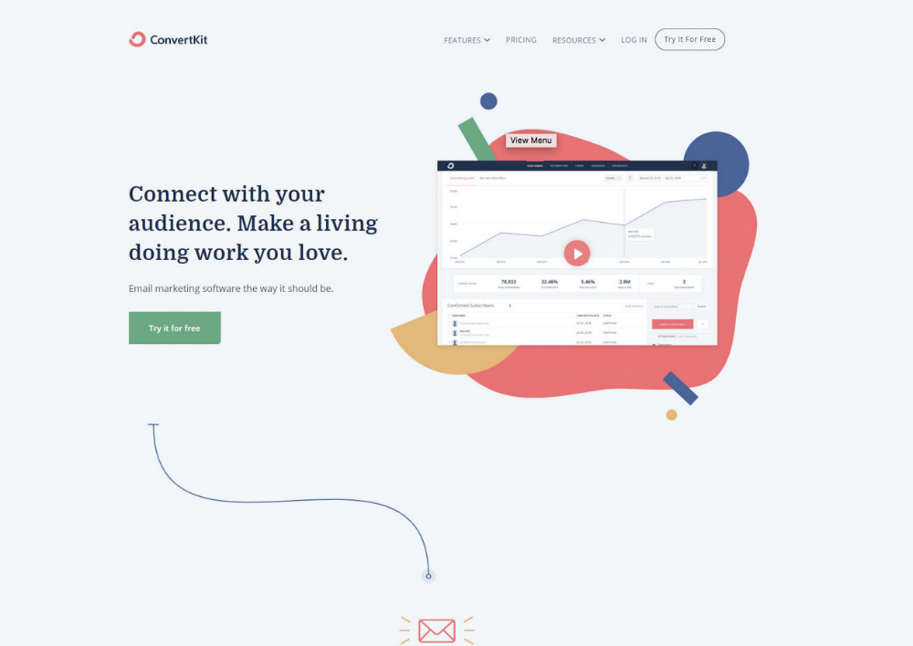
A directional boost could lead a visitor to look where you want them to read or click. That way, you’re letting them stay on your page as you lead them to what you want them to do. In some cases, the directional cues could guide the visitor to a funnel.
You can use the following elements to lead visitors to a specific direction:
- Arrow
- Play button
- Pointed items
- Lines
A great example of this is from Convert Kit. They use lines to guide the customer to the end of the page to get an idea of what Convert Kit is and how it works.
9. Optimize on Mobile
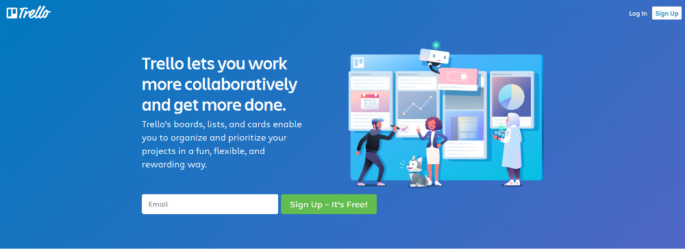
Don’t forget to make a landing page that would also look good on mobile.
In 2017, CIO Dive reported that 70% of internet traffic came from a mobile phone. So, expect that more visitors would use their smartphone to access a website. That’s why you should optimize your landing page for smartphones. That way, no elements look distorted, or people don’t have to zoom in or out to view the whole page.
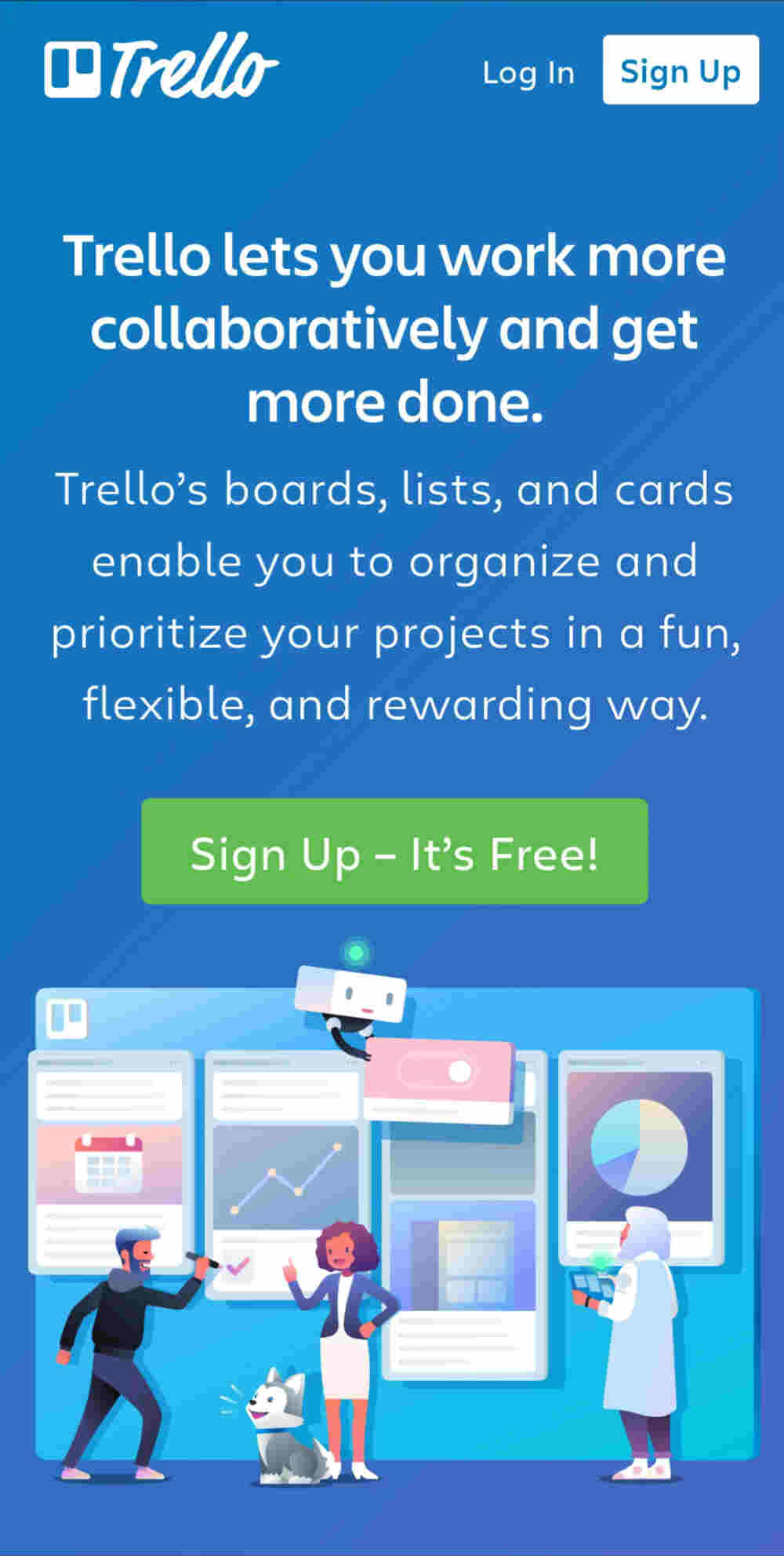
Trello’s desktop and mobile pages follow the same design. Trello optimized the landing page to its mobile, which means they follow landing page best practices.
10. Spruce Up the CTA Button
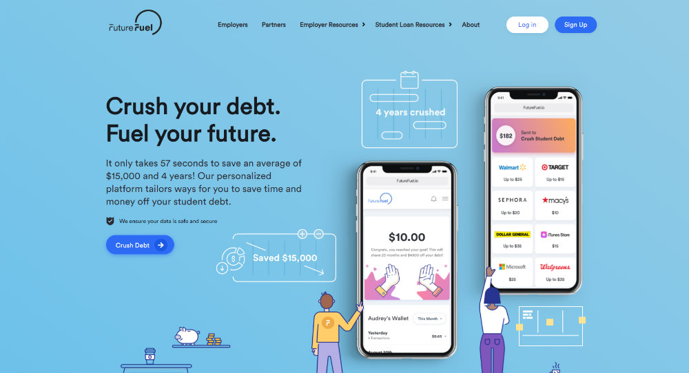
The CTA button is an essential element. Without this, you may not convert your customers.
Your CTA button doesn’t have to look like a rectangle that asks you to do something. You can make it oblong or add an icon on it. Don’t stick with traditional buttons. Make it visually appealing to the visitor.
Future Fuel diverts from the usual triangle CTA button and uses a rounded-edge. They also add an arrow inside the CTA button, which leads them to the next page for new users to sign-up.
11. Mix it up with A/B testing

You don’t want to get stuck using one landing page design. It’s a way for your company to see which landing page design works and how many convert by using one or two. It’s one of the most suggested landing page best practices because it helps in knowing customer behavior and why they convert as customers.

Upwork uses different images whenever you load their page. It’s a way also to put the spotlight on top talents too. It’s a technique many businesses use when doing A/B testing, and they do it well.
12. Apply Segmentation
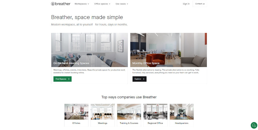
Another alternative in creating illustrations is using an image associated with your target audience. You’d want your target audience to connect to your company immediately. By doing that, you need to post a photo that speaks to your audience. It could be a person of your target demographic or the best selling product or a place associated with your company.
Here’s an example from Breather. It’s for those looking for workplaces. You have two options. You can choose to have on-demand meeting spaces or monthly office spaces. They give you an option from the start, and you can immediately determine what you need on the get-go.
13. Make Data Stand Out
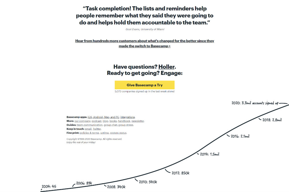
One of the most recommended landing page best practices is to add social proof. Crazy Egg recommends adding actual data on the landing page. It’s a sure-fire way for the visitor to get an idea of why this product works and how effective it is.
Numbers do have an impact on a copy, but you can convert numbers into an image. Use graphs or charts. It would be easier to digest those than just putting plain numbers.
Check out Basecamp’s landing page. The data isn’t located above the fold (the upper half where all the essential information goes), but it’s at the bottom. There, you see how they graphed the number of sign-ups. It’s a great way to see its progress and how many people put their trust on the platform.
14. Include Badges or Icons
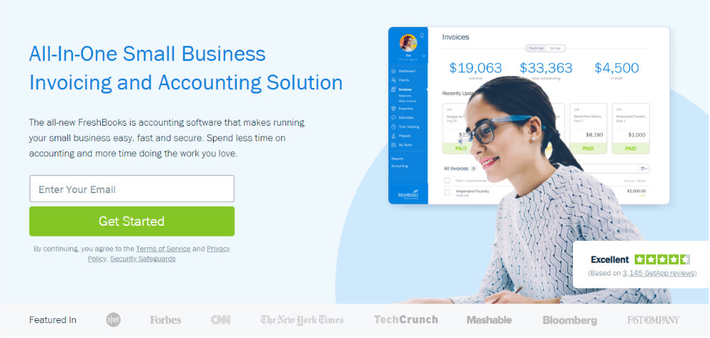
Another way to add social proof is to add badges or icons on your landing page design. Icons can help in making things interactive. Badges, on the other hand, can also add some credibility like an award the company won or used by the top companies in the world.
Check out FreshBooks’ landing page. On the bottom right of the landing page, you see a badge that indicates the performance of the software for its users. It’s a great way to show social proof. Not only that, but they also included logos from CNN, Mashable, and Forbes since those outlets featured the software.
15. Take Note of Typography
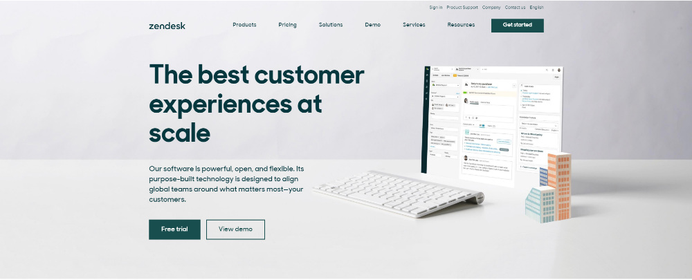
What’s a landing page without a copy? It shouldn’t just be an image and a button. To entice your target audience, your font should complement the overall landing page. For the heading, you need a powerful font. You want to stand out and make sure that from the heading alone, you’re capturing your lead and eventually convert them.
As suggested by experts, use two to three typefaces only. Not only does it follow a visual hierarchy, but it’s also readable, as said by Denise Villanueva.
Here’s Zendesk’s landing page. They use a rounded-edge font all throughout the landing page. It’s consistent and readable. They used a bolded header, so it’s readable.
Need a landing page for your small business or startup? Look no further because Design Doctor can do that for you and more. A team can design your website, flyers, posters, and even your logo. You don’t have to worry about the cost because you can request all your design deliverables for a flat monthly rate of $329.


