25 Ecommerce Website Design Examples You’ll Want to Copy
To get visibility, many ecommerce stores have set up their websites so customers can find them. To keep visitors on the website, however, it’s necessary to have an ecommerce design that will make them navigate on the site more and eventually buy products.
Some ecommerce stores follow a similar pattern in designing their websites. Since there are templates readily available, ecommerce stores need to stand out among the crowd regardless of their industry.
In this article, we take a look at 25 ecommerce design examples, and perhaps you might get some inspiration from these stores.
1. The Modern Shop
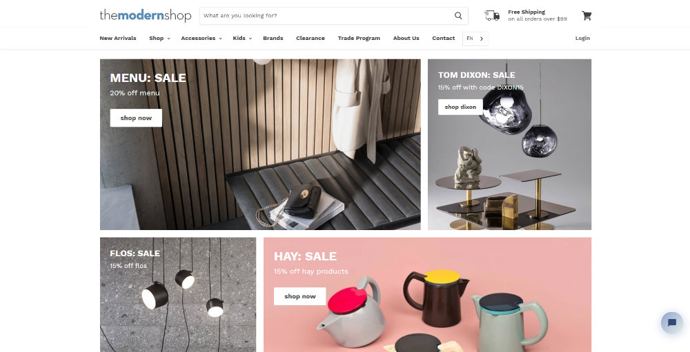
The Modern Shop is a Canadian-based furniture retailer. You would see from the get-go grids of different shapes. It’s easier to identify which categories are on sale. It also contains sections of their favorite items, a featured furniture brand, and Instagram photos.
The website uses whitespace well, and it doesn’t look cluttered at all. Not only that, but they also use around two to three typefaces to stay consistent with the clean design.
2. 18Karat
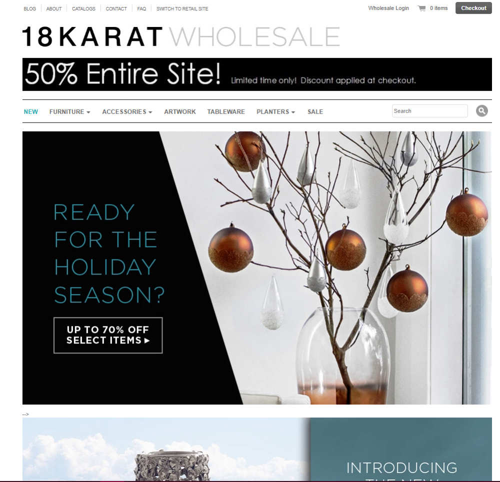
18Karat manufactures and sells its furniture. You’ll see the symmetry in their website, which will make a visitor focus on the sections of the website.
However, they do practice some asymmetry and grids in their graphics too, which follow design trends. There’s subtle overlap on the homepage also, which is another trend followed by many.
3. Made
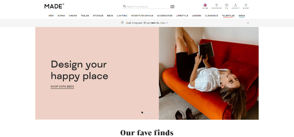
Once you open the Made website, you can already get a preview of their products. You’ll also notice the serif as a header, which is consistent on the site. The sans serif, on the other hand, is used as a sub-header and the main copy too. The website also follows whitespace, which makes it easier to navigate the site.
4. Hauser
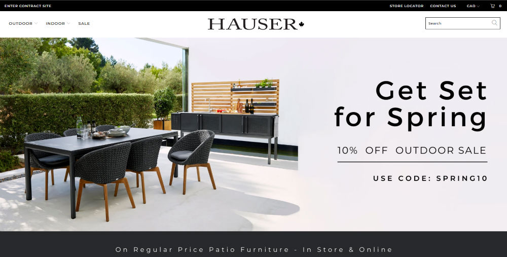
Taking notes from trends, Hauser also uses a high-quality header image to captivate the visitor. On the side of the header image, you’ll notice visual hierarchy in the way they present their sale text.
The further you go down the homepage, you’ll notice their use of white space to indicate organization as well. Overall, the ecommerce design on the website looks neat and clean.
5. Norwegian Rain
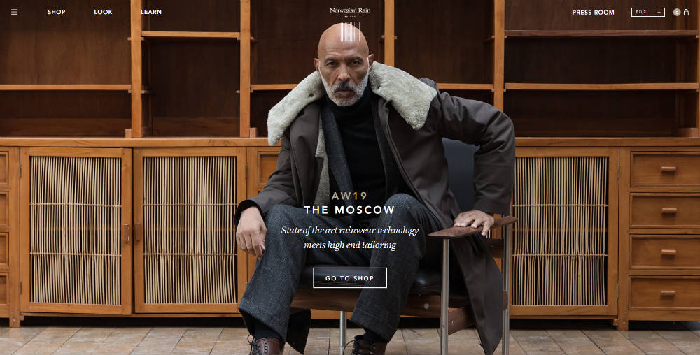
Despite having rain in their name, Norwegian Rain has an earthy colored web design to match the clothes as well.
Once you open the website, you’ll see a hero image, where a model wears one of their designs. When you navigate further on the homepage, you’ll see an illustration of the layers of their clothing to show its breathability and waterproofing capabilities. Following best practices, they also use two typefaces for the ecommerce design of their website.
6. Everlane
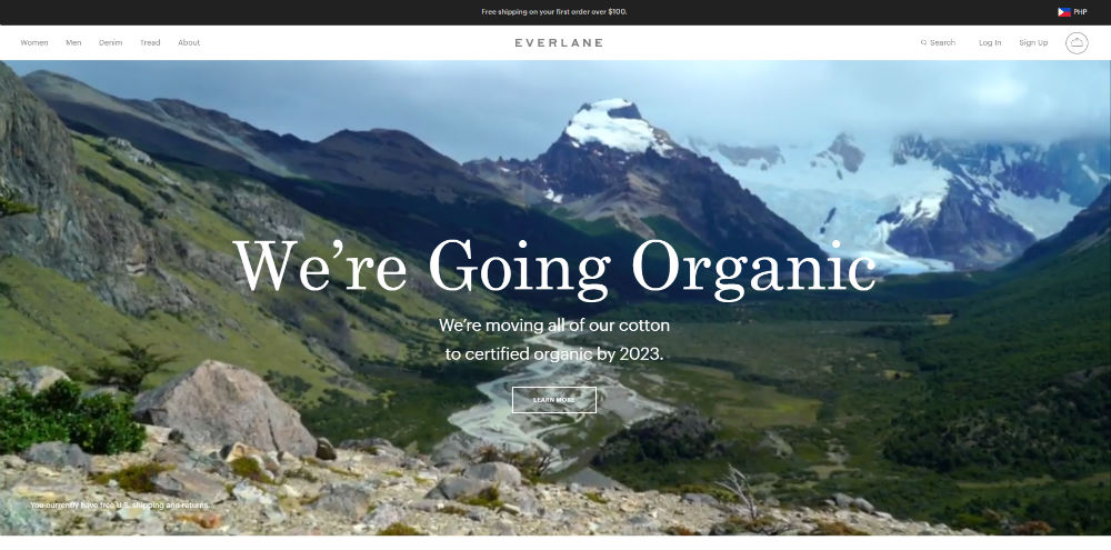
The header on the Everlane website shows a video of nature demonstrating their commitment to going organic.
Video is another alternative to use as photos for website designs. As you browse the website, high-quality images add to the visual appeal of the website. It’s a great way to attract visitors to see the products better too.
7. Harper Wilde
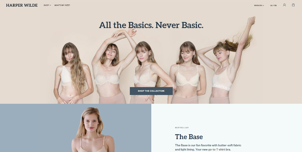
Harper Wilde produces everyday affordable bras that aim to empower women when they wear their intimates.
The use of muted and pastel colors make it pleasing to the eye. The typeface is consistent in different webpages as well. They also use a grid system on the homepage to organize their website better.
8. Esqido
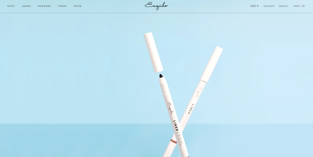
Directional cues can help the visitor browse the website, and Esqido incorporated it for their ecommerce design. It’s only one, but it can lead the visitor to where you want them to go.
As you explore their homepage, they also have a grid system like other websites do. It makes it easier to navigate because of how organized their website is.
9. Sunday Somewhere
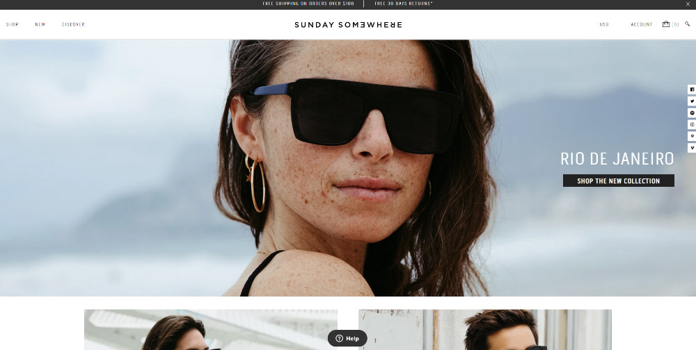
Sunday Somewhere produces and sells sunglasses. The homepage for the site lets a visitor scroll a few times only, reducing any clutter.
They also have a segmented audience section, so it’s easier for visitors to navigate the site. A scrollable bar is present on the homepage as well to show recommended styles.
10. Light Box Jewelry
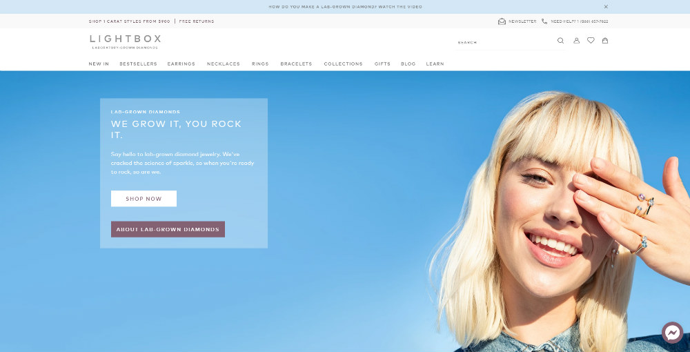
Light Box Jewelry produces lab-grown diamonds. So for their website design, they use pastel colors throughout to match the colors of their diamonds. They also use overlaps in their homepage, which is a growing website design trend. Plus, the typeface is consistent on every page too.
11. The London Sock Exchange
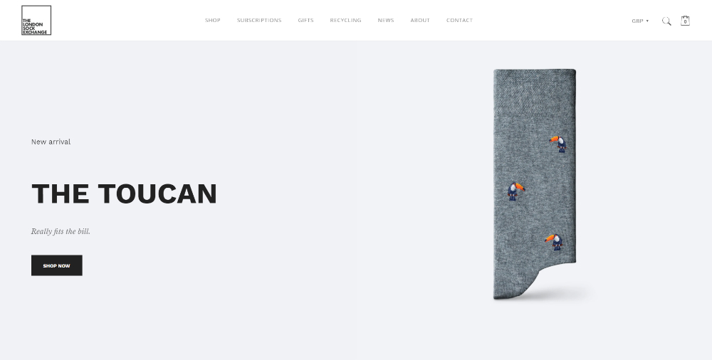
One of the coolest parts from the London Sock Exchange website is the transition of the featured socks as you scroll down. It’s an impressive feature because it makes scrolling down seamless. You can also see a preview of their sock collection as you scroll down further. Overall, the website seems to lean on the minimalist side, and it looks good.
12. Sole Rebels
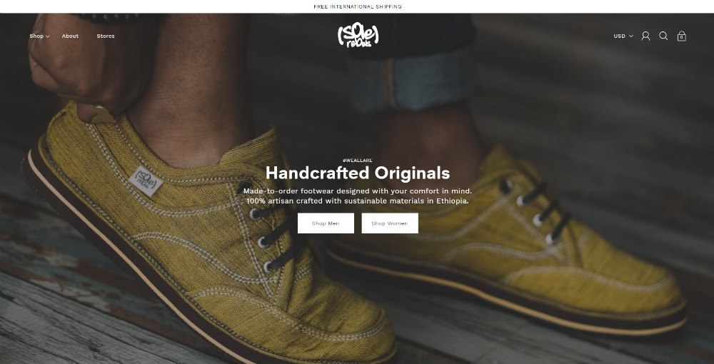
The Sole Rebels website also follows a grid that arranges their sections neatly. They use both rectangles and shapes to feature products, so it gives it some asymmetry.
They use a Sans Serif font that’s consistent to give the website a clean and simple look.
13. MVMT Watches
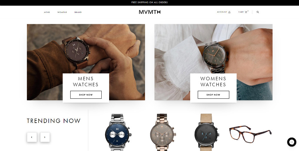
Both the watches from MVMT Watches and its website follow sleek and elegance. They also use segmentation above the fold; this allows visitors to get a more personalized shopping experience on the site.
On the homepage, there’s not much scrolling. However, the header is a sticky page, so when visitors reach the bottom page, they can explore further on the website.
14. WP Standard
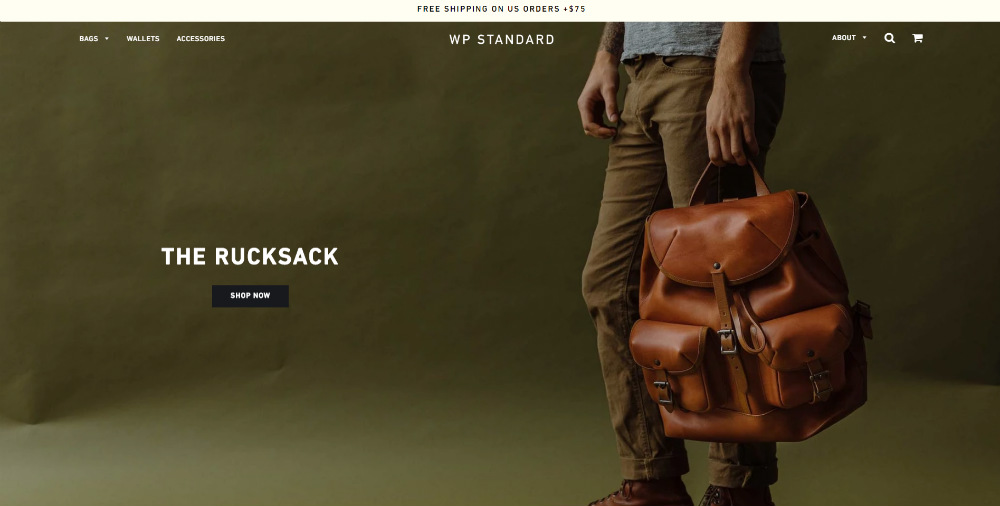
Following suit from other websites, WP Standard has its product on display once you open the site. It’s a practice many do to provide a preview of what their product is.
As you check out their site, you’ll see there’s a minimal copy, allowing the products to shine on their homepage. Their minimalist approach works well with the responsiveness of their site too, which is a plus for many experts.
15. Bellroy
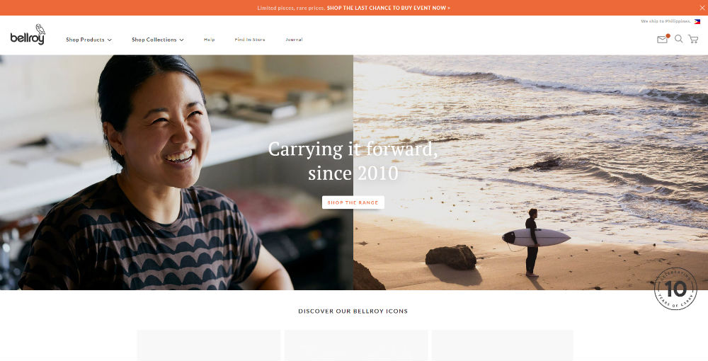
Bellroy uses a split-screen type of header, but they mix up the photos, unlike other websites. It’s to show their range of products. Scrolling down, you’ll notice they follow a grid system to keep the site organized as well. They paired serif and sans serif fonts as well, which when done correctly can make the right combination. In their case, they did a great job of doing so.
16. Smashmallow

Smashmallow creates healthy gummies and cookies for everyone. The website is one of the best ecommerce website designs on the list.
The use of animations makes it very interactive for the visitor. The pastel colors are pleasing to the eye too. While the illustrations look cartoony, it could still become a delight for kids (and the kids at heart).
17. PipCorn

PipCorn has a similar type of ecommerce website design with Smashmallow.
The difference lies in the organization of the homepage. On the homepage, you’ll see they adopted asymmetry and overlaps to follow graphic design trends. It also uses a geometric style that, when done right, looks good on a website. PipCorn did well in that.
18. Press London
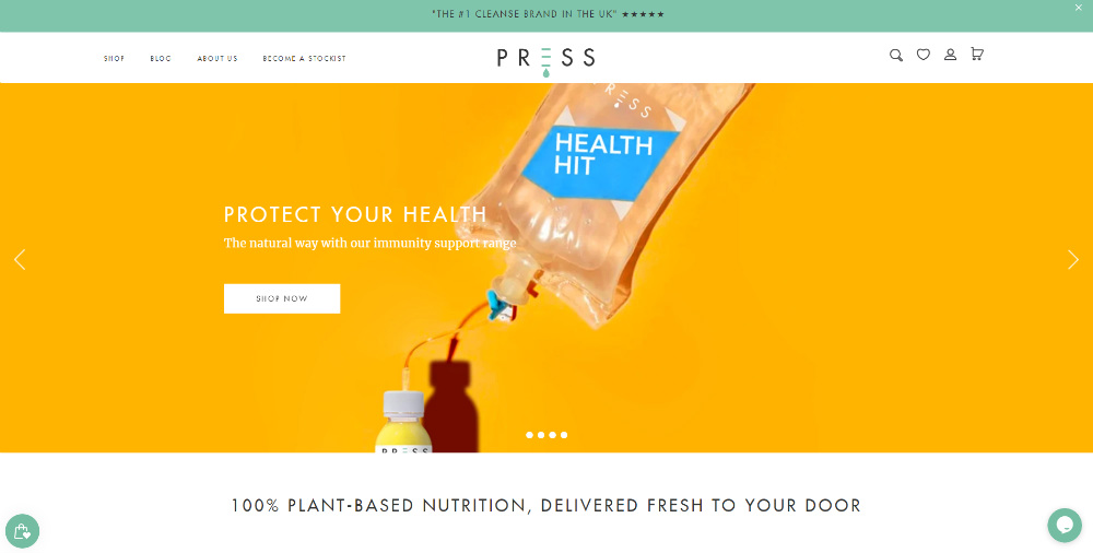
Press London produces cold-press juice for healthy living. For their header photos, they have a scrollable bar where you can check out different images, with the last picture being an animation. When you scroll, they present their website with grids where you can choose the detox plan you want to do.
19. Capellos
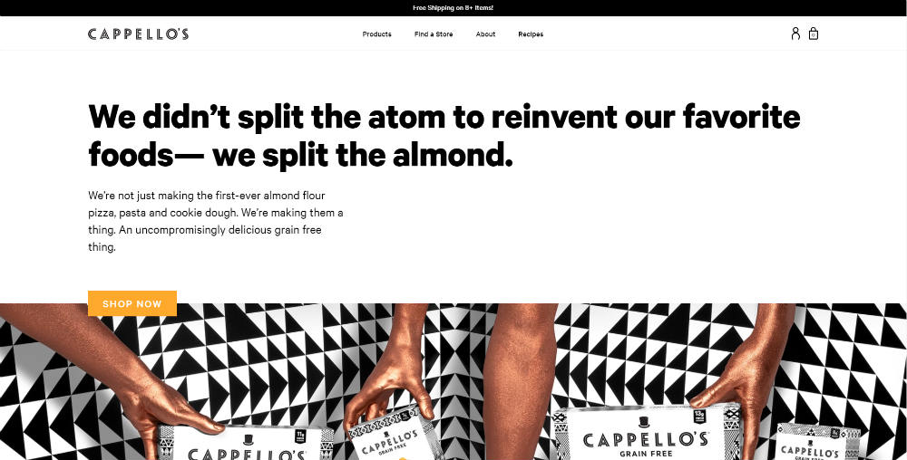
Cappellos reinvented frozen food and other Italian dishes to make it healthier for customers. On the website, you’ll see patterns in the photos. Patterns look hypnotic in that they capture the audience’s attention and make them look at the pictures. Plus, they also used big fonts to keep your focus on their homepage.
20. Simply Gum
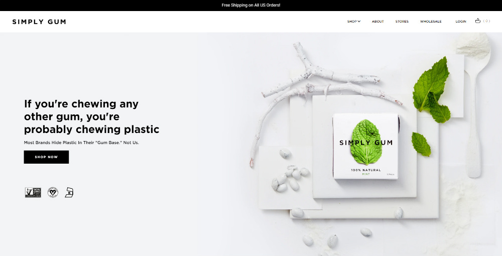
On the Simply Gum website, you can swipe left to right. They featured their bestseller and their newest product. Scrolling down, you’ll see social proof (i.e., Buzzfeed and Vogue), which adds credibility to their product.
For those interested and are environmentally conscious, Simply Gum added their commitment towards safe environmental practices in creating their products. Plus, you can go back to the top by pressing the Top button found near the footer.
21. Heath Ceramics
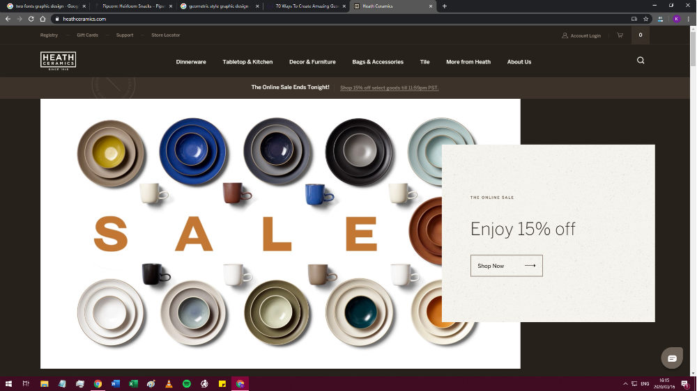
Above the fold, you’ll see that Heath Ceramics has a 15% off sale for some products. The ecommerce design radiates sleek and elegance as you scroll down and check out other pages too. It’s how they present the brand to its customers also.
22. Hello Lucky
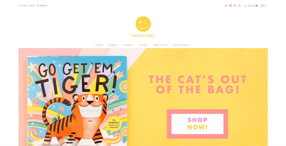
Hello Lucky is a design studio focusing on designing greeting cards and book covers. Their values (positivity and creativity) reflect their ecommerce website. The bright colors will draw the visitor’s eyes towards their products.
23. Telegramme
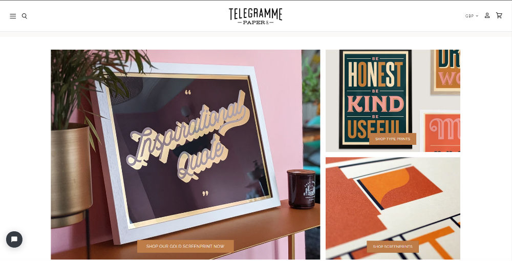
Telegramme creates and produces personalized prints. Once you load their website, you’ll see a preview of what their products and designs look like.
You can also check other card designs when you scroll down the homepage. They even have a photo of what the card creation process looks like. The homepage seems organized thanks to the grid system.
24. Myro
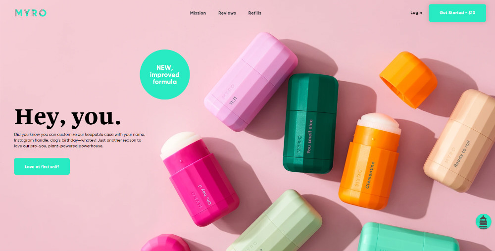
The large photo and the “hey you” phrase help pique the interest of the visitors on the Myro site. Like others on this list, they use icons to visualize the copy of their product.
Below the fold, they used animation instead of an image to show how their product works. They also use pastel to keep it visually appealing and easy on the eyes. Not only that, but you’ll also see their signature green on their website which indicates branding.
25. Clare
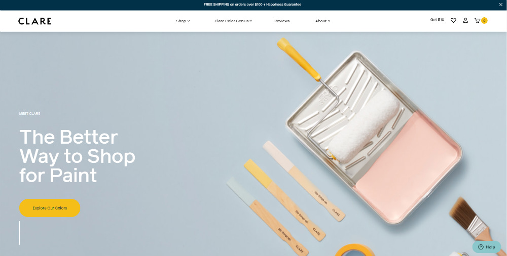
Clare offers paint and supplies for its customers. As you browse the website, you’ll see they use blue and green hues all around, indicating consistency. It’s also a way to give a sense of calm for the site visitor too. They also used high-quality photos that could entice the visitor to learn more about the products.
If you need a clean and well-designed website for your small business or ecommerce store, look no further because Design Doctor can help fulfill that need. Design Doctor will not only design your website, but you can also request other graphic design assets. You can ask for logos, flyers, and other collaterals monthly at an affordable rate.


