11 Best Ecommerce Website Design Examples You Should Copy
From the user interface, user experience to navigability and ease of checkout, website design is the lifeblood of eCommerce. With around 24 million eCommerce stores worldwide, online sellers must create the best eCommerce website design. If you’re an aspiring eCommerce entrepreneur, web designer, or online shopper, these eCommerce design examples will undeniably impress you.
1. Apple
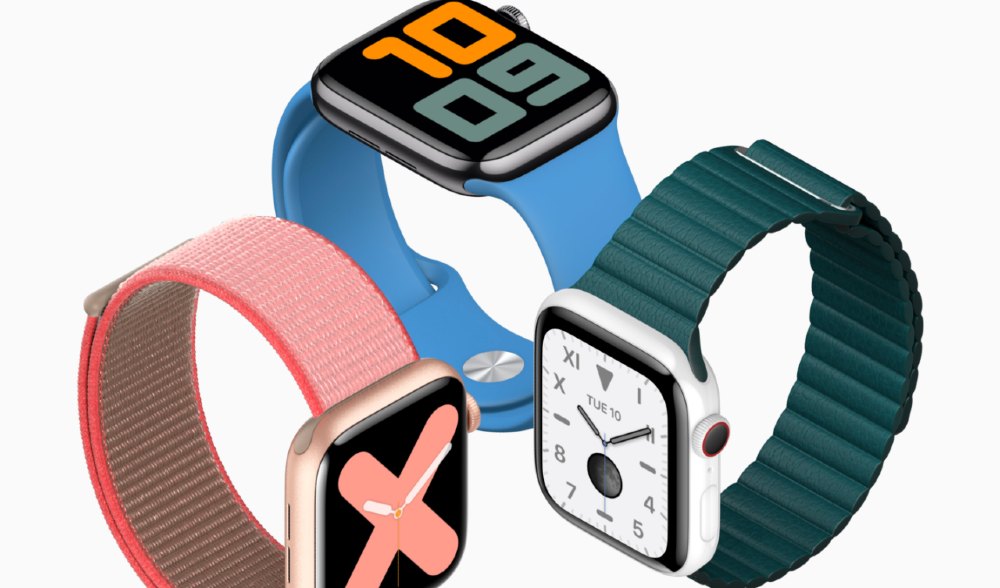
When it comes to sophisticated designs, Apple beats the rest of the competition. Apple has the best eCommerce website design in terms of visuals. Apple features its products front and center through quality hero images.
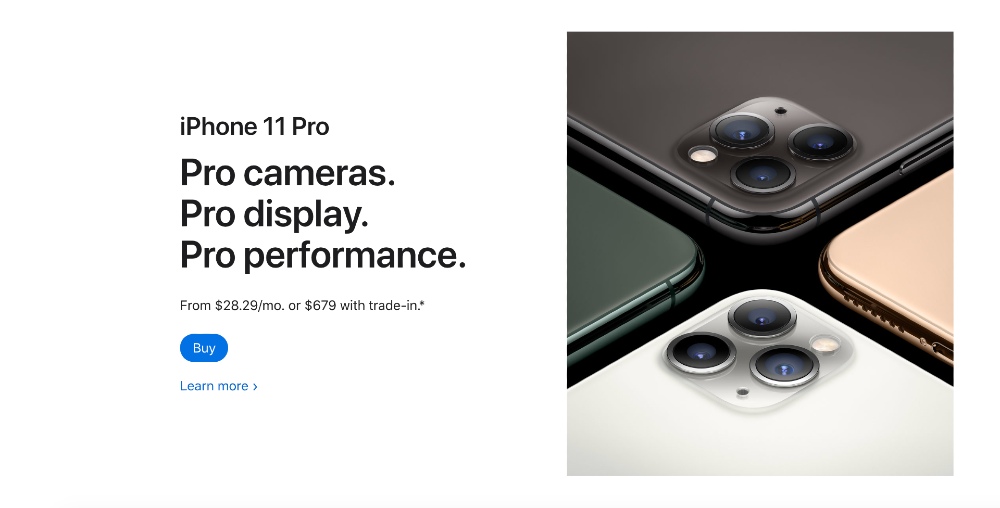
Plus, the brand’s no-fluff copy is also a trademark. The copy enumerates each product’s features and the price underneath. A beautiful snippet of the product also accompanies the copywriting. Lastly, a call to action sits evidently on a plain, white background.
2. Satorisan
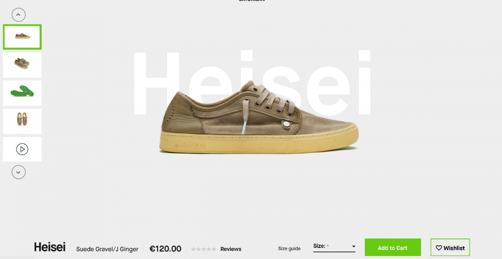
One of the goals of online sellers is to provide a seamless shopping experience for their buyers. For this reason, a navigable checkout process could mean the difference between adding to cart and abandoning cart. Satorisan has a clean checkout page with the product photos taking the spotlight. The product name is also behind the image, which deviates from the typical product labels.
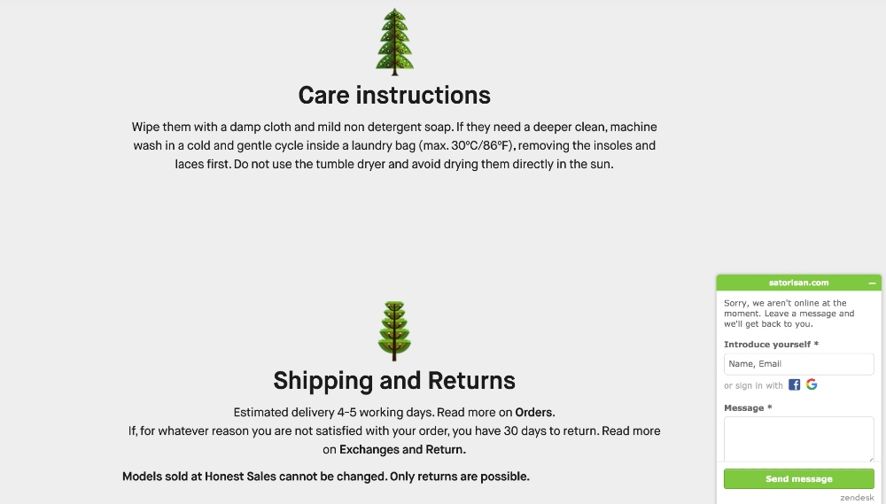
The brand also numbers the features and benefits, presenting each with accompanying images. Plus, the live chat feature is on every page, ready to answer any customer query.
3. Ratio
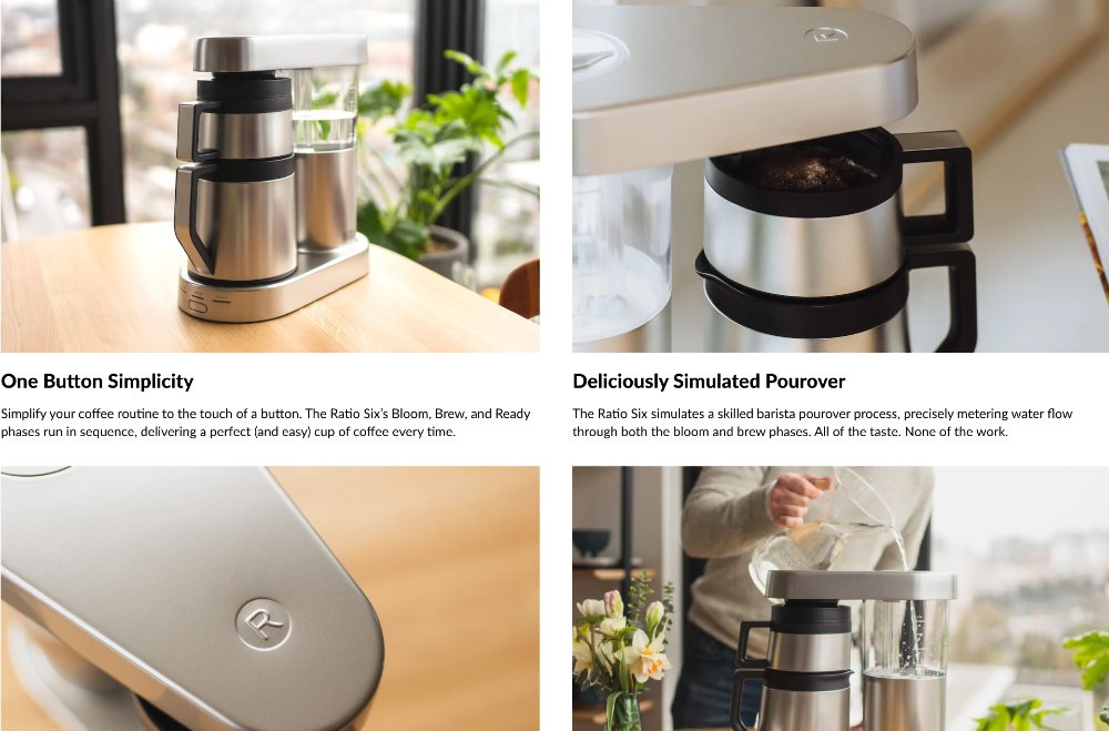
Ratio, a brand that sells coffee makers, has a clean user interface. Once you click on the product, the product page descriptions aren’t in huge chunks of text. For online shoppers, it’s easy to scroll from the main product picture down to the testimonials at the bottom. The grid-like product photos with the features and benefits are attractive.
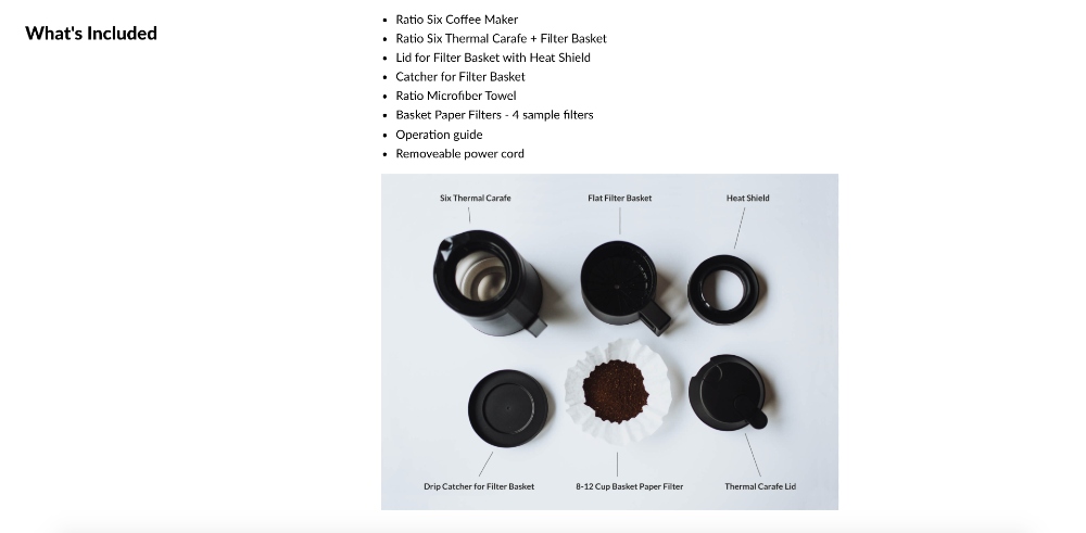
Additionally, Ratio provides static images dissecting the product with bullet points of the inclusions. Overall, the website design is simple, and product details are written with the audience in mind.
4. Porter & York
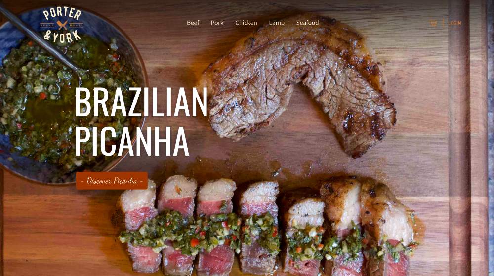
When it comes to food eCommerce business, food photography can make or break sales. We picked Porter & York as one of the best eCommerce website design examples for the salivating photos on their homepage. In food porn, one way to make consumers’ mouths water is to display movement in food. A sizzling steak, foaming oil, or steaming food is one way to paint a picture in diners’ minds.

Although Porter & York sells raw meat, they also showcase their 28-day aged beef temptingly in high-quality images.
5. Henry J
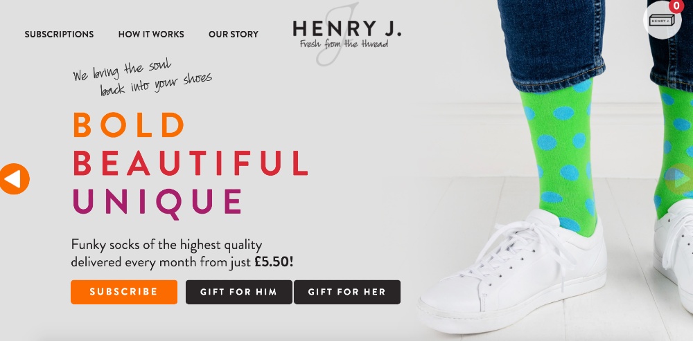
Staying consistent throughout your channels is crucial for customers to recognize your brand. For example, choosing the right colors that represent your brand separates you from your competition. Henry J, a brand that sells funky socks, banks on visuals, and colors for their eCommerce design.

When you take a look at their website, orange is undeniably its primary brand color. You can see the color seamlessly woven into different parts of the website. However, it doesn’t seem to overwhelm you because the balance between other colors is just right.
6. Skullcandy

One of the most effective web design trends that’s here to stay is user-friendliness. A navigable website means opening your market to computer-savvy and computer-illiterate users as well. Skullcandy’s homepage only has four menu options. This makes it easy for users to go straight to the category of their choice.
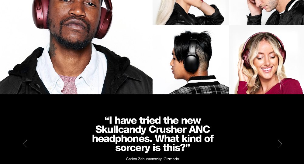
And once you click on a product, bold colors and oversized graphics will swarm you with temptation. Their product page also features people wearing the item and a scrollable social proof at the bottom.
7. Harry’s
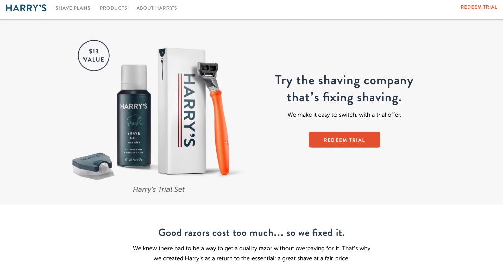
Harry’s revolutionizes the men’s shaving products industry because of their witty and smart branding. Although the eCommerce web design dwells along the lines of minimalism, the copy makes up for it.
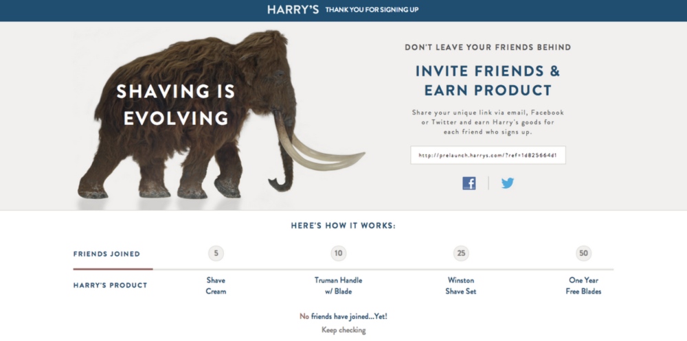
The brand incorporates smart marketing by sprinkling a bit of storytelling in their copy. It’s funny; it’s captivating and surprisingly — compelling.
8. Lookback
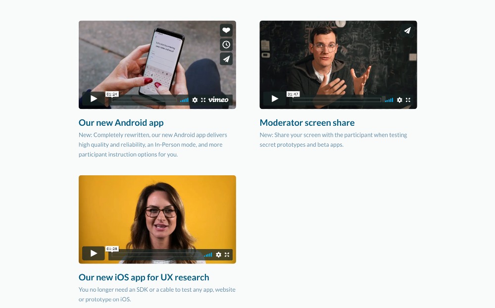
Lookback is a company that makes user research a walk in the park. For a brand with an obscure offering, the company gladly provides video tutorials of all their services. They walk customers through their application or software, explaining a step-by-step process on how to use it. Lookback’s video marketing strategy is competent in reeling customers to try out their products or services.

Additionally, their homepage also features a video run-through of the brand’s unique selling proposition. Plus, Lookback leverages social sharing by displaying a “share” icon on the upper-right corner on every video.
9. Spotify
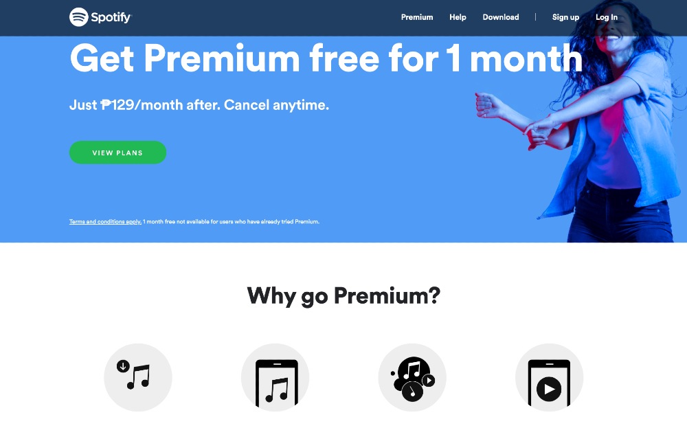
Spotify’s checkout page is simple yet straightforward. The page is divided into three parts: the product label, features, and plans. Spotify banks on soft colors for appeal, with a heavy font strewn across the top page for contrast. Moreover, an image of a dancing woman complements the entire composition.
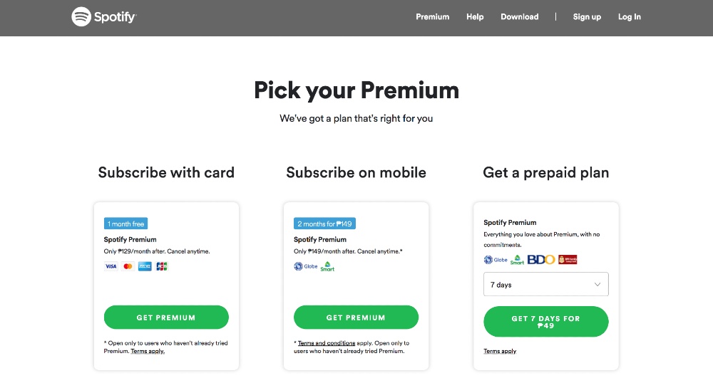
Underneath it are oversized icons displaying the Premium Plan’s features. Last but not least, Spotify sews the ensemble together by showcasing a concise copy for the various plans, with calls to action enclosed in bright, green buttons.
10. Lumio

Lumio’s eCommerce website is eye-candy. It’s colorful and attractive with an elegant appeal. The overall design is apt for the brand’s innovative lampshades. Once you land on their homepage, an overlay welcomes you with looping images of their products. A one-liner copy with a personal messaging is inviting, which says, “Meet Our New Camouflage Print.”
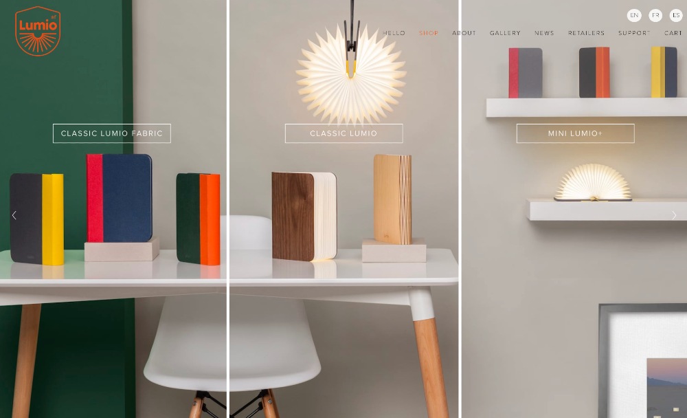
Lumio also shows off its various products by composing a unified image divided by vertical lines. Once you click on each division, it subtly highlights the entire pane — just like what a lampshade does.
11. We Talk Money
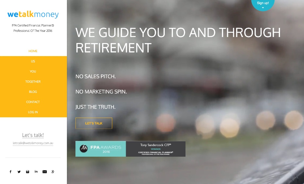
We Talk Money, a financial consulting company, went against the grain by displaying its menu navigation page on the left side. Contrary to conventional web design with menu headers on top, We Talk Money’s eCommerce website is unique.

Additionally, the Blog page also features colorful cover images with different customized icons. This design marketing strategy also sidetracks from the regular featured photos. Adhering to web design trends is recommended. However, swimming against the tide could make your site one of the best eCommerce website design examples.


