Best Color Combinations for Your Marketing Materials
In marketing, colors make or break conversions. That’s because colors impact consumers’ purchasing decisions by invoking particular emotions. And this is where marketers can concoct effective color combinations to hook their audiences.
However, merely putting together a combination of colors won’t work. Choosing efficient color pairings that best speak about your brand should be key to attracting prospects. Using color psychology is one way to let logos and advertisements speak to your audience.
This has something to do with consumers’ intuition and cognitive performance. For example, we tend to relate the color red to love and passion. On the other hand, we link feelings of happiness and sunshine with yellow. And if we put both together, the color combination evokes feelings of enthusiasm and cheerfulness.
But don’t stick to those color combinations alone. Here are 12 of the best color combinations to make your marketing materials convert.
Two-Color Combinations
1. Black and Orange: Fascination, prestige, authority
Black and orange are perfect combinations when you want to establish a playful authority. Additionally, black creates a feeling of authority with a touch of prestige, primarily when used on logos. Meanwhile, orange reminds you of enthusiasm and sunshine. Combining both creates a prestigious authority that is friendly and playful, just like Harley Davidson’s logo.
2. Light Blue and Brown: Sincere, peaceful, dependable

Brown is the color of nature. It reminds you of the outdoors that brings calmness and relaxation. On the other hand, blue is one of the most commonly used primary colors in marketing. It implies peace, sincerity, and uniqueness. Combining both colors exudes tranquility that’s excellent for healthcare, entertainment, and cafes.
3. Grey and Green: Confidence, endurance, stability
Green is another color of nature. We associate green with leaves, fields, and mountains, bringing a feeling of serenity and calmness. Additionally, green is also the color of money. Grey, however, is a more neutral color, which can sometimes look dull and monotonous. Pairing both creates contrast and implies advancement in health and technology. This Sony Ericcson logo denotes a feeling of stability and endurance, showing audiences Sony is a brand they can trust.
4. Navy Blue and Orange: Excitement, strength, flexibility

Blue and orange color combinations not only create contrast and spark excitement. But the combination also emanates a sense of trust and flexibility. That’s why blue is mostly used for financial and educational institutions. The Detroit Tigers’ logo also signifies strength with its dominant blue color. And the orange tiger denotes excitement, igniting fans’ enthusiasm when watching their favorite team play.
5. Red and Yellow: Energy, desire, joy
One of the most common color combinations is the red-yellow mix. We associate red with fire, which indicates a burning desire for something. It also enhances human appetite. That’s why red is commonly used on fast-food chain logos. When you put the color yellow into the mix, it ignites happiness as yellow is reminiscent of sunshine. An example would be the McDonald’s logo.
6. Black and Red: Power, authority, energy
While black can remind consumers of death and evil, black is also excellent to signify authority and elegance. However, if you don’t want to come off as being extremely formal, mixing red into black marketing materials ignites energy. Here, KFC’s logo has the right balance of red and black. While black comprises less than half of the logo, the color red still dominates the entire design. Overall, the logo ignites enthusiasm but suggests authority in the food and restaurant industry.
Three-Color Combinations
7. Blue, Yellow, and Green: Youthful, reliable, strength

The use of two primary colors and one secondary color makes these color combinations attractive. Google Drive’s logo is an excellent example. Blue connotes reliability, which implies storing your files here, is safe and protected. Yellow indicates youth and intellect, which shows the type of audiences Google Drive is for. Lastly, a mix of green on this logo symbolizes safety and growth.
8. Blue, Red, and Yellow: Passion, dependability, happiness

Color combinations should look cohesive and must convey the brand’s identity. Burger King’s logo piques consumers’ interest through the colors red and yellow. The blue color, which seemingly ties everything together, denotes a feeling of dependability. Overall, the three colors are appealing and apt for a fast-food restaurant such as Burger King.
9. Pink, Yellow, and Blue: Femininity, tenderness, warmth, happiness
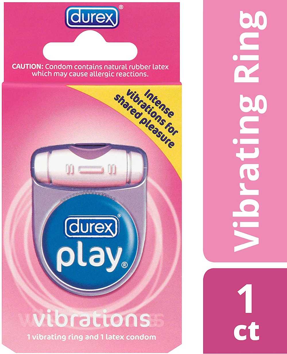
For a brand such as Durex, the best color to ignite a feeling of subdued lasciviousness is pink. Pink is associated with tenderness and femininity. The colors blue and yellow denote trust, warmth, and happiness. These colors are suitable for representing a brand that banks on consumer trust yet ignites lust and want.
10. Green, Yellow, and Black: Freshness, honor, power
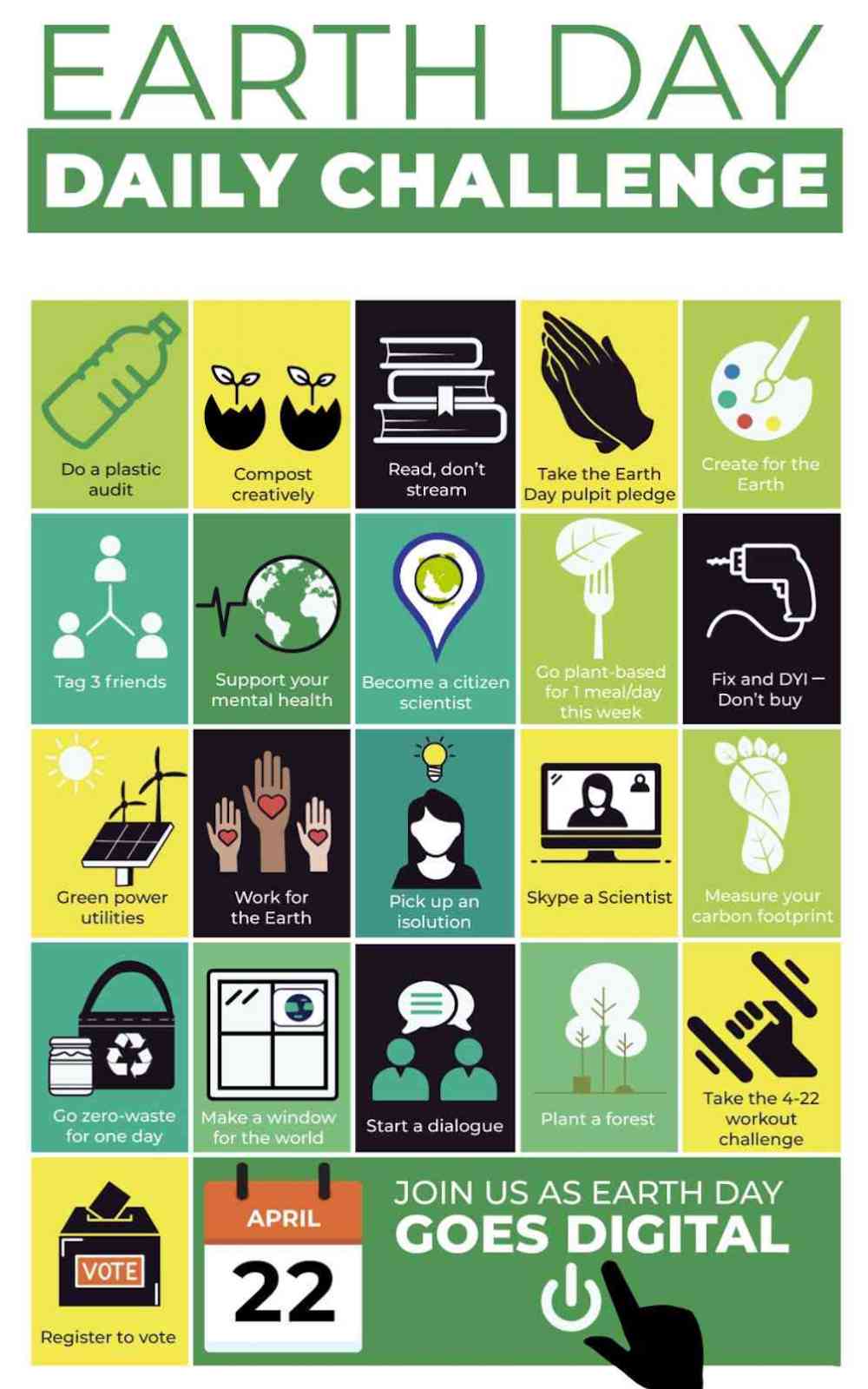
Since we associate green with nature and outdoors, this is excellent for brands that center on health, wellbeing, and nature. This is an Earth Day Daily Challenge post on social media from Earth Day Network. Although green is the most dominant color, the yellow reminds you of sunshine and cheerfulness. Moreover, the splashes of black indicate power, which reminds us of how Omni-potent Mother Earth is.
11. Orange, Green, and Red: Stimulation, confidence, desire
The best color combinations are those that are eye-catching and at the same time evoke the right emotions. This Absolut advertisement radiates confidence for those dipsomaniacs who want to have a smashing time. The domineering orange also stimulates a sense of happiness, which reminds you of good times spent with friends over alcohol. The right amount of red creates that last nudge for consumers to grab a refreshing Absolut drink.
12. Dark Blue, Turquoise, and Beige: Creative, trustworthy, reassurance
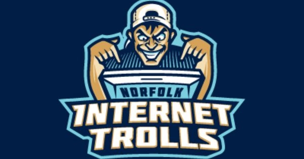
The turquoise color against a dark blue backdrop is a perfect contrast that makes the logo pop. The beige, which is a neutral color, creates a feeling of warmth and reassurance amidst two dominant colors. This logo example signifies trustworthiness and creativity. This color combination can be perfect for healthcare sectors, or travel blog niches.
Wrap Up
Colors not only give life to your advertisements. But they help entrepreneurs and marketers elicit suitable emotions. As consumers rely on emotions to choose brands and products, colors can be that last nudge that urges audiences to pick your product instead of others. That said, make every splash of color count.


