
10 Ways a Bad Graphic Design Logo Can Hurt Your Company
A bad graphic design logo kills your company’s reputation. If you scrutinize megacorporations, you’ll notice they all have excellent logos. This is why ventures and small businesses must have a strong logo at the onset because logos reflect your company.
The goal of making a name in your field is a perennial struggle businesses undergo. As you whip up your branding, ensure that your logo speaks your brand’s story, personality, and overall identity.
Skimping on your graphic design logo by entrusting it to amateurs could spell disaster for your brand. And here are 10 ways it can hurt your company.
1. No professionalism
![]()
The work of an amateur graphic designer is incomparable to a professional. If your logo is an extension of your business, you must not let inexperienced designers create your logo.
For one, professional graphic designers know what it takes to make logos stand out. They know the proper use of design principles and psychology like the back of their hand.
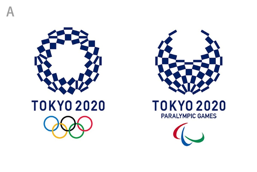
A good logo must look professional, so it reflects the business. If your graphic design logo looks sluggish, then your business probably is too. Take a look at the 2012 London Olympic logo. While Wolff Olins, the agency responsible for it, claims it’s “edgy and youthful,” people disagree. It’s a far cry from the Tokyo 2020 Olympics logo.
2. Using stock art
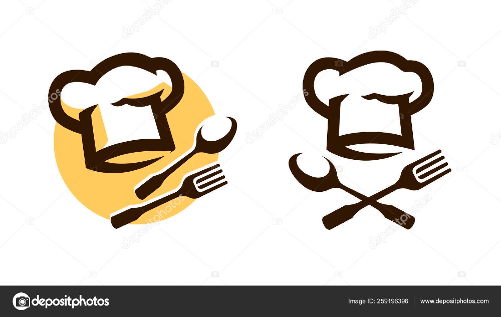
Using stock images on your logo only means one thing — mundane and ordinary. Having these characteristics leads to brands sitting on the sidelines instead of scaling.
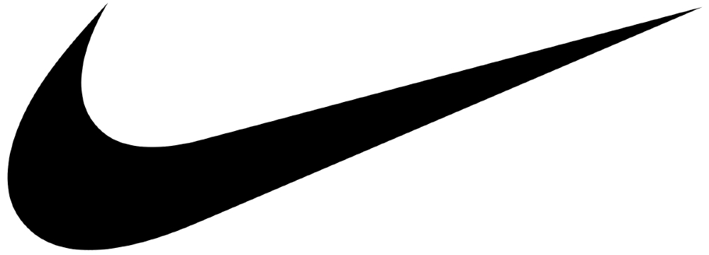
Check out both logos. Though Nike’s logo is simpler, it looks more memorable and unique than the first image.
Business logos should be original and must be a standout. Sprinkle some creativity into your logo, so your audience appreciates and remembers it. Plus, using stock art means your jeopardizing your business to a severe copyright infringement litigation. And that’s the last thing you want to deal with when starting your venture.
3. DIY logos
![]()
Don’t get me wrong. Some DIY logos may not look that bad. But some who DIY their logos without graphic design experience might risk the final design outcome. Not doing market and competitor research, not knowing the right design principles or color psychology, or not using the proper font are things learned through experience.
To beat the competition, you need to stay ahead of the game by stalking the competition. And those who DIY logos might have no clue how to go about it. Imagine if you create your logo via an online logo maker like the example above. There could be others who chose this particular design too. Only DIY logos if you’re a graphic designer by profession.
4. Using raster images
![]()
Using raster images are fine, but not on graphic design logos. Logos should have one crucial element, which is scalability. Businesses might soar to new heights in years or even months. The need for corporate identity and marketing materials like billboards, banners, or social media ads will arise.
Raster images tend to become pixelated when printed on other bigger mediums like the above example. On the other hand, vector images have mathematically precise points, which make them good even on bigger mediums.
Remember, quality translates to professionalism. If you can’t fix a simple thing as a pixelated logo, how much more fixing even bigger things like customer service or product quality?
5. Misuse of proper colors
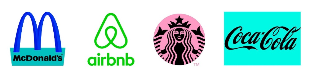
Color psychology is a must in logo design. Colors invoke particular emotions, and brands need to make their audience feel certain emotions when seeing their logos.
Red stimulates hunger. That’s why it’s perfect for fast-food chains like McDonald’s. Green is for freshness like Starbucks’ logo color, apt for their fresh sandwiches and earthy-flavored coffee. Orange is also associated with sunshine, joy, and enthusiasm. Just like Airbnb’s logo, vacationers are reminded of the happiness they feel when booking tourist destinations and accommodations.
Can you imagine if you mix up some of these brands’ colors? Their particular audiences will feel all sorts of emotions when looking at these!
6. Typography blunders
![]()
Typography is another element in your graphic design logo. Like colors, typefaces also invoke various emotions. Typography also has the power to establish authority in your niche. Plus, having the right typeface ups your brand’s credibility.
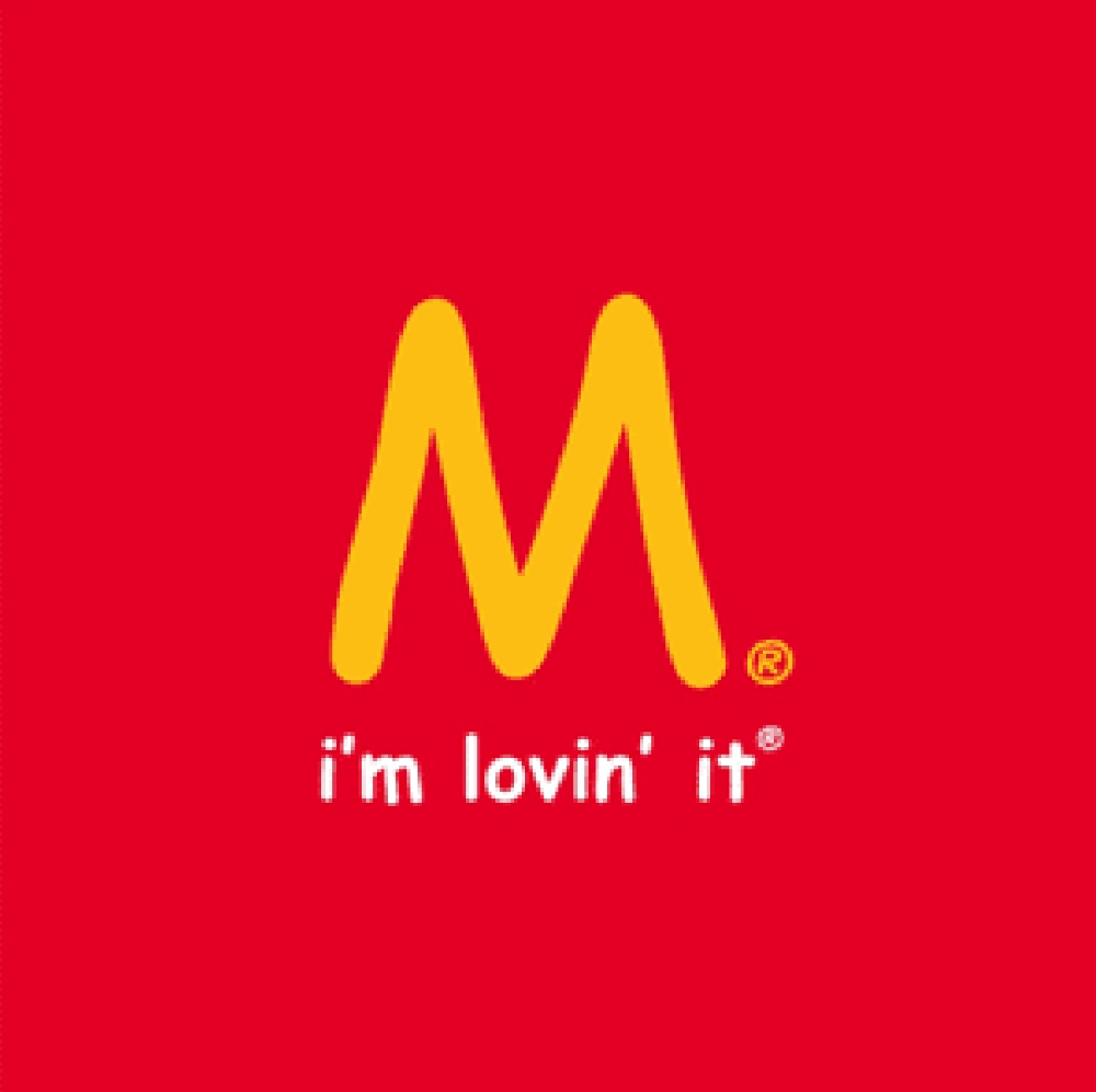
McDonald’s has always used the Mclawsuit Font. Let’s try to put McDonald’s in another typeface like the example above. The second example doesn’t depict the “Golden Arches” in 1962 anymore. The bottom line is, choose a typeface that best represents your brand’s identity.
7. Wrong font pairings
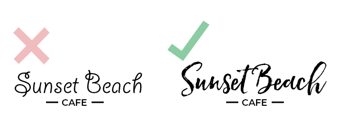
A good rule of thumb is to never go over three font combinations. As much as possible, try to stick to two fonts and make sure to choose the right typeface. You want to signify the proper brand identity and image to your audience. Selecting the wrong typeface and font combinations may repel audiences.
Check this example out. The second logo has a more carefree font style. It has more freedom and playfulness, instead of the first one having more controlled strokes. And this reminds you of sunshine, sea breeze, and refreshing cocktail drinks. Overall, this combination is more suitable than the first example.
8. Overly complex designs
![]()
Steve Jobs once said, “Simplicity is the ultimate sophistication.” An overly complex logo doesn’t impress anyone. If anything, it’s even uncomprehensive and will lose its meaning. A complicated graphic design logo will not be as memorable as the minimalist ones like Apple, Adidas, or Nike.
Kraft managed to transform its complicated logo into a fresher, bolder, and simpler one.
9. Relying on design trends too much
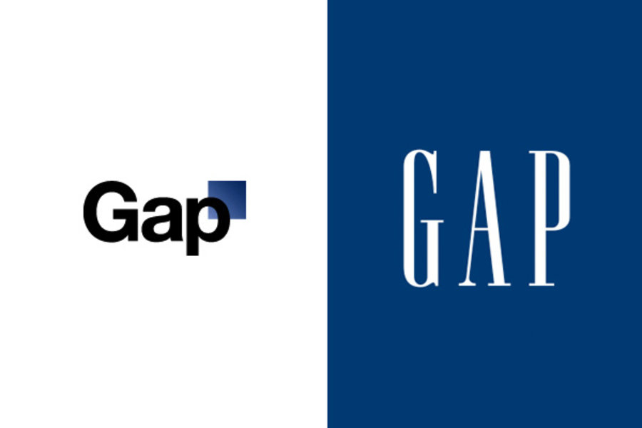
Having graphic design logo trends as your guide in creating a memorable and scalable logo is recommended. However, relying too much on the trends isn’t. Brands strive to make their logos modern to cater to younger demographics, as is the case with the GAP.
Their 2010 logo redesign was futile as it received public backlash that led the brand to revert to its old logo. For one, the font choice was wrong. Choosing Helvetica in 2010 was not acceptable because it doesn’t show growth and identity. The second criticism was the gradient square, which looked like an asterisk at the end of the word. Fans raved on about the unnecessary change, which ended the GAP discarding the new logo after a week.
If your brand doesn’t need a redesign or if you feel the trends don’t match your brand identity, then ditch the idea. Or else, you run the risk of shooing your audience away.
10. Stolen logos
A bad graphic design logo is one thing, but a stolen logo is another. And it’s even far worse than having a hideous logo design. Stealing logos from competitors will ruin your company’s credibility. And mind you, this is extremely hard to attain.
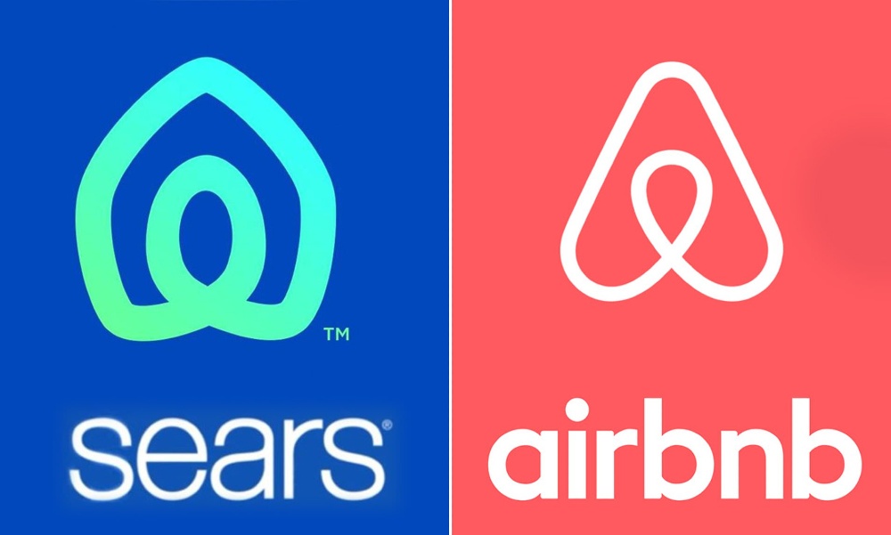
Aside from uniqueness, your logo must stand out amongst all the other logos that people recognize them at a glance. On May 01, 2019, Sears unveiled its revamped logo yet again, and people went berserk!
It looks very similar to Airbnb’s logo, which was launched in 2014. Whether Sears copied Airbnb’s logo or not, stealing logo designs is one crime that will make brands collapse.


