
7 Elements to Consider Before Creating Your Graphic Design Website
Experts say that you need to have a website for your business. Otherwise, your company will be perceived as non-existent. This is absolutely true. But having a live website without good graphic design isn’t going to cut it if you want to get customers. You need to have the right elements to engage your visitors. It needs to be logical yet striking enough to stand out from the competition. That is why the right graphic design website elements must be put in place.
Now, while there are a lot of website templates online, remember that different industries will require a different graphic design approach. What works for banks and financial institutions may not work for non-government organizations and medical facilities. So the best solution for this is to hire professional graphic designers to work on your web pages.
Even if you are going to outsource your graphic design website needs, it is crucial that you know the following. This is so you can work hand-in-hand with your graphic design team, and check if their design is according to the best practices. Include these seven elements when creating your web graphic design:
1. Add Relevant Images
You know when they say that a picture tells a thousand words? That still works up to this day, and you need to take advantage of that when building a website. You have to carefully choose images not just to fill in blank spaces. But instead, it must highly support your texts.
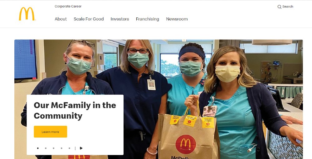
Let’s take a good look at McDonald’s corporate website. It’s the perfect image that can supplement the text ‘Our McFamily in the Community’. In an instant, you will understand what’s in store for you. Even before clicking the ‘call-to-action’, you already have an idea that McDonald’s is supporting our frontliners amidst the pandemic.
Now, try to imagine if they used a different image such as their burgers, fries, or their logo. The impact wouldn’t be the same. And in fact, you wouldn’t even bother going to the next page.
2. Use Different Typography or Learn Font Matching
Typography plays a crucial role in any web content because it helps visitors read texts easily. In addition, the right type of fonts can convey emotions. But with a graphic design website, you do not have to stick with just one type of font. Two is a good choice, and using more than that can be distracting.
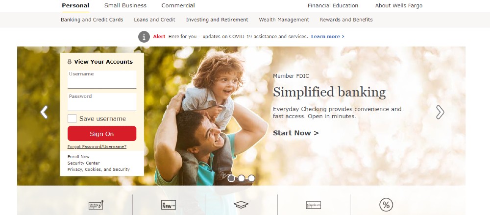
Wells Fargo is a good example for this. Notice how they used a different font to highlight one of their benefits.
However, you have to be careful if you will use more than one type of font. It has to match, otherwise it can send mixed signals. Some of the best font matchings are the following:
- Playfair Display + Montserrat
- Merriweather + Lato
- Open Sans + Roboto
3. Use the Right Color Schemes
The colors of your website should generally match your branding. But if your branding ideas are not yet cast in stone, then you might want to understand first how color affects one’s perspective and behavior. This should be dependent on your industry and the demographics you serve.
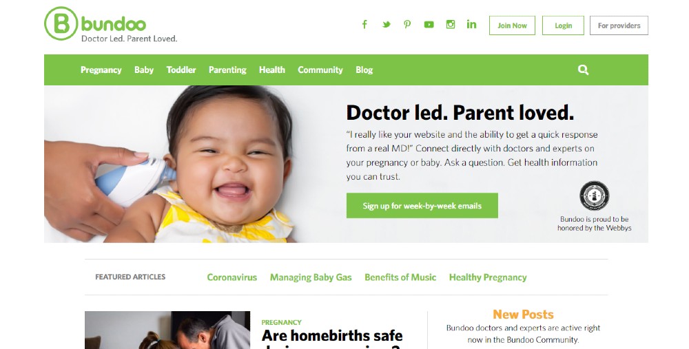
We have a good example here from Bundoo. It’s a website dedicated for new parents. Thus, the use of lighter colors is on point. If you have the same services, then lighter shades of blue and pink should do you good.
For websites offering professional services, dark blue or dark green signifies professionalism.
4. Pick the Right Layout
There are several layouts to choose from for a graphic design website. But you need to pick the right one that will showcase your content, most especially your core products and services. Simply put, your layout is your website’s framework.
The first step is to identify your website’s goal. Do you want your visitors to buy from your web page? Would you like to get leads? Or would you just like to showcase your art?
The commonly used layout is the Zig-zag wherein your visitor’s eye direction goes from left to right, followed by going down, then starting once again from left to right. This works for most industries.
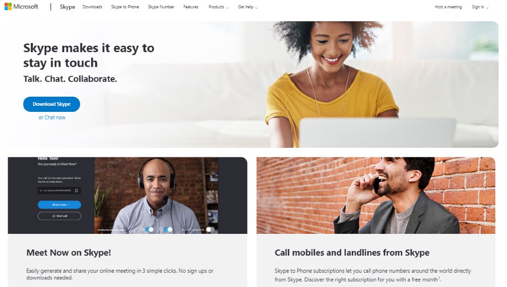
Skype uses this approach on their graphic design website. The principle here is that you will place the most important image or texts on the top left corner of your page. This is highly effective considering that the eye movement is directed the same way that we would read books. So it’s almost natural for us.
But you don’t have to restrain your layout to only a Zig-zag pattern. We also have the F-layout which is ideal for creating portfolio web pages. Grid is another pattern which is commonly used for vlogs or newspapers wherein you would want multiple contents to share equal footing. Other companies are using a split-screen layout if they want to highlight two different products. Think about clothing stores catering to both men and women.
5. Humanize Your Website’s Graphic Design
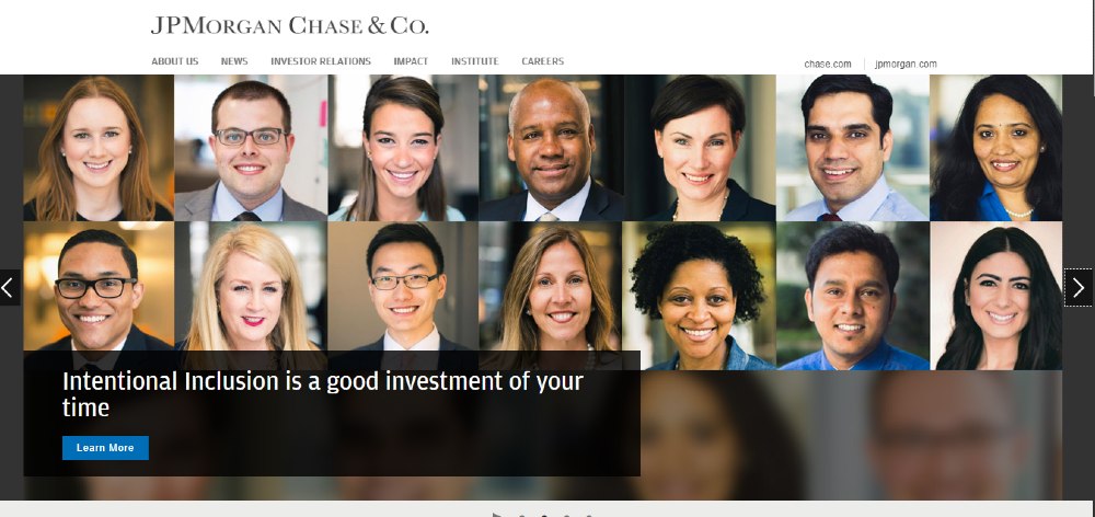
Another great technique when designing your website is to put actual faces on your layout. Humanizing your pages can boost your engagement and a lot of companies are now using this approach. Most of them observed drastic improvements in their website traffic just by doing this.
We encourage that you use photos of your leadership team as it builds trust among your visitors. People naturally want to ensure that they are working with real people.
JPMorgan Chase & Co. has been doing it on their website for quite some time. And if you visit their page, 90% of their photos include human faces.
6. Optimize Your Images to Load Faster
So, you’re done perfecting the layout. You have already added the right images and fonts. You also completed an intuitive design. These are all good, but these are not enough. Your website speed matters and while it isn’t exactly a part of visual design, it can affect your traffic.
Large photos can slow down your loading time. But you can reduce its size without compromising quality. That’s the whole concept of optimizing images.
High-resolution photos are around 590KB and up, and these are not advisable to use for a website. What you can do is to resize the photos to around 151KB – 200KB. This will give you almost the same quality of photos while improving your website’s speed. However, don’t go below 68KB or your photo will lose its quality and look grainy, which of course, can damage the entire graphic design of your website.
7. Practice Repetition
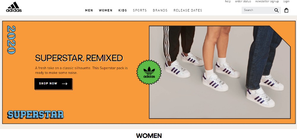
And lastly, to ensure that your website is effective, your design across different web pages must be consistent. The use of logos, fonts, and the color scheme must be repetitive as it improves the entire flow of your website graphic design. It’s not only because most people value clear and organized web pages. It’s because repetition helps in brand recognition as well.
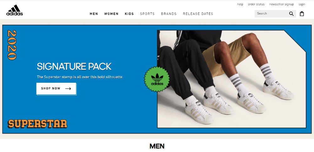
Modest variations on your design are encouraged too. This is to avoid a plain and boring website.

Adidas is a good example to look at. These three pages cater to different audiences but they have the same layout and typography. And to add variation they used different colors for each page.
Graphic Design Website Do’s and Don’ts
We also want to share with you a quick list of Do’s and Don’ts to enhance your graphic design website.
Do:
- Think about your target audience
- Focus on usability and experience before aesthetics
- Understand your website’s objective and create your focal points
- Make it easy for your visitors to find what they need
- Use a maximum of 2 different fonts
- Choose photos that perfectly suit your message
- Play with your creativity yet set boundaries
- Test your website
Don’t:
- Add a lot of visuals
- Use too many colors
- Write copy like a block of texts
- Use stock photos
- Ignore feedback
Where to Get Graphic Design Website Inspiration
What’s great about graphic design nowadays is that you can get ideas from different websites. We have two recommended places where you can draw inspiration for the design. These are Dribble and Behance.
With Dribble, you get to find quality design inspiration from seasoned designers. Navigating through their page is easy as well. Behance is also a good source because even amateurs can submit their designs. While you have more options to look at, you also need to screen which ones are professionally made and which ones are not.
Conclusion
A graphic design website isn’t just about adding random elements together. It’s about balancing science and art to increase engagement.
Hiring experts might be the best solution for you. This can be intimidating for some since most web designers will charge a high professional fee. But you can avoid that if you choose a design team that works on a subscription model. This means that your web design will be finished on time – and for a fixed price of $394 every month.


