2020 Online Store Logo Design Trends You Can Copy
When your eCommerce business expands, the principles, values, branding, and goals likely evolve as well. And entrepreneurs should take that as a hint for a logo redesign. But when do you know it’s time to redesign your logo? According to Forbes, when your logo is outdated, too complex, or when the company is changing directions or growing, it’s time to update it to the latest logo design trends. Whether you’re thinking of redesigning or creating your online store logo from scratch, ensure that it adheres to the recent logo design trends. Here are 10 of the logo design trends to watch out for this 2020.
1. Minimalism

If you think your online store logo is a bit complex, maybe it’s time to tone it down a bit. Minimalism has been ubiquitous in eCommerce logos as well as other enterprises. Steve Jobs always believed that “Simplicity is the ultimate sophistication.” And look at how Apple has become one of the most revered and elegant brands worldwide.
A clean and minimal look with uncomplicated fonts and clear approach is in these days. Apart from Apple’s minimalistic logo, Uber has also jumped on the bandwagon on logo simplicity. Uber’s sans serif typeface makes for a straightforward and casual appeal. A simple logo is perfect for online financial businesses that imply they have a NO BS approach.
2. Modernization

Always assess your logo once every five years. If experts say that your online store logo is outdated, then redesigning it to a more contemporary look is recommended. If you’re whipping up a logo from scratch, always think about scalability. Keeping your logo designs modern ensures that you cater to younger demographics.
Take a look at Slack’s logo. As you can see, they used an old-school hash symbol on the left and thinner font. The updated one is an abstract symbol of a hashtag with a heavy font, giving the overall look more vigor. Keeping your logos modern also makes them apt for any type of eCommerce industry.
3. Custom Typefaces
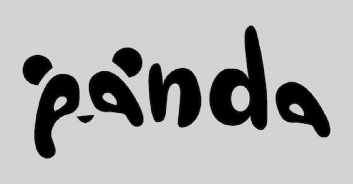
Typography logos are making waves in the eCommerce industry. Think Amazon, Etsy, Kohl’s, Sears, eBay — these online store logos are sufficient on their own. However, one logo design trend in typography logos is custom and unique typefaces. Some brands add their twist into their typography logos to make them stand out.
Without symbols, your typography logo should act as a standalone representation of your brand. Check out this Panda logo designed by graphic designer Daniel Carlmatz. He put a playful take on the typeface by turning the first two letters into the face of a panda. Custom logos are perfect for online apparel stores or any online business with more fun and lax branding.
4. Color Gradient
One trend that will surely rock logo design in 2020 is color gradient. Without losing touch on color psychology, online businesses will move to a more modern color combination. Instead of having various colors separated by several elements like white space, letters, or symbols, they will interweave but still come out exceptional.
Color gradients also give logos depth and a more realistic look that’s fresh and modern. Take a cue from Lazada’s icon. The exquisite mixture of orange and bright pink allows the company to scale in a fast-paced eCommerce industry. Color gradient on logos could work well for IT companies that dwell on technological aspects, complicated concepts, and revolutionized methods.
5. Cartoon Logos
For eCommerce industries that want to be perceived as cheerful and fun, cartoon logos are their best bet. This type of logos is also suitable for online brands that cater to a younger audience. Cartoon logos are simply entertaining to look at, even at first glance. This allows online businesses to connect with their audience right off the bat.
Here’s an example of a clean, black-and-white cartoon logo by Patrick Madrigal.
6. Isometric 3D Effect

Prepare to see more isometric shapes with 3D effects on logos. This logo design trend is one that keeps up with the changing demands of eCommerce. If you give your online store logo a 3D effect, it provides the design with depth. Additionally, the isometric shapes also ensure it’s current and fresh.
Moreover, you can also add some other contemporary elements like color gradients to give it oomph. Here’s one example from Synchronicity Business Networks. IT companies like this can take advantage of technical logo designs as they’re apt for their products and services.
7. Retro Look
Who says vintage logo design has long been gone with the previous trends? A retro look on logo design will undeniably take its resurgence. Whether it be retro shapes, old-school symbols, or vintage typefaces, retro eCommerce logos are hip, cool, and (ironically) modern.
Here’s an example of a barbershop logo. While an industry like this can benefit from retro logos, online businesses such as jewelry or accessories stores are better suited for this trend.
8. Multiple Layers
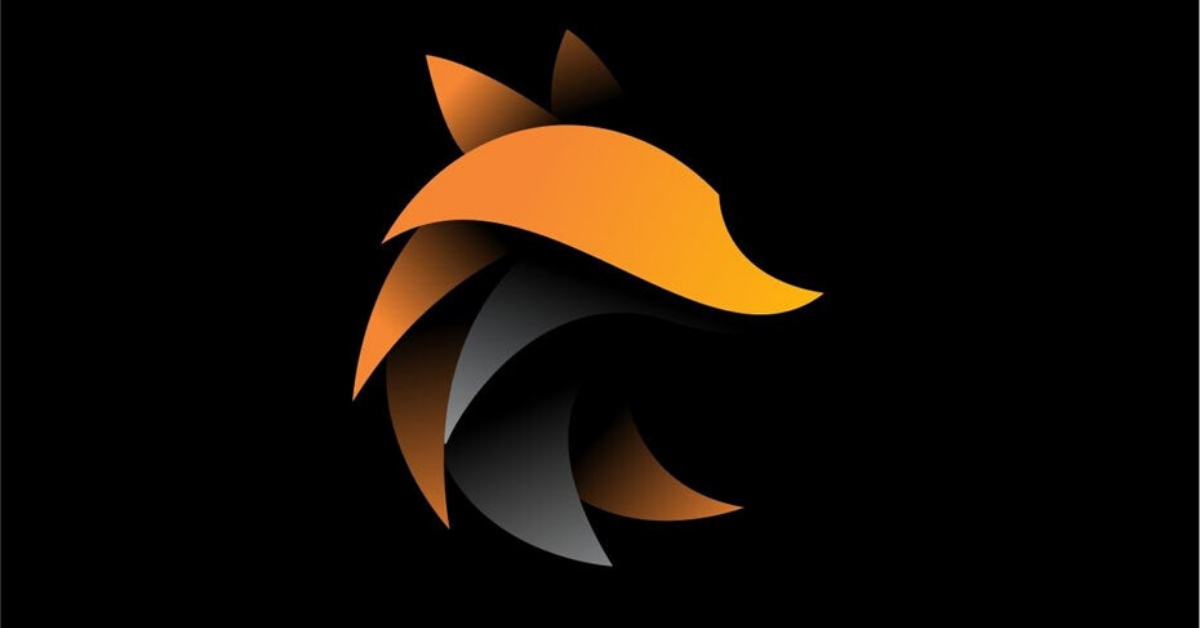
Contrary to flat logo design, multi-layering online store logos are in this 2020. Putting layers on top of the other makes for a more realistic appeal. It makes the icons or symbols come alive, giving logos memorability.
Combined with shadowing, shapes, and gradients, logos with multiple layers are versatile and innovative. Last but not least, this trend is perfect for any eCommerce industry as long as colors, shapes, patterns, and typefaces are relevant to the branding. Check out this example.
9. Geometric Shapes
Geometric shapes will also be part of logo design this 2020. Various shapes invoke specific emotions. For instance, curves symbolize creativity and dynamics. Circles represent infinity, completion, and perfection. On the other hand, squares imply balance and stability.
Take Microsoft’s logo, for example. For a big tech corporation like Microsoft, the squares show that businesses can rely on their software for security and all-around processes. Any eCommerce industry with formal branding and deal with information, security, and money can use geometric shapes.
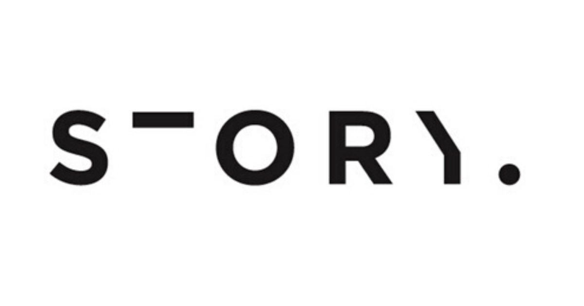
10. Missing Text
Incorporating some missing texts, lines, letters in your logos create mystery and intrigue. However, it’s also a playful way of presenting your brand. Expect to be seeing more of these text destruction styles in online store logos this 2020. Here’s one example that is simple yet ingenious.


