11 Bizarre Finance Logos Companies Actually Used
Finance companies stick to sleek or simple company logos. Most finance logos would have the name of the company as part of the logo and use shapes or other patterns to complement the text.
In the US, it’s common to have a red or blue motif because of patriotism. On the other hand, blue also means security, according to Logo Maker. Some brands would use green too, which is associated with money, as observed by Crazy Egg.
Some finance companies find success with their logos and branding. Mastercard, for example, while they had their share of a criticized logo, they bounced back. Another example is the Bank of America, wherein they use the colors of the American flag as part of their branding. They’re successful because it’s easy to identify them.
However, some finance companies don’t get the same recognition. It may be because of its unconventional design or it’s not aesthetically pleasing.
In this article, we examine 11 different financial logos that look bizarre. We also look at different types of financial institutions such as banks, private equity firms, credit unions, financial technology companies, and insurance companies.
1. M Capital Partners

M Capital Partners is an investment company from France. In 2019, M Capital Partners changed its old logo to a modern one. The redesign didn’t sit well with others from Under Consideration. For some, it was a bold choice for M Capital to move forward with the new logo.
It seems the redesign chopped off the bottom and top parts of letters. It may be quite difficult to read at first glance. Their old logo was simple, but you can easily identify them. It’s not one of the strongest finance logos, but it tries to become modern and keep with the times.
2. BBVA
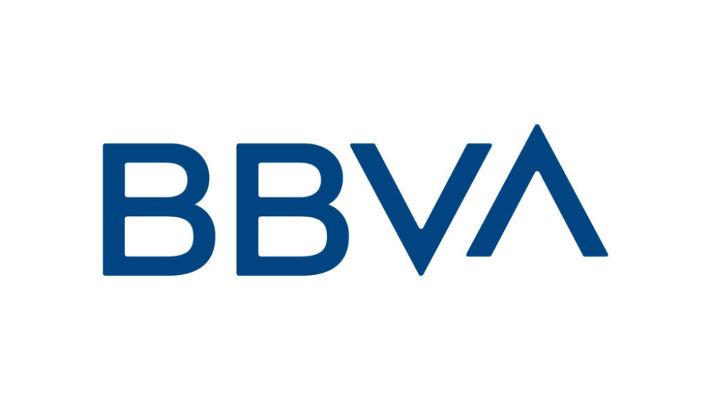
BBVA is one of the largest financial companies in the world. Its headquarters is in Spain, but it has offices in the USA, UK, France, and Mexico, among others. Like M Capital, BBVA revamped its logo to modernize. The design agency made improvements to the new logo.
However, the A on the new logo rose, and it may not have been in a good way.
It may signal growth or progress, but it looks awkward. Plus, upon closer inspection, the Bs on the logo looks different too. Perhaps, it was all uniform, some people would say it’s too bland. It’s one of the finance logos that look good, but it could’ve been great with consistency and uniformity.
3. Qudos
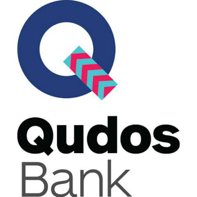
Qudos is a small bank in Australia and rebranded from Qantas Credit Union. The old logo integrated the Qantas company logo and added the text Credit Union, with what it seems like a speech bubble. It wasn’t exactly a bad logo, but it wasn’t good either.
Since Qantas Credit Union rebranded to Qudos, it also changed its logo. It was a drastic change, but it wasn’t exactly an improvement. The leg on the Q, looks like it has tape stuck to it. As one user from Under Consideration commented, it looks like washi tape. Maybe the text could’ve been consistent with color and emphasis (i.e. bold or regular form).
4. TIAA
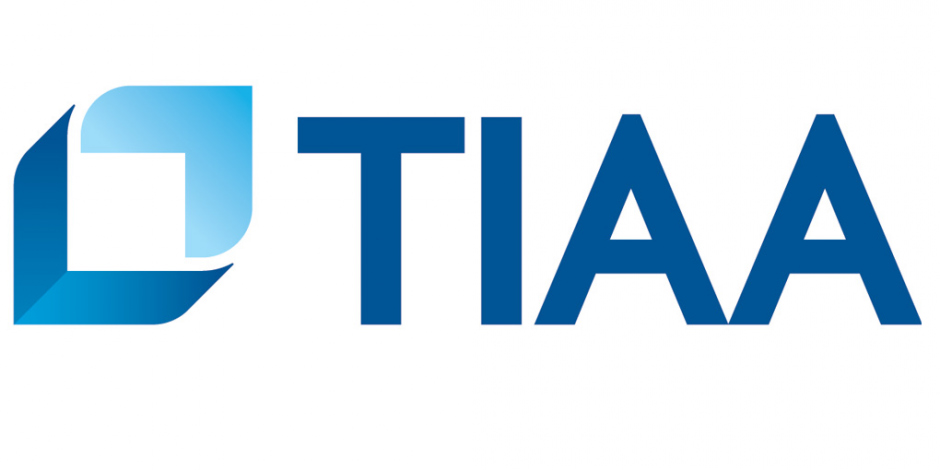
The Teachers Insurance and Annuity Association (TIAA) rebranded from TIAA CREF on the logo and dropped CREF. Its old logo, a two-toned blue box with TIAA CREF looked like an optical illusion. It doesn’t have a bad logo design; it was just simple.
However, the new TIAA logo didn’t provide much improvement than its predecessor. The box on the upper left and the bottom right curved. They used three blue hues for the new box as well. The logo looks a bit confusing, but it’s not all bad.
5. Unique Insurance Company
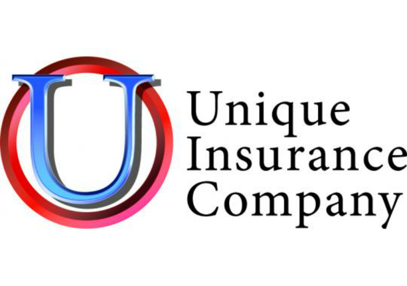
It seems that the Unique Insurance Company hasn’t changed its logo. In some cases, keeping a logo that many people identify can be a good thing. However, it seems that the financial company logo seems outdated.
The blue U is on top of a ring, and that’s pretty much it. It doesn’t look like it’s an insurance company logo. Maybe, Unique Insurance could consider a revamp of its logo to stand out from the rest.
6. Morgan Stanley

Before 2006, many remembered the Morgan Stanley logo with a triangle atop the letter n. According to 1000 Logos, the triangle symbolized financial success. However, it seemed that the triangle was out of place because the logo would have done without it.
In 2006, Morgan Stanley got rid of the triangle and the logo remained with just the text: Morgan Stanley. It became simplistic and minimalist. The logo went with just the name and there was an improvement in keeping the color of the text the same. Previously, Morgan was black, while Stanley was gray.
Through this, they have one of the most popular finance logos in the world.
7. Take Cash & Go

Take Cash & Go helps people where to find loans and seek cash advance. The Take Cash & Go logo doesn’t look like one of the many sleek or minimalist financial logos. Based on the text used on the logo, the only thing that makes it look “financial” is the use of the $. Perhaps if they used a serif font, it would make it look polished.
It seems that’s the only logo they’ve had for their website. Maybe Take Cash & Go could also consider a modernizing revamp that would establish them as the leading financial locator. That way, they can have a more defined company logo.
8. Guardian

The Guardian Life Insurance Company of America (Guardian) had a logo that looked like a golden egg with a G on it. It wasn’t exactly one of the best financial logos. However, the Guardian’s new logo was an improvement from its old one.
Like with many other logos in this list, a design agency, The Working Assembly, gave the Guardian its new and revamped look. According to The Working Assembly, the g logo represents strength, warmth, and longevity. It’s a much better-looking finance logo than the previous one because the company looks to reach a younger customer base.
9. QAPITAL
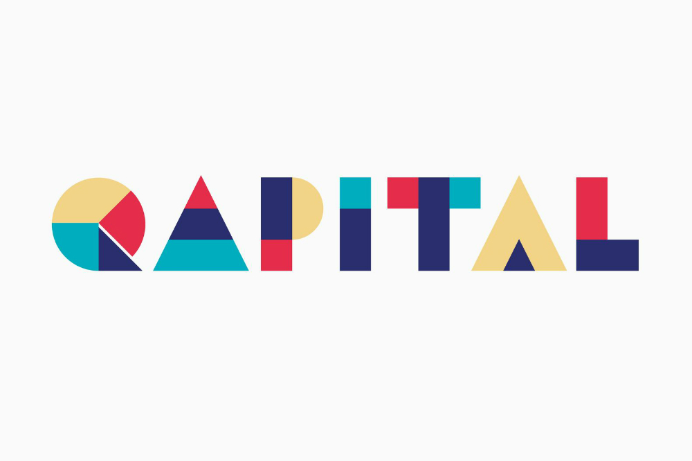
Qapital is a financial technology company that can help its users save money through an app.
Looking at Qapital’s company logo, it looks quirky. Somehow, though, the logo looks complex. Maybe it’s the different colors or the weight of the text on the logos. From that, it does look like Qapital is targeting a young demographic.
However, their company logo looks too distracting. What it does is try to look hip, but somehow there are too many elements like colors and shapes. That’s what makes the logo look complicated somewhat.
It’s one of the finance logos that look bizarre, but it manages to prove itself as a company that knows its audience.
10. People’s United Bank
Just like the Unique Insurance Company, it seems People’s United Bank stuck to its old logo. It looks a little bit like a famous bank logo as well.
The title on the i should have been blue to keep the logo consistent. Also, it seems that the logo is outdated as well. Perhaps, People’s United Bank can benefit from a rebrand that can help them keep up with its competitors. Plus, it may help them become different from other banks to avoid any confusion.
11. Square 1 Bank

The Square 1 Bank logo, before becoming part of Pacific Western Bank, was rectangular and had two colors: black and red. Somehow, it didn’t look great. There was too much space between the letters in the text. The 1 doesn’t seem centered in the “Square 1 Bank” copy either.
Once it became a part of Pacific Western Bank, they kept the 1 in a black square, while they converted the text to red and removed the red rectangle. It’s not much of an improvement, but through the acquisition, they’re able to establish their identity even if they’re part of the Pacific Western Bank.
Final Thoughts
Finance logos tend to lean towards simple, sleek styles. It’s a way for finance companies to modernize and reach out to younger audiences. Not only that, but it can help in establishing a new brand identity for the company as well.
Meanwhile, some would have logos that would have patterns or shapes to make them stand out. Since text might be too basic or simple, a shape or another graphic may help people recall the brand.
However, some of these logos may not follow the traditional design or have a bad logo design. What these companies can do is to reassess their logo and evaluate if it’s the right one for them. That way, they’re able to communicate not only their branding but also a way to connect with their customers or clients.
As such, it’s necessary to create a logo design that would make them stand out from the crowd without compromising their identity.
If you’re looking to get high-quality designs or a great new logo at a reasonable price, Design Doctor provides affordable rates for your design needs. You can get any visual assets you need like stickers and packaging too. Design Doctor has got you covered. Check out the plans that are right for you and your business here.


