Improve Your Online Presence If You Hire a Logo Designer
You may not know it, but your logo plays a significant role in getting recognition online. Since it’s part of your branding, your logo should act as the visual representation of your business. Plus, if you already have a well-designed logo, your customers or users can associate your brand with what you’re selling or producing. However, if you need a logo or a revamp, you need to hire a logo designer who can fulfill your brand’s vision and make you a memorable brand online. In this article, I elaborate on how your logos can elevate your online presence and why you need a logo designer. Plus, I present ten brands with a logo redesign and how it might have affected their presence to their customers or users.
How Can Logos Improve Your Online Presence?
Logos are essential to your online presence because this will build your branding across your online platforms. Your logo should be on your website and social media profiles so your customers and users can recognize your brand. As an example, use them as profile photos or add them as a watermark on your photos. Plus, they might associate your brand to something all the more your logo appears on your most important online platforms.
That’s why you need a logo that can communicate your branding well. It’s to gain retention, and they can remember what your logo stands for or represents.
So what if you have a logo already? You’ll need to determine if your logo needs a makeover. Since we’re in the digital age, and trends change almost every month, or year, your logo needs an update as well. That way, you’re not lagging.
That’s why, in some cases, big brands have to redesign their logos. Some might have to modify their logo because the old one may no longer convey the message you had five, ten, or twenty years ago.
One reason that companies choose to redesign their logo is to keep up with the times. This way, they can elevate their online presence by connecting with the current demographic. Plus, it’s how they can continue doing business despite the constant changes and trends.
For them to accomplish this, they hire a logo designer that will address their current brand challenges. Then, they can strategize in positioning and messaging. So, their current and potential customers can become familiar or reintroduced to the brand.
Why Should You Hire a Logo Designer?
First of all, logo designers have the experience to boot. If you find a logo designer, you can expect to receive a high-quality, compelling design. The logo designer will ensure that they can capture your branding and make it pop. That way, you can stand out among your competitors.
Second, even if there are DIY graphic design solutions available, you may have some challenges in terms of design and ownership. Also, if DIY solutions are cheaper, you’ll have limited use of the software. Plus, if you’re using a logo template, you and some others would have a similar logo. That’s not a good look for your business.
Lastly, it’s best to leave it to the designers who can work on your logo. You don’t want to stress over making your logo when you can delegate it to someone who can do it professionally for you. This will give you more time to work on what matters most in your business. That way, you can focus on hiring the designer, collaborating with them, and receiving your logo at the end of the project.
Luckily, it’s not difficult to hire a logo designer since you have several options:
- Fiverr
- Upwork
- Toptal
- Design agencies
- Design Doctor
In finding your logo designer, you need to be careful as well.
For starters, while freelancers charge less than design agencies or companies, some leave a bad impression on some unsatisfied clients. Some might have issues with realizing your vision, trouble in communicating with you or even show up at all.
On the other hand, while design agencies have a good reputation for presenting professional designs, you might have to pay a hefty fee since they’re intricate with their work. Who knows, once you’ve saved up, you can approach them for any marketing or branding challenge.
That’s why you can depend on a subscription graphic design service like Design Doctor. Not only can designers from this service provide you with a high-quality logo, but you can also request for other design assets. This will save you on costs, and you can focus on the things that matter in your business.
Now that you’ve gotten an overview as to why you need to hire a logo designer, know which brands changed their logo designs.
Examples of Logo Redesigns
Dropbox

Early users of Dropbox would remember the glassy box and the gradient wordmark in the file-sharing company’s logo. However, they rebranded in the early 2010s and changed the texture of the box and font’s color. Another redesign followed keeping the early 2010s version, with the help of design agency, Collins.
What makes the modern logo look good is it keeps the old style while reconstructing it with new elements or colors. For example, while the box no longer looks like a box, it still retains its shape. That way, users don’t lose retention of the logo.
MailChimp

Before MailChimp settled on their new logo, their old logo was a script wordmark. The old logo didn’t capture the brand, so MailChimp made the right decision in redesigning its logo.
In their new logo, Freddie (the monkey) plays a significant role in the logo since he’s the pictorial mark complementing the wordmark element of the logo. Since they also use yellow for their logo and branding, it’s very striking. In color theory, it signifies positivity and friendliness. That’s how MailChimp wants its users to perceive them. As Design Week commented, MailChimp seeks to integrate playfulness and creativity.
In their 2019 annual report, they disclosed there were almost 11,000 sign-ups every day that year. This figure may be attributed to the new logo design that can be easily spotted anywhere.
Dunkin’
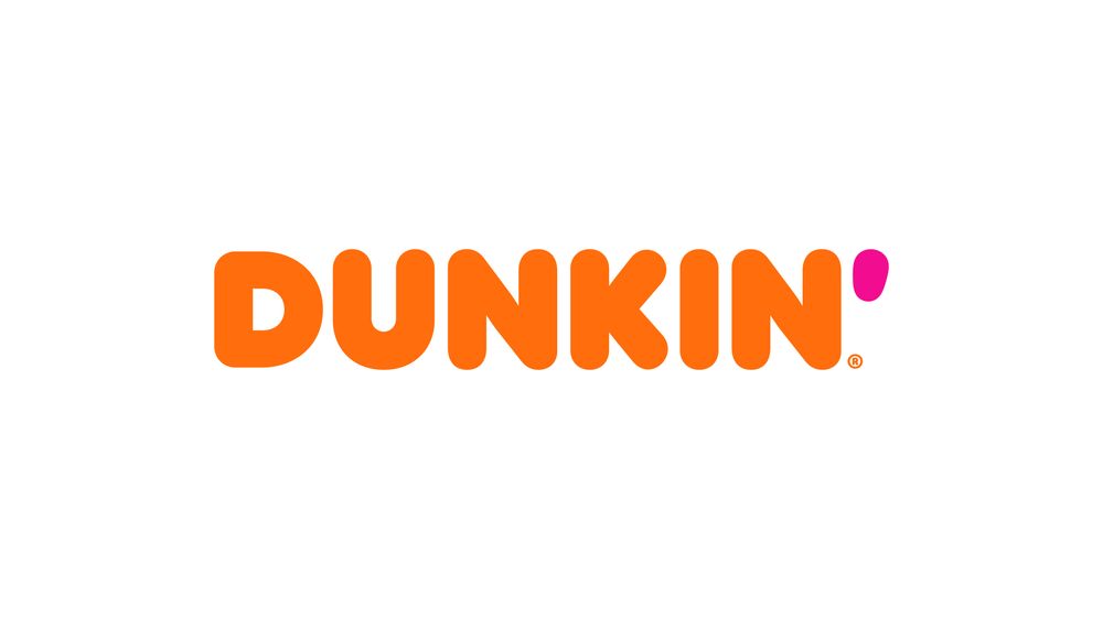
Before Dunkin’ became just Dunkin’, it underwent several logo changes over the past 60 years. However, in the 1980s, Dunkin’ settled on the logo that we know today. In the early 2000s, Dunkin’ added the pictorial mark of a brewed coffee in a paper cup but retained the text.
When Dunkin’ dropped Donuts in its name, lots of people had things to say. Some thought that the Dunkin’ rebrand doesn’t work. On the other hand, some believe it was a good thing to keep the font and style.
This will further increase their online presence because they made their logo simpler, yet it retained its branding style. Even if orange is the dominant color, they add a subtle pink as the apostrophe while still maintaining its notable color scheme.
Evernote

Evernote wanted a brand refresh since it celebrated its 10th anniversary in 2018. According to Design Studio, Evernote wanted to show the world that they’re no longer just a note-taking app. They wanted to provide a platform where users can organize their thoughts and make Evernote their number one productivity tool.
In the new logo, they made the elephant rounder, and the overall design modern and clean. They also switched the color to the elephant emblem instead of keeping it on the wordmark. This allows the Evernote wordmark to stand out while establishing a fresh look for the elephant.
Rotten Tomatoes
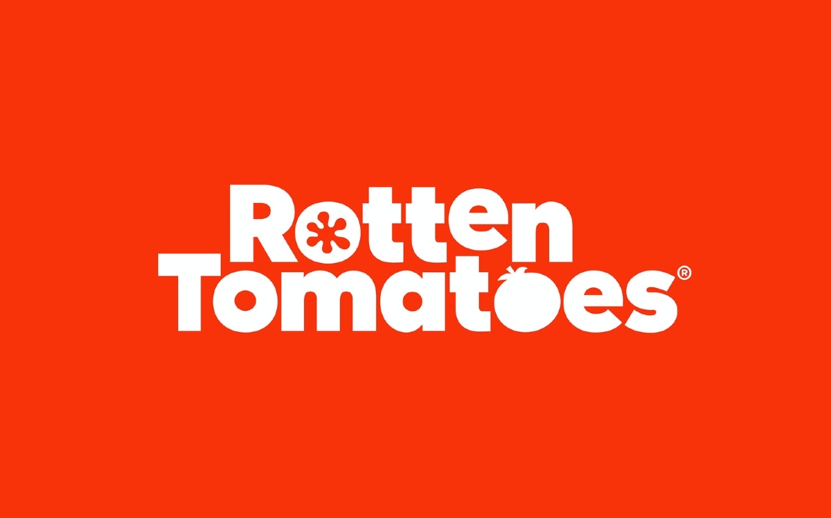
The movie review site, Rotten Tomatoes, made a shift from its outdated early 2000s logo to a cleaner and sleeker one in 2018.
Pentagram, the design agency tasked for the rebrand, kept the logo’s form but made changes in the text and some elements. When one leaves a review on the site, they can rate it as fresh or rotten. On the website, icons are indicating those ratings. It’s still featured on the logo, keeping the overall essence of what the site is. The “fresh” new Rotten Tomatoes look gives the logo a modern design fit for the times.
Asana
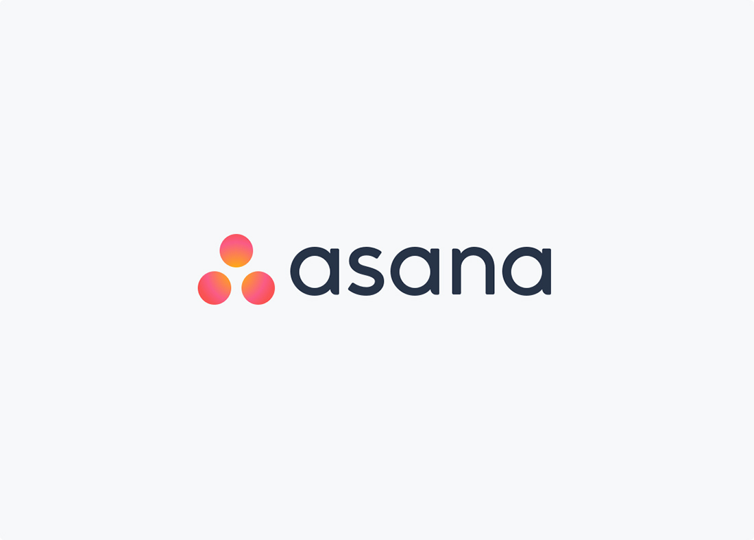
Before Asana introduced us to its contemporary look, it had a basic logo that showed they’re a productivity tool in the late 2000s to early 2010s. Asana made the right choice to rebrand so it could become an application that any team would use.
Moving Brands wrote that the brighter gradient color scheme and the three dots on the Asana logo represent collaboration. Since Asana is a collaborative productivity tool, they wanted to portray that on the mark. Plus, if you look closely, you’ll see that the dots make up an A too. This enables Asana to become the leading tool in the market and become easily recognizable through its colors and messaging.
Spotify

Here’s another project from the Collins agency. This time, it’s for Spotify.
Like other logos on this list, Spotify removed the shadow from its pictorial mark and flattened it. It kept the three lines on the image and the typography for the wordmark. This time, they used green throughout the whole logo instead of having dual tones. The agency gave the music streaming service a new look without losing its meaning or message. They want to show that they’re a prominent streaming service that anyone can access.
Duolingo
The infamous Duolingo owl (Duo) has become one of the most recognizable icons of the decade. It bugs users so they can learn languages on the app. That’s how Duo became a meme. In 2019, they had a logo refresh after redesigning the infamous owl earlier that year.
The agency responsible for the redesign, Johnson Banks, modeled the font from Duo. Thus, they have a custom font called Feather Bold. This allows them to make their brand consistent. Therefore, it’ll play a role in making their brand consistent everywhere. Then, users can easily recognize the brand anywhere.
PayPal
PayPal redesigned its logo in 2014 after its last redesign in 2007.
Like many others in this list, PayPal sought to make a modernized version of their logo without losing its essence. So, they used a lighter color scheme for the new logo and kept a sans serif font. According to Fuse Project, the new logo heightened a sense of trust, innovation, and youthfulness.
Netflix
Before we were glued to our screens and binged watched our favorite shows on Netflix, you had to order shows or movies. Then it gets mailed to your home. Back then, it had a red background with a white font that used a shadow.
As the popularity of Netflix rose, it had to keep up visually. So, they redesigned their logo to stay modern. The 2014 redesign dropped the shadow, making a flat logo. It’s the common logo trend. They then used red on the font, while using black or white in the background.
The new redesign received mixed reviews from netizens. Still, it didn’t push Netflix to revert its previous logo. After all, the new logo was more modern and cleaner. Maybe it’s the new design or the fact that Netflix had expanded to the global market, subscriber rates increased year after year.
A redesign can help in increasing online presence because they can engage with their leads or potential users. That’s why you need to hire a logo designer that can help you achieve that goal.
Final Thoughts
You need to have a logo that stays true to your brand. One that will position your company to your audience. That’s why you need to hire a logo designer instead of using a DIY graphic design service. They can help you build your brand message and connect with your audience online.
But if you have a logo and it needs an update, it’s not all bad to have a redesign of your logo. This ensures you’re still in the game, and that you want to establish yourself as a formidable competitor online. As you can see in the examples above, they’ve opted to have a brand redesign so they can stay on top and want to be ahead of their competitors.
