10 Brilliant Banner Design Inspiration for Your Ecommerce Platform
Admit it. Back in the early 2000s, when banner ads popped up on your site, you would ignore them. It could be a little annoying sometimes. You’re browsing on a website or reading an article, and then you see one of those pesky banner ads detract your attention. You’re not alone because 64% of users think they’re distracting on any website. However, if you want to get more visitors on your eCommerce platform, you’ll need to go all out with advertising. It means you need to explore other options aside from social media and traditional advertising.
Even if banner ads may not receive as much love as the other forms of advertising, you could still increase traffic and sales through that method. Plus, big brands still use banner ads, you know.
In this article, I provide banner ad design tips for your eCommerce platform. Plus, check out ten banner ad examples from eCommerce websites.
Banner Design Tips
On your banner ad design, you need to remember these essential features:
1. Size
The most crucial element you have to remember in creating banner ads is the size.
BannerSnack provided the three banner ad sizes for your eCommerce platform:
- 300 x 250 (Medium Rectangle)
- 336 x 280 (Large Rectangle)
- 728 x 90 (Leaderboard)
2. Color
The next thing you need to remember on your banner ad design is the color. The most obvious choice for your banner ad is your brand or company color. You don’t have to go all out with the color. For example, you want a simple black and white banner ad, then your logo has splashes of color. That’s totally fine. Make sure that you’ll integrate branding into your designs.
However, you could also go for colors that would capture the attention of your leads or customers. You want to make sure that you make an impression because an average internet user sees 1,700 banner ads a month.
This means you need to apply color psychology to your banner ad design. Marketers and designers have practiced color psychology to capture people’s attention and evoke emotions.
Blue is one of the most widely used colors because it’s easy on the eyes. Plus, it’s easy to pair with other color combinations too. Perhaps, you could use green or red as alternatives. But if you want to stand out, use purple, pink, or orange.
3. Typography
Another thing to consider in banner design ads is typography. It’s an essential part of any graphic design output because it’s one of the elements that will glue your reader’s eyes to your design. It’s another factor as to what makes the ad copy look attractive.
Again, you may use what’s dictated by your brand style guide. However, you could consider these fonts on your ad design:
- Avenir
- Univers
- Futura
- Gotham
- Helvetica
4. Imagery
In terms of imagery, you’ll see some would use photography (based on brand guidelines). Others would use graphic design. This way, potential visitors would see or get an idea of what you’re offering. Plus, they’ll process the ad faster and could remember it if you added a photo or graphic design.
Most experts do recommend you feature your product. However, if you want to take it up a notch, go for something different that still captures the essence of your brand. Don’t be afraid of making it quirky.
Tip: Recommended file type for your banner ad design: JPG.
5. Simplicity
If you go back and see the dimensions for a banner ad, you know you don’t have a lot of room to work on.
In terms of structure, you want to make it simple. You don’t want to make your banner ad cluttered. Sure, it could get your potential visitor’s attention, but is it something worth clicking on? In this case, you could consider applying some elements of a visual hierarchy:
- White space (negative space)
- Contrast
- Scale
- Alignment
- Balance
Now you know the basics of designing banner ad designs. Learn who or what services can design banner ads for your eCommerce platform.
Banner Ad Design Services
No one’s stopping you if you decide to design your banner. You could use Do-it-Yourself (DIY) graphic design services like BannerSnack or Canva. They do offer wonderful templates, even on a free plan.
However, you should consider tapping freelancers, professional graphic designers, or subscription design services like Design Doctor to save you resources. This way, you’ll receive more compelling designs and get more views and clicks. Plus, you’ll get designs like the ten examples on the list below.
Examples of Banner Ad Designs
1. Daily Harvest
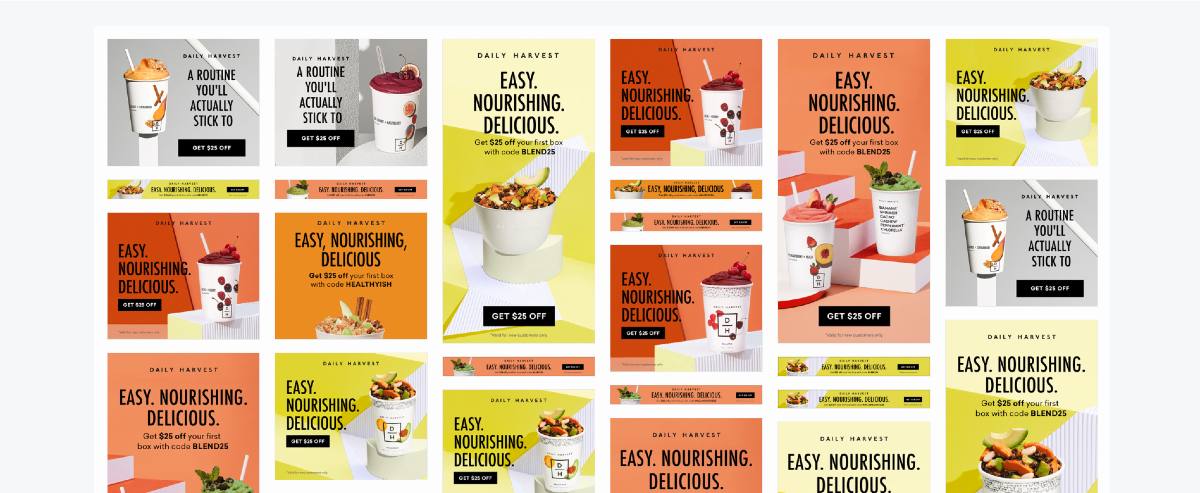
One of the best things about the Daily Harvest banner designs is the consistency in the brand identity. You’ll see they posted high-quality product photos and used the same fonts, colors, and the call-to-action (CTA) button.
The customers could click on the banner because of the discount and the captivating colors. Plus, the food on the photos look so good, I want to try them out too.
2. Ben & Jerry’s
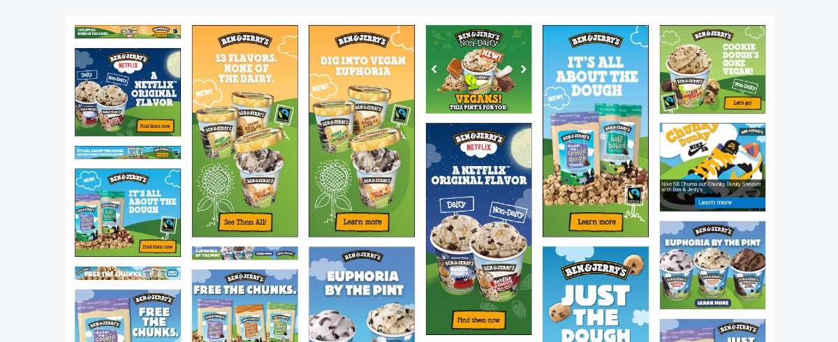
One look at any Ben & Jerry’s banner ad, you’ll know that it’s from the company. They used the fonts and illustrations found on their websites and their ice cream packaging. It’s a bonus that they added certifications like “Fairtrade” and “Vegan” to attract conscious and vegan ice cream aficionados.
3. Lowe’s
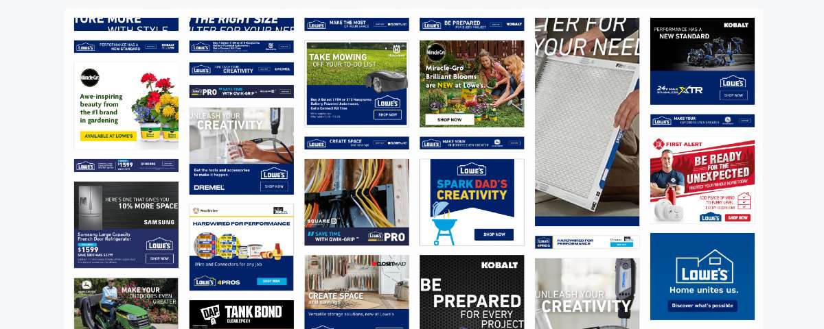
Lowe’s uses a variety of static and dynamic ads and imagery for their banner ad designs. Their signature blue is consistent in most ads, which is a plus for brand identity. Most of the time, they would go for product photography to feature a product and add an appropriate copy. They did use graphic design once for their Father’s Day banner ad.
4. Sephora
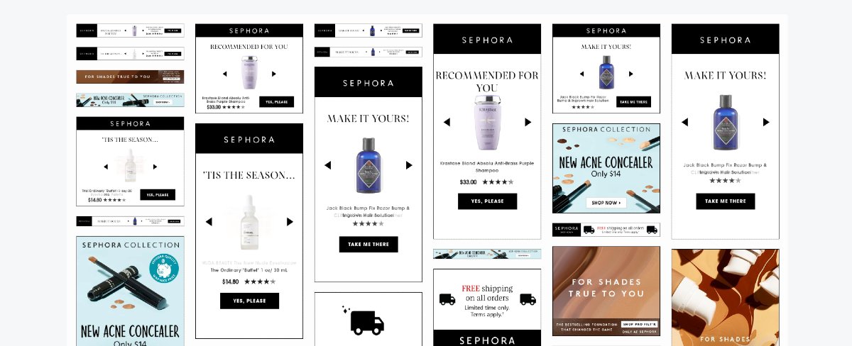
Sephora runs different banner ads depending on the product they’re advertising. However, most of the designs look the same, which would be easy for customers to remember.
Another workaround to the one product per banner ad is the carousel ad. This way, in one banner ad design, they could showcase products that a potential visitor might like. Plus, they also added a splash of color on their background so that their banner ads would pop.
5. Nordstrom
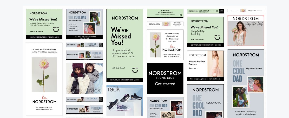
What makes Nordstrom different from other examples on the list is its use of CTA. Instead of the rectangle one, they used a directional cue that will lead them to the website.
They also ensured to keep the ads simple so customers could directly click on their CTA button. The cute icon on their reopening campaign is a nice touch too. It’s a way for them to let customers know that they’re making sure they’re safe while saving money while shopping also.
6. Happy Socks
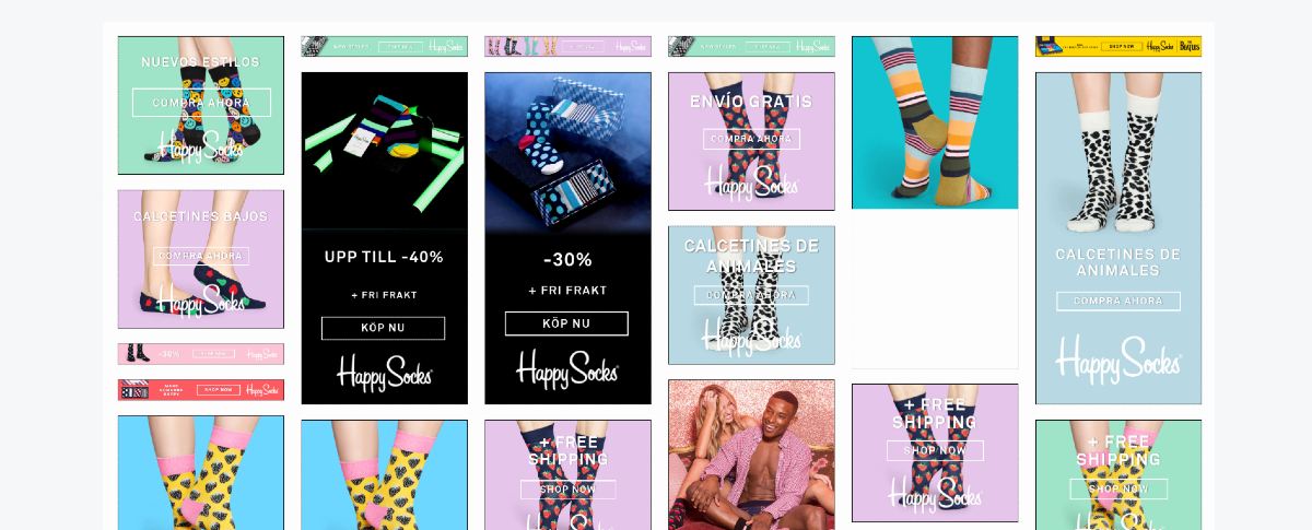
Another example of an eCommerce platform targeting global customers is Happy Socks. They used English ad copies, but they used Spanish and Norwegian on their banner ad design.
I like that they used a transparent CTA, which blends well with the design, making sure that the focus is still on the product. Plus, on the ad design, they always add an offer or compelling statement to attract customers to shop on their website.
7. Aerie
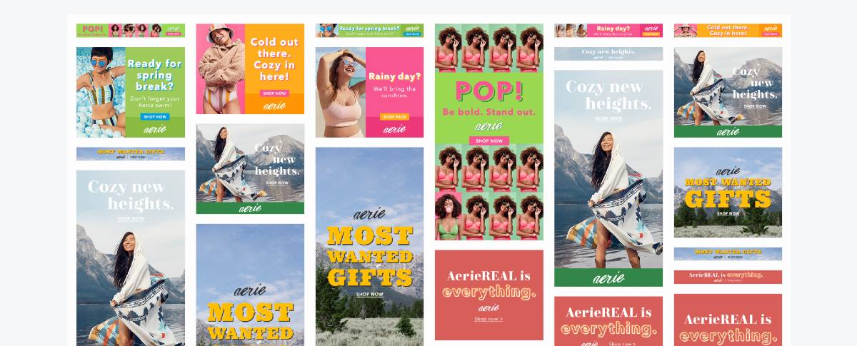
For the Aerie banner ads to pop, they used different colors for one of their campaigns. It works well because the colors are striking, and they used contrast for their CTA buttons too.
Even if the drop shadow is no longer a trend, they made it work to get drawn to their banner ad design. Plus points for Aerie for having a diverse group of models for their ad design too. It’s a way for them to show that anyone could buy at Aerie.
8. Casper
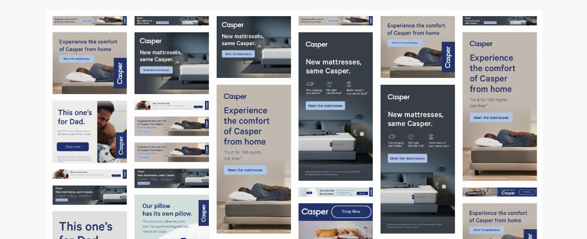
Instead of the usual “Shop Now” or “Learn More” CTA, Casper uses “Meet the Mattresses” as a way to drive traffic to the site. It’s a smart way for users to click on it or visit their website directly and view their selections of mattresses.
The eCommerce website uses muted colors aligned with its design. However, they made sure to use contrast as well on the CTA, so you’ll click on it. They also used icons to visualize certain text like shipping, free trial, and better sleep.
9. Crate and Barrel
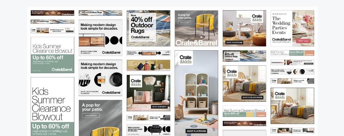
Some experts would advise it’s better to feature only one product on a banner ad design. However, Crate and Barrel decided not to go with the norm, and it worked. You’ll see that they made use of a “set” type of feature to show which products go well together. From there, a potential visitor would want to look around and see more products.
10. Bose
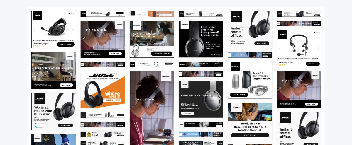
Like some of the eCommerce platforms on this list, Bose also used German and Japanese to attract international customers.
They’ve even gone for simplicity on the banner ad designs to enable customers to click on their Shop Now CTA. Plus, they use models in some photos, while they feature the headphones only in some others. It’s great to see how the headphones look on people before you could purchase a pair.
Are you looking to start a display or banner ad campaign for your eCommerce platform? If so, Design Doctor has got your back. The team at Design Doctor knows how to create high-quality, professional, and engaging ad designs to make you stand out. Not only that, but you can request graphics such as social media graphics, marketing collaterals, and branding related visuals. Subscribe for only $349/mo.with the Starter subscription, and get all the designs you need in a month.
