11 Powerful Ad Design Tips Marketers Swear By
Some marketers may have a significant role in how designers create ads. Of course, graphic designers create an ad design, but marketers may have some input on how to deliver a message on the ad. That way, they work hand-in-hand to deliver their brand’s message for that campaign.
Some marketers may experience creating ads through graphic design services. From there, they experience how to design simple advertisements for their campaigns. By doing that, they get to learn design elements along the way as well.
In this article, we focus on ad design tips that marketers provide for designers and marketers alike.
1. Place a Call-To-Action
Marketers love adding a call to action to almost everything. It’s a way for their target audience to do something. It can be something simple, like “read more.” Sometimes, it could be “sign up” or “subscribe.” That sense, you’re starting to capture leads as they get to know the company more.
So, it’s no surprise that the concept is part of ad design.
The copy is integral to advertisement design. It should serve as a support to the image. That’s why a call to action is the best way to captivate your target audience. In a sense, it’s also called “urgency.” You want your customers to take action right away upon seeing the ad.
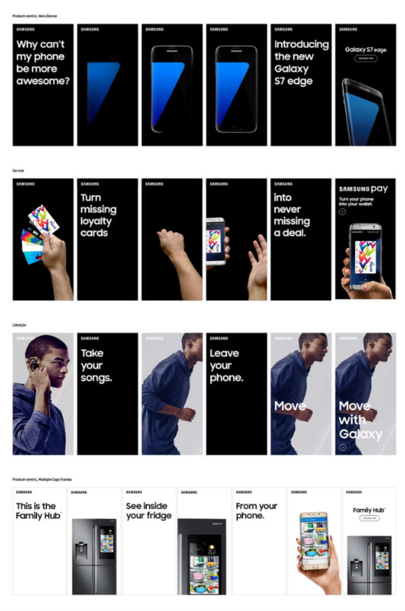
Banner ads are prime examples of integrating a call to action on advertisements.
Here are the sample banner ads that designer Gabby Manotoc created for Samsung US. You can click on the call-to-action button: “Available Now.” In some cases, there wasn’t even any call to action, a button served as the call-to-action button.
2. Take Note of Hierarchy
There are many elements in the visual hierarchy that any designer should always consider. Marketers know that it’s essential to have a hierarchy in graphic design because of presentation style.
For your advertisement design to look more presentable, you need to apply the grid system. In this manner, you’re incorporating hierarchy in your advertising design. This way, you know where to put the font, images, and other design elements.
You have different grids to choose from in terms of how you want to create your ad. Simon Andrys from Content Harmony provided nine ways on how to use the Facebook 20% grid layout. You may also use the layout designs enumerated by Orana Velarde as well. Here are some examples:
- Hierarchical grid
- Compositional grid
- Modular grid
It’s not just about the placement of elements that are part of the hierarchy. According to Samantha Lile, some other design elements include:
- Spacing
- Negative space
- Proximity
- Alignment
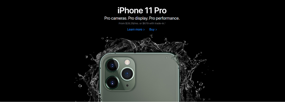
As you can see on Apple’s banner ad, there’s a grid-like hierarchy on how they present the advertisement. They emphasize the large iPhone 11 text, followed by the description and the pricing as the font gets smaller. Alignment seems to apply in the ad where you can see one line.
3. Set it in motion

Make something feel fluid or tangible by making an image in motion, even when it’s just a photo. You want something interactive, also if it’s static.
Examples of setting an ad in motion are adding splashes or explosions. Motion can help in making products stick out, which would further put the focus on the product itself or how the product can become the solution.
You can see this design from Omo. Omo is a cleaning solution found in Vietnam. The image tries to make a spill because of the splash. What Omo probably wants to show is that despite the stains and spills, it will still clean the product.
4. Go for Surreal or Weird
Many designers and marketers alike recommend simple designs. But simple doesn’t have to mean boring. To heighten simplicity, you can make it surreal or weird. That way, you’re able to pique your target audience’s interest when they see something out of the ordinary.
You want to become more prominent against your competitors, and sometimes it’s a good idea to divert from how designers make ads.
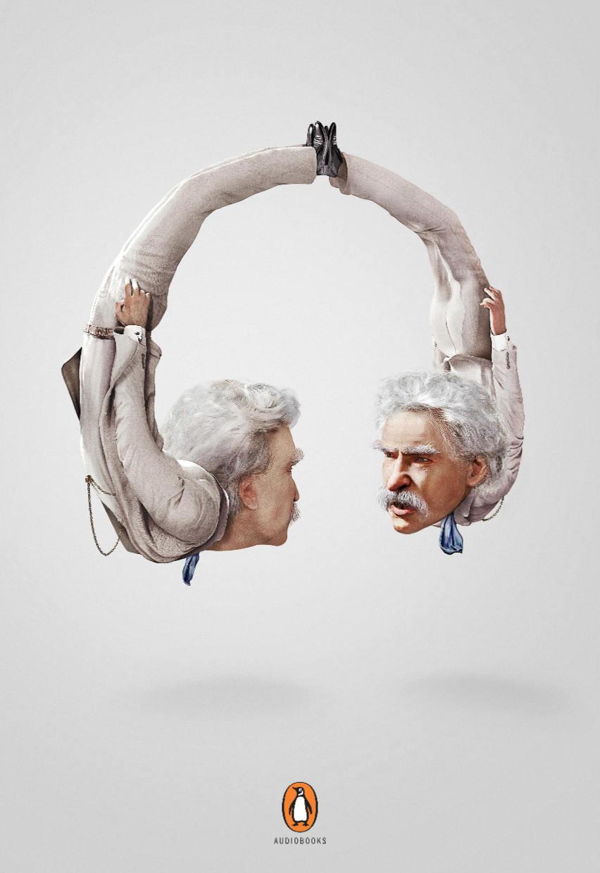
Here’s an ad from Penguin Books. It used authors and morphed them into headphones. It’s a way to promote audiobooks. It’s surreal, but it’s creative, and it works!
5. Take Inspiration from Hero Images
Hero images don’t pertain to the superheroes from Marvel or DC. A brand’s product or service should serve as the hero image. You won’t notice it, but many companies use a hero image on their website. That way, they’re able to shine a spotlight on their bestseller.
To further emphasize hero images, go for the Facebook 20% rule. The 20% rule means it prioritizes the image or visual than text. That way, at first glance, it’s always the product or service that appears immediately.
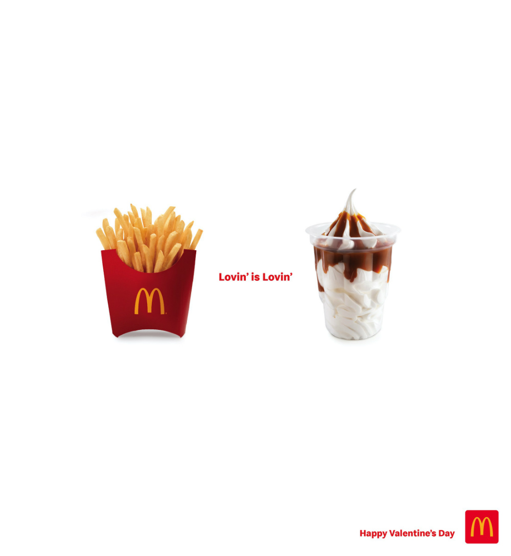
As part of their Valentine’s Day campaign, McDonald’s presented pictures of their most popular products and had only just one bit of text on the main ad. They’re promoting love and their products, which became the main focus of the ad.
6. Incorporate Color Psychology
Most would recommend using color palettes or complementary colors to make the ad design pop. However, you should also remember to use color psychology. Color psychology can help evoke certain emotions to the viewer of the ad. That way, they can associate that emotion with your company.
You don’t have to set aside the colors of your branding. Say, the color of your branding is red, you can use green and blue or orange and pink. Maybe you could start from there, and craft a message based on the colors you saw. Or you could go with the copy or message first then use an appropriate color scheme.
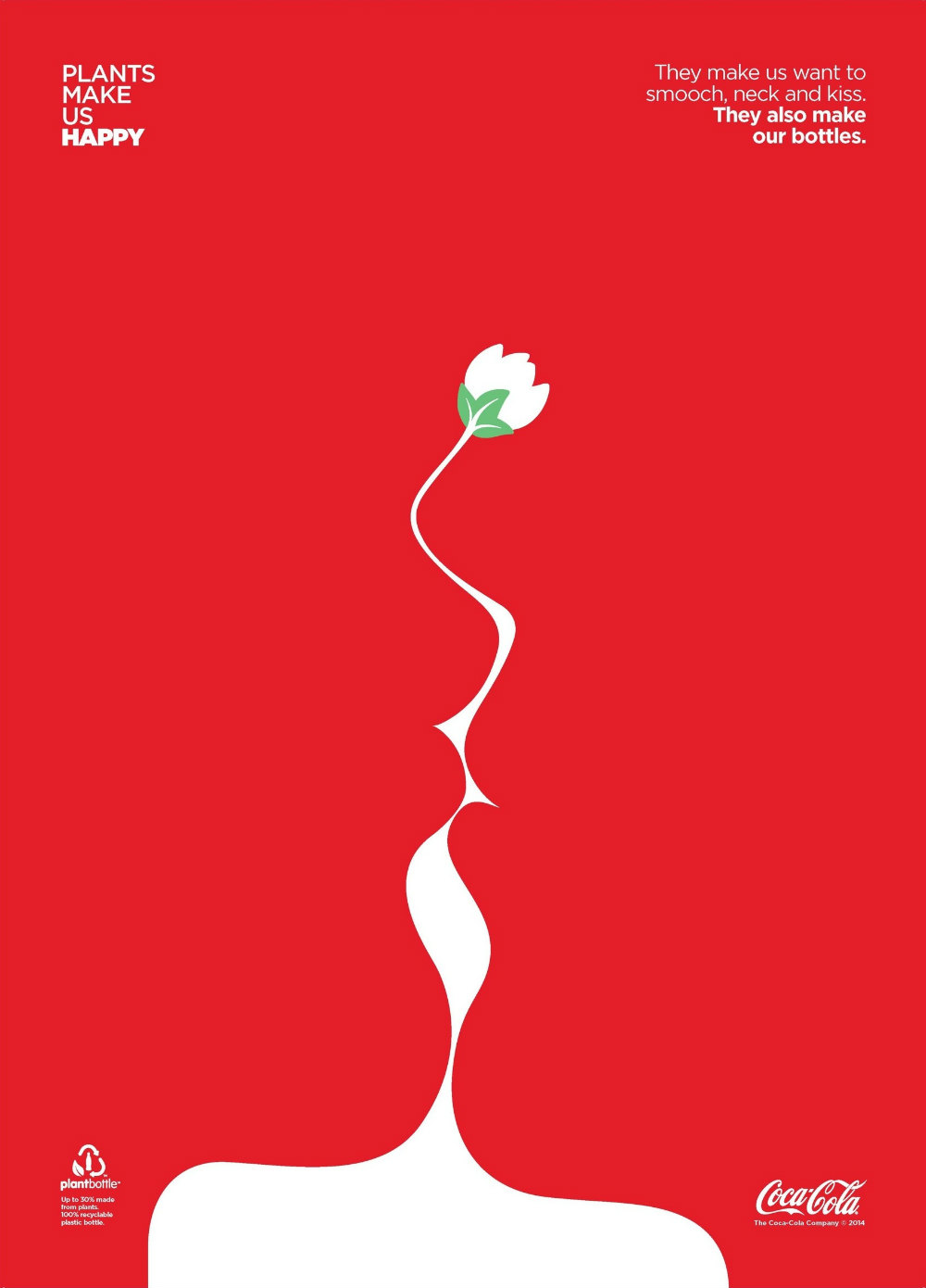
In this example, from Coca-Cola, they used their signature red. Red presents passion, warmth, and energy. You can see that a couple is kissing, which can signify passion and warmth. It also uses green, which is a complementary color to red. The color represents nature. It’s an excellent example of incorporating branding, color psychology, and complementary colors.
7. Keep the Audience in Mind
Marketers have the responsibility of knowing who the target audience is. That way, it’s easier to guide them to a buyer’s journey, convert them into customers, and become loyal over time. In creating ads, it’s not just about design. It’s to remember the audience at all times.
Designers should also remember that audience perception is integral in viewing the ad. That’s why you should have the audience’s interest in mind when you create ads.
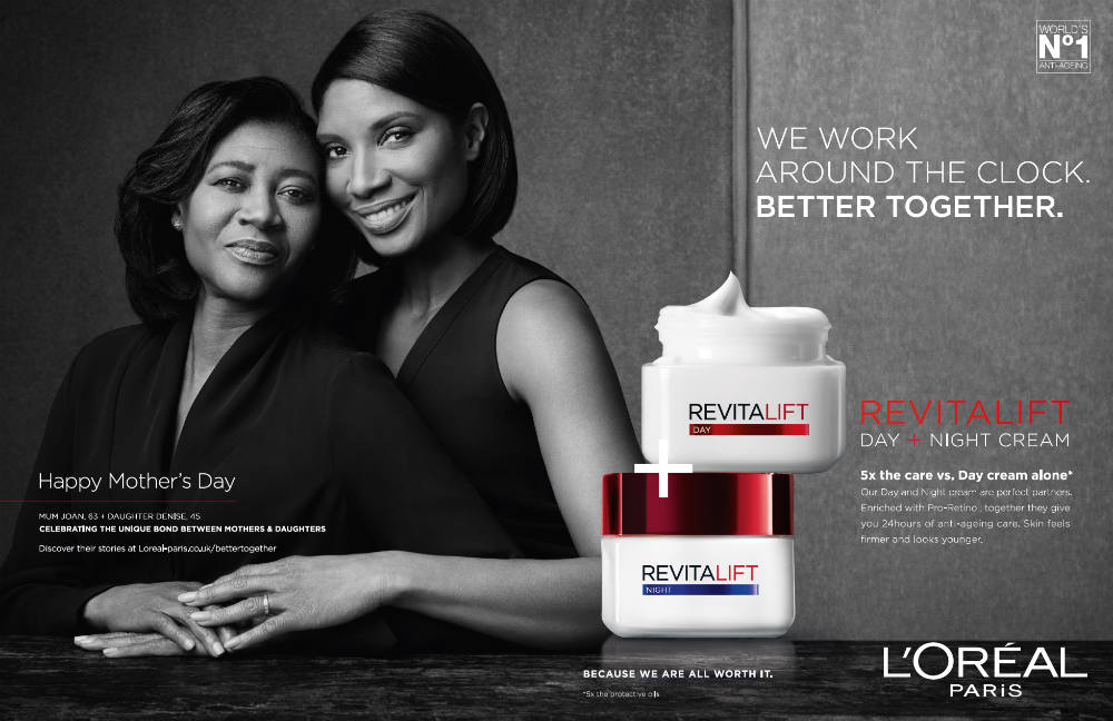
Makeup brands always keep their audience in mind. In this print ad for L’Oreal, it’s targeting all women (specifically moms and daughters) for the Revitalift product line. It seems that a mother-daughter duo would help exemplify their product to present a joint effort for younger-looking skin.
8. Add Icons, Shapes, or Lines
In cases where you need to create a simple ad, don’t hesitate to use the simple elements that could make your ads pop.
Icons like the notification bubbles you see on your phones are apt examples. You can add shapes to accentuate some elements in your product or service. It can be a quirky ad design too. As for lines, you can add borders to highlight specific areas of your ad. The hierarchy principle goes well with lines also.
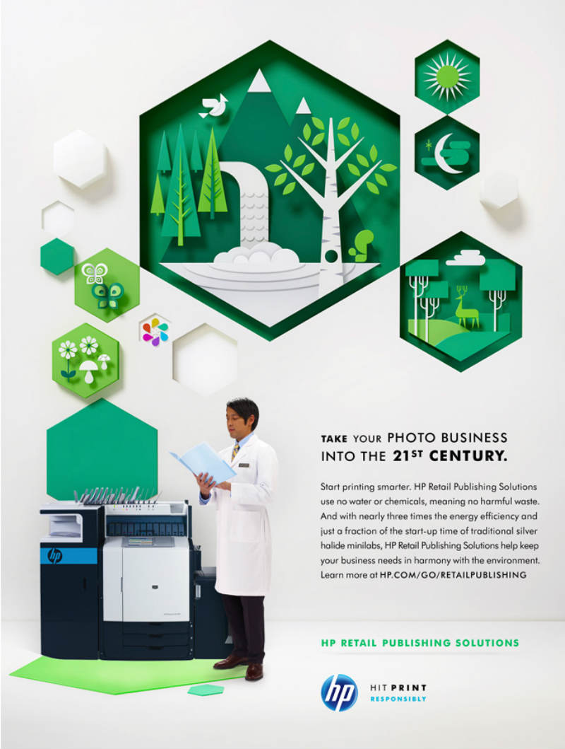
Here’s an ad by HP. They used octagons as part of their ad campaign, “Hit Print Responsibly.” It’s a way to animate the design. It even used icons to add more context to the message of the ad.
9. Use Two Fonts Max
You want to capture the audience’s attention, not confuse them. The copy of the ad, sometimes called typography, can make customers look twice on the ad. However, the font plays a significant role in how the copy stands out.
Less is more with fonts, according to the Search Engine Journal. You don’t want it to become noisy by having different fonts all at once. It may prompt your customers or audience to look at the ad, but they might not take an interest if it has too many typefaces.
Another tip on fonts: make sure that it will set the mood. According to B3 Multimedia, to demonstrate friendliness, use rounder fonts. If you want to present elegance or class or power, stick with Sans Serif type of fonts.
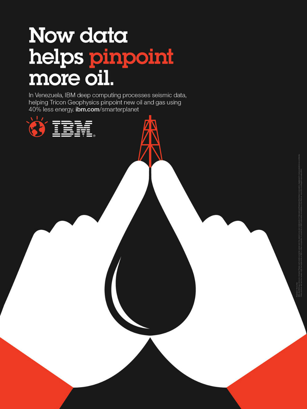
Here’s an example from IBM’s Smarter Planet campaign. They used only two fonts to emphasize the copy of the ad. The bigger font wants to present emphasis, while the smaller one provides support about the main point.
10. Remember Ad Sizes
If you’re publishing an ad online or printing one out, you might have to use the same ad for other platforms. That’s why you should remember different ad sizes.
It’s best to create a design that can fit all ad sizes. It could be easy to adjust the design for different social media platforms like Facebook, Twitter, and LinkedIn. You can modify the design for vertical ad types in Snapchat and Instagram.
Another tip to follow in ad sizes is to try it out before you publish it live. You wouldn’t want to post an ad that doesn’t have the dimensions right. From there, you can readjust accordingly.
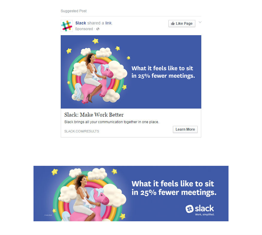
Slack ran its first ad campaign in 2015. They ran banner ads and Facebook ads. As you can see on the examples, they resize the ads to the specific dimensions.
11. Integrate Storytelling

Remember the saying, “a picture is worth a thousand words”? Sometimes, all you need is a photo and an excellent copy, and that could pass as an ad. Why? You may need to add a photo to an advertisement to tell a story.
That way, your brand or company emphasizes with your target audience. In turn, they’ll connect with you.
Check out this ad by Dettol. You can see the shape of a hand, but you see different hands and what people touch during the day. From there, you would see a story of someone touching things. So, Dettol, advertised its hand sanitizer to make sure that your hands are clean throughout the day.
Final Thoughts
Ad design doesn’t only focus on the graphic design elements. Marketers also provide invaluable input on how they can create better advertisements. Marketing elements can be incorporated to ensure the delivery of the message in the ad. That way, the target audience can connect with the ad better.
If you need advertisements for your small business or startup, Design Doctor can provide high-quality social media or banner ad designs for you. You can also request for other assets like posters, flyers, or logos. All in one flat monthly rate of $329.


