15 Ecommerce Landing Page Examples You Can Copy
With so many things on their minds, business owners tend to disregard the conversion powers of a landing page. Studies show that for companies that have ten or more landing pages, they do see a 55% increase in leads—the main reason you should create more landing pages. But the challenge doesn’t stop there. For your eCommerce landing page to get noticed, you need to add creativity to it. If you want to know what landing page designs are worthy of emulation, read on. We listed 15 of the best eCommerce landing page examples we found around the web for your inspiration.
1. Hello Fresh

Food subscription boxes are thriving, and standing out from the crowd can be a tough task. Hello Fresh has done a beautiful job with their landing page that looks refreshing and enticing. The use of clear imagery and big, bold letters grab the attention convincingly.
The landing page has all it needs to make you understand why buying from them is a good idea. The offers mentioned aptly show that the brand is offering undeniable value you just can’t miss.
2. Infinite Moon
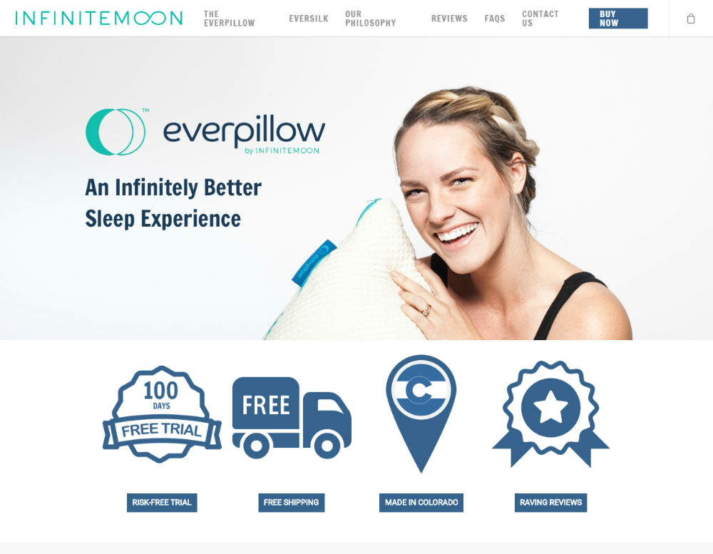
A landing page only has a few seconds to get the attention of prospects. Infinite Moon made it easy for viewers to see who they are and what they’re about at a short glance. Providing a good buyer experience is essential, whether on a physical store or your eCommerce landing page. Infinite Moon had done that when they designed their landing page to have a functional hierarchy of elements as well as proper use of white space.
3. The Farmer’s Dog
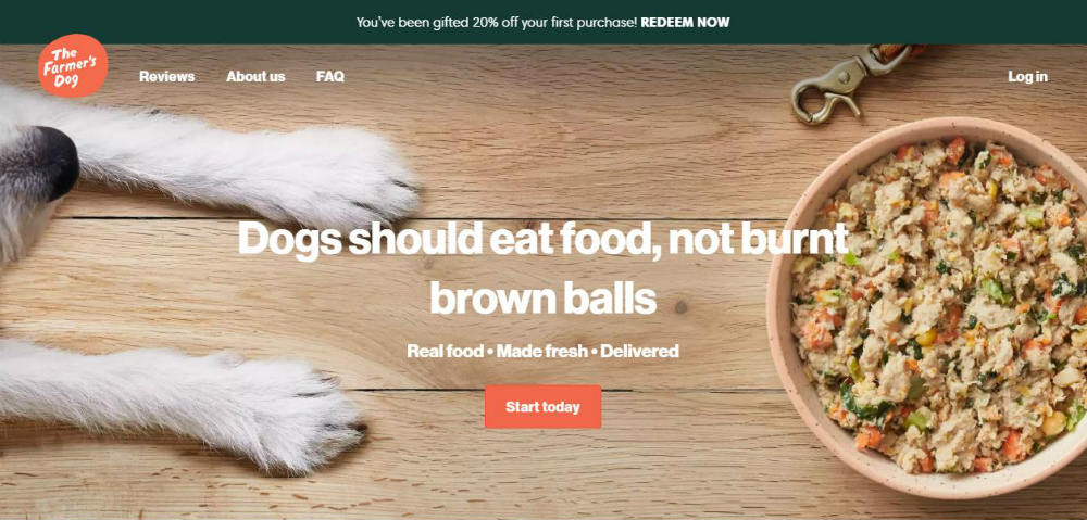
Every second that a visitor spends on your landing page has to count; otherwise, you’ll have little to no chance of converting them. The Farmer’s Dog puts its 3 seconds to good use with images and texts that are relevant to the brand. Doing so means avoiding fluff and putting unnecessary elements in it.
4. T-Mobile
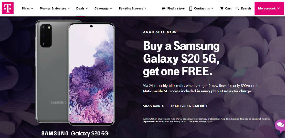
They say that there’s no such thing as window shopping online. When a prospect visits an eCommerce website, it’s highly likely that they’ll make a purchase. T-Mobile does it well with their landing pages when they urge visitors to click on an offer and read the details later.
5. Alchemy Fine Home
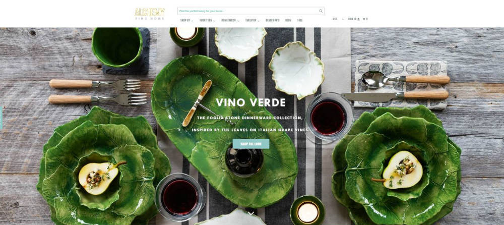
Focusing on their product images and using less copy, Alchemy Fine Home does landing pages quite well. Their 15% discount is a great way to get prospects to shop as well as build a customer database via the emails that they collect. This is a landing page that has both beauty and brains.
6. Casper
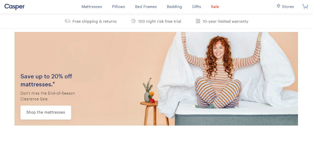
Aside from its overall design that’s pleasing to the eyes, Casper capitalizes well on their special offers. You can see all over the website the discounts and various offers, such as free shipping or risk-free trials that are sure to grab buyers’ attention. They are everywhere, and you can’t possibly miss them.
7. The Coffee Network
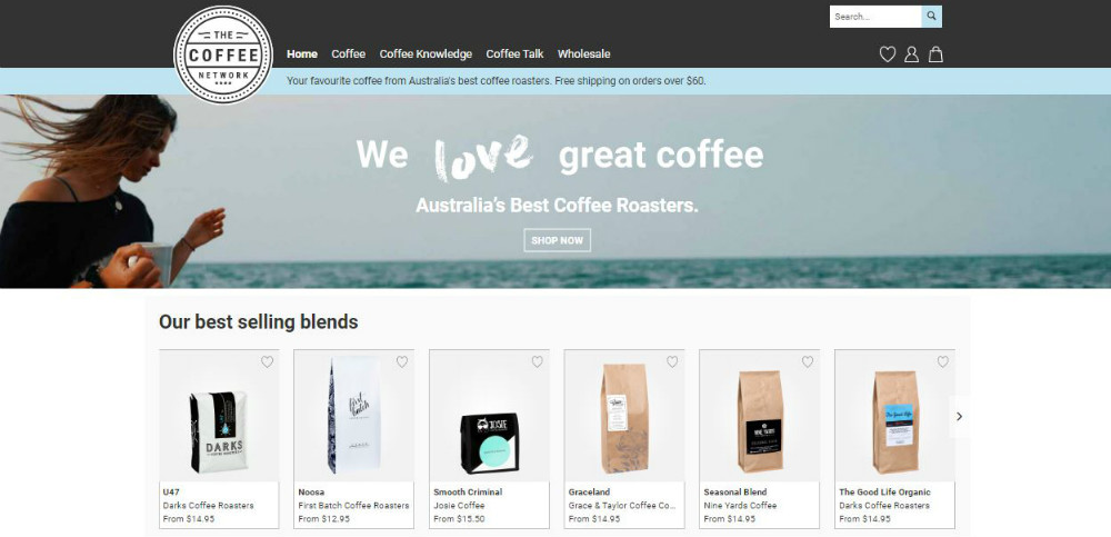
The Coffee Network‘s landing page is beautiful and informative. It offers ways to find which coffee is best suited for you to give a feeling of getting personalized services. It is focused on educating the visitors on their products and coffee in general.
8. SnackNation
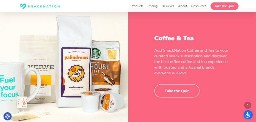
One right way to create a landing page that gets the eyes of your prospects is by engaging them. SnackNation‘s landing page design features a quiz that’s hard to resist. The whole website design has a cheerful and energetic vibe to it that makes snacking seem like a celebration.
9. GoPro
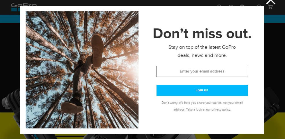
Adding a sense of urgency is an effective marketing strategy. You can use this tactic on your landing page as what GoPro has done on theirs. FOMO (Fear Of Missing Out) is a thing, and they used this well with offers of big savings on a limited time only. The images and layout are also noteworthy as they give a sense of excellence and high-quality performance in their gadgets.
10. Prime Ambassador
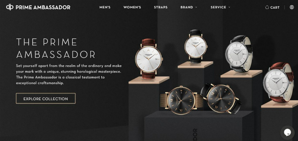
Prime Ambassador’s landing page kept their copy to a minimum, allowing the products to sell themselves. It would be safe to assume that visitors to your website will most likely ignore blocks of texts anyway. The product images are the first ones to greet the visitors, which would be the best as your prospects are there for precisely that reason.
11. Fabfitfun
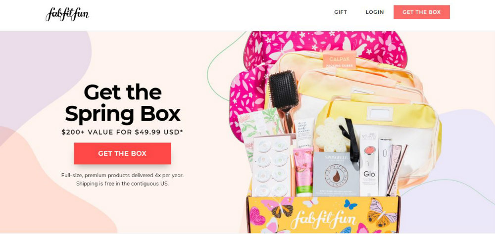
Using a spinning wheel to grab attention, Fabfitfun‘s landing page is vibrant as well as engaging. The chance of getting huge discounts is a good come on in addition to the opportunity to play a game. The images are crisp, the colors are bright, and the addition of trust signals adds credibility to the website and the brand.
12. Axis
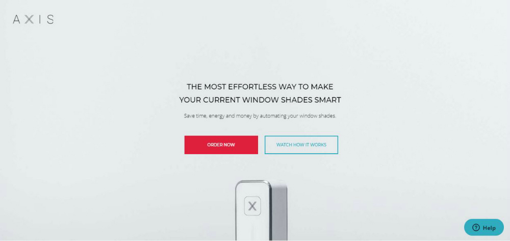
Being concise and straightforward is a must in the business world. Axis does this on their landing page by using a headline that speaks well for the brand. This is simplicity at its best and does the job well with the Order Now and the Watch How It Works buttons that explain it all.
13. Flaviar
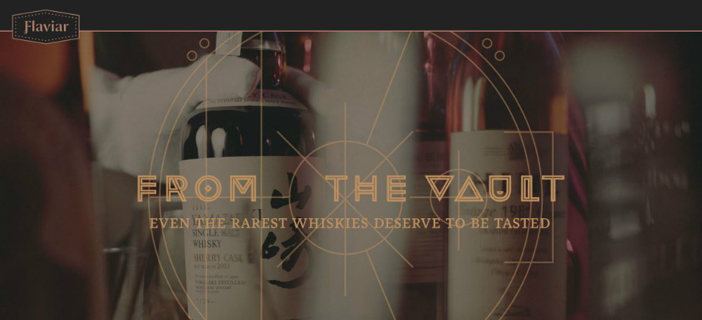
Flaviar‘s landing page is an excellent example of blending mystery with exclusivity that is sure to pique the visitors’ interest. The online store design uses dark and somber colors that convey secrecy and sophistication. The headline is short but powerful, along with the sub-headline that reinforces the atmosphere the brand is trying to project.
14. LIV Watches
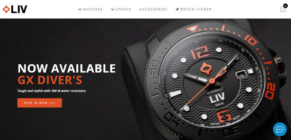
If you scroll down LIV Watches’ website, you’ll find amazing up-close images of their products. And they have done this throughout their website, showcasing their products in multiple ways. They also have the standard product with price listing, but the overall design allows the craftsmanship to shine through brilliantly.
While most eCommerce websites use the typical carousel approach, the company’s online store design went against tradition. And it has proven that taking the off-the-beaten-path definitely pays off.
15. Apple
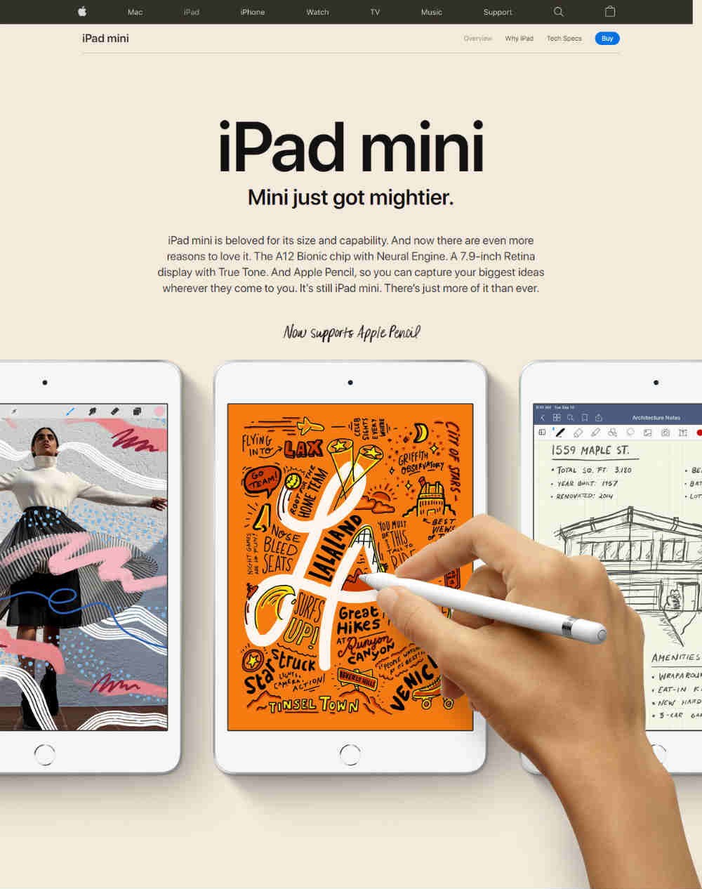
It seems that Apple has not only dominated more than the tech industry but eCommerce landing page design as well. Their web designer did an excellent job on the landing page that mixes playfulness with precision and clarity. Every design element is relevant, and the direction to the customer’s next step is clear.


