Here’s What NOT To Do For Your Company’s Logo Design
Icons8 finds that big brands would spend thousands, even millions (e.g., Pepsi, BBC, and Symantec), to pay for the perfect logo. That’s a bit much, but an excellent company logo design will create a robust brand identity and increase retention.
That said, some business owners may opt to use do-it-yourself (DIY) logo design services to pay less for a logo. However, businesses may make design mistakes, especially if they have no prior design experience. This is why it’s much better to hire a graphic designer, so there won’t be any design blunders on your logo.
In this article, learn the most common logo design mistakes people make. Plus, know why you should hire a graphic designer instead of doing your own logo.
1. Mixing Fonts
Like with other graphic designs, mixing different fonts is a no-no. It shows you don’t have a consistent brand, and you won’t look professional.
If it comes from the same font family, then it’s possible. For example, if you’re using Open Sans for the logo. You can use two variations of the font in the logo (e.g., Regular and Italic). However, use it with caution.
It’s best to stick with one font and style. After all, your company logo design is another way you can encapsulate your brand. Stick to simplicity.
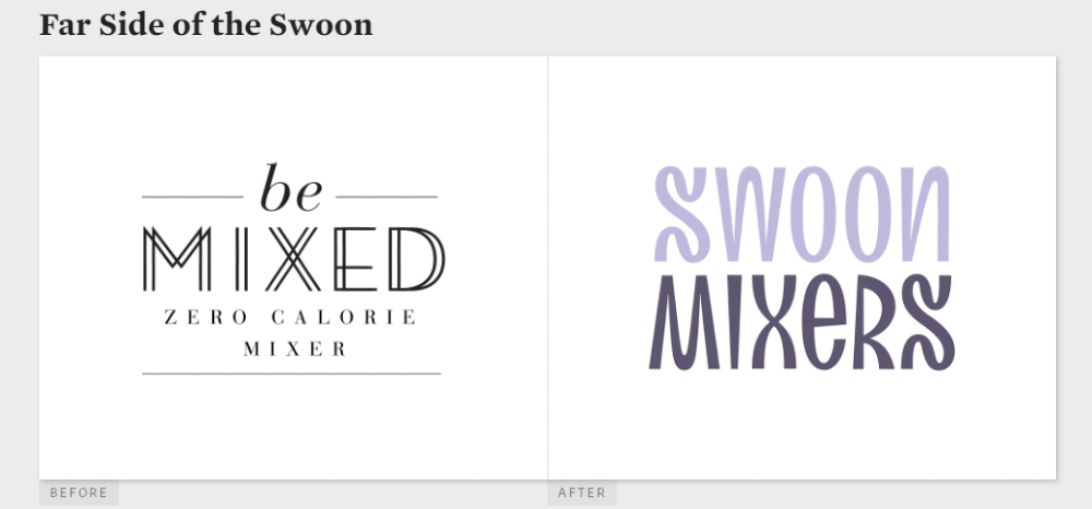
Check out this example from Swoon Mixers. Before the logo redesign, they had three different fonts. If there are three different fonts, it can become unclear how people would want to perceive their company. Luckily, their logo refresh is an improvement, and its identity is more evident than ever before.
2. Combining Different Colors
As with any graphic design rule, you shouldn’t mix colors that don’t complement each other. It will look messy, and it’s not pleasing to the eyes.
Professional graphic designers use tools that will check which colors match. A site like Paletton will help a graphic designer know how to create a professional company logo design.
If all else fails, you can try a black and white scheme. Still, before you decide on black and white, test it out with a complementary color. That way, you can gauge if the color works for your company or not.
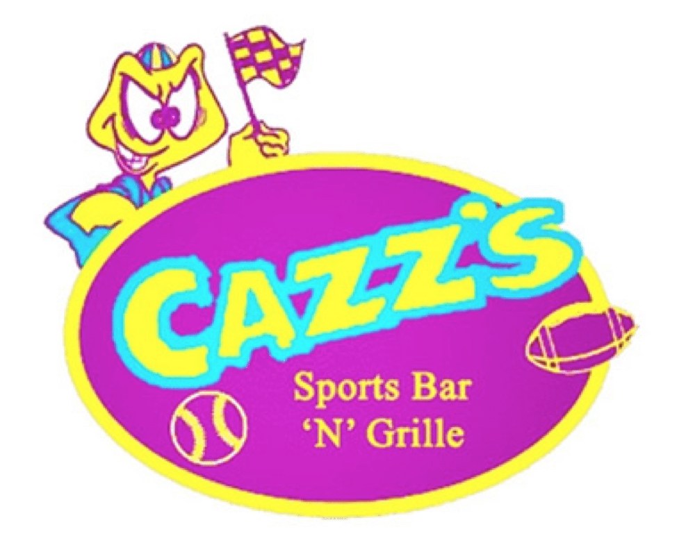
The Cazz’s logo is one of the most infamous bad logos. In any bad logos list, they’re part of it for good reason. It’s a colorful mess, and it’s a bad one. Putting it lightly, it seems like a unicorn barfed, and that was the result of it. Plus, it’s too neon, and it hurts the eyes.
3. Copying An Existing Logo

They say imitation is the highest form of flattery. For logos, that’s not true.
Logos should be unique to your company. That’s why your logo should have a copyright. That way, in case of any trouble, you can dispute your logo. There have been cases where logos were copied like for Louis Vuitton and American Eagle Outfitters
Plus, you can probably get a copyright issue when you use DIY graphic design services online. Since it’s one of the cheapest ways to get a design, new businesses would use it to save money. You wouldn’t want to get into more legal trouble and spend more just because you and some other businesses share the same logo model or style.
Here’s a comparison of two similar logos. It’s the battle between American coffeehouse and Korean coffeehouse Starpreya. Get this, Starprenya won the battle against Starbucks after Starbucks questioned the logo’s copyright. In 2011, Starbucks had a logo redesign to celebrate its 40th anniversary.
4. Using Stock Images/Illustrations
Business owners who don’t hire a graphic designer may believe it’s easy to whip up a logo from scratch by using DIY services. But they also risk making another mistake by utilizing stock images or illustrations. Sure, it’s the easiest way to do it. You could either pay for it, download it, and add it to your logo.
However, business owners should avoid doing this. Sure, since you’ve paid for it, you can use it in any way you want. Sometimes, you still need attribution. Again, a logo designer can make everything from scratch. So, any component in the logo is original. Again, this is another matter on copyright, so make sure that every bit of your logo is unique.
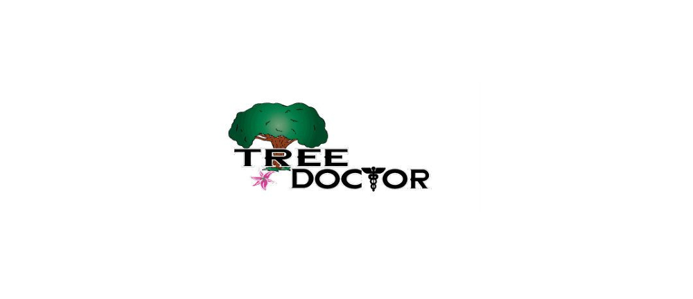
Here’s another bad logo culprit. As you can see on the logo, the Tree Doctor seemed to use stock illustrations. This makes it difficult to take them seriously because of how comical the logo looks.
5. Not Following Visual Hierarchy
The visual hierarchy provides a more coherent way of assembling your logo. There are rules to visual hierarchy. Sometimes, graphic designers will follow it because it’s dictated by design. In other instances, they’ll change course but observe the rules of visual hierarchy.
You may not know it, but you need to follow the visual hierarchy in your logo. What is visual hierarchy? It’s the way you organize different elements to create cohesion. If you don’t follow it, you could have a messy and disorganized logo.
So what are the essential elements included in this?
- Whitespace
- Contrast
- Alignment
- Balance
- Types
Through these components, graphic designers can create a compelling, high-quality logo that captures the essence of the company. In turn, this will give you not only a well-designed logo but one that will put you on the map.
You may read more about visual hierarchy here.
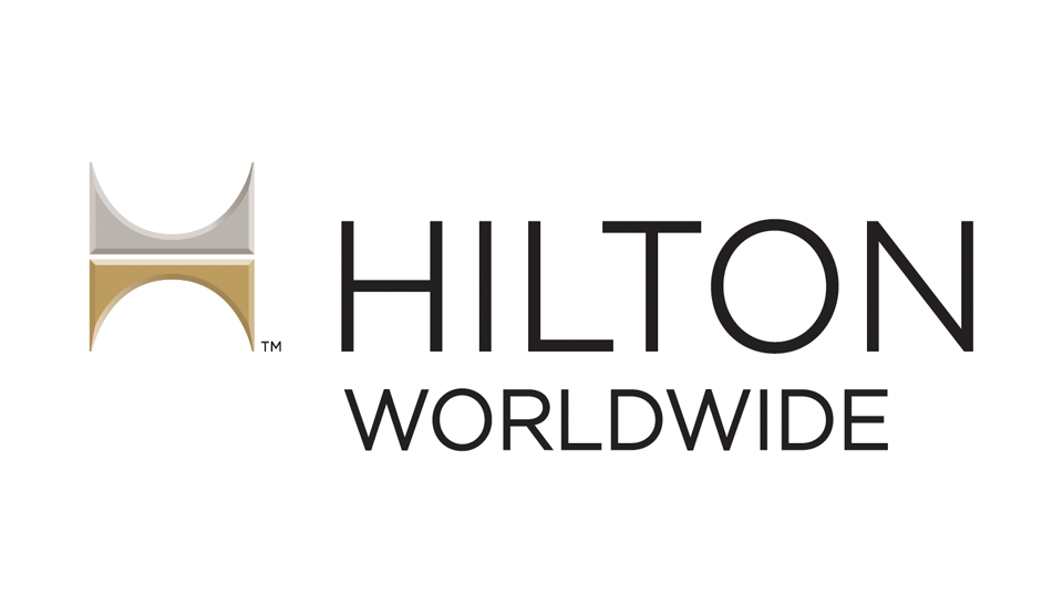
Here’s an example of a logo that didn’t follow visual hierarchy thanks to alignment. The Hilton Worldwide logo doesn’t look polished. The logo could’ve looked better if the emblem was in the middle alongside the wordmark.
6. Creating Clutter
If you put too many elements in your logo, you would lose your overall identity. Plus, you’ll make it too complicated that not even you may understand what your logo is. Don’t break through the noise with a complicated company logo design.
Put it this way. Simple is best. That way, at first glance, you have a sense of what your company is through your logo. Besides, your customers or users would understand you too.
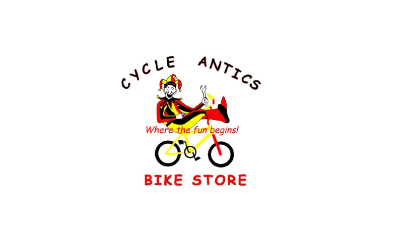
Here’s the logo for Cycle Antics, another bad logo alumnus. There’s a lot of things going on in the logo. It’s too confusing because of the colors, the icons, and the text. Everything’s distracting, and it’s unclear what Cycle Antics is about.
7. Having No Process
One of the mistakes that you might unintentionally make is the lack of research before designing your logo. Your logo shouldn’t just have a design for the sake of it. A logo can tell a story. This way, your logo can strengthen your branding.
You should never forget researching as part of your company logo design process. Here’s how graphic designers usually conduct their process.
Research starts with knowing you, the audience, and the market. Then, a graphic designer would draft sketches and present the best drafts to clients. After this, a client can choose a design, and a graphic designer would revise it based on feedback. Once done, they’ll finalize the design to publicize.
Leave it to the experts since they have the chops to create a logo that suits your company and brand.
8. Not Making Different Versions
Creating a logo is a process. Sometimes, it takes a while for you to decide on which design would be perfect for you. As emphasized before, a logo isn’t just a design. Your logo is a powerful brand asset, and you should treat it as such. This means expect to design different logos until you find the one that fits your company. Don’t settle for the first draft you create (or receive, if you hired a logo designer).
9. Being Inflexible
You want your logo to be displayed across all channels where your customers can see it. It should appear on your flyers, social media profiles, merchandise, and other deliverables.
However, what many forget to realize is it needs to have different scales or sizes depending on where it will be displayed. You wouldn’t want a logo looking pixelated on your social media profile. I’m sure you wouldn’t want it to be stretched out on a pen or stationary. That’s why you need to include scale during the logo design process. That way, you can see how your logo would look on different platforms or printed items.
10. Following Trends
What once was a trend can become outdated eventually. That’s why professional graphic designers don’t follow trends. They think beyond what’s hot that year, and make sure the logo is relevant. Or at least until it’s redesigned to make it modern again.
One of the most common trends (and grievances by design experts) in the past for a company logo design is drop shadows. It was common to see logos with drop shadows before since many companies applied the design. Even Google had drop shadows before, but they’ve changed their logo since. Drop shadows will make your logo look tacky and old.
Another design trend not to follow anymore is using glowing edges. Sure, you want to stand out by being brighter than others. But it won’t bode well for you. Since, like the drop shadow, it’s an old fad.
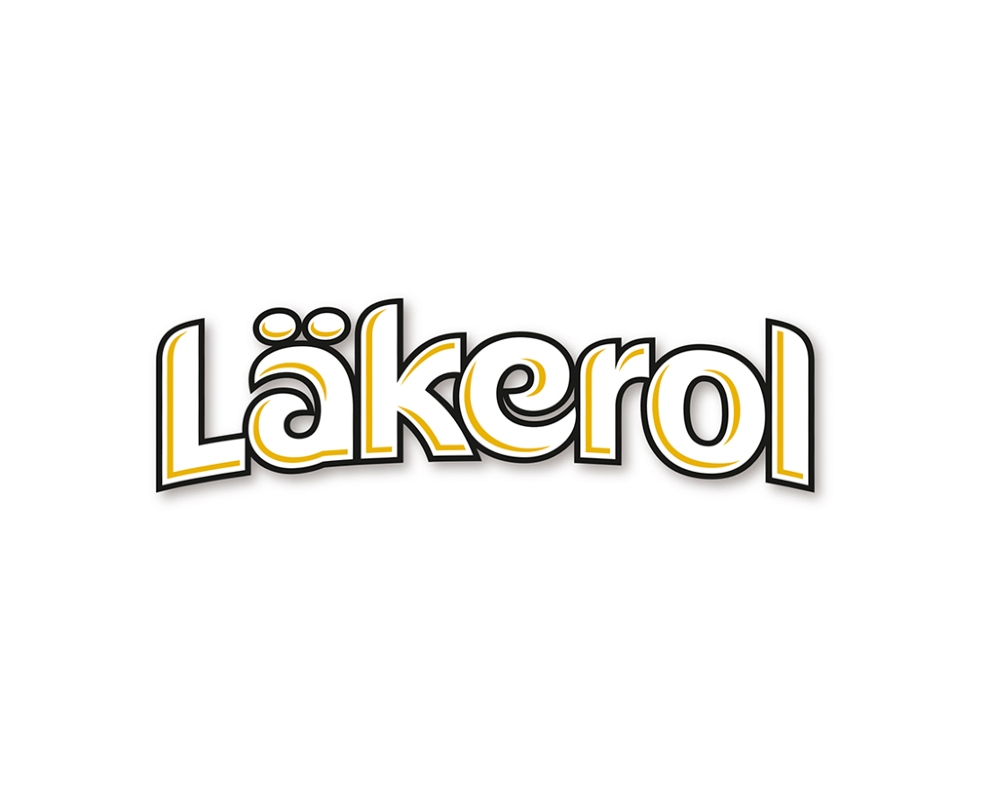
Check out how the old Läkerol looked before its redesign. As you can see, there was the drop shadow, but it doesn’t look bad like other logos. Still, it made it outdated. However, they redesigned their logo, and the new one looks modern and simple.
Why You Should Hire a Logo Designer Instead
The above reasons are why you shouldn’t use do-it-yourself logo services for logos or any other graphic design. A logo designer can ensure that you won’t encounter any don’ts for your company logo design.
In this case, you’ll need to hire a professional graphic designer to create your business logo. Design Doctor, a subscription-based design service, or a design agency can meet any graphic design requirement you’ll request.
An on-demand graphic design is well-equipped to handle any design tasks that come their way. They’ve hired or enlisted help from professional graphic designers to solve any client challenge. However, due to their design knowledge and expertise, they charge a higher rate than some graphic design services and freelancers.
You don’t have to go to a design agency even if you have a limited budget. That’s where Design Doctor enters.
The unlimited graphic design service can produce your graphic design requests anytime you subscribe. You can ask for flyers, infographics, packaging design, and any other design you need. The subscription starts at $349/mo. This saves you money from a per-hour or per-project basis. Plus, you won’t spend time looking for a new freelancer after a project is done, and you won’t have to do your own designs. This way, you can focus on what’s important: running your business.


