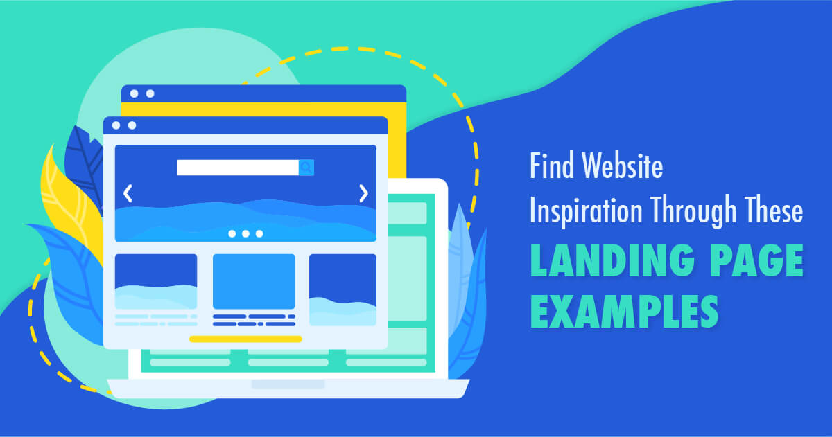
Find Web Inspiration From These Landing Page Examples
Placing ads is one of the best-proven ways to gain traction and attract more clients. But what could possibly be wrong when you don’t see a spike in your sales rates despite having an excellent ad campaign? Simple. Your landing page could be the problem. In this article, we’ll discuss the benefits of an optimized landing page. We’ll also look at the best landing page examples that will inspire you as you brainstorm for a visual asset that converts well.
Benefits of a Well-Designed Landing Page
Why should you spend time, effort, energy, and resources for a well-designed landing page? In general, it could hold the power to give your audience that final nudge they need to try your product and service.
Here are some of the benefits you’ll get for a well-performing visual asset:
- It summarizes your offer in a headline or a short subheadline, making it easily digestible for the viewer.
- Whether you’re incorporating your custom logo design or your brand color palette, it can surely reiterate your brand identity.
- A landing page gives you the chance to paint a picture of your market’s desire through relevant photos or videos. This convinces them that opting-in takes them one step closer to their goal.
- The web graphics’ call to action, when done well, can be a very powerful tool that would lead your audience further into the sales funnel.
According to a report, all it takes is seven seconds to make a solid impression. So be sure that your web design makes the most out of that golden window of opportunity to make a mark.
10 Landing Page Examples
Here are some of the best landing page examples you might want to check out before deciding your visual asset’s look.
1. Paint the Desired Outcome
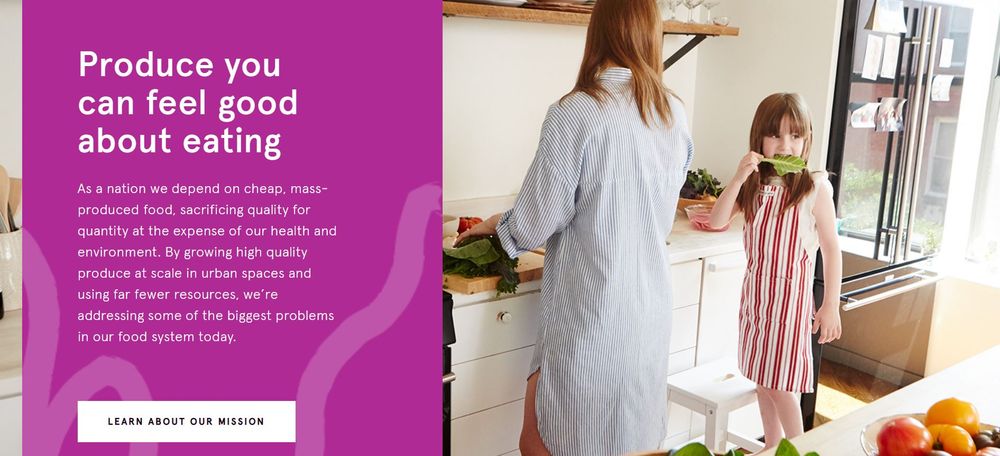
If you look at most product landing page examples, they paint a picture of the prospect’s desired outcome. For instance, this graphic for Bowery, a farm-to-kitchen venture, shows a mother in the kitchen with her child gnawing on a piece of leafy green. Now, what parent wouldn’t want their kid to love veggies?
2. Highlight the Product
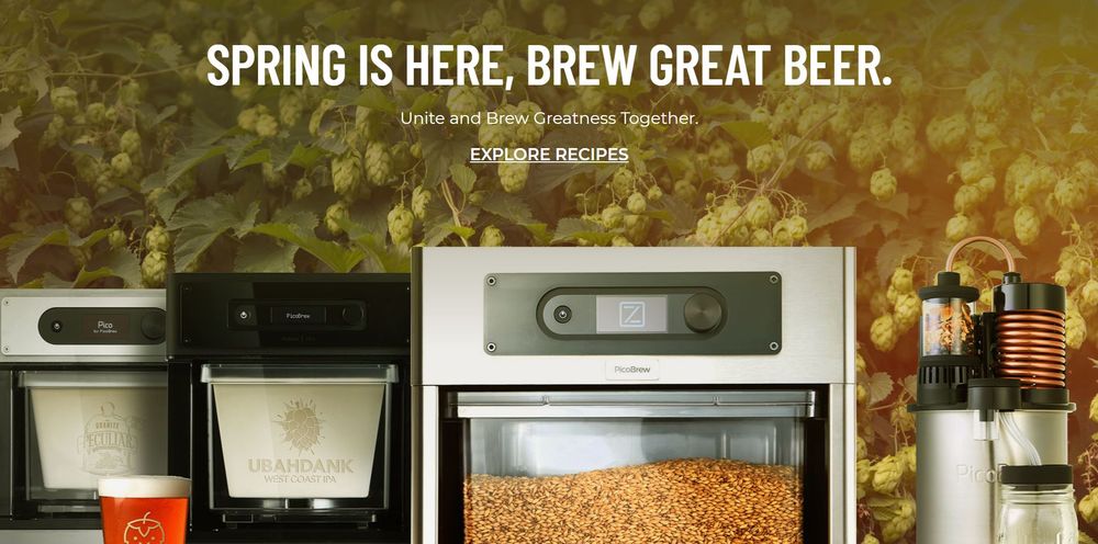
This landing page for PicoBrew highlights the beer-brewing equipment that they offer. The white text is limited to a headline and a short tagline, helping keep viewers’ attention on the products themselves. In addition to that, the call-to-action is different from the usual “buy now” button. Instead, it encourages the viewer to browse the recipes.
3. Go Minimalist
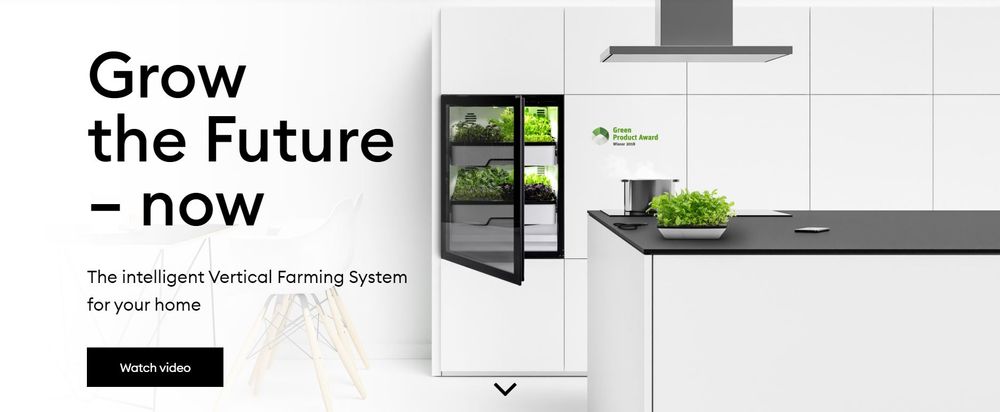
This landing page for Agrilution shows that you don’t need a lot to capture and sustain your audience’s interest. The graphic’s minimalist aesthetic and concise copy looks fresh, modern, and sophisticated. That said, prospects would certainly be intrigued to learn more about the venture.
4. Simple Visuals for Text-Rich Design
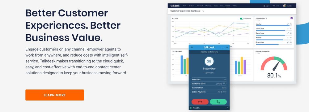
Some products and services can’t simply be explained in two to three lines of text. If such is the case, make sure to keep your visuals simple to give enough attention allowance to the copy. This example from Talkdesk includes a bit of explanation about the service. That said, they limited the visuals to two screenshots with a simple shape accent.
5. Provide Options for the Next Step

If you look at excellent PPC landing page examples, you’ll see that one tactic is to provide the viewers with options. For instance, this design for GitLab offers two call-to-action buttons – try the service for free or watch a demo. Because of the options, it allows the page to appeal to customers on different levels of the sales funnel.
6. Complement Videos With a Clean Layout
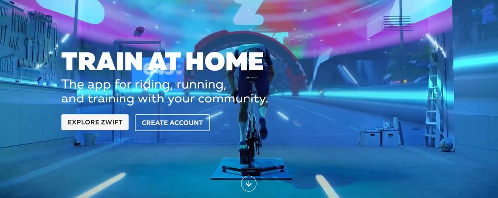
According to studies, 8 out of 10 people remember a video ad they’ve seen the past 30 days. With the prevalence of videos on social media, video marketing has truly taken over the internet. If you’re using a video on your landing page, make sure to combine it with a clean layout, just like Zwift did. That way, the web page won’t look too noisy and hard to digest.
7. Use Icons
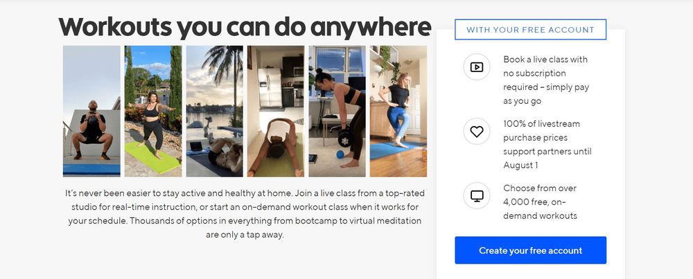
In line with graphic design basics, if you need to include heavy text on the landing page to explain your product or service, do it with a clean layout. For instance, this visual for Classpass enumerates the service’s benefits. And so, to make the layout look neater and easier to digest, they used icons as bullets.
8. Put Value on the Spotlight
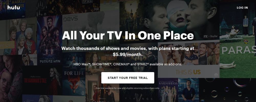
One look at this landing page for Hulu, and you’ll appreciate the value it offers prospects. The design features a montage of its best offerings underneath a simple text that says you can watch all those titles for just $5.99/month. Furthermore, the call-to-action button informs the prospect that you can start for free, thus amping up the service value.
9. Showcase Popular Components

Instead of showing a montage of all its offerings, NowTV took a different approach to its landing page design. To attract prospects, they showcased the three most popular movies on their platform: Star Wars: The Rise of Skywalker, Gangs of London, and Once Upon a Time in Hollywood.
10. Use an Attractive Color Palette
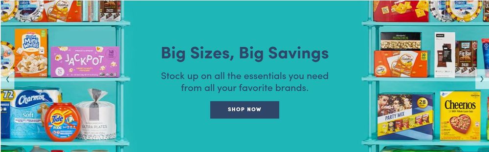
This landing page for Boxed has the charm of most infographic landing page examples because of its many components. That said, the packaging designs of some of the most popular household brands stand out against the refreshing robin egg blue background.
Conclusion
Without a doubt, a superb advertising graphic design can do a lot when you need to increase your sales rates. However, it can only do 50 percent of the work.
As soon as the viewer clicks the link, the ad passes the torch to the landing page. Thus, it’s crucial to optimize it so that it can do the other half of the job well.
If you look at these landing page examples, you’ll see that each one reflects the brand’s unique selling proposition. So, make sure to have a solid grasp of your USP and have a pro graphic design service translate it into excellent visuals.
Like what you learned from this post? Share it on social media!


