How a Great Email Design Increases Click Rate
Most business owners know that investing in a good website or landing page is a must. However, a huge percentage will not spend the same amount on great email design, and that’s the wrong business decision.
Research has it that email marketing is still effective if you want to grow your sales and widen your audience.
The truth is, millions of people check their emails every day. Not maximizing the platform for your marketing could mean a significant loss for your company. But sending a plain email will not cut it as well. Chances are, your readers will not read it right away. Worse, it will go straight to the Trash. So how do you make an effective email design?
How to Create Great Email Design
In this section, we will share with you the key points to having a great email design.
Your Goal
Before you add the design elements, the first thing you have to identify is your objective for sending the email. What’s your primary purpose for creating it? Is it to direct your readers to a landing page? Or would you like them to download a more extensive document about your brand? Perhaps, you are sending an email for special occasions such as Thanksgiving. Knowing your focus should help you organize various design elements in your email.
While it can be tempting to add a lot of information in the design, this could backfire. Make it brief, direct, yet informative.
Place Your Logo at the Top of Your Email

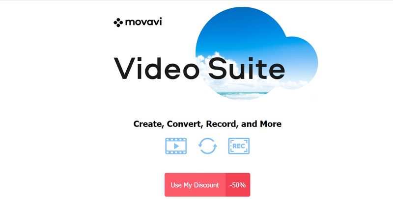
Do not forget your logo when drafting a great email design. This is for brand recognition and recall. Plus, a logo gives your email a professional touch. Make sure that it is the right size wherein readers can easily identify it, but at the same time will not be a distraction from your actual message. See what Movavi did to their email for their subscribers.
Choose a Hero Image

We strongly recommend that you choose an interesting hero image. When we say a hero image, it means the fore visual or picture that your readers will see in your email. More often than not, it is big enough to capture your reader’s attention, and it gives them an idea of what the message is all about.
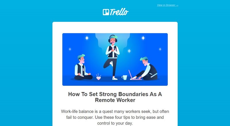
Take for example this email from Trello. Their hero image clearly shows what their core message is. It targets professionals wanting to have work-life balance. And if you are an employee having trouble with your work productivity and personal life, this could be an exciting read.
Also, you need to choose your images carefully. It must be of high quality because mediocre ones give an impression of a lousy brand or a spam message.
Balance it with Text
Your email or newsletter shouldn’t dwell on visuals alone. Likewise, avoid a text-heavy email. There must be a balance of excellent pictures and sensible texts. Make sure that it is free from spelling and grammatical errors because these can also affect the overall performance of your email. Before sending it out, have your editor check it first. Or, you can ask your colleagues so that there are fresh sets of eyes to spot errors.
Avoid Special Characters
If possible, limit the use of special characters and emojis. While it can make your email more personal and engaging, your readers might not see the same characters. In some cases, they will just see small boxes or question marks. This depends on the program, device, or application they use.
Add a Splash of Color

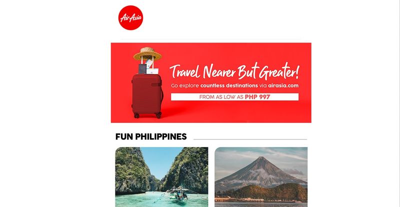
When adding color to your email, you can use two different approaches. One, you can use your brand’s color like what Air Asia commonly does. Again, this is beneficial for brand recall. However, other companies use the psychology of color for their email design. This is more appropriate if you want to trigger certain emotions or moods. Below is a quick guide if you’re going to add colors to your email.
- Yellow for warmth, clarity, and positivity
- Green for peace, growth, and health
- Red for excitement and passion
- Blue for trust and strength
- Orange for confidence
- White for purity
Use Microanimations

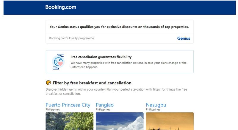
The use of GIFs and other microanimations is the trend not just on websites but also for emails. Take advantage of that to make your images more interesting and engaging. Booking.com subtly incorporates this in their email.
Remember, a plain message without any form of ‘movement’ could be monotonous or dull, and your readers will not be impressed.
Add Your Company Details
At the end of your email, you must include your company details, such as your website, address, hours of operations, and other contact details. This shows that your business values transparency and most consumers will trust your brand. Essentially, they will be more confident to transact with you either offline or through eCommerce.
Call-To-Action
Make sure to place your call-to-action above the fold. This means that it has to be visible to your readers right away. There’s no need to scroll the message to see the button or the links.
If you are using buttons, make it at least 44 x 44 pixels or big enough for your thumb to tap it.
Unsubscribe Button
Some of you might think that this tip is unnecessary. After all, who wants to have a growing number of readers suddenly unsubscribing, right?
However, adding an unsubscribe button or link can help you create better email design or content in the future. Removing this option from your email can have its own drawbacks which are worse than losing your subscribers.
Conclusion
When creating a great email design, consider if it will display well in all devices, including desktop, laptop, tablets, and even mobile phones. This is what we call responsive design and professional graphic designers from the Design Doctor team use this approach to increase conversion.
Lastly, you need to measure your email performance. Otherwise, you won’t be able to understand what works or not. Plus, you won’t figure out what areas you need to improve on in your succeeding emails. Track your open rates, clicks, email sharing, subscriber engagement, and of course, conversions.


