Email Design Inspiration and Tips on Creating Your Own
Sending emails is easy, but getting recipients to read them is the most challenging part. Creating the most compelling email newsletter is an endeavor businesses are still trying to master. The growing number of email users is the reason why email marketing is on the rise. According to Statista, there will be around 4.4 billion global email users by 2023! Additionally, the profit from email marketing is also the icing on the cake. Did you know that for every $1 you spend on email advertising, you get a $42 ROI?vExcluding email marketing means missing out on fast and easy revenue! If you’re wondering how to leverage this digital marketing approach, here are email design inspiration examples from big companies.
Choose Attractive Color Palettes
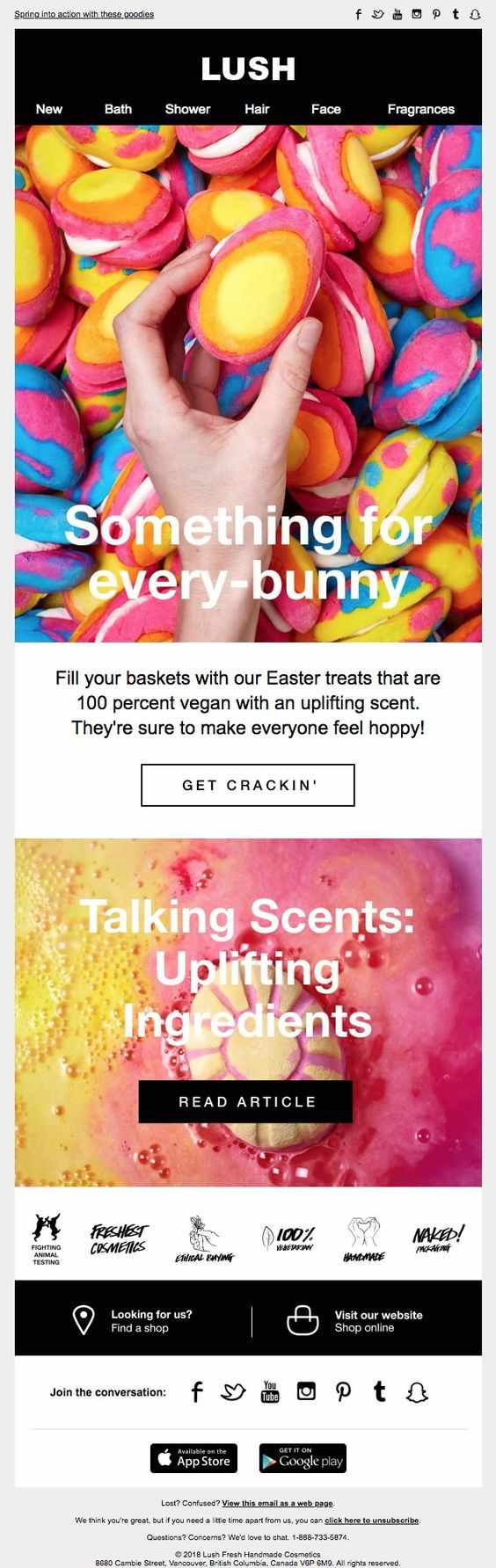
Since humans are highly visual creatures, colors are one way to grab their attention. This Lush email design for Easter marketing is eye-candy. For a skincare company, the bright colors are fitting, and the design concept is perfect for Easter as well. The dominant color palettes are pink and yellow, which is the symbol of femininity and happiness, respectively.
Go for Uncluttered Design
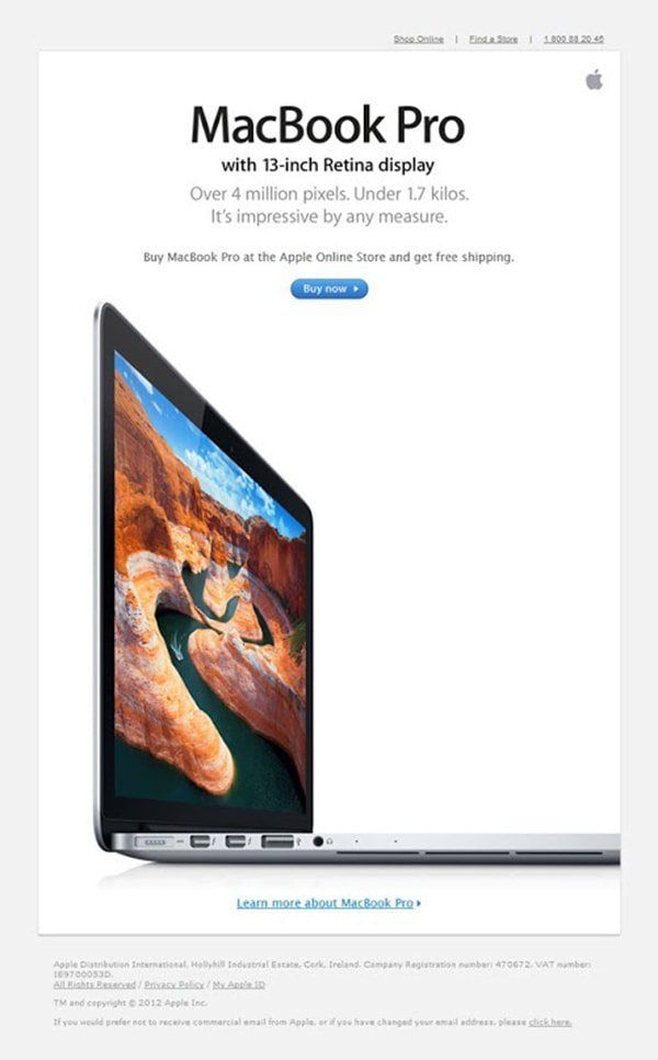
When it comes to minimalist email design inspiration, Apple emerges at the top of the list. The brand banks on sophistication and their email newsletters don’t fall short. Apple has similar formats on their emails. It starts with the model name as the main heading, product features, copy, call to action, and ends with a beautiful product photo. The overall design is simple, straightforward, and apt for their branding.
Experiment with Typography
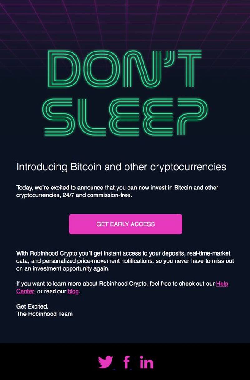
Although graphic design is extremely eye-catching, dwelling on unique typography on emails also works. As long as your fonts speak to your audience, the email can be as captivating as a graphics-based email. Take note of kerning, leading, proper alignment, and typeface pairing. Here’s an example from a crypto company Robinhood, the main headline looks like an electrical circuit in neon lighting. It’s an excellent choice considering the company relies heavily on technology and gadgets.
Make Designs Relevant
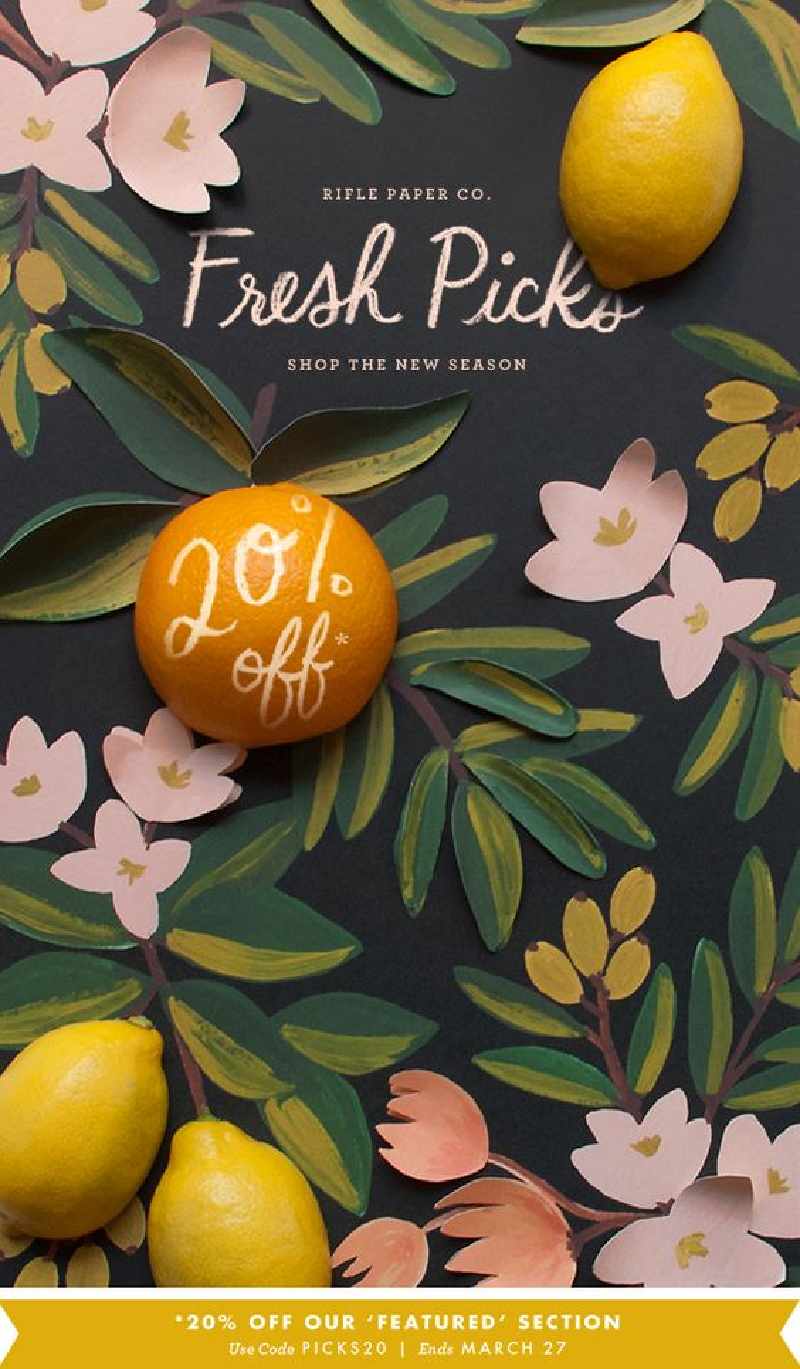
Graphic design should be relevant to your brand. However, creativity knows no bounds, and graphic designers can create a design concept that’s akin to your branding. For instance, Rifle Paper Co.’s email newsletter looks like a freshly hand-painted canvas. The use of fruits and florals is what the brand aims for — bold colors and whimsical characters on their stationery.
Go for Contrast
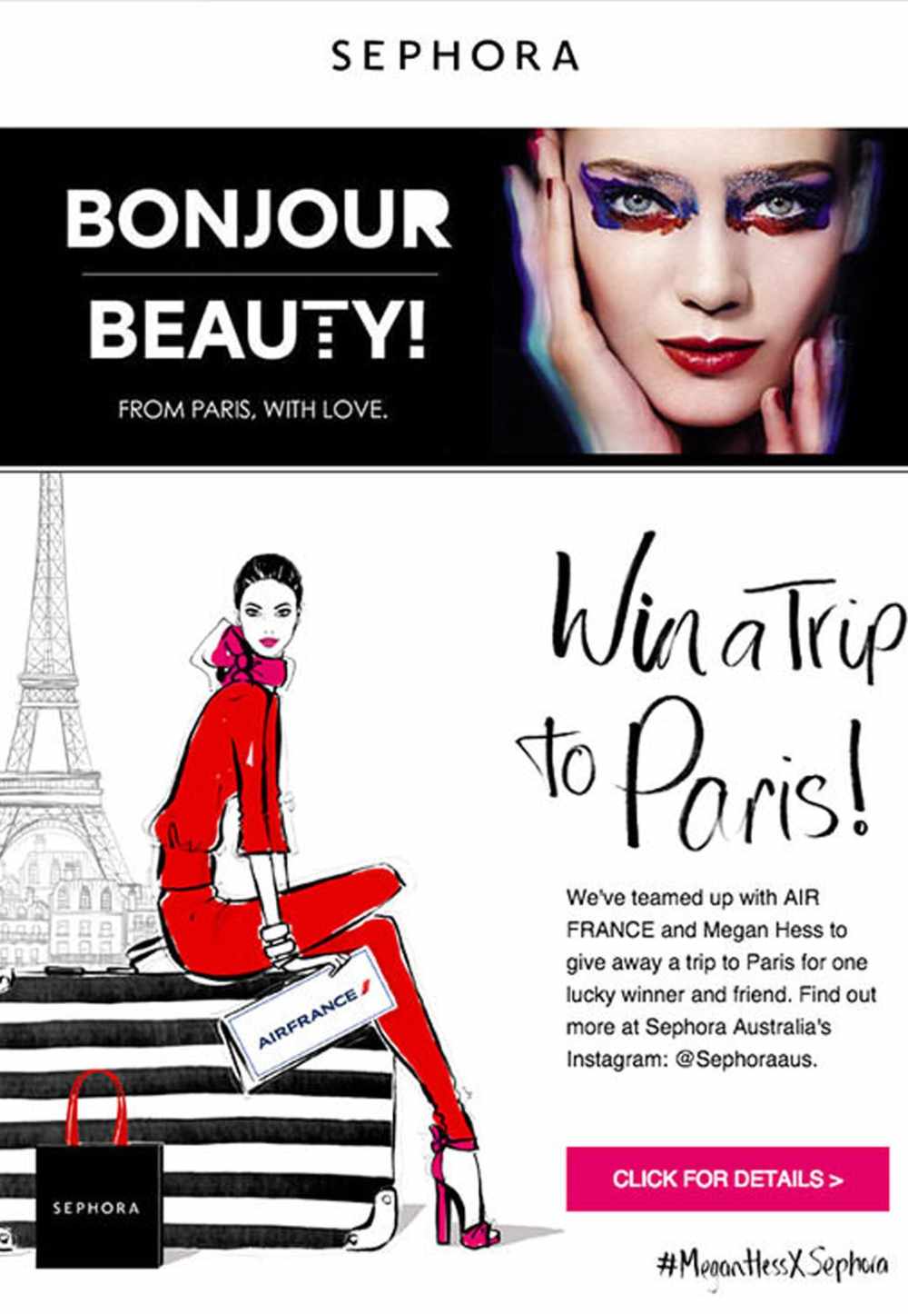
Contrast is a strategic way to lead the eyes from one direction to the next. It also creates synergy in the email design. Lastly, incorporating contrast makes the elements pop. For example, Sephora used contrast and hierarchy in their email design. The email is divided into two parts, one part for the heading and the second part for the body. The black and white colors attractively separate both, making the other components stick out, such as the woman’s face and the red dress.
Include Animation
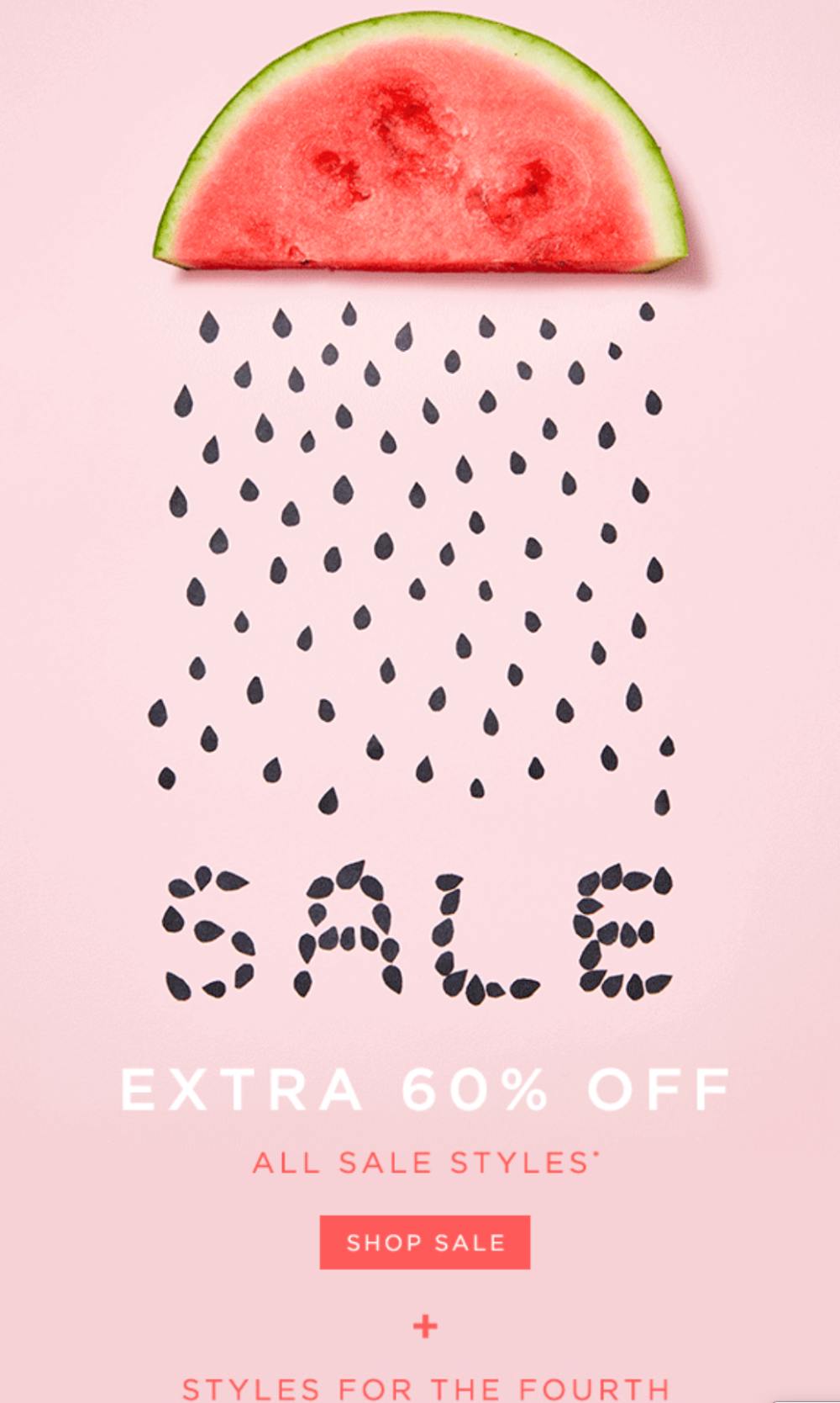
Including animation or GIFs in your newsletter is another email marketing design trend this 2020. Animation also implies playfulness, which can be perfect for representing your brand personality. Take this example from Loft as an email design inspiration. The pastel color is soothing to the eyes. A watermelon sits on top with its seeds resembling rain, and finally forming the text “SALE.” The entire design concept creates an element of surprise that appeals to its target audience.
Create Structure with Grids and White Space
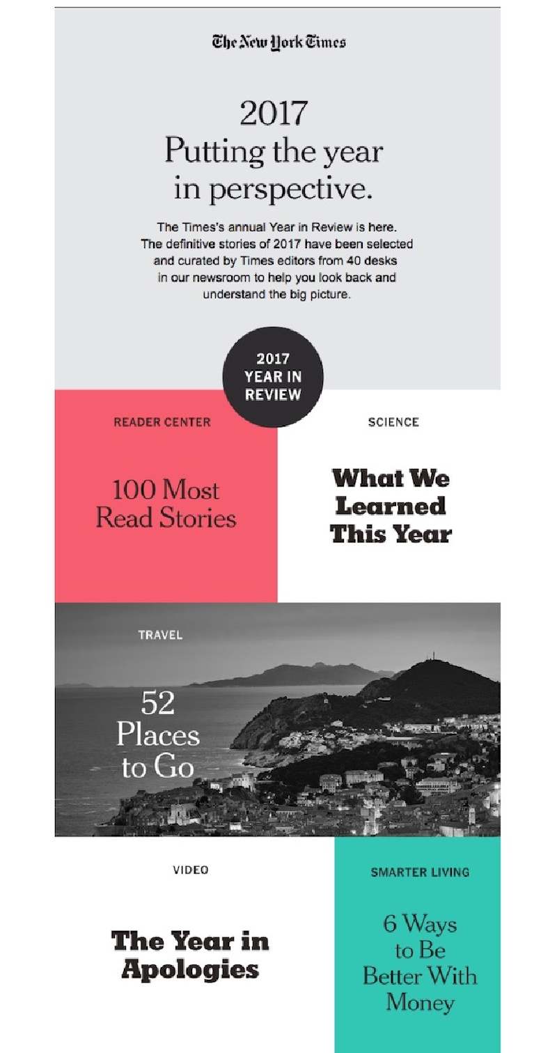
The layout is fundamental in your email advertising. A lousy layout could discourage recipients reading the rest of the email. However, an excellent structure establishes a hierarchy of information. Take The New York Times email, for example. The grid-like layout with various colors emphasizes the copy. The white space in between the grids also lets the eyes breathe. Last but not least, the play on the different typefaces fits well with the overall concept.
Add Fun Copy
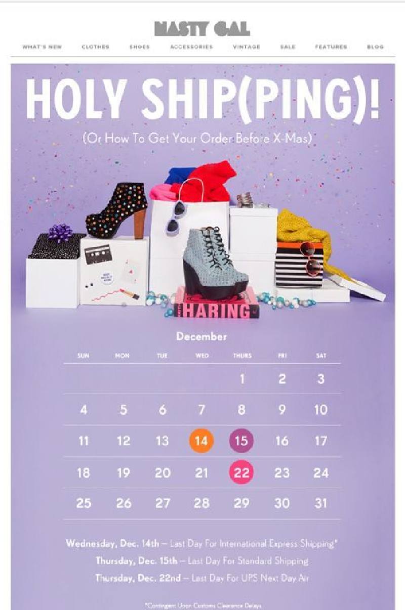
Persuasive copy urges recipients to act. One way to appeal to your audience, especially if you have fun branding with younger demographics, is through funny copywriting. Here’s Nasty Gal’s email copy inspiration. Instead of “Holy Shit,” they used “Holy Ship(Ping)” for their Christmas email marketing campaign.
Make Value Propositions Clear
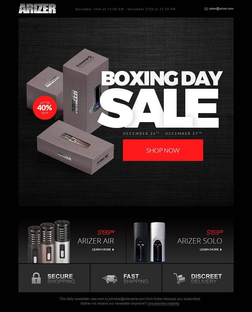
Your main headline should describe what the email is all about. Typically, the essential information like your selling proposition should be above the fold. And this is what Arizer did with their email newsletter. The heading, “BOXING DAY SALE,” is displayed prominently in the upper middle part, taking all the attention. This is an excellent approach as it lures recipients to read the rest of the email.
Create Excellent Graphics
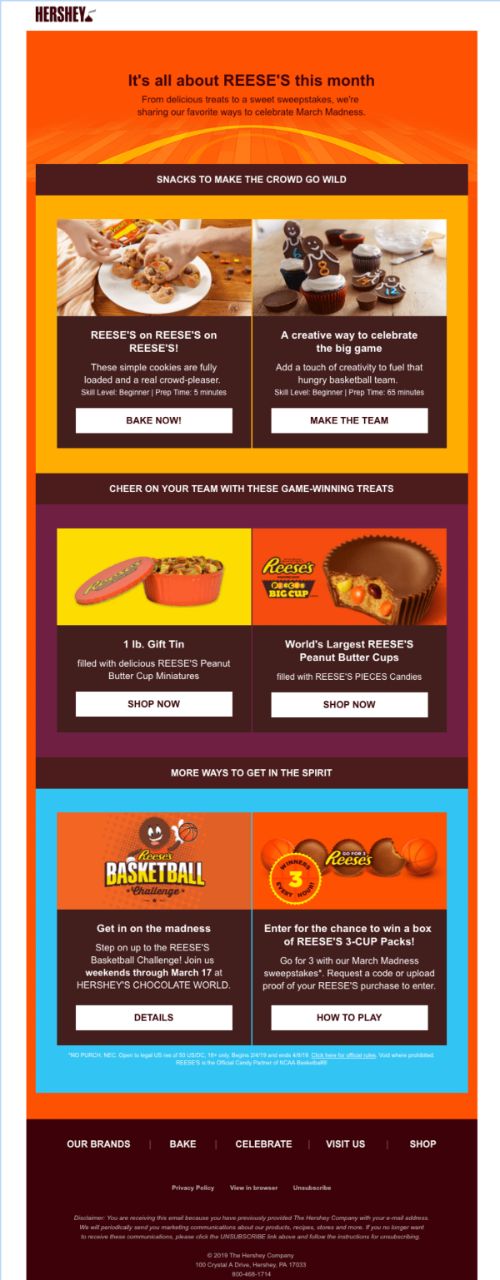
Excellent graphic design is the main ingredient in email marketing. If you’re a brand that sells products, put high-quality product photos front and center. If you offer services, create a unique graphic design concept that symbolizes your services and branding. This email design inspiration from Hershey’s is admirable. From the color palettes, color combination, layout, and most especially the graphics, the overall design is cohesive and eye-catching. The photos of the chocolates and cupcakes are so tempting; it makes you want to grab one after you see it!
Complete Footer
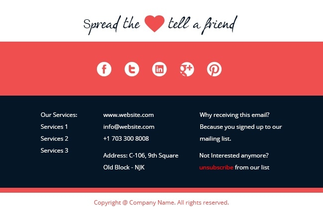
Your footer should be as important as your header and body. Ensure that you include essential information, such as:
- Copyright
- Services
- Address
- Phone Number
- Links
- Social Icons
- Unsubscribe Option
- Sitemap
- Privacy Policy & Terms of Use
In all cases, never forget to include the reason why recipients are receiving the email. This is to avoid your email from going into the “Spam” folder. Here’s a template example.
Include Playful and Compelling Calls to Action
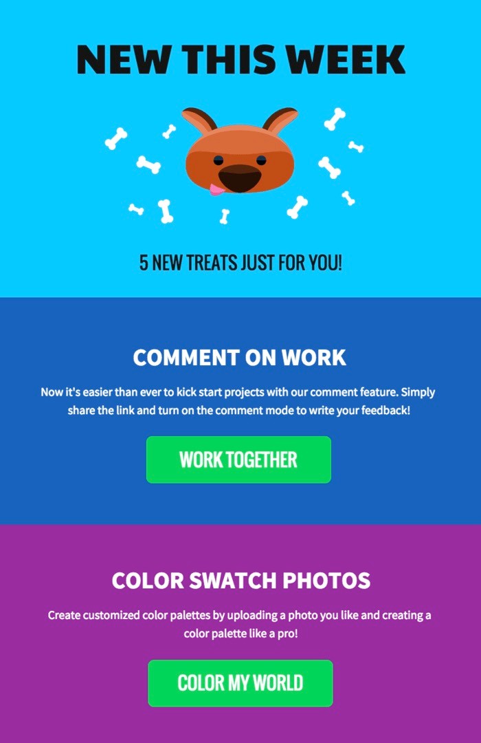
Email marketing will never work without a compelling call to action. Marketers should always try to convert leads. By telling them what to do next, they can push them further down the sales funnel. A call to action does wonders for your business. On your email layout, make sure the CTA buttons are displayed prominently, donning contrasting colors, so they stand out. Also, it doesn’t hurt to be playful with the wording like this template example with a colorful background.


