25 Creative Landing Page Examples You’ll Want to Copy
If you’re in the online marketing field, we’re sure you’ve come across the term “landing page.” But what exactly is a landing page? In a nutshell, it’s a standalone web page with a primary goal of converting or leading users further down the sales funnel. To get to these landing pages, users must click on any type of advertising campaigns such as Facebook or Instagram ads, newsletters, a PPC ad, and whatnot. And the main sauce for conversion? Strategic and compelling landing page designs! In this article, we give you 25 landing page examples that’ll make you click that CTA button.
If you ever need help designing your landing pages, reach out to Design Doctor. We have a team of vetted graphic designers who can create the most appealing landing page designs. Whether you want users to sign up to your email list, buy your product, or schedule a demo, Design Doctor ensures everything is laid out to persuade prospects to act.
In the meantime, check out these 25 designs for landing page inspiration.
1. Uber Eats
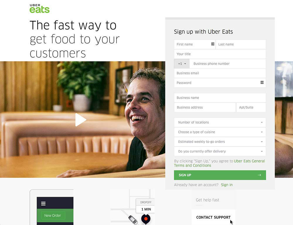
We love how strategic this Uber Eats landing page is. The main headline answers hungry consumers’ pain points of getting food fast. Then a video accompanies the heading. Plus, a form on the right ties the whole invitation together.
2. Shopify
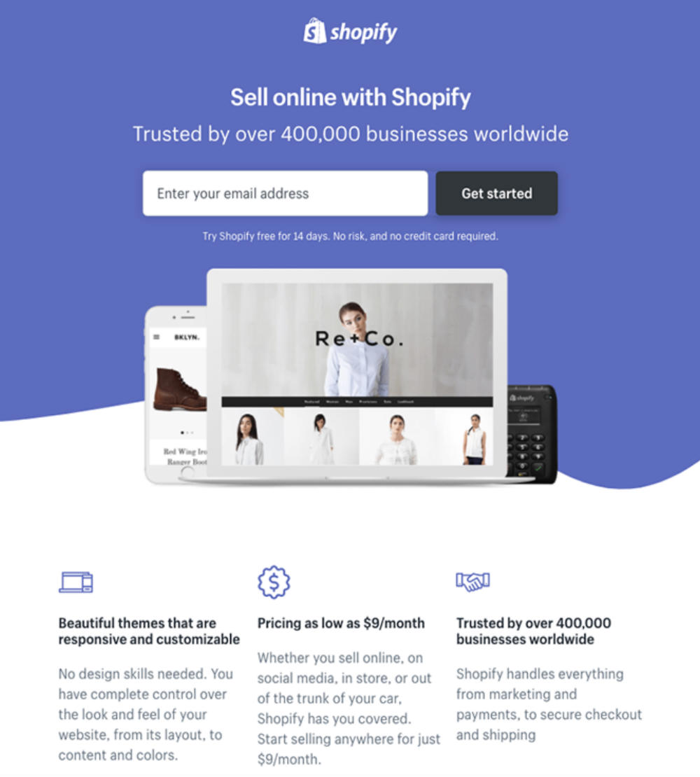
Online competition is a numbers game, and Shopify uses figures to entice its audience. They dwell on a concise copy, partnered with the number of businesses that use their platform. Lastly, the icons that separate features and benefits add depth and grab user attention.
3. Splash
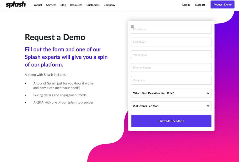
Splash’s use of bright colors and negative space is a simple way to guide users to the call to action. It also has an uncomplicated sign-up form, which makes requesting a demo easier and quicker.
4. Transferwise
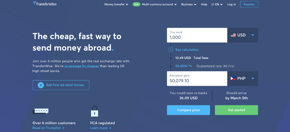
We love the actual conversion example on this Transferwise landing page. They also include the estimated fees when transferring $1000. The two CTA buttons are in various lively colors to lead users to what they want to do next.
5. Muck Rack
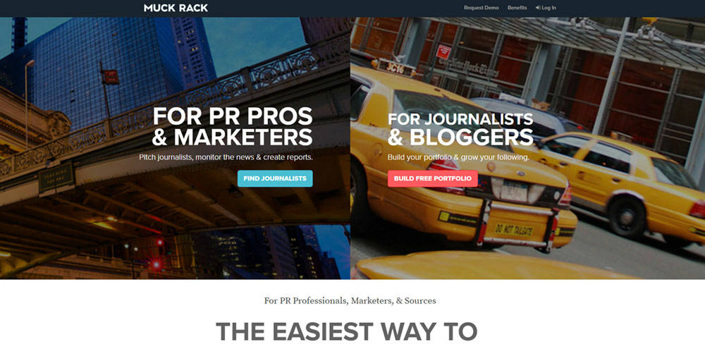
Muck Rack is hellbent on serving its two types of audiences, and it shows on their landing page design. They separate the goals for both, with contrasting colors and CTA buttons as well.
6. Zendesk
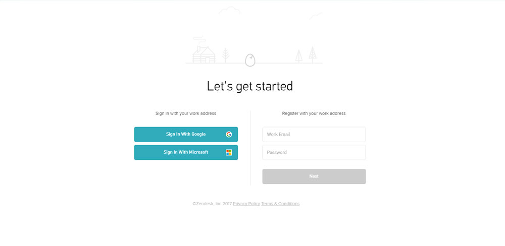
Zendesk has one of the most minimalist landing page examples on this list. But simplicity doesn’t mean ineffective. In this case, the white space lets the blue-green CTA buttons pop.
7. Harry’s
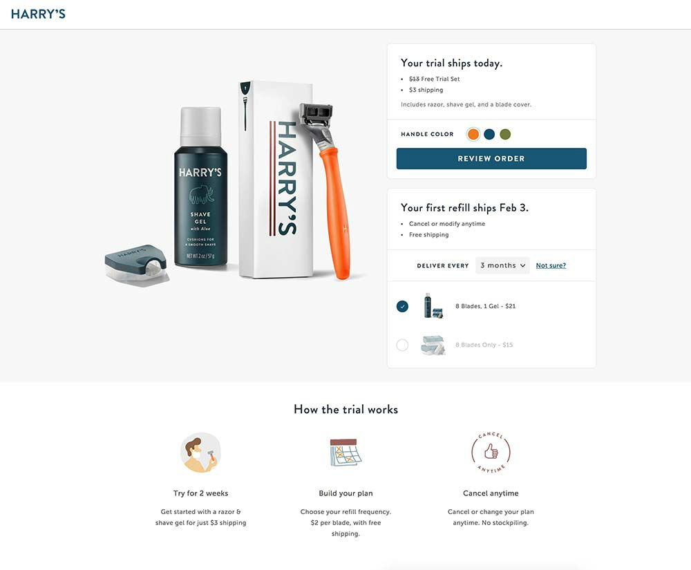
This landing page from Harry’s is the quintessential page for eCommerce brands. The product image on the left, coupled with enticing free trial details on the right, is compelling. Lastly, the icons below create a design structure that balances everything out.
8. Impulse Creative
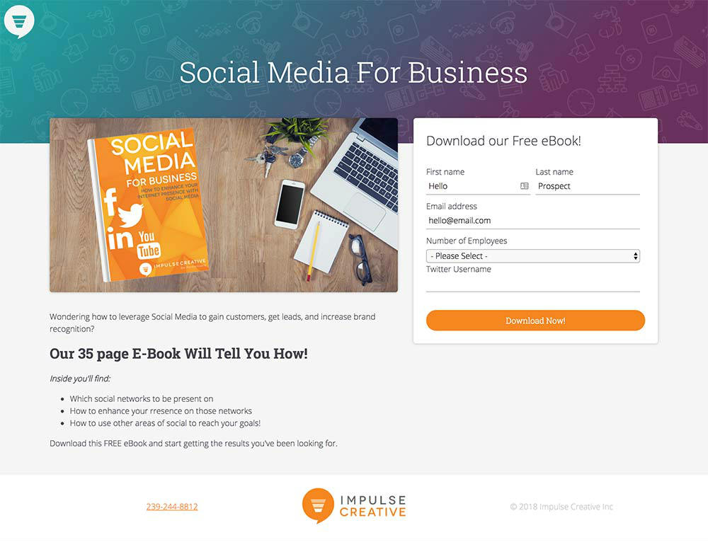
Although we’re not too keen on the stock image background from Impulse Creative’s landing page, the other elements make up for it. The headline and the bullet-style unique selling proposition are sufficient to lead users to the uncomplicated form on the right.
9. Lyft
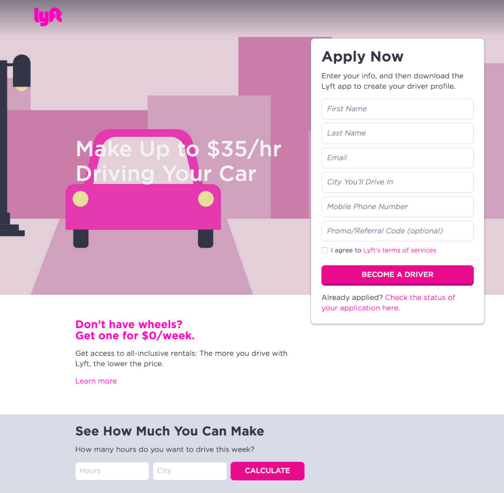
Lyft tries to cater to its audience’s every concern on one landing page. For instance, willing drivers can quickly sign up through their simple form. Next, drivers without vehicles can also learn about rental details. Lastly, those with initial inquiries on possible earnings can even fill in the form at the bottom.
10. Airbnb
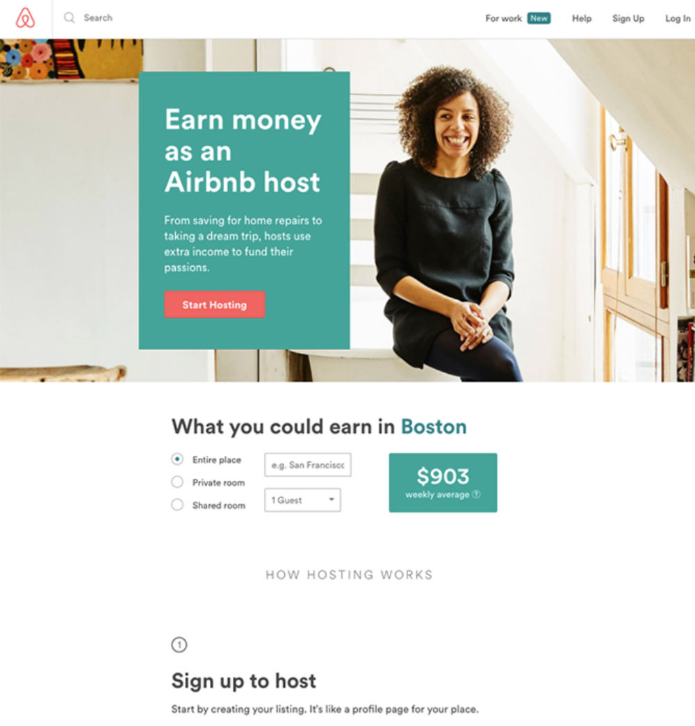
Airbnb lays hosts’ cards on the table by letting them input their location to calculate a weekly average earning. And if they’re ready to sign up, the red CTA sticks out like a sore thumb against the teal background.
11. Apple
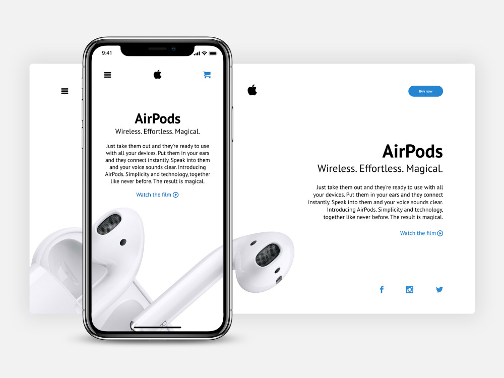
Apple never strays from its minimalist sophistication. And this landing page design is one that packs a punch. First of all, the graphics undeniably bank on creativity with the way the AirPods come out of the iPhone. Secondly, the copy is punchy yet explains everything you can interestingly do with the AirPods.
12. Amazon
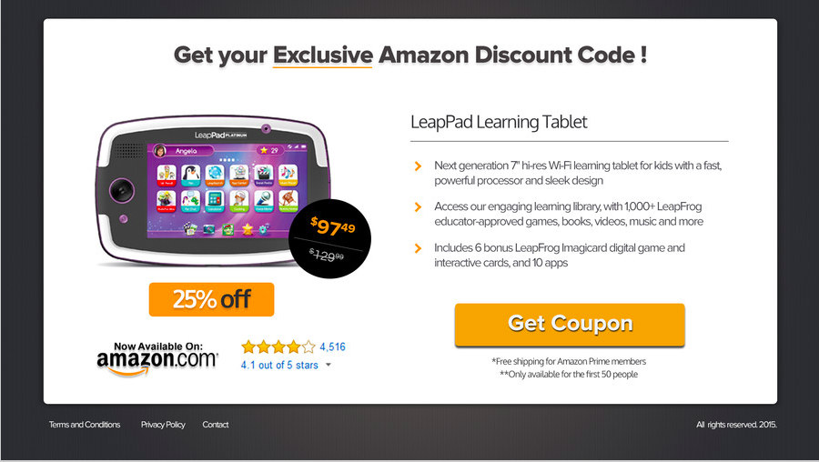
An enticing headline is what makes prospects scrutinize the landing page, and this one from Amazon doesn’t disappoint. The heavy text and the value it offers can make you want to avail of the 25 percent off right away! Another element is the way Amazon shows the original price and slashes it off, revealing the discounted one.
13. Samsung
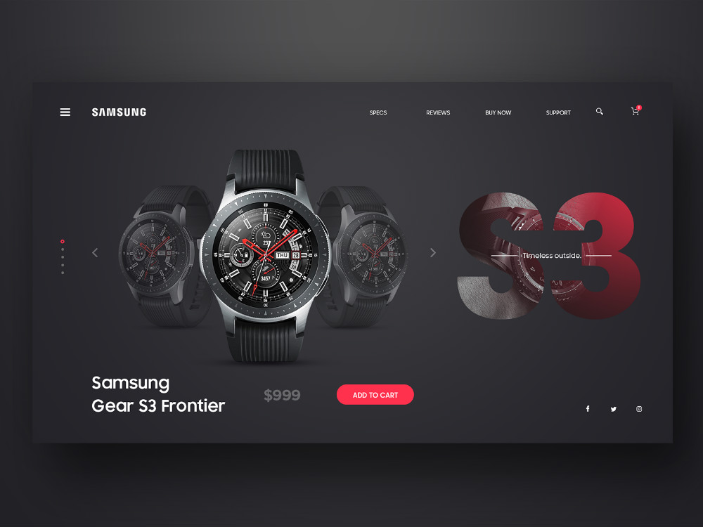
High-quality hero images are essential factors that make prospects act, especially high-quality hero images of your products! And Samsung has outdone itself with this landing page. The watch and the color palettes are apt for the product’s elegance. The product name, price, and CTA are also arranged linearly. This strategy makes users’ eyes end up on the red CTA button.
14. Webflow
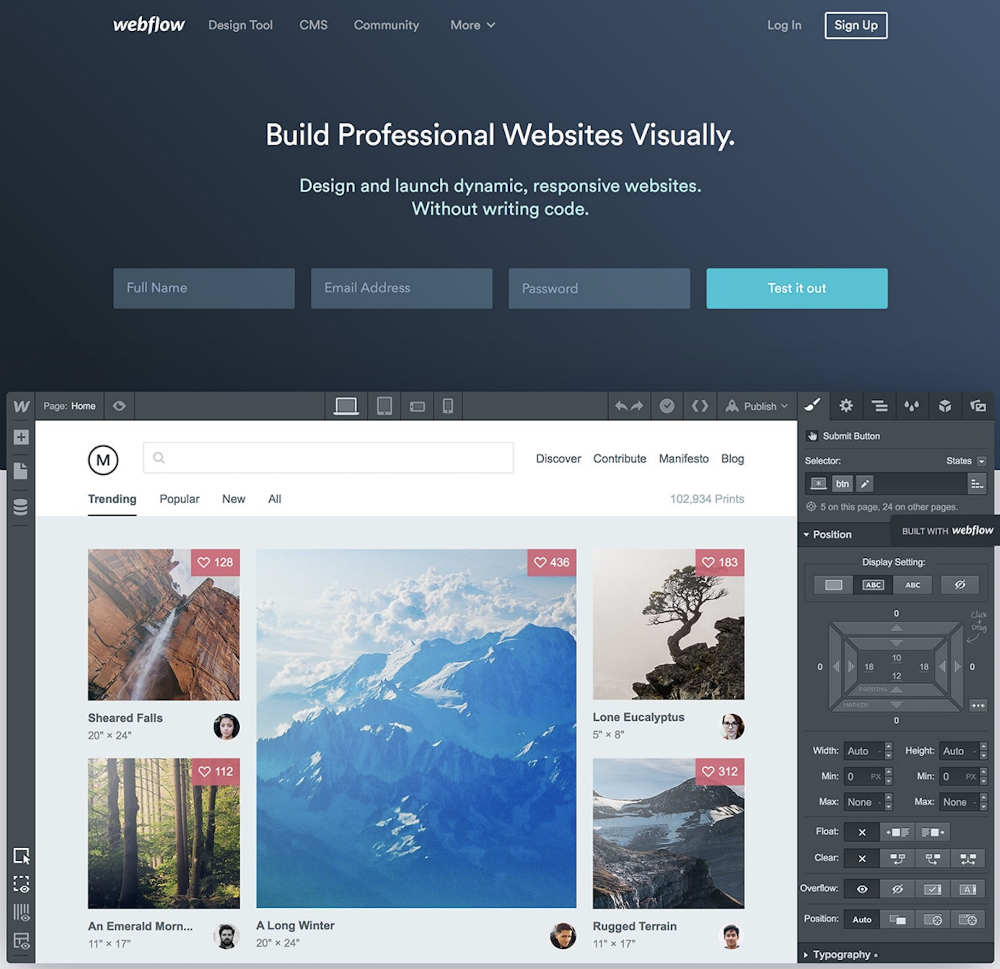
Webflow is a tool that lets developers build websites. And what better way to pitch your products than give them a snippet of the interface? They also have an unconventional sign-up form that requires only three pieces of information before users can “Test it out.”
15. Impact
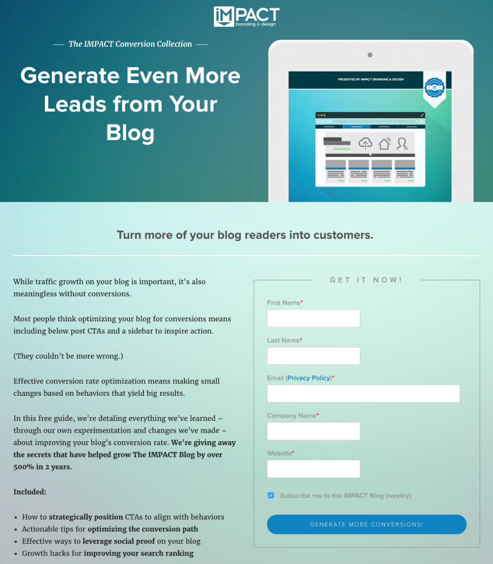
Impact knows its customers’ pain points, and they’ve brilliantly unveiled the resolution through the CTA button. Instead of the usual “Download” or “Subscribe Now,” Impact reveals what customers will receive in return — get more conversions!
16. Breather
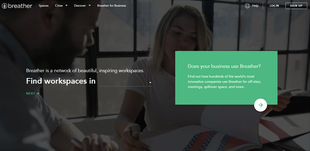
This landing page example from Breather encourages engagement from the get-go. The main headline says, “Find workspaces in,” followed by a blank. Users can input locations to get a list of options. This is brilliant in getting users to take action right off the bat.
17. Upwork
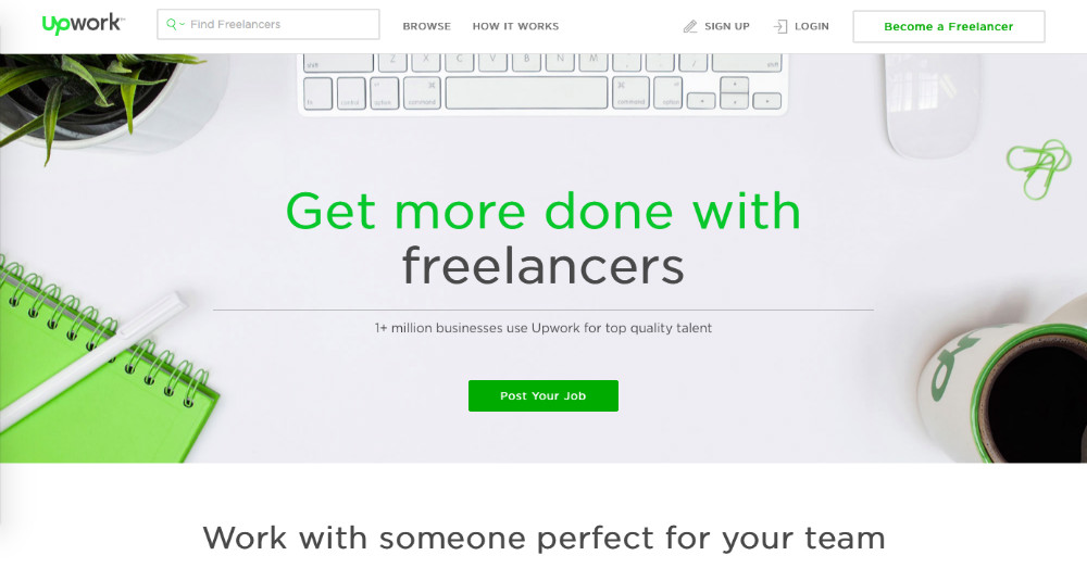
The layout of Upwork’s landing page is tasteful. It has branding consistency as well as structure amidst the handful of design elements. However, the bright green CTA button cuts through the noise and can seal the deal.
18. Unbounce
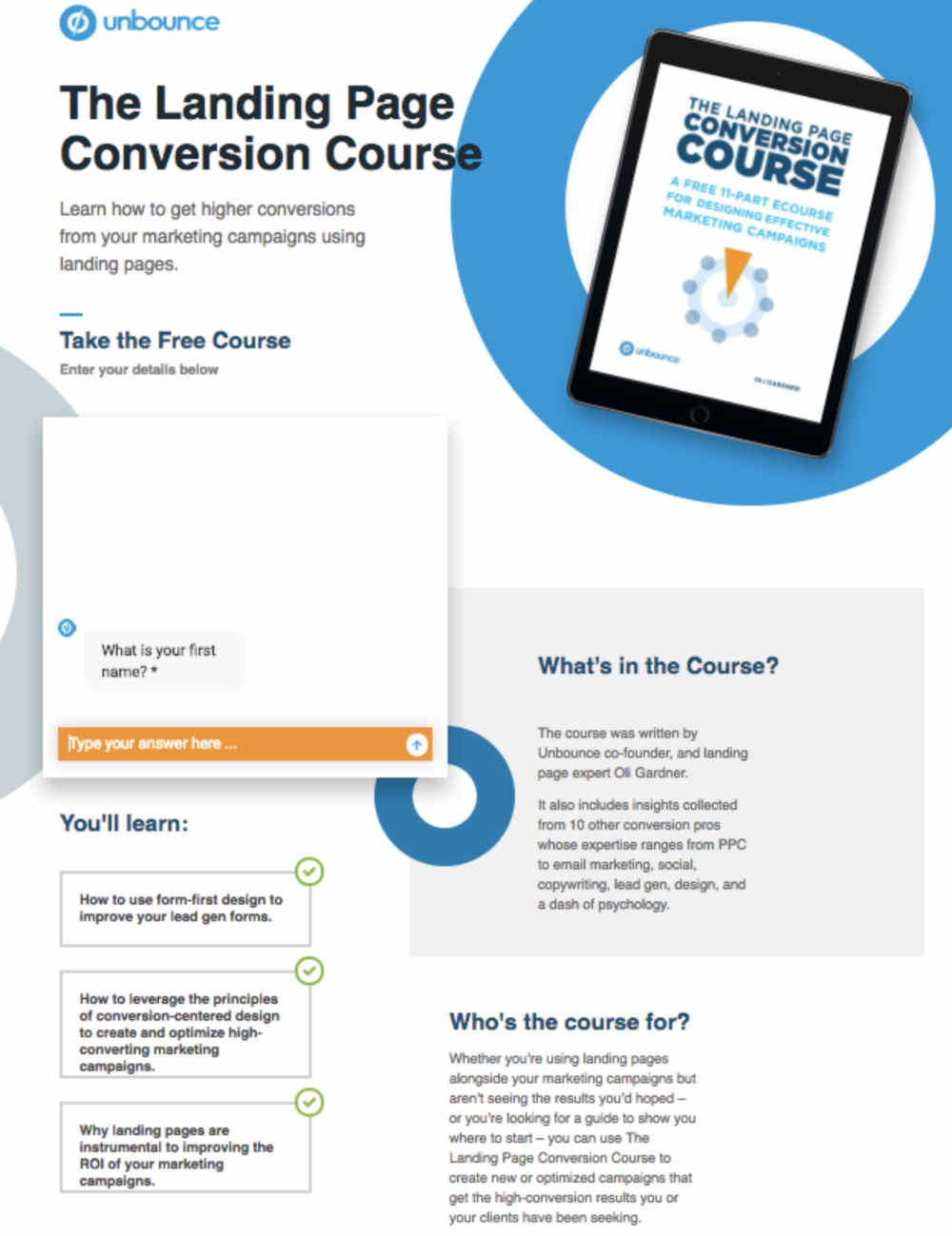
Although the copy could be improved, Unbounce’s creativity in using a chatbot to make prospects take the course is brilliant.
19. The Knot
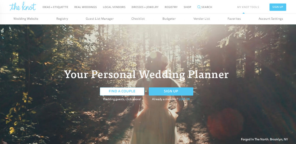
The Knot’s hero image is a beautiful background of a bride engulfed in a lush forest with dark color palettes. The copy is a four-letter word that concisely describes what the service is. Lastly, the two options are enough to guide users to their next move, “Find a couple” or “Sign up.”
20. Trulia
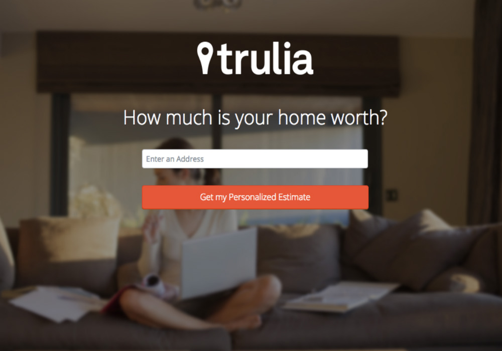
Simplicity on landing pages can either make or break your success. However, when coupled with an engaging question and simple process, it can have the power to lure users. This Trulia landing page does just that.
21. Redfin
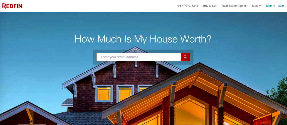
Here’s one of those landing page examples that uses a question to engage prospects. Similar to Trulia, Redfin asks, “How much is my house worth?” It has a single field where users can enter their address and a search button beside it. But what makes this striking is the oversized image of a brightly-lit house.
22. GEM
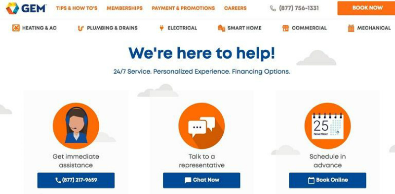
We think the navigational pages can be lessened on this GEM landing page. Other than that, the straightforward copy, icons, and blue CTA buttons make this example clean and effective.
23. Munchery
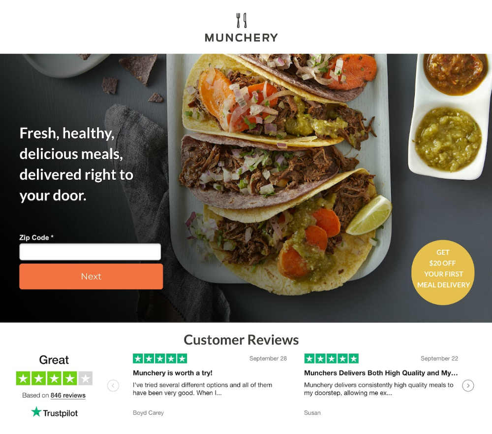
Social proof is another tactic that reels in prospects. This landing page from Munchery displays star ratings, testimonials, and the total number of customer reviews. If the delicious-looking taco image doesn’t entice hungry consumers to order, we’re sure the customer reviews will!
24. Casper
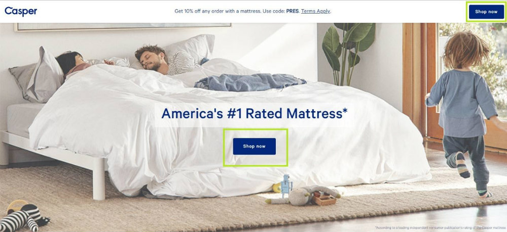
It’s always thoughtful to paint a picture for your audience by showcasing real people using your products. Hats off to Casper’s creative marketing team! It shows an image of a couple sleeping on a comfortable mattress and a child seemingly running around the bed. Plus, the blue “Shop Now” button emerges against the white blanket.
25. Landbot.io

This chatbot builder, Landbot.io, smartly uses a fun Ryan Reynolds GIF bot on their landing page, making this one of the unique landing page examples on this list. The copy also matches the playful style and deviates from the cliche action words. Overall, it’s an ingenious way of connecting with your audience and boasting what your brand can do.


