5 Ecommerce Logo Styles that are Overused
A logo isn’t just putting together a few lines and squiggles. It transcends into telling your story to your customers. It’s about creating a symbol that consumers can associate with good customer experience. According to statistics, 86% of consumers say that authenticity factors big when deciding which brands they like and support. From this data alone, we can surmise that your eCommerce logo plays a vital role in your business’s success. And with a sea of competition to contend with, you need one that will make you stand out.
Here are five examples of eCommerce logos that have been overused. We’ll show you how you can avoid this and what you can do to get a great one.
5 Overused Ecommerce Logo Styles
When you look at eCommerce websites, you’ll be surprised how similar their logos are. You’ll always see that money, price tags, or shopping girls logos. Even if they use different colors, the concept is still the same. This isn’t doing your brand any good if standing out from the crowd is what you’re after. Here are the top 5 eCommerce logos that are overused and should be avoided:
The Shopping Bag

The most common logo we see of an eCommerce store is that of a shopping bag. This one from Shopify is a classic example. The company is known worldwide, and to use a shopping bag for your logo won’t differentiate your brand. And that’s one example only, if you search for eCommerce store logos, you’ll find more of the same.
With too many online stores using this for a logo, it diminishes its effectiveness and makes it ordinary. Tap on what makes your brand unique and try to incorporate that into your logo. Being in the eCommerce industry doesn’t mean you have to use images used for shopping for your logo.
The Shopping Cart

Another overused eCommerce logo is the shopping cart. It has become synonymous with online shopping that you can see it on almost every store’s website. It’s also used as an icon for the Add to Cart button and many others. This makes the design monotonous and boring, actually.
Using the shopping cart will make you lose your brand identity. This isn’t good for establishing your business name in the marketplace. Joining the bandwagon won’t take you forward, instead, you’ll get lost in the muddle. Drupal Commerce has a shopping cart for their logo alongside many other businesses, so steer clear from it.
The Globe

When a business owner wants the world to know that they are a global company, they use the globe for their eCommerce logo. This is true for so many other global companies out there. Most companies in the tech industry gravitate towards this icon for their logos. Thus, it has totally lost its appeal.
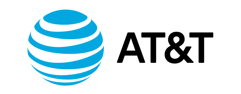
AT&T is a brand known all over the world, that’s more than reason enough to avoid using a globe for your logo. They can get away without using their name, the logo alone can identify them. Don’t try to do a similar one, lest you want to be unrecognizable.
The Price Tag

Online shopping involves money and price tags. This is the reason many eCommerce sites use the price tag as their logos. Retail company Best Buy‘s logo is a perfect example of one. Along with the shopping bag and cart, this is something you see in online stores so often.
It’s a great-looking logo, that is, if you’re the only one using it. This shows a lack of ingenuity on the part of the designer. Or it could be something out of a template logo maker that some entrepreneurs use. If you think getting a unique logo is out of the question if your budget is limited, you’re mistaken. We’ll show you how at the end of this article.
The Marketplace

A logo that has become a cliché for online marketplaces, this is one that you should avoid using at all costs. There are probably a thousand ways to show that a brand is an online store without using the marketplace icon. Take eBay as an example, its logo is simple, colorful, and makes it seem that shopping with them is fun.
This marketplace logo from Facebook is a work of wonder, but to do something similar isn’t a smart move. You want to have brand recognition, and going further away from famous logos can help you achieve it.
Tips to Avoid Creating These Overused Logos
Knowing what you need to avoid helps significantly in getting an eCommerce logo that’s uniquely yours. Seeing the above logos will help you design the best logo for your brand. A logo that allows you to be different and stay ahead of your competition. Check out these tips to avoid:
Less is More
The simpler the design, the better for brand recognition. You don’t have to use complicated fonts or too large of an image. Also, avoid using too many colors. At best, you can use up to three, going more than that can become too distracting.
Don’t Use Templates
A professional-looking eCommerce logo can only come from, you guessed it right, a professional graphic designer. Using websites that offer logo templates means having a similar logo with a hundred, even a thousand other businesses.
Get Unlimited Graphic Design
If you think a professional graphic designer can cost you an arm and a leg, think again. An unlimited graphic design service such as Design Doctor can help you get the logo of your dreams.
Design Doctor Can Help
Design Doctor is an on-demand graphic design service that lets you submit design requests as many as you can in a month. Our unlimited revisions mean we won’t stop until we get the best eCommerce logo for your brand. And the best part is, you don’t have to spend a ton of money on your logo.
At just $349 a month, you can request not only logos but any graphic design assets you need. From social media graphics to custom illustrations, we have designers that specialized in each of them. Contact us today to learn more about unique eCommerce logo designs.


