
11 Crucial Ecommerce Website Design Elements
The process of starting your eCommerce website has become easier. You can immediately build a website by selecting an eCommerce website solution. Once you’ve got that settled, you can choose a template for your design, upload your photos, create content, and launch it. However, some owners may miss out on optimizing their websites and including necessary elements for their eCommerce website design. This could become a no-no for visitors and potential customers, and they may go to a competitor’s site instead.
In this article, I list down 11 necessary website design elements, so you’ll have website traffic and won’t lose customers.
Features
1. Responsive Design
One of the essential elements of an eCommerce website design is having a responsive website. Responsive design refers to how your website adjusts well to different screens. For example, you’ll have a full website view on a laptop or desktop and a mobile version on a smartphone.
You should optimize your site on mobile because more than 50% of website traffic comes from browsing on smartphones. Think of it this way, if your website appears as it would on a desktop, would you still browse on it? No, right? You’ll manually zoom in and out, and the website will look distorted on the phone. That’s why optimization is a must.
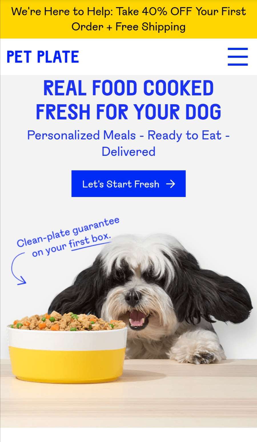
Look at how Pet Plate optimized its website on mobile. They still used the same landing page, but with a different call to action button. They minimized the menu bar with the three lines. When you scroll down on the mobile website, it’s easy to scroll down, and there’s no need to zoom in or out the page.
2. Navigation
One huge part of eCommerce website design is navigation. Yes, it’s more on the user experience side, but part of good design is to ensure that everything runs smoothly and it’s easy to move from one page to another.
Most experts would link navigation with the word: intuitive. Plus, they would say, ALWAYS keep your customers in mind. So, you shouldn’t make your website’s navigation complicated, that it might infuriate your visitors by closing their browser. You can stick to one scrollable home page and click on another page through your links, clickable photos, or cards.
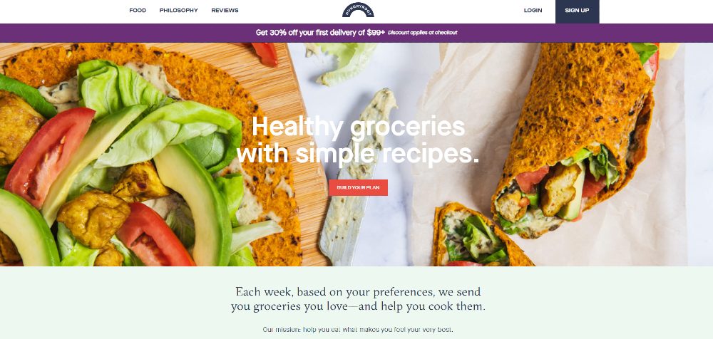
Check out this example from HungryRoot. Once it loads, you can immediately build a plan. You may even check out their food selections, learn about their philosophy, and read reviews. You can also scroll down the page and see they added a visual cue so that you can browse more below. As you explore the website further, they have links to their pages and a simple FAQ page.
3. Clean Design
Modern and clean design is no longer just a trend for any website. It’s a must because it’s easier to navigate on your website. You don’t want a cluttered website. Chances are your users may have difficulty exploring your site, and they would contribute to a high bounce rate.
Part of having a clean design means you’re utilizing whitespace (negative space) as well. This way, it’s organized, and people focus on the important parts of your website. Don’t mistake a clean design for a minimalist website. You can have a clean design even with various photos and text on the site. Make sure that you follow the visual hierarchy, and it’s not cluttered.
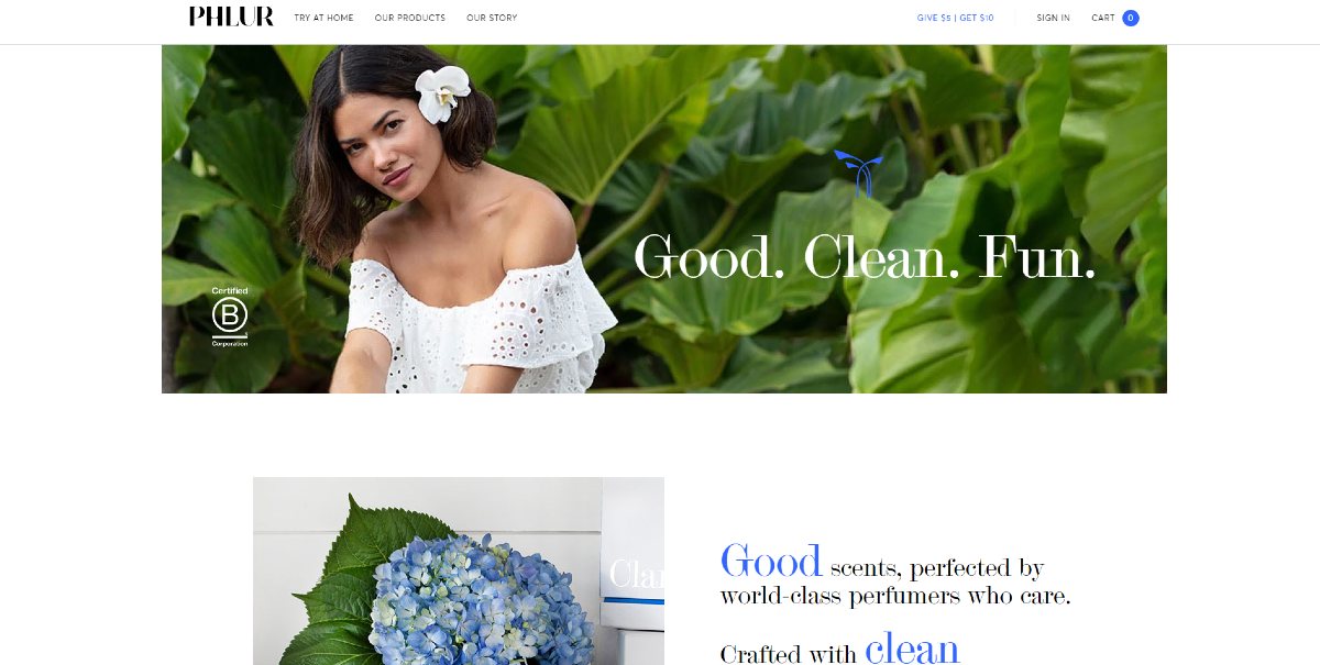
The Phlur website is an example of clean website design. It’s clean and modern in a sense wherein as you further explore their site, it’s organized. They follow a visual hierarchy, too, through a zigzag design, font headings, and whitespace.
4. Card Designs

If you’ve ever browsed in some websites, you’ll see some boxes that could lead you to the blog page or product page. Those are called cards.
On the home page, card designs would usually appear near the bottom of the page. Not only does this diversify the look of your homepage, but it enables your visitor to go to another page. It could be the blog section where they can get more information about your product or services. Perhaps, you could lead them to the product page directly. You may even use cards to guide your customers or users to your social media pages.
Here’s an example of how you can apply a card-type design for your website. In this example, from Molly Jogger, they used cards to organize their featured products. This makes it easier to navigate on the page, and the visitor can scan information easier.
5. Consistency
Have you ever gone to an online store website, then go to different pages and feel like you’re on a different site every time?
In most cases, you wouldn’t experience this in an eCommerce website design. Every element is consistent down to the font and color. You want customers to jump on different web pages and not lose your digital brand identity.
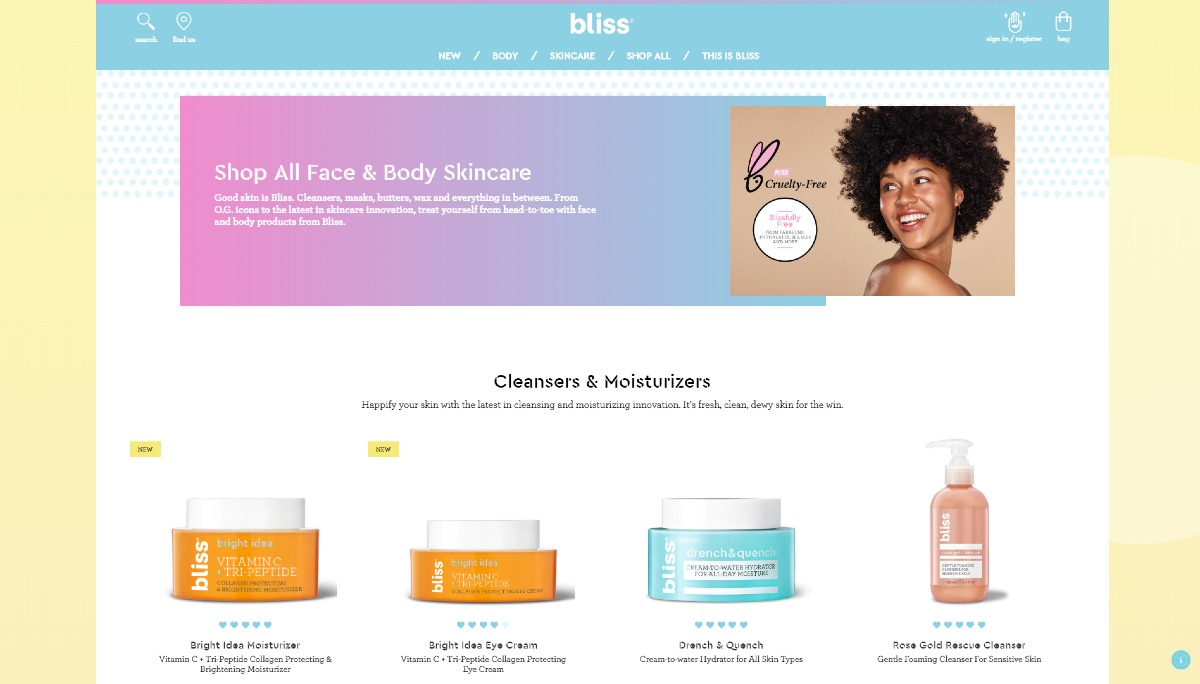
Get inspiration from how Bliss World applies consistency on their website. You’ll see the same pink, purple, and blue gradient motif as a header for a page. If you notice too, they use header and body fonts to establish a visual hierarchy in all their pages.
6. Large High-Quality Photos
One mistake that you can make in uploading photos is to showcase your products and have photos appear pixelated or stretched out. As you would see in any eCommerce website, they post pictures without losing its quality. It means they optimized images on the site. A slow website will spell trouble because of pictures with large file sizes.
The best file type to upload on a website is JPG. This file type is excellent when the photo has many colors. Plus, Theme Isle says that when you use JPG, you can optimize your photo and the drop in quality won’t be noticeable when uploaded.
You can try out these software applications to optimize your photos:
- Optimizilla
- TinyPNG
- Image Optimizer
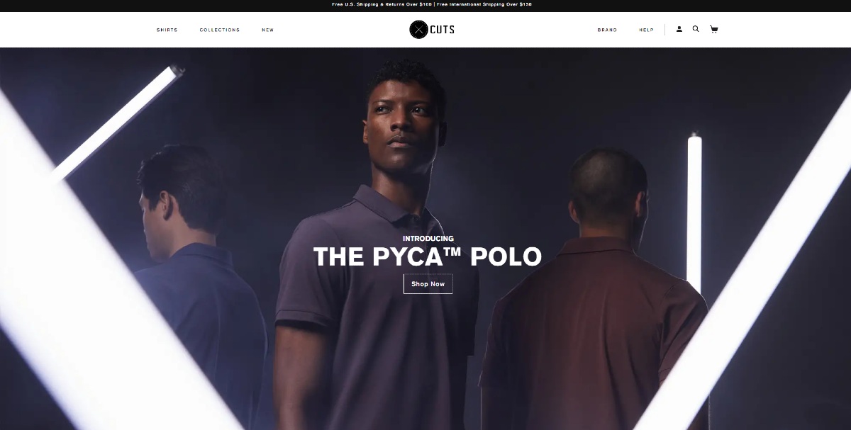
The best way to showcase your products (or people) is through hero images. They’re usually the first thing visitors would see since hero images appear on your home page or landing page. Plus, this could attract them to know more about your product (or people).
As an example, check out how Cuts Clothing uses their hero image. They hired a model to wear their newest product. Even if the image is high-quality, the website loads fast as well.
7. Social Proof
Even if social proof is intended for marketing, you shouldn’t forget it as part of your eCommerce website design. What counts as social proof?
- Reviews
- Testimonials
- Certification
- Celebrity endorsements
- Awards
Adding social proof may increase the chances of your visitors or customers availing your products or services. It’s because people trust it, vouch for it, or love it that others may get intrigued over it.
So, where should you add it?
The landing page is the ideal space for your social proof. From the get-go, people can determine if your products are worth buying or not. If you don’t have a landing page, you can add at the bottom of the home page as people scroll down. Better yet, you may also add social proof on your product pages.
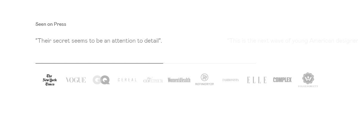
As illustrated, here’s how Haerfest integrated social proof on their website. They used the mentions from known press outlets like The New York Times, GQ, and Vogue. This will have visitors stop scrolling on the page to read about what the press says about them. Plus, since the menu bar is a mainstay on the page, customers can click on the products after reading the social proof.
Pages
8. Responsive Checkout
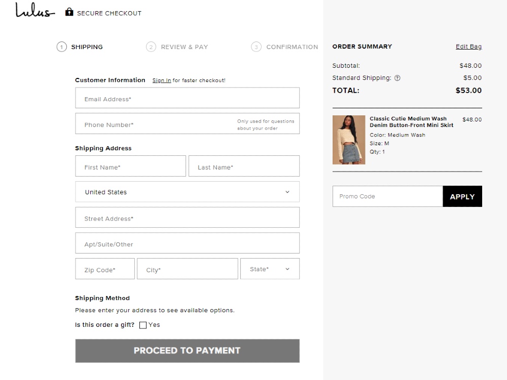
A responsive checkout page is one of the essential features in any eCommerce website design. You want to lead them through the process of checking out by adding forms or subpages. Make sure that the checkout page is a separate page from your main pages too. This way, they fixate on making a purchase and won’t abandon their cart in the process.
According to Web Alive, here are features of a responsive checkout page:
- Shipping details (name, address, contact number)
- Promo code
- Payment methods
- Cart details
- Add or remove item
- Total price
- Security seal
Here’s the checkout page for Lulus. As you can see, almost everything is included, because the payment methods are available on the next page. This allows users to check out any item easily and securely. Plus, they make use of whitespace effectively, so the customer’s focus is on checking out the item. This way, the page loads faster, and it doesn’t distract the customer from purchasing the item.
9. Frequently Asked Questions
Your eCommerce website design needs a Frequently Asked Questions (FAQ) page. It can be repetitive when you answer the same questions over and over again.
Plus, on the user side, they can check if they thought of a question that some have already asked you about the product or service. This could reduce delays in their purchase.
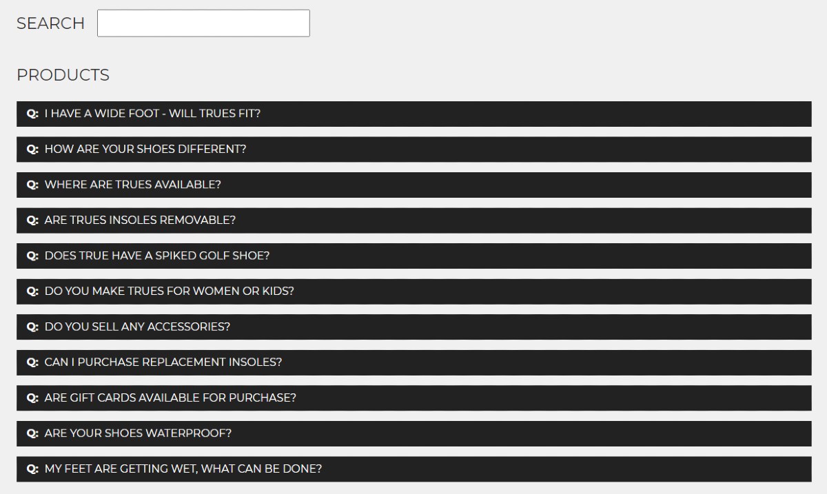
Check out this snippet of the True LinksWear FAQ page. They segment their FAQ page, but they also added a search button (for those who don’t want to scroll) and a shoe comparison chart. This enables the customer to stay on the page longer before making a decision. It also helps that the menu bar is also a mainstay on any page so that any interested buyer can click the +Shop button anytime.
10. Wishlist
A product page isn’t enough in an eCommerce website design.
You want them to come back to your website after their first purchase, so you should add a wishlist page. That way, when they’re browsing your products and aren’t ready to purchase yet, they can click on an “Add to Wishlist” button. They can then return to your website and click “Add to Cart” when they’re ready.
On the wishlist page, make sure that you feature the products they want to buy in the future. That way, they remember why they clicked on the button. Plus, make sure to integrate the link of the product as well. It’s to redirect them to that product’s page, and they can browse for more products.
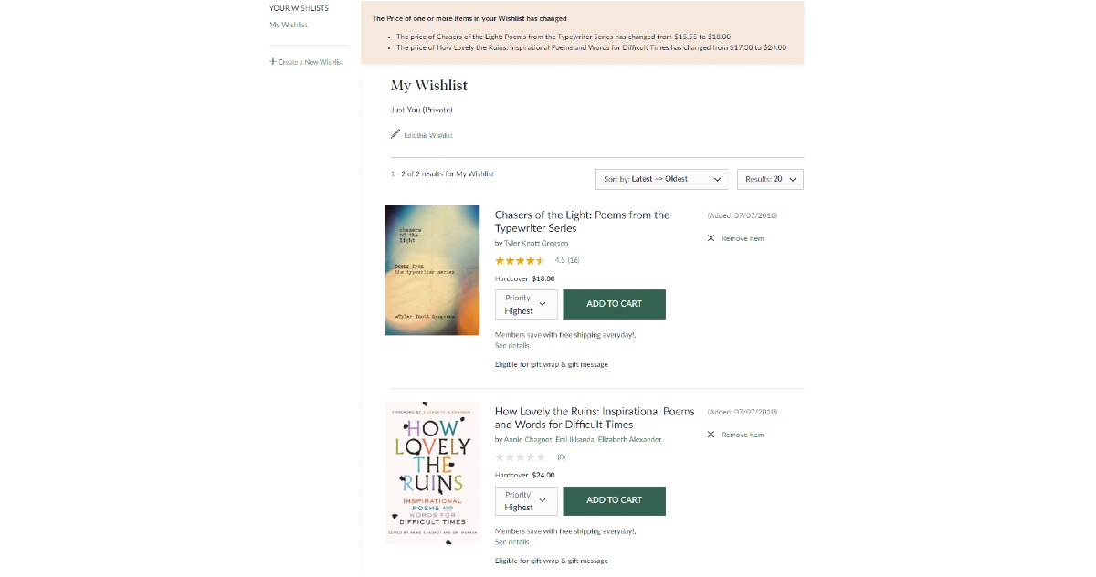
Here’s a sample of my wishlist from Barnes & Noble. As you can see, they put a preview of the book cover on the wishlist and a link to the product page. Also, notice how they have an add to cart button just in case I decide to buy the book. Plus, they added reviews too, so you can see what people thought of the book also.
11. Call to Action

Again, like social proof, call to action (CTA) has more weight in marketing than design. But in the bigger picture, CTA doesn’t only refer to the button on an eCommerce landing page. Nor should it just serve as a lead generation approach.
Dian Griesel shared on Forbes said that a CTA is a critical part of website design because you want visitors to contact you at any time. If you don’t have a contact or support page, you could lose customers. Sure, you can add a FAQ page, but what if your customer has a specific question that needs answering, and you didn’t add any CTA on any page? You might end up losing a customer if that feature is missing.
A simple link or button can count as your CTA on any page. So long as it allows them to talk to you or contact you in any way.
Here’s the CTA for Nutrafol. Even if you see it at the end of the page, they give adequate information on how to get in touch with them. Plus, bonus points for them by adding a support button at the side too, which is present on any section of the home page.
If you want all of these elements on your eCommerce website, Design Doctor can do that for you. As a subscription design service, Design Doctor will not only design your website but also request other visuals. Examples of designs include social media graphics, advertisements, and logos. You can get that and more on the Professional plan. Sign up now for your Design Doctor subscription.


